
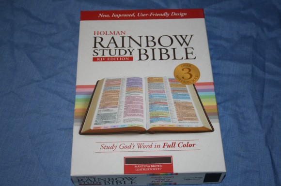

I recently reviewed the Holman Rainbow Study Bible KJV. Although I liked it a lot there were a few things that bugged me about it. Mostly I wasn’t fond of the paper. It had a blueish hue. I’ve never been a fan of paper with a blue tint. That’s just me being picky. Holman has now improved that edition with better paper and a few upgrades. At first I didn’t think the previous edition needed much improvement, but after seeing this one I’m impressed with what Holman has done.
Pros
- Every verse color coded
- Color code key printed at the bottom of every page
- Sewn
Cons
- The pages are not pre-separated
Features
- KJV
- Every verse color coded
- Color code key on every page
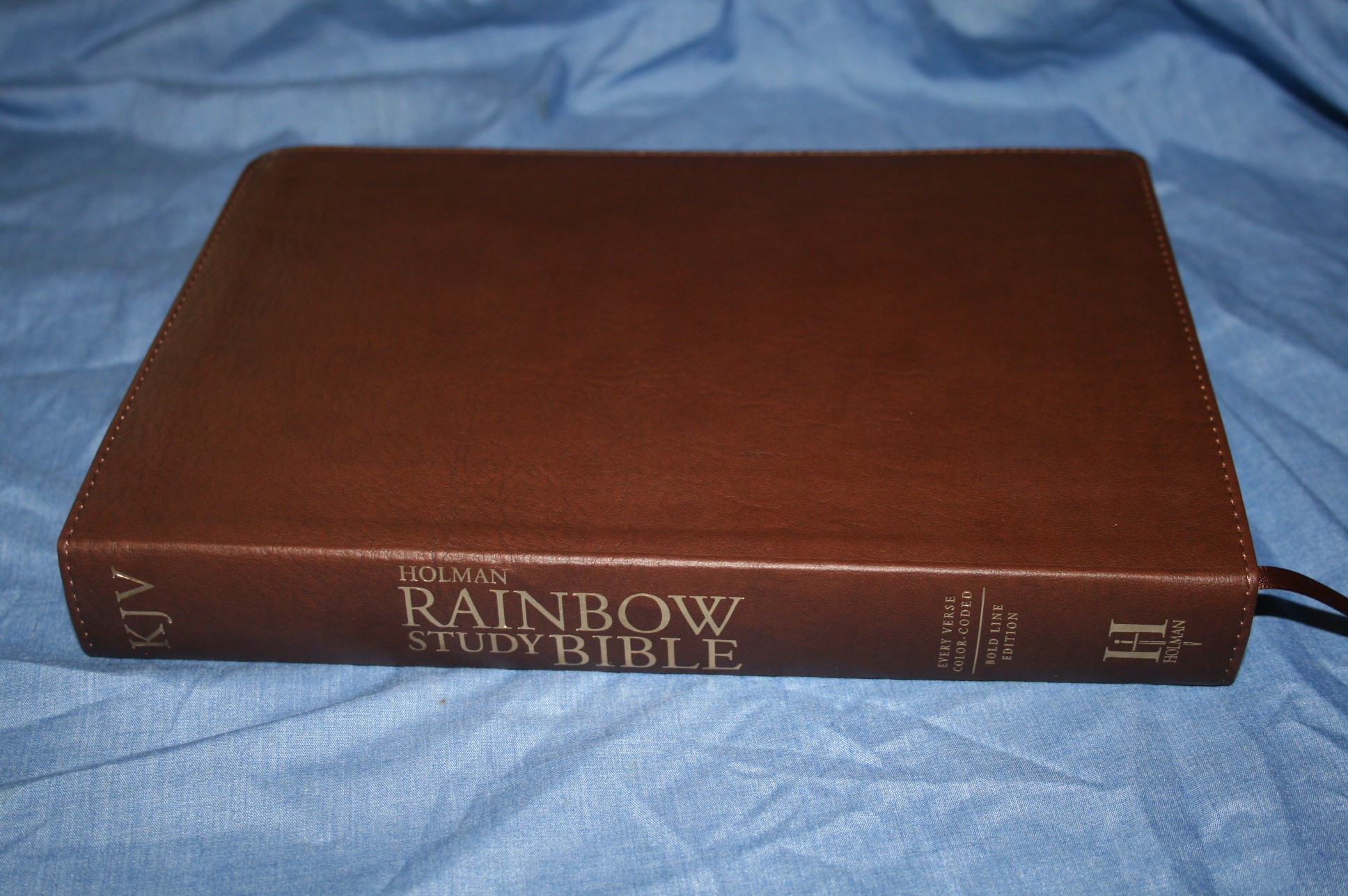
- Mantova Brown imitation leather (LeatherTouch)
- Sewn
- Words of God in both testaments underlined
- Center-column reference
- Concordance
- Daily reading plan
- Daily reading calendar
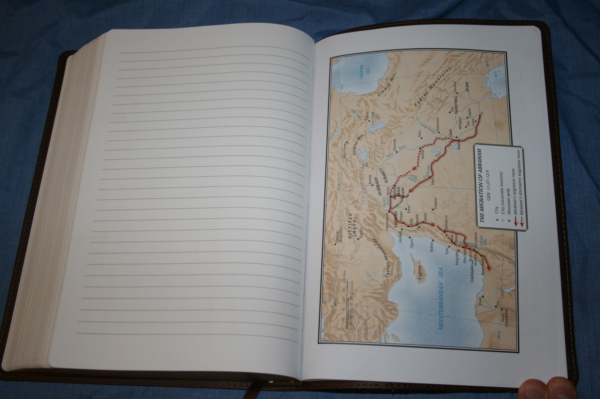
- 12 maps
- One brown ribbon
- Gilted edges
- 8 pages for notes
- 9 5/8 x 6 1/2 x 1 1/4
- ISBN: 9781586409111
- MSRP $59.99
- CBD $37.49
- Amazon $37.83
- Printed in China
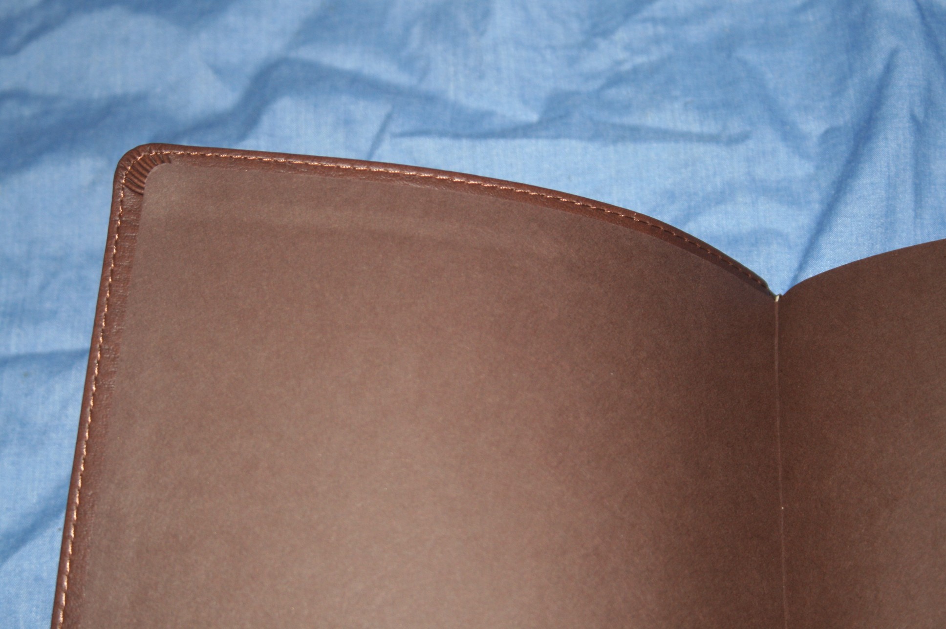
Cover and Binding
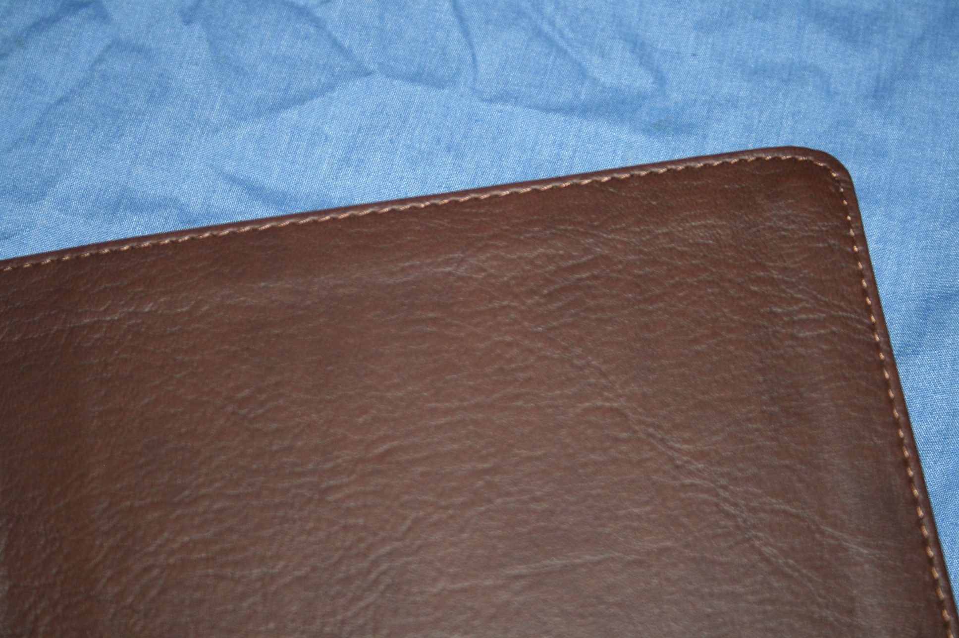
The cover is a soft brown imitation leather. The grain has a nice look and feel to it. It has stitching all around the perimeter. The liner is a brown paper card that matches the cover. The liner is stiff, keeping the cover from having much flexibility. The binding is sewn. It doesn’t lay flat in the front or back like a sewn Bible but the cover and liner might have something to do with that.
Paper and Print
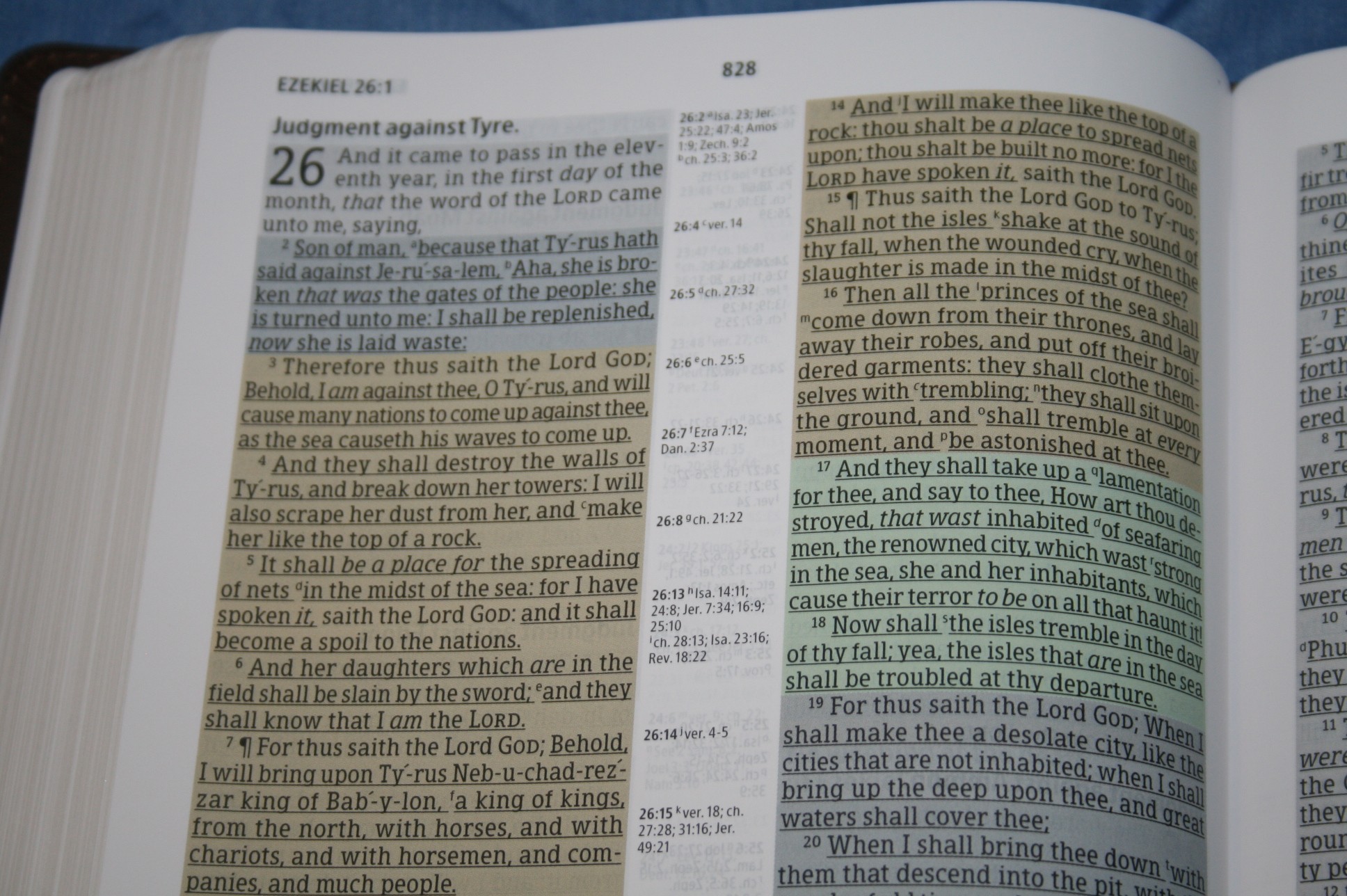
The paper is a little thin but it’s still opaque enough that the color doesn’t bleed through too bad. The only place it’s really noticeable is in the center column when there’s a map on the other side of the page that spans both columns, at the end of a book where the paper is blank, or in the book introductions where the paper is white. I don’t have any real complaints about the paper, though. It has a good feel to the touch and the color-tone is white instead of blue like the previous edition I reviewed. The print is bold and consistent throughout. The words of God in both testaments are underlined. It’s a different font than the previous edition. There are more words on a line and they look a little closer together. This allows more verses on the page but it doesn’t feel cramped. The font is bolder than previous, making it easier to read. To me it looks like a 10-point font with 11-point leading. I called the last one a 10/11. Comparing it to this one it may have been a 10/11.5.
Layout
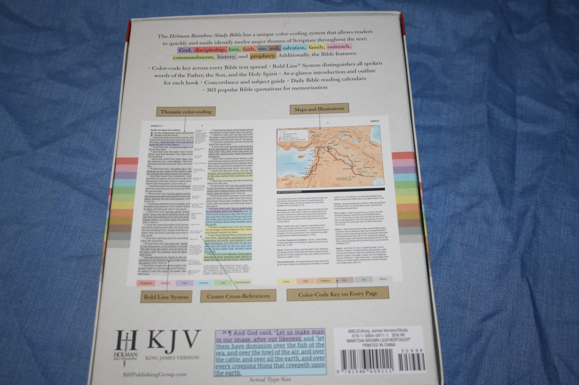
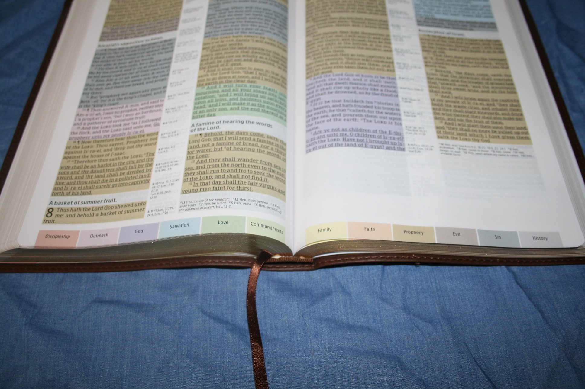
The most obvious update to the layout is the color-code key on the bottom of every page. The page contains two columns of text in verse format with center-column references. Section headings are in bold. The center margin is wide enough that the text doesn’t get lost in the gutter. The pagination is different from the previous edition. This edition is also thinner by 1/4”. The header shows the first full verse on the left page and the last verse on the right page.
References and Notes
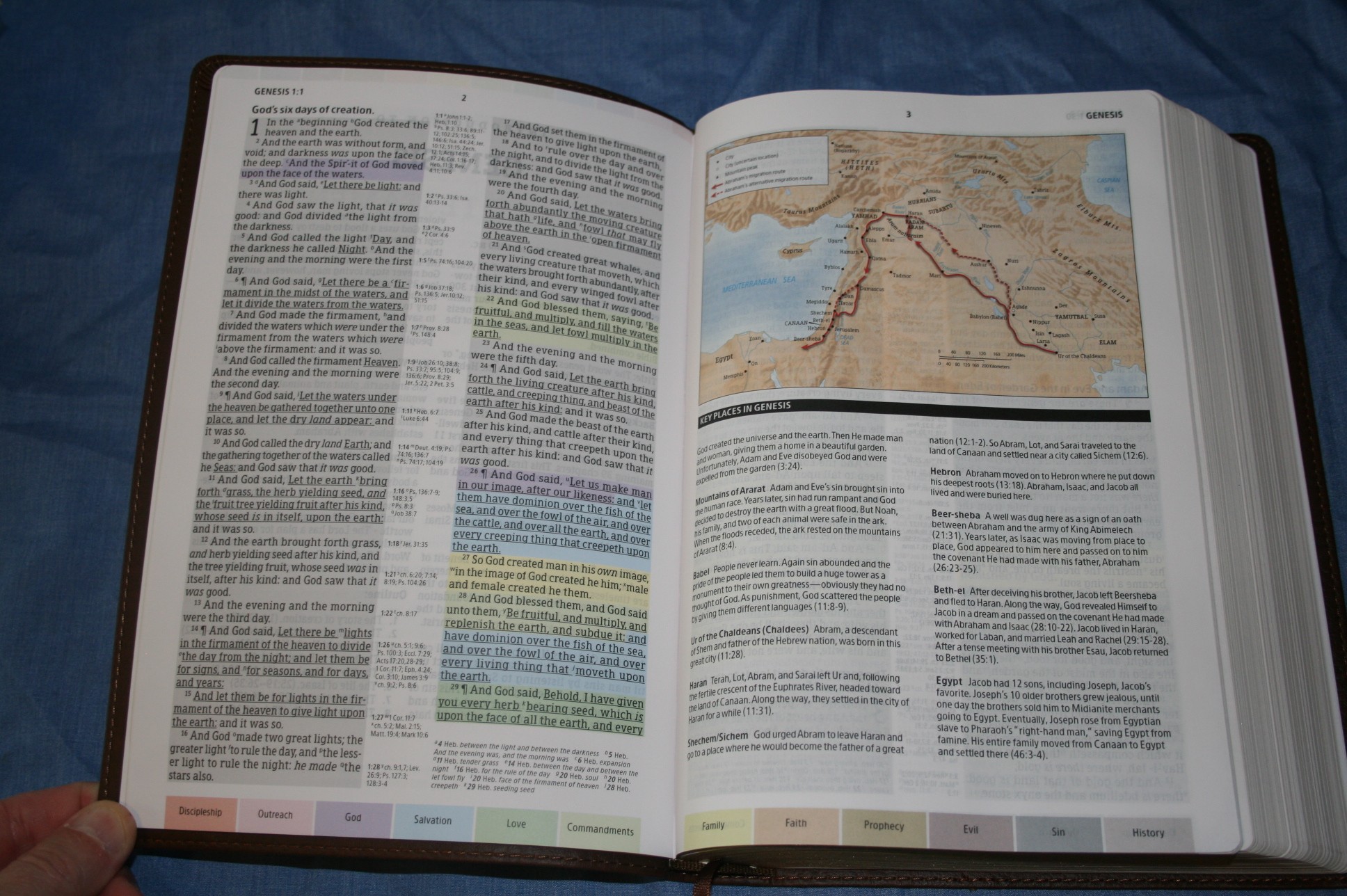
I’m not sure how many references this Bible has but it has more than average. Genesis 1:1 has 23 references. References are keyed to the text with letters. The references are labeled in the center column with the verse they correspond to. One thing I look for in the references is Mt 10:33. I want it to link with Mk 8:38, Lk 9:26, and 2 Tim 2:12. Most reference Bibles don’t include all of these references at Mt 10:33. This one does. I like this because it shows they are more complete, which builds a harmony of the Gospels in the references. The translators notes are also included. They are also keyed to the text with letters and appear under the last verse on the page. I would rather have them keyed with numbers, but since they have letters you have to look in the center-column, and when you don’t find the letter you have to look under the last verse. It isn’t too bad but it could have been easily avoided. They include notes on the Hebrew and Greek words and sometimes give references to other passages.
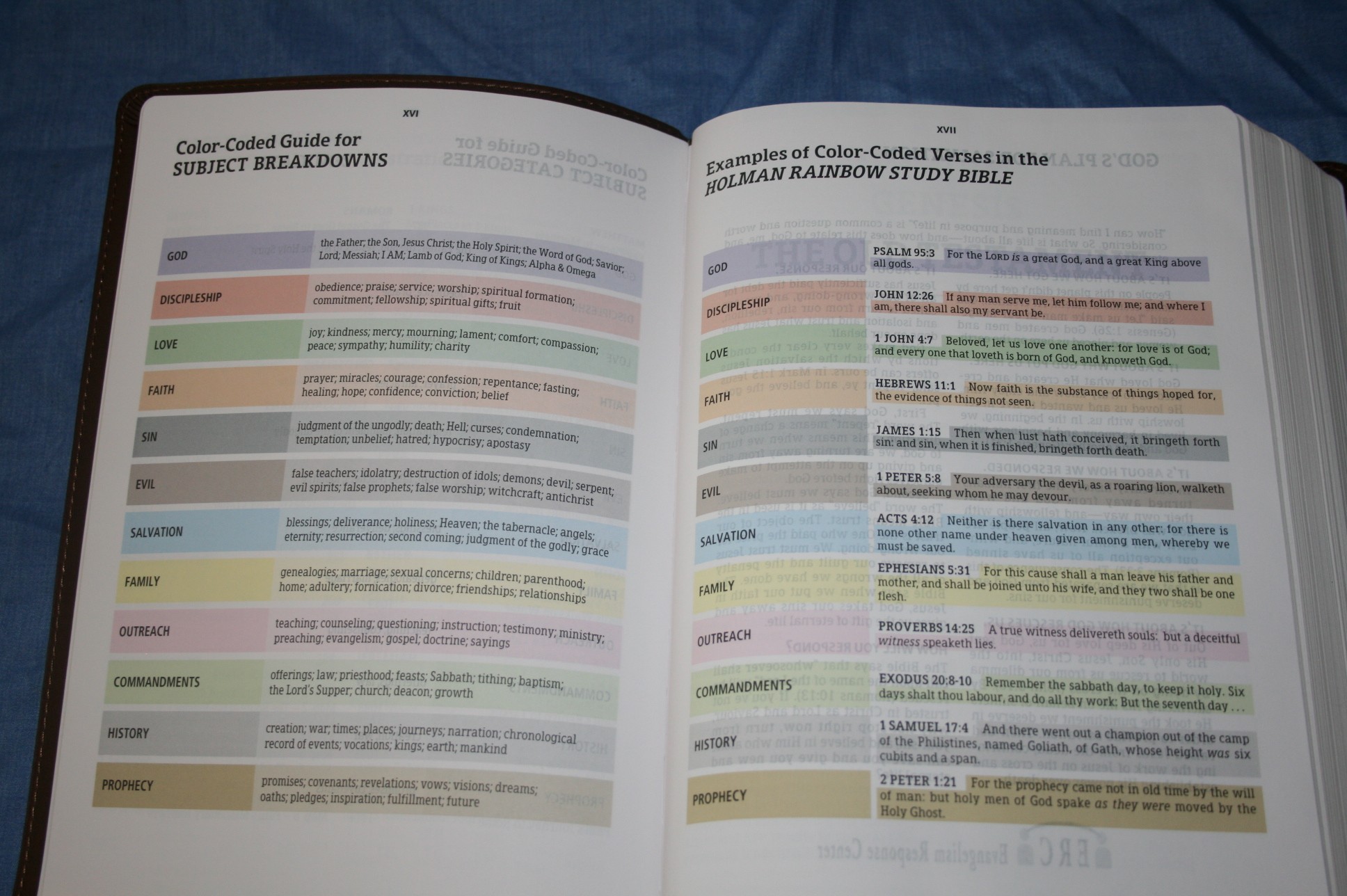
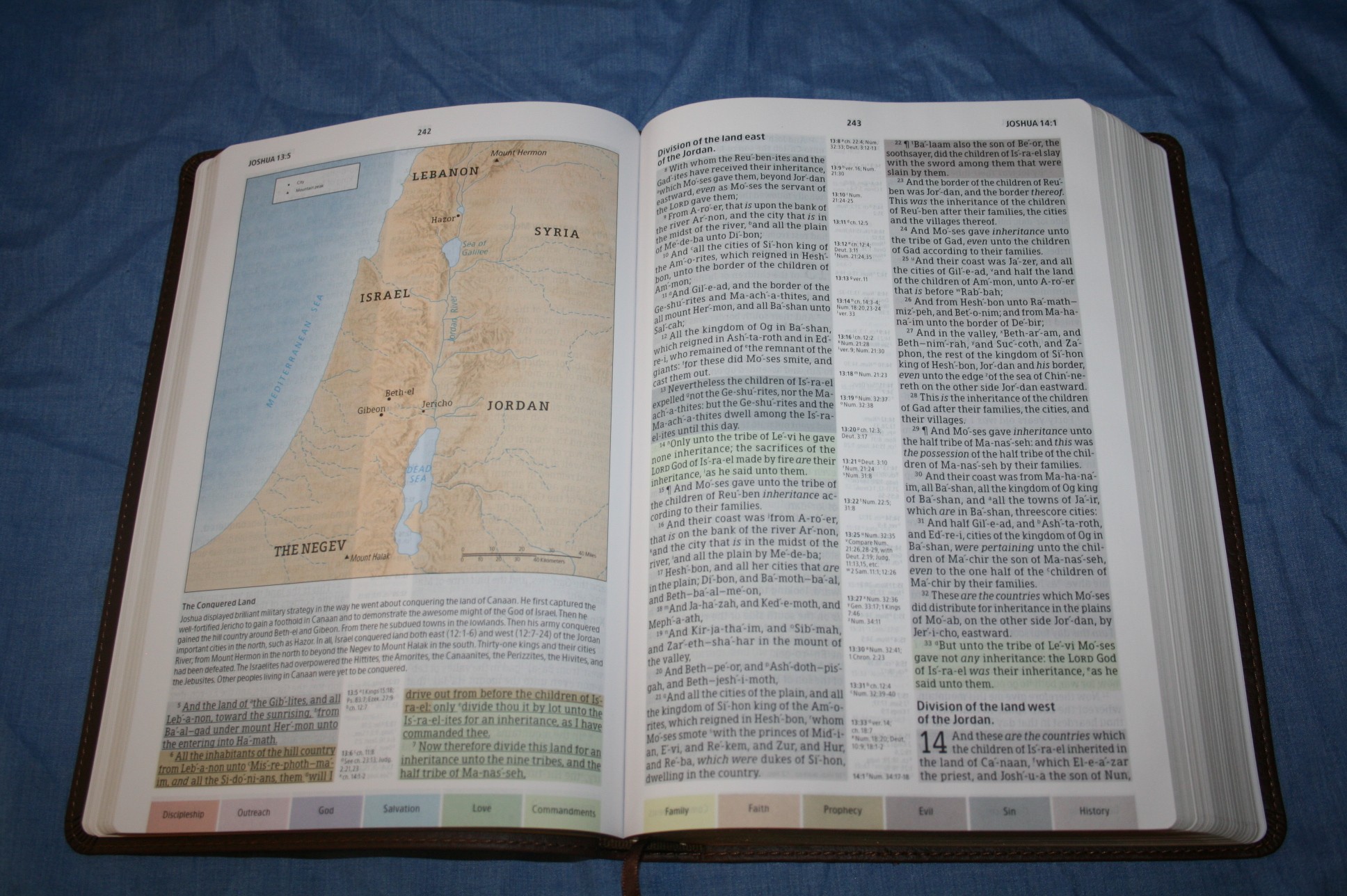
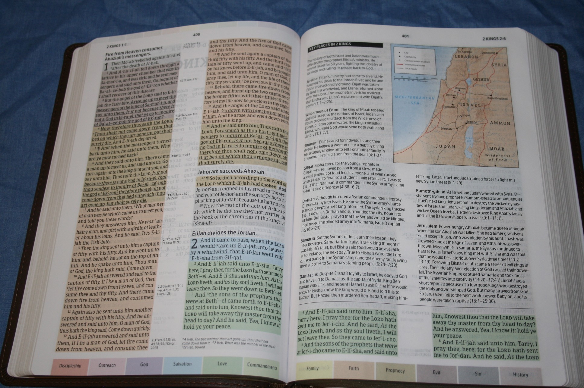
Color Code
The color code is what sets this Bible apart from all others. Every verse is colored according to its primary topic. There are 12 topics in all:
- God
- Discipleship
- Love
- Faith
- Sin
- Evil
- Salvation
- Family
- Outreach
- Commandments
- History
- Prophecy
Most verses are colored for just one topic. There are quite a few that have two topics. I like that the color key is placed at the bottom of each page the only pages that don’t have it are the book introductions. These pages should have included them as well. Now you have to turn to the next page to see the color-code key. That’s a very small complaint considering how easy it is. Having the key on each page has greatly increased the usability of the color code. Some colors are still a little difficult for me to tell apart and having the code on the page helps a lot.
Study Notes
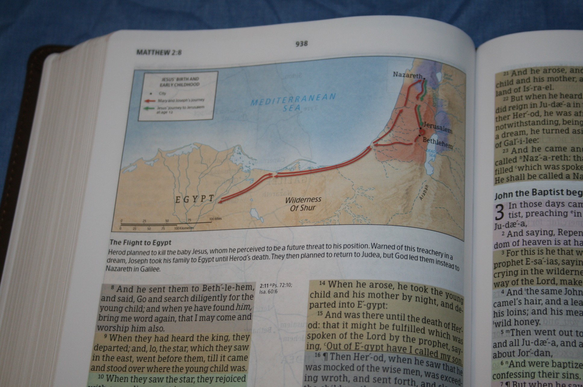
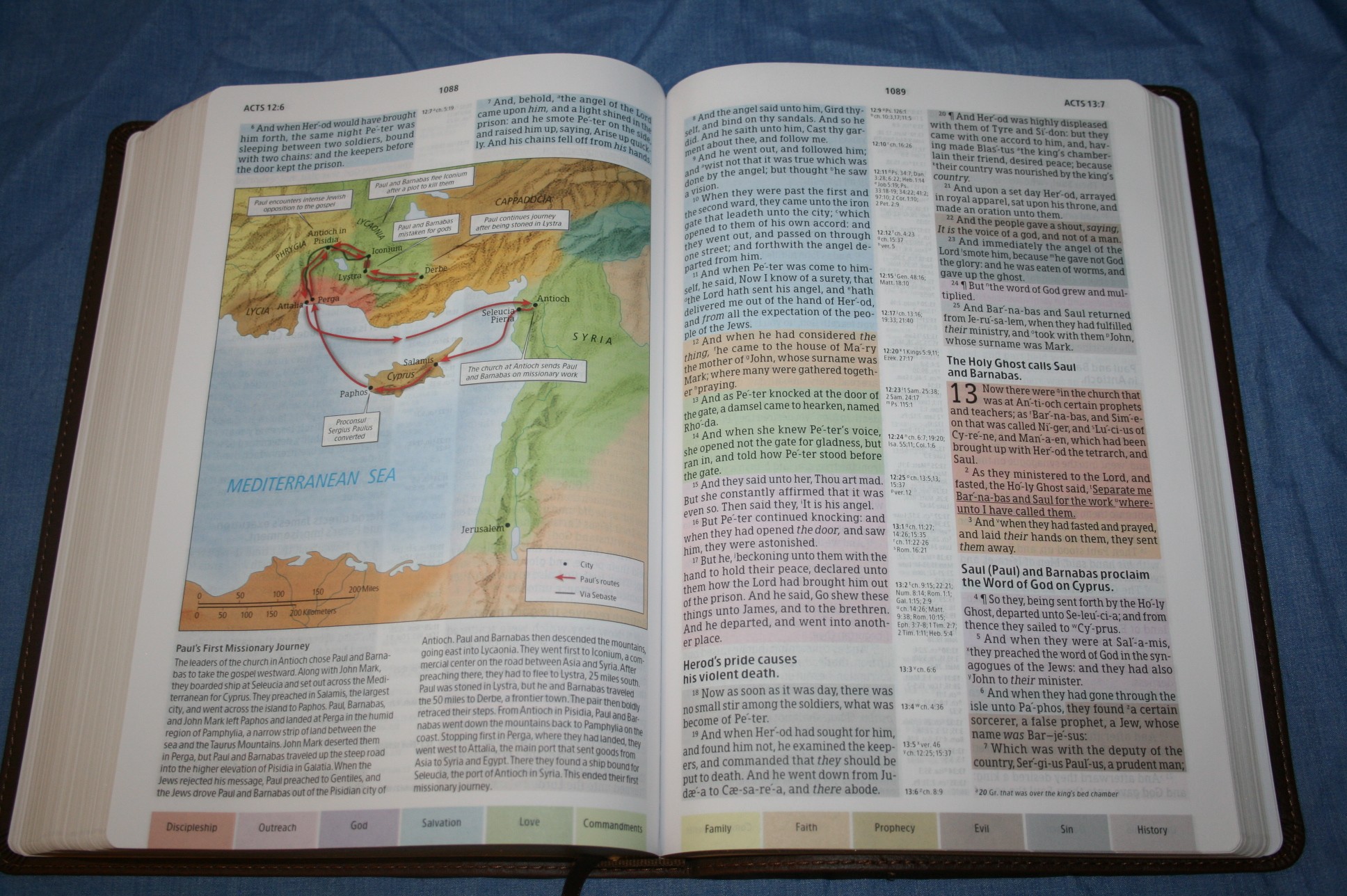
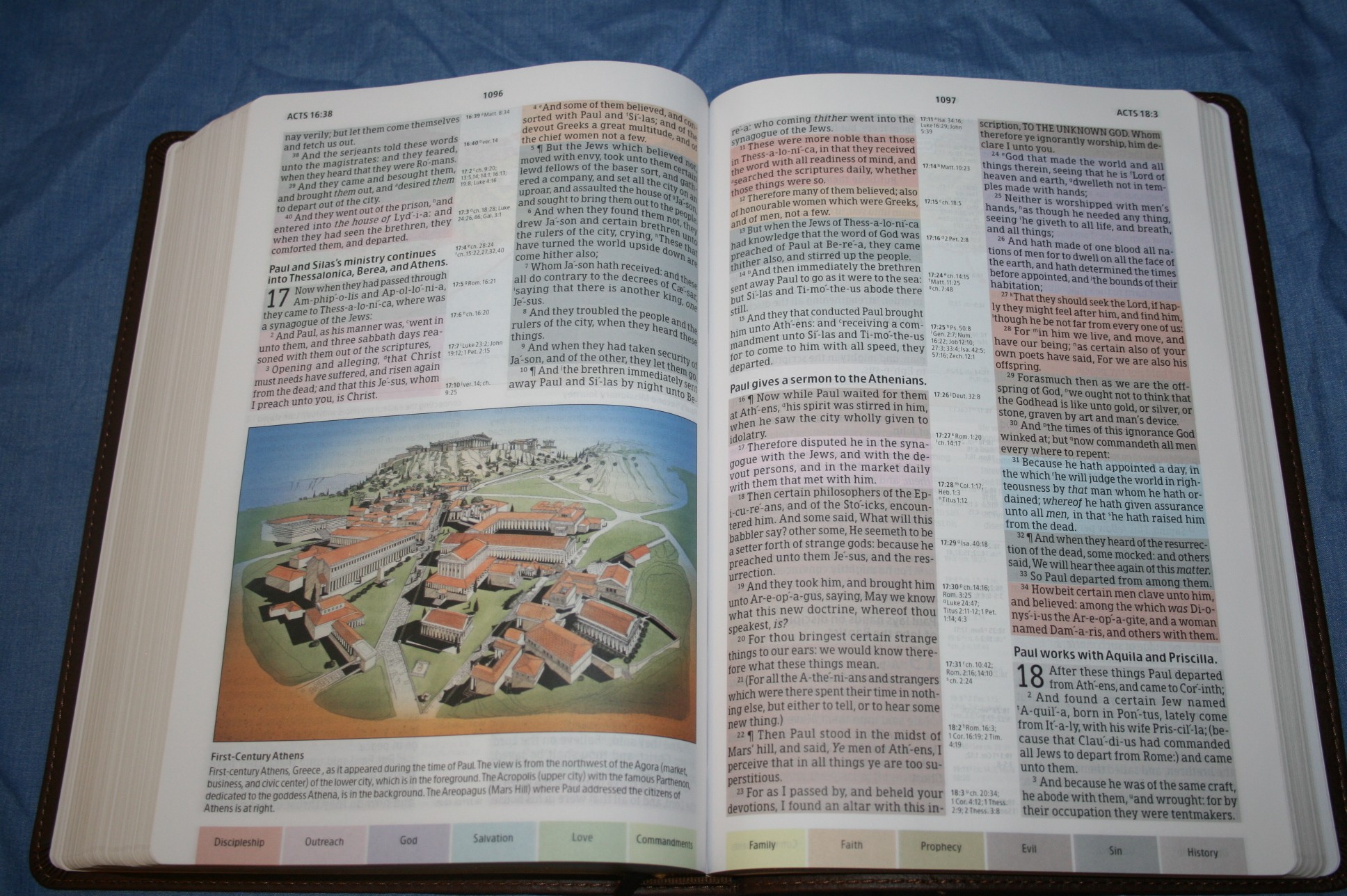
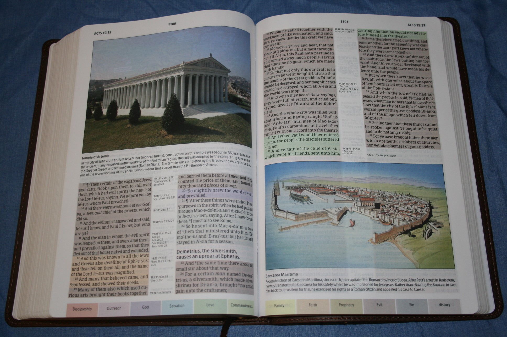
Another study feature is in-text maps and illustrations. This is my favorite type of study notes. Rather than having commentary on the text, the maps and illustrations have notes about geography, cultures, archaeology, etc. The maps are improved from the last edition. These are cleaner and easier to read. The text with the maps is bolder. In my opinion this is one of the strengths of this Bible and it’s worth having and using for this feature alone- even if you don’t care about the color-code system. For this reason I would like to see this Bible produced as-is only without color. This would allow me to do my own highlighting and marking.
Book Introductions
Book introductions are one page and contain information about the author, date it was written, the time span, title, background, where is was written, to whom, content, key words, themes, and an outline. It’s enough to be useful without giving pages and pages of info that I might go back to.
Supplemental Study Aids
There is a decent amount of good material in the back without taking up too much space. Most of it is stuff that I would use. It includes:
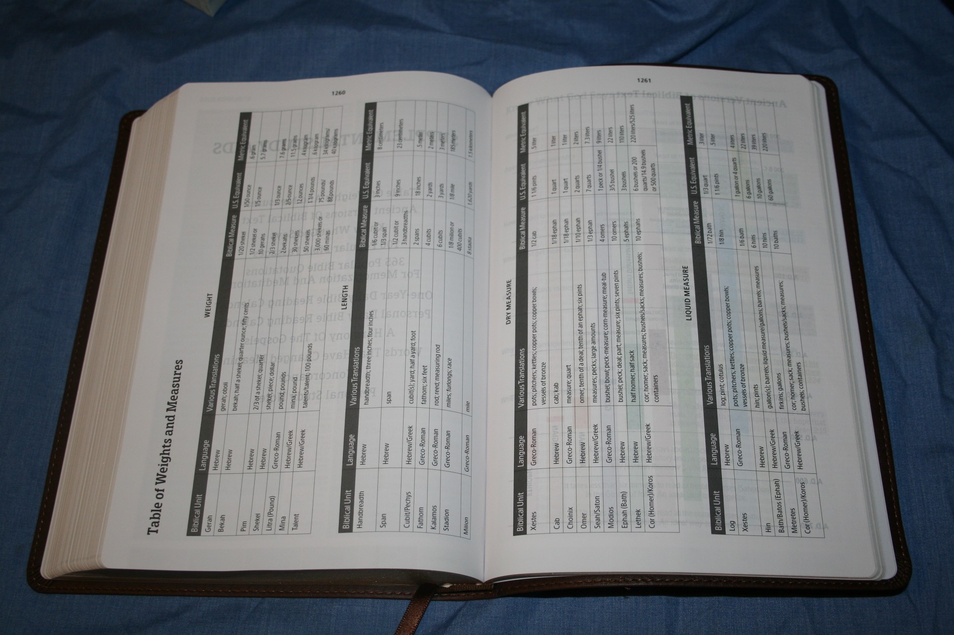
- Table of Weights and Measures – 2 pages and includes weight, length, dry measure, and liquid measure
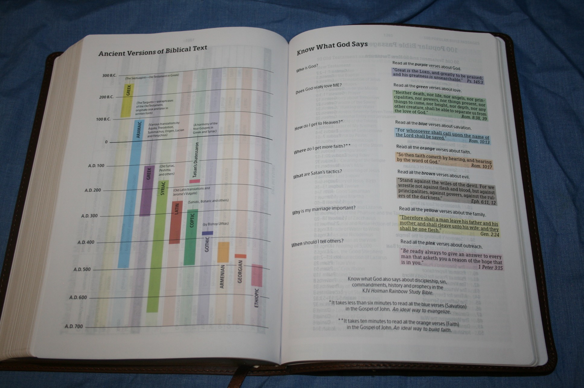
- Ancient Versions of Biblical Text – 1-page chart showing various texts and their dates
- Know What God Says – has Scripture answers to 7 popular questions
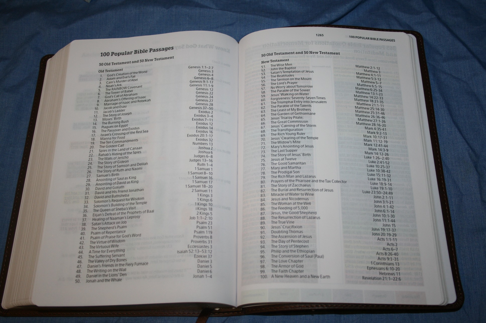
- 100 Popular Bible Passages – 50 popular passages for both testaments
- 365 Popular Bible Quotations for Memorization and Meditation – a passage to read for each day of the year. Includes a column to mark when you memorized it.
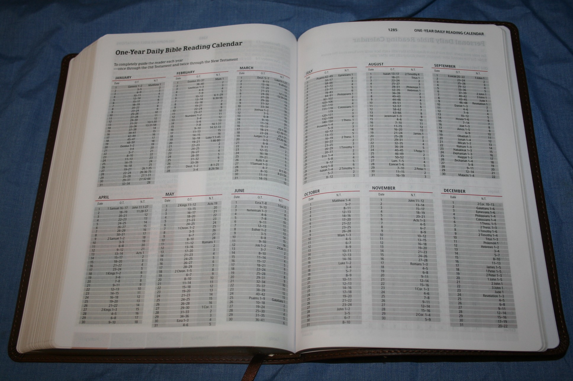
- One-Year Daily Bible Reading Calendar – a 1-year reading plan with a reading from both testaments taking you through the OT once and the NT twice
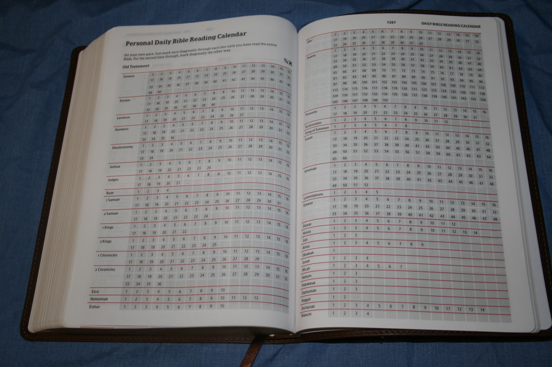
- Personal Daily Bible Reading Calendar – every chapter listed so you can mark them off and read at your own pace
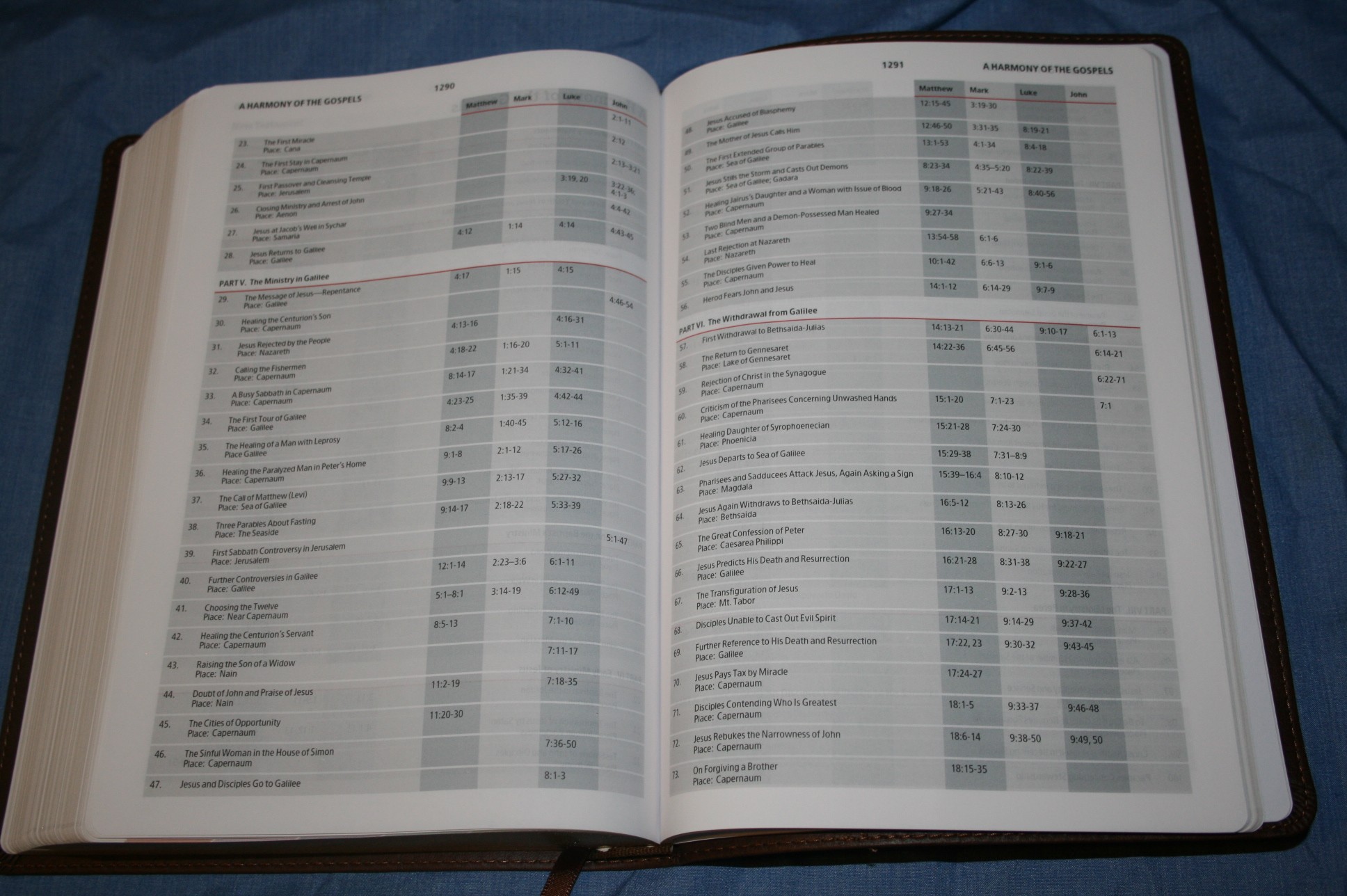
- A Harmony of the Gospels – 6.5 pages breaking he Gospels into 12 sections, listing 166 items
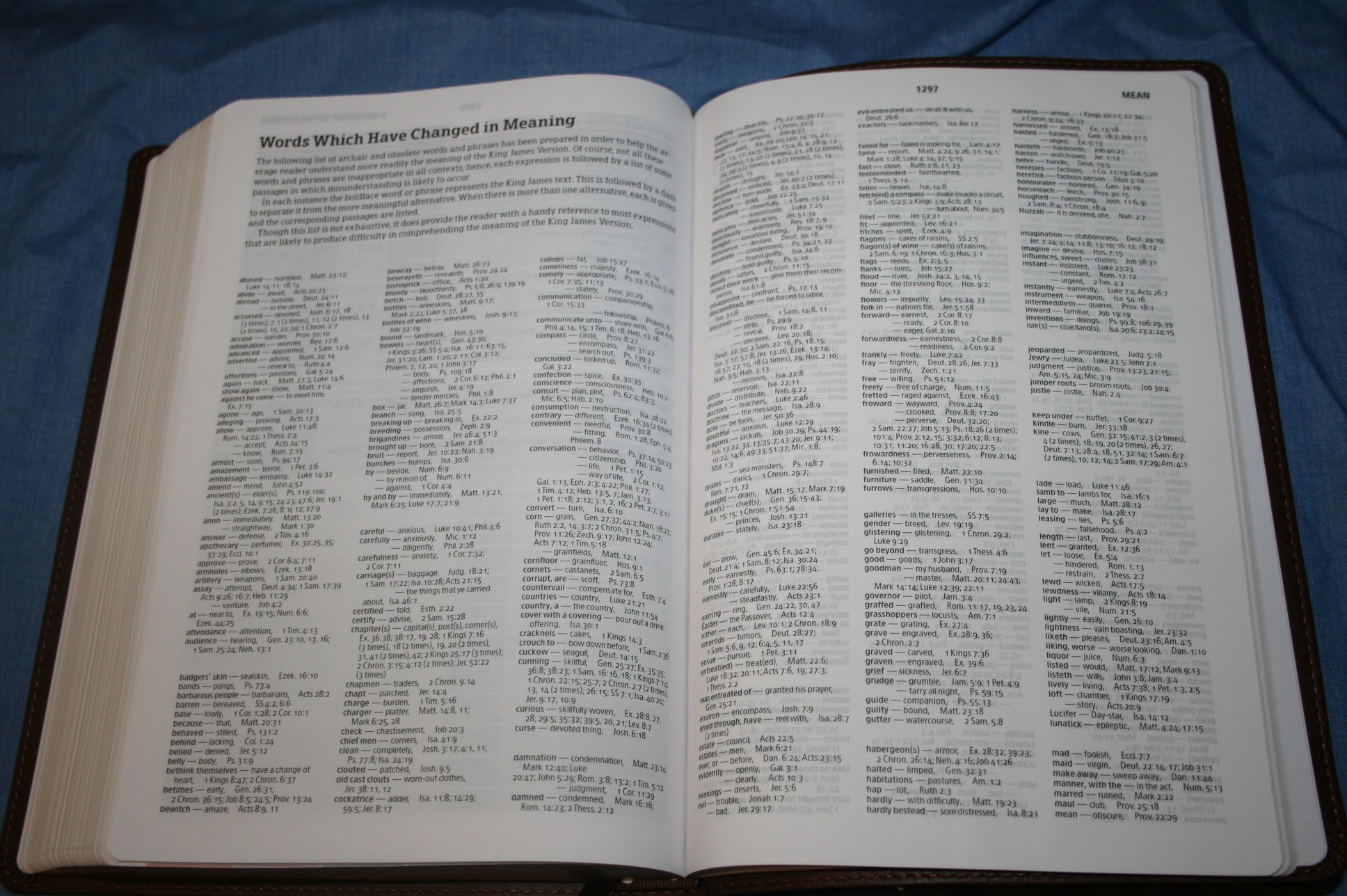
- Words that have Changed Meaning – 3.5 pages with 3 columns per page of archaic and obsolete words and phrases. Includes passages where the words can be found
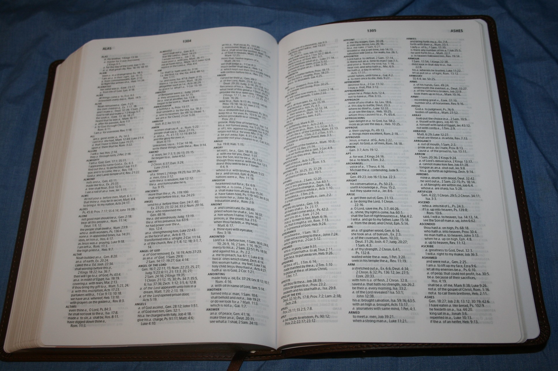
- Concordance – 79 pages with 3 columns per page. Has 44 entries for God and also includes entries for God of Heaven (x10), God of Hosts (x4), Gods (x9), and God-ward (x3)
- Personal Study Notes – 8 pages of ruled Bible paper for your own writing enjoyment
Concordance
Here are a few example entries with their number of references to help you compare:
- Christ – 9
- Christ Jesus – 3
- Christian – 3
- Christs – 2
- Faith – 22
- Faithful – 16
- Faithfulness – 3
- Faithless – 3
- God – 44
- God of Heaven – 10
- God of Hosts – 4
- Goddess – 3
- Godhead – 2
- Godly – 4
- Godliness – 3
- God-Ward – 3
- Gods – 9
- Praise(n) – 10
- Praise(v) – 4
- Praised – 7
- Praises – 7
- Praising – 6
- Pray – 16
- Prayed – 3
- Prayer – 7
- Prayers – 9
Maps
There are 8 full-color maps on tick, non-shiny, paper. They are the standard Holman maps and are a nice match to this Bible. They would be more useful if there was an index to maps. The previous edition had more maps but they were printed in the standard Bible paper and were not as nice as these.
Conclusion
I was a fan of the previous edition but I like this one much better. Virtually everything has been improved. I like the improved fonts and maps, and the color-code at the bottom of each page simplifies its use. This is a good Bible for its references, in-text maps, ans supplemental study aids. Throw in its unique color-code and it’s a winner all around. I highly recommend the new and improved Rainbow Study Bible from Holman Publishers.


Holman provided this Bible free for review. I was not required to give a positive review- only an honest review.