
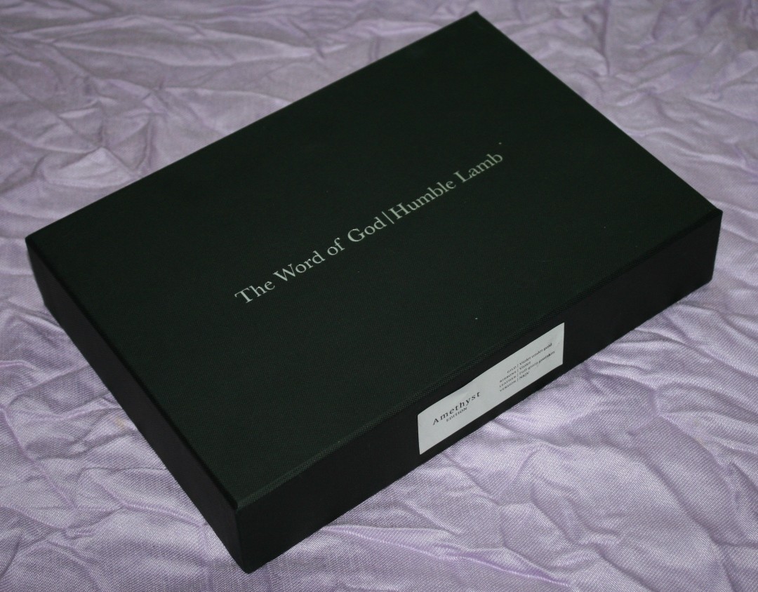
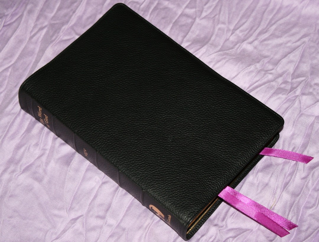
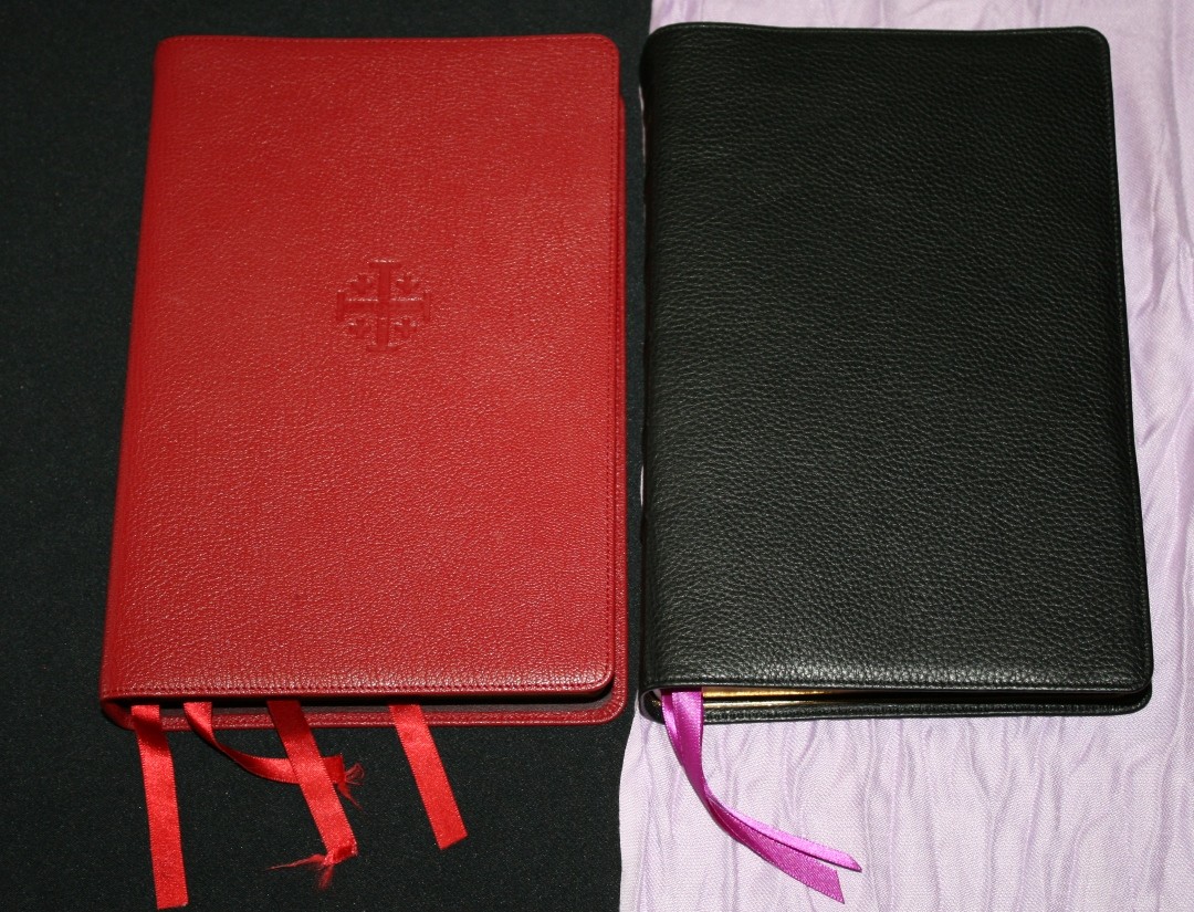
Humble Lamb’s The Word of God is the company’s first premium Bible. It’s a hand-made New King James reference edition that comes in just under $150. It presents the text in a red-letter single column that’s as sharp as it is elegant. I’m reviewing the Amethyst edition, which has violet under gold art-gilt and violet ribbons. It’s made in China.
Humble Lamb provided this Bible in exchange for an honest review. I was not required to give a positive review, only an honest one. All opinions are my own.
_________________________________________________________
This Bible is available at HumbleLamb.com
_________________________________________________________
VIDEO REVIEW

COVER AND BINDING
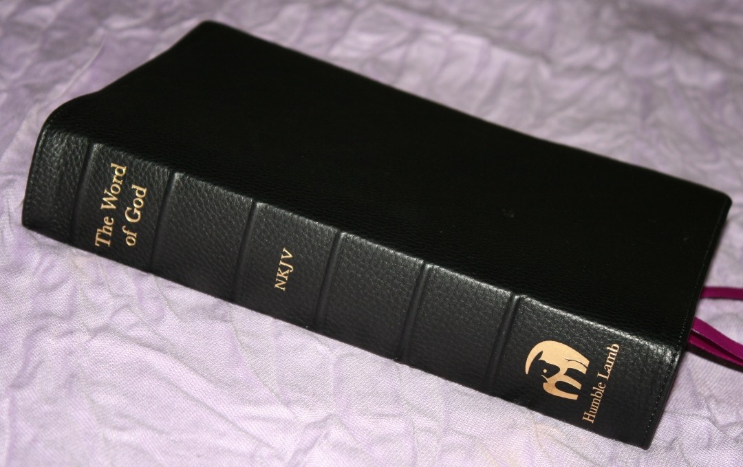
The cover is black goatskin. It has that familiar pebbly grain that we’ve seen on lots of goatskin editions. It has a matte finish. It’s soft to the touch and it’s extremely flexible. The spine includes 6 ribs and the text – The Word of God, NKJV, and the Humble Lamb logo stamped in gold. The liner is calfskin. The leather feels thinner and more flexible than most goatskin editions.
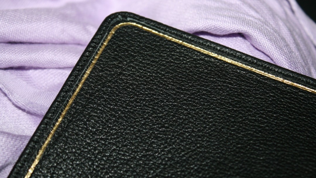
I love the grain of the calfskin liner. The calfskin liner helps make the cover soft and pliable. It’s edge-lined and even includes a gold decorative line around the inside of the cover that gives it a finished look.
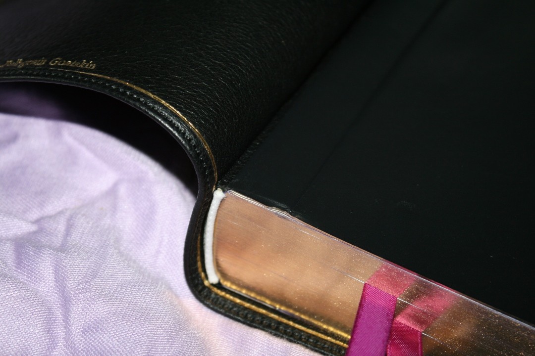
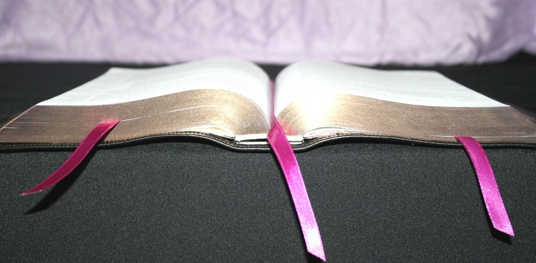
It has 3 long 10mm violet ribbons with a shiny look on one side and a matte look on the other.
The overall size is 9.75 x 6.5 x 1.75″ and it weighs 2lbs 9.9oz. Even though I love this cover, it can feel a little flimsy for the size and weight of this Bible.
PAPER
The paper is 30 gsm. It’s white in color and has no glare under direct light. It does have some show-through, but it’s more opaque than the paper in my NKJV Clarion. The show-through is mostly noticeable in the poetry settings or when there’s a drawing on the other side of the page. It’s an excellent paper for reading. It has a rough texture that’s easy to grab and turn. It does seem to crease easily when turning pages. I haven’t tried writing in it but I think this would be good paper for marking.
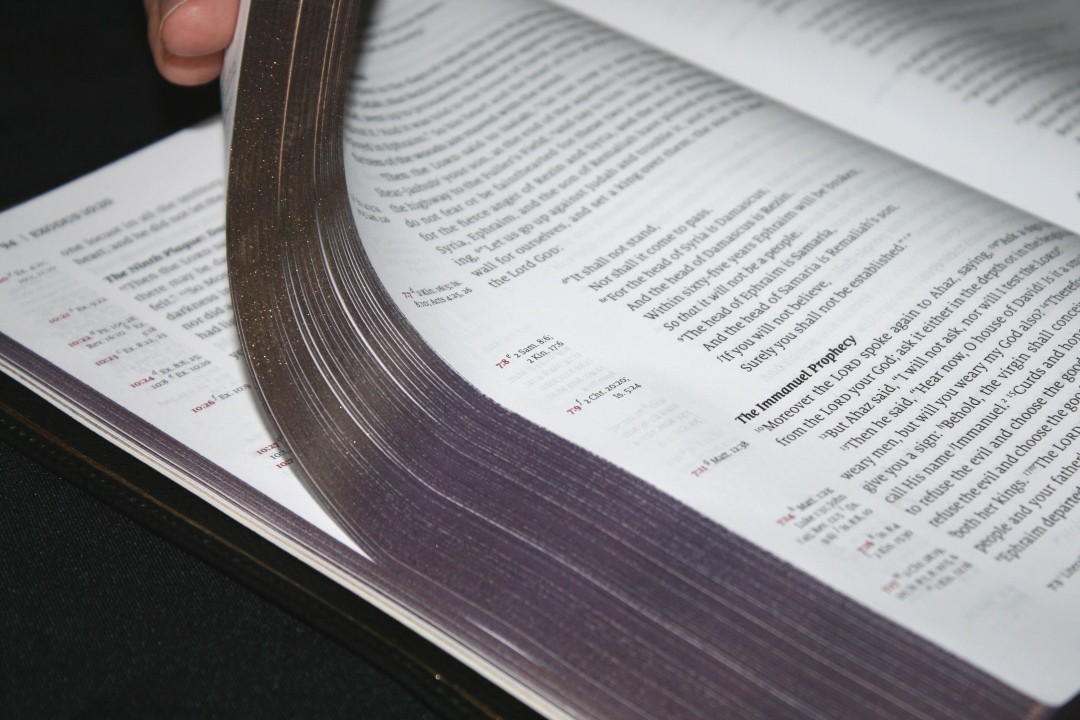
It has violet art-gilt edges. The color is dark and consistent. It does have a few splashes of color that made its way past the outside edge of the page. This doesn’t bother me at all, but it is noticeable. I’ve seen this, or worse than this, on more expensive Bibles.
TYPOGRAPHY

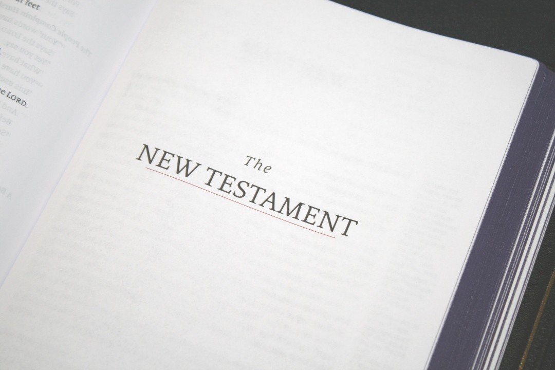
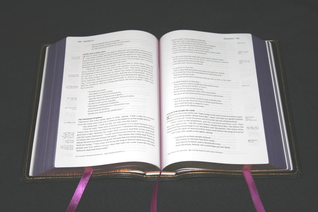
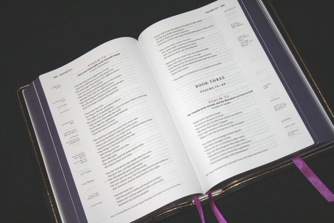
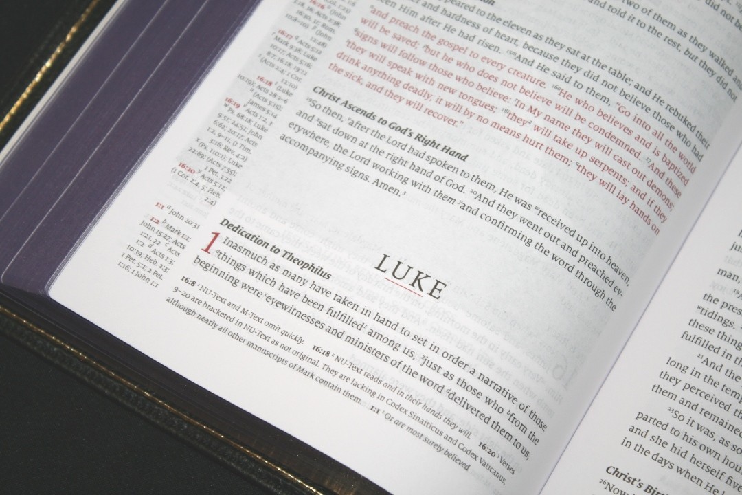
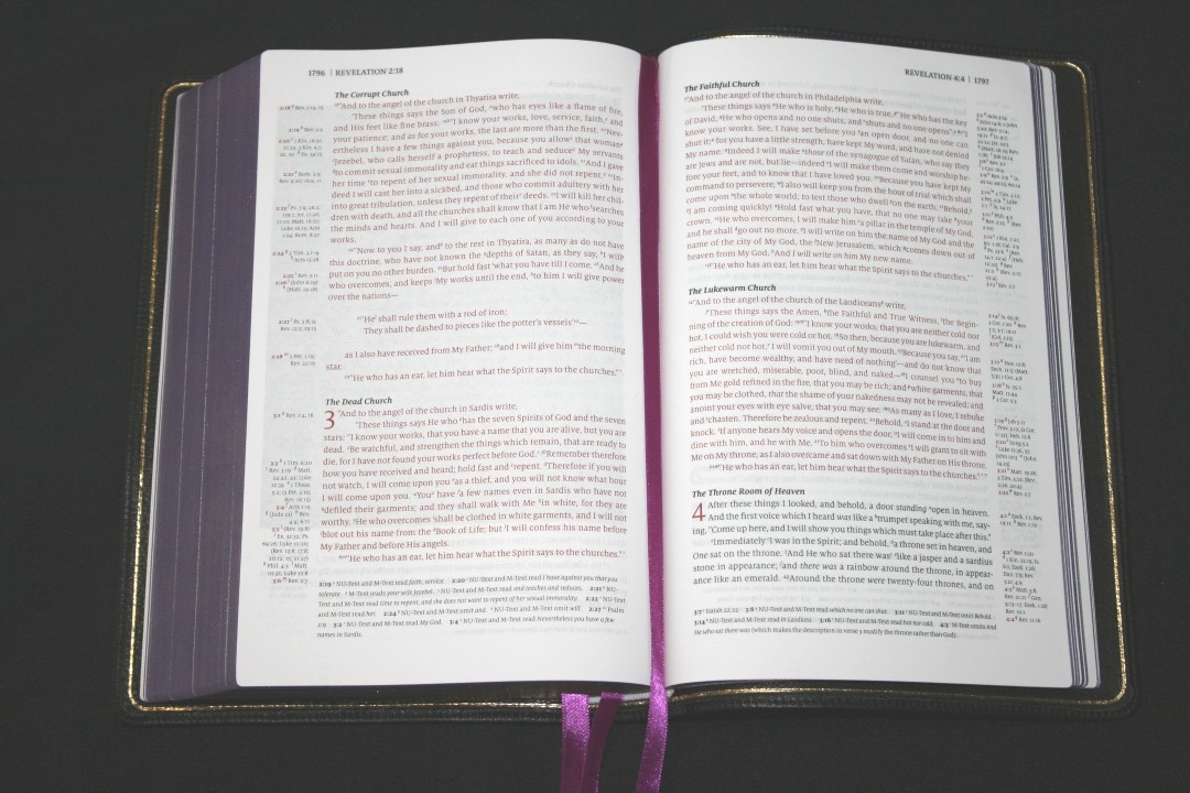
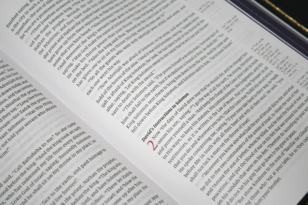
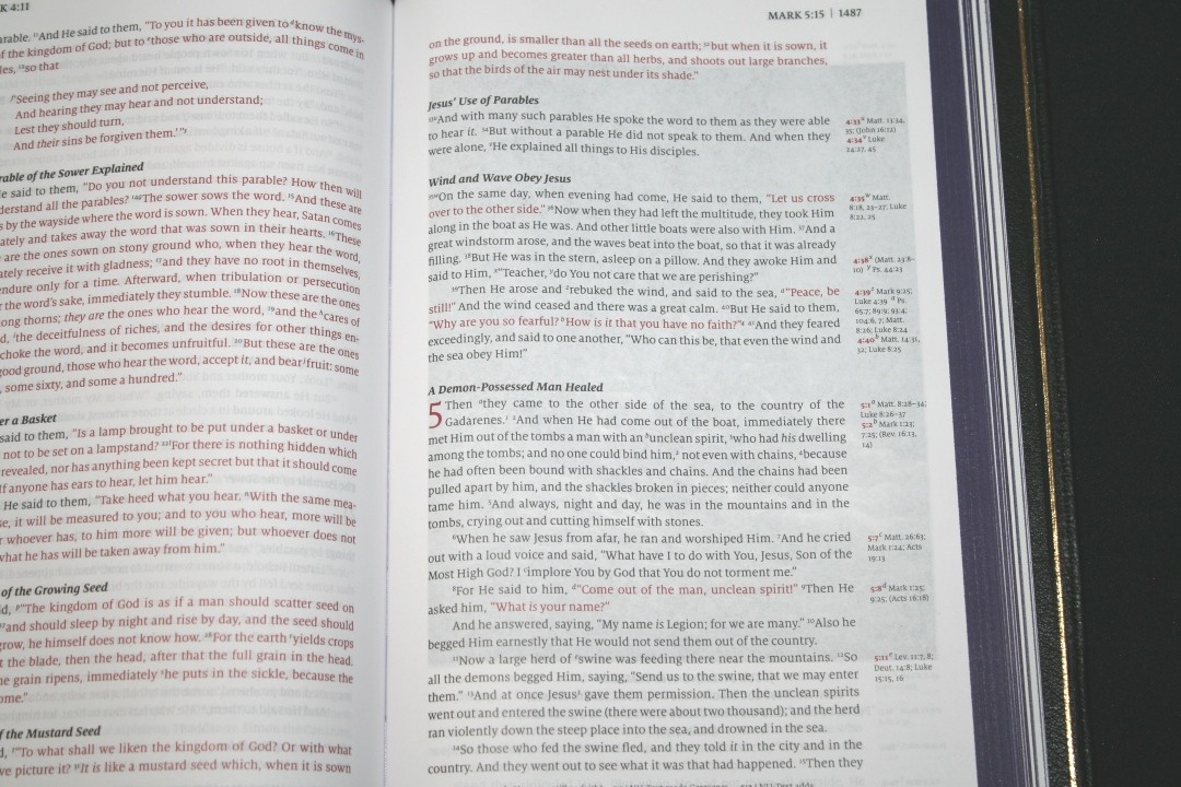
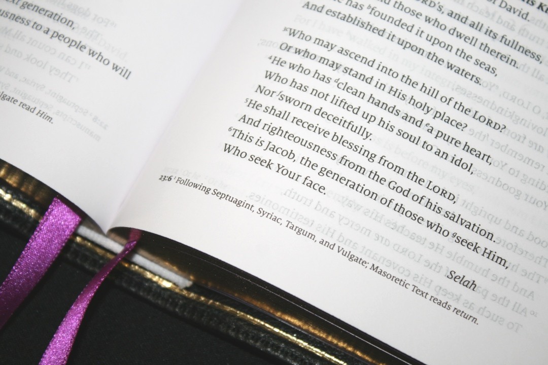
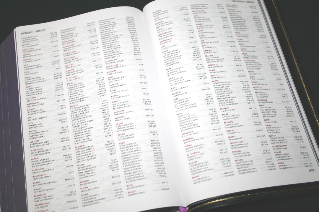
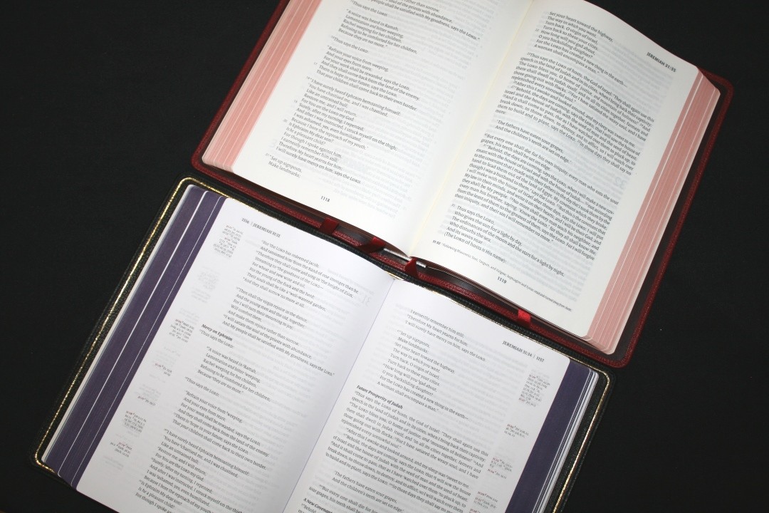
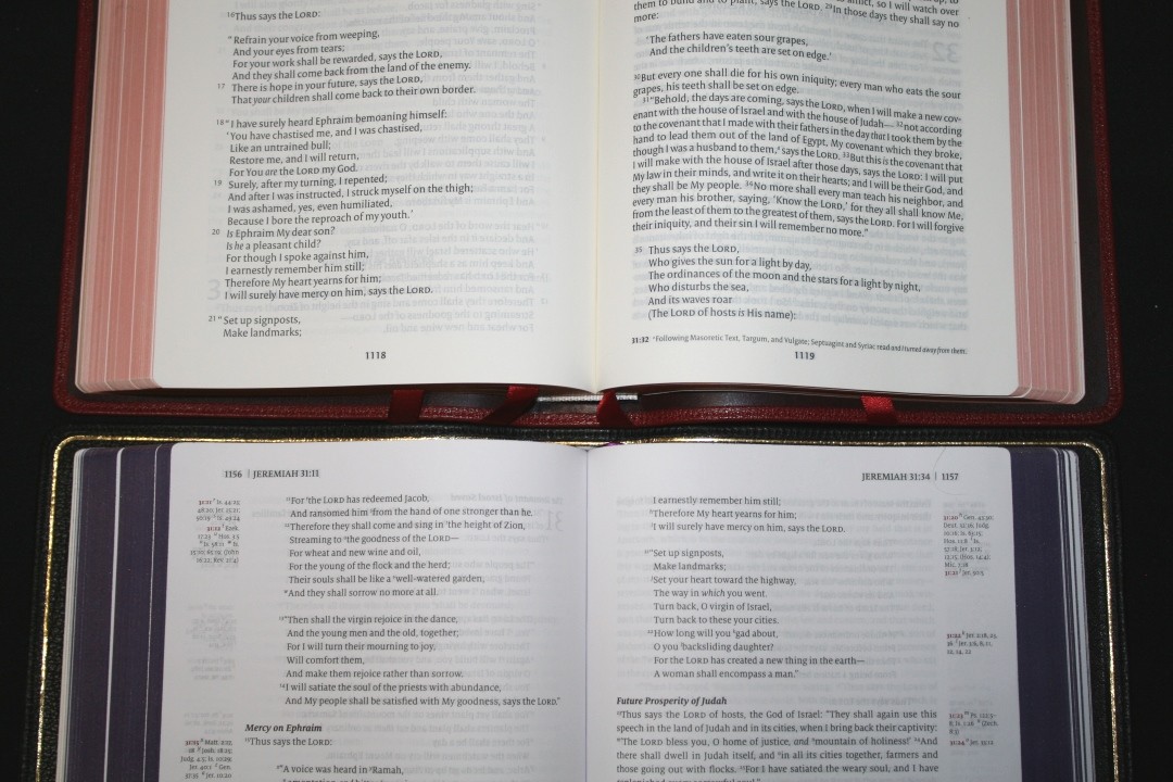
The text is set in a single-column layout with references in the outer margins and footnotes in the footer. Poetry is set to stanzas. The header shows the page number in the outer corner followed by the book name, chapter number, and verse number. Red is used for highlights, such as the underline for book names.
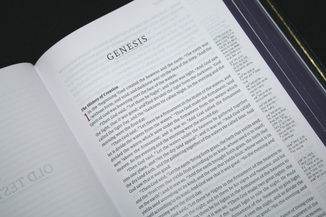
The typeface is a 9-point Milo and includes red letter for the words of Jesus through Revelation. The Milo font reads slightly larger than other fonts of the same size due to the lower-case letters being almost as tall as the upper-case letters. This Bible also has a larger leading (space between the lines) than most Bibles. There’s plenty of room for underlining with practically any type of Bible marker you want to use. Both the black and red letter are about a medium darkness. It has a little bit of variation in the darkness of the red letter. The black is consistent throughout the Bible. The print isn’t as dark as the Clarion, which I’m sure is part of why the paper has less show-through.
The text is printed with line-matching so the lines are printed in the same location on both sides of the page. Fortunately, the paper is opaque enough that this doesn’t make the text gray. It does look a little gray if a drawing is printed on the other side.
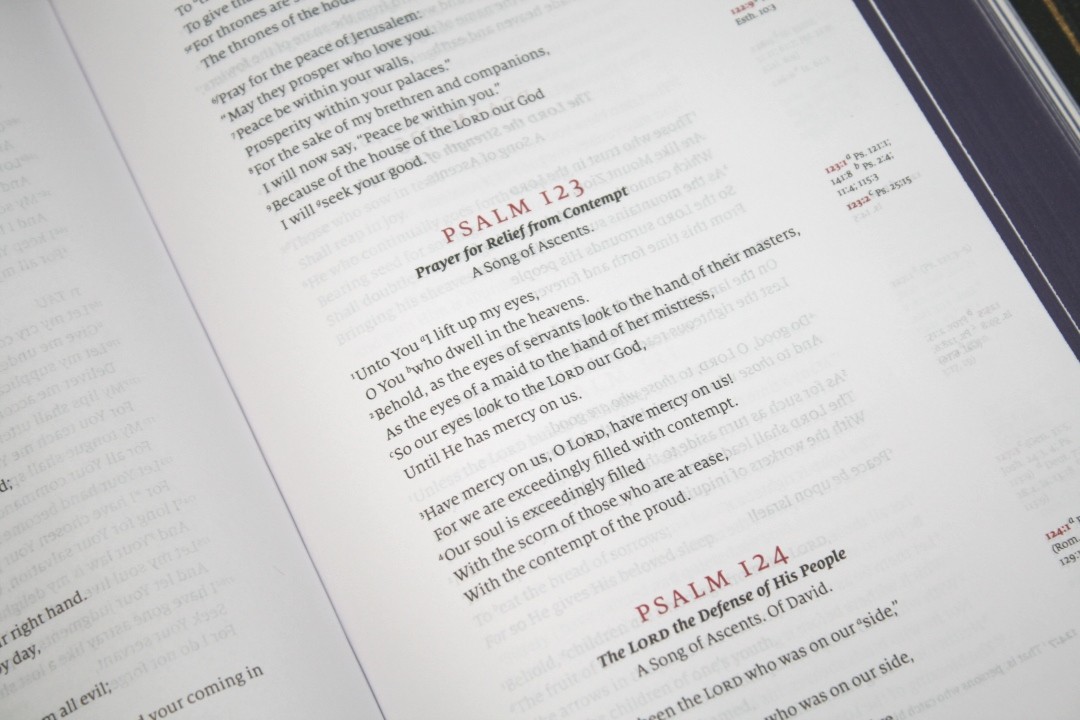
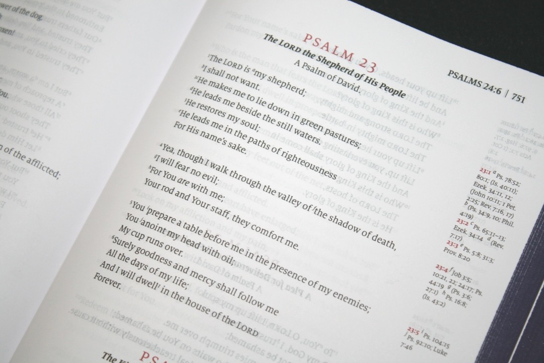
The column of text is 4 1/8″ wide. It has around 78 characters across with around 14-16 words per line. Normally this would be too many words for my tastes, but the extra leading and wide inner margin helps keep the line flat making it easy to read the longer lines. Poetry looks amazing with this character count. It has 47 lines per page.
Supplied words are in italics. It does include reference and footnote keys in the text. They’re small enough to ignore when reading. The references can be a little difficult to find if you just search through the text. I use the cross-references in the margins to help me find them.

OT quotes are not placed in oblique type like most NKJV’s are. The oblique type would be helpful to find OT quotes at a glance, but it can also stand out too much or be confused with italics. This uses standard type for OT quotes, which is easier to read and doesn’t make the text look awkward. This does make it more difficult to recognize the OT quotes at a glance.
Paragraphs are indented more than most Bibles. The section headings are bold. They stand out and are easy to scan. I personally prefer a lighter font for sections headings so they’re easier to ignore, but that’s just my preference. Bold section headings are fine. They especially stand out around the red-letter text.
Chapter numbers are also printed in red, as well as the chapter and verse numbers in the references. The chapter and verse numbers for the footnotes are black. This makes the cross-references easier to identify. The black for the footnotes helps ground them. They’re bolder than the footnotes, and footnotes have some space between them which makes them easy to see.
ARTWORK
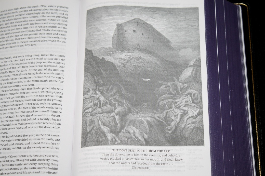
Throughout the Bible is 65 full-page black-and-white drawings by Gustave Doré (they look much better in person. Sorry for the bad lighting). They’re relevant to the text they’re placed next to. I’m a fan of artwork in Bibles and I’ve always been a fan of Gustave Doré’s work, so I like that these are included. They help with imagining the setting. The drawings don’t show through that much (they are noticeable though) and they look great in the Bible.

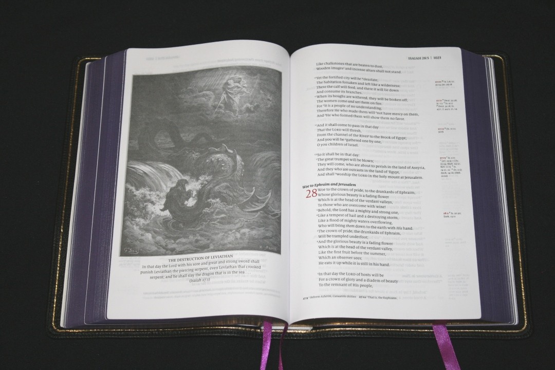
Just keep in mind that any artwork is the interpretation by the artist, so try not to let that interpretation influence your interpretation of God’s Word.
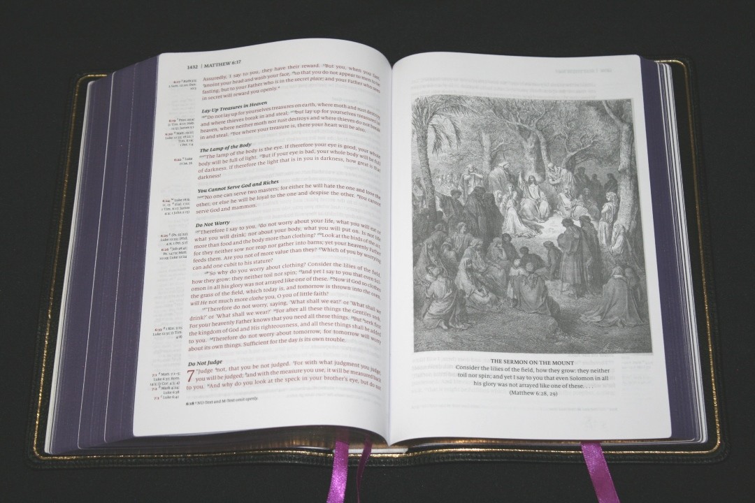
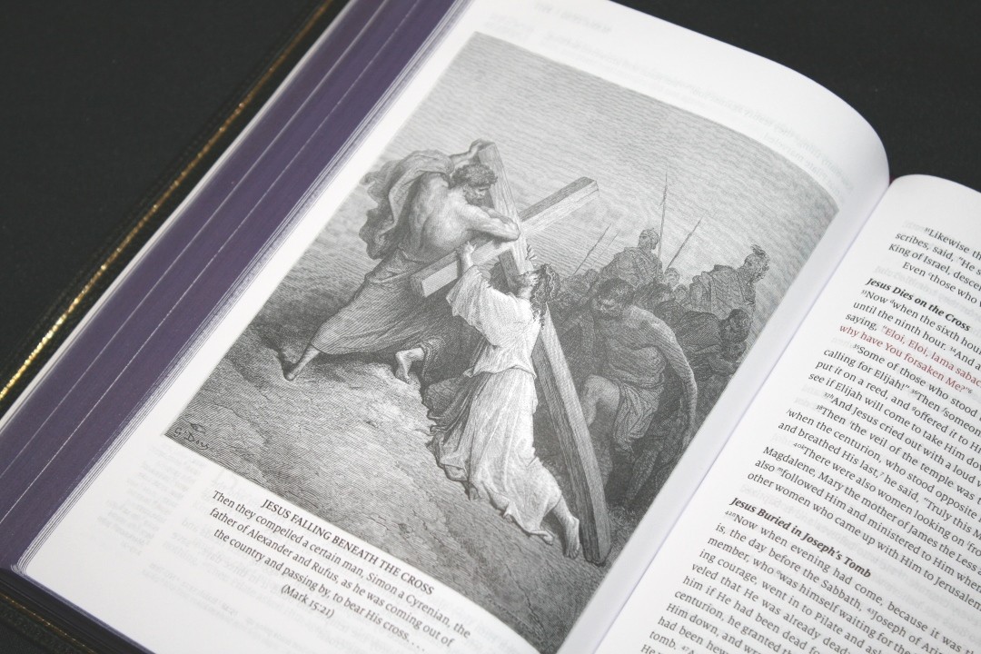
I’d like to see a page in the front that would introduce Gustave Doré’s art and its usage in this Bible. There is some good info on the publisher’s website.
REFERENCES
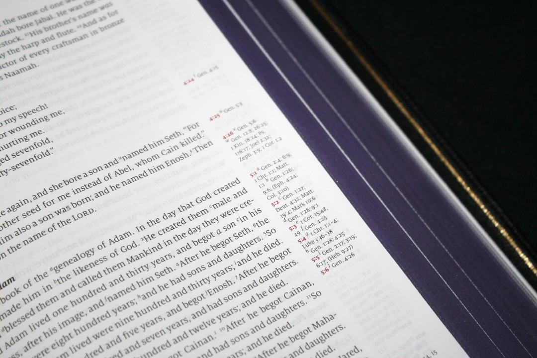
It includes 32,523 cross-references (I didn’t count them to confirm that though). As far as I can tell, these are the standard NKJV cross-references. Cross-references are keyed to the text with letters. They’re placed next to the verses they correspond to and the chapter and verse numbers that they correspond to are printed in red. I like the placement because they can be used to find the verses quickly. The red helps them stand out and gives it an elegant touch. Here are some example references to help you compare:
- Genesis 1:1 – Ps 102:25; Is 40:21; Jn 1:1-3; Heb 1:10; Gen 2:4; Ps 8:3; 89:11; 90:2; Is 44:24; Acts 17:24; Rom 1:20; Heb 1:2; 11:3; Rev 4:11
- Deuteronomy 6:4 – Deut 4:35; Mark 12:29; John 17:3; 1 Cor 8:4, 6
- Isaiah 9:6 – Isa 7:14; Luke 2:11; John 1:45; Luke 2:7; John 3:16; 1 John 4:9; Matt 28:18; 1 Cor 15:25; Rev 12:5; Judg 13:18; Titus 2:13; Eph 2:14
- Matthew 17:20 – Mat 21:21, Mk 11:23, Lk 17:6, 1 Cor 12:9
- Mark 11:23 – Matt 17:20; 21:21; Luke 17:6
- Mark 12:29 – Deut 6:4, 5; Is 44:8; 45:22; 46:9; 1 Cor 8:6
- John 1:1 – Gen 1:1; Col 1:17; 1 John 1:1; John 1:14; Rev 19:13; John 17:5; 1 John 1:2; 5:20
- John 2:19 – Mat 26:61, 27:40, Mk 14:58, 15:29, Lk 24:46, Acts 6:14, 10:40, 1 Cor 15:4
- Acts 2:38 – Luke 24:47
- 1 John 1:1 – John 1:1; 1 John 2:13, 14; Luke 1:2; John 1:14; 2 Pet 1:16; Luke 24:39; John 2:27; John 1:1, 4, 14
It also includes the standard NKJV footnotes. Footnotes show the manuscript variances from the Nestle-Aland / United Bible Societies, Majority Text, Septuagint, Targum, Vulgate, Syriac, and shows the literal renderings from Hebrew and Greek. I’ve always found the NKJV footnotes to be interesting and helpful for study and I’m glad they’re included.
CONCORDANCE
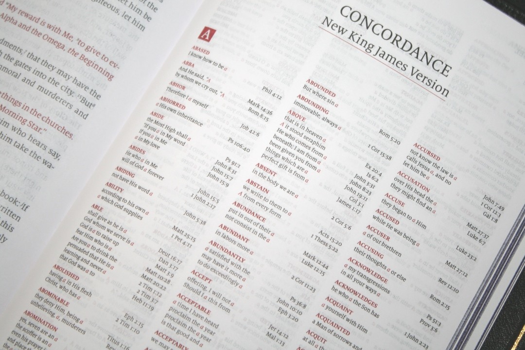
The concordance is smaller than most NKJV’s I’ve reviewed but it still has a good amount of entries to help in study. It’s 63 pages with 3 columns per page. The entries are in red. Here are some example entries and the number of references they provide:
- Christ – 9
- Christian – 1
- Christians – 1
- Christs – 1
- Faith – 38
- Faithful – 18
- Faithfulness – 5
- Faithless – 2
- God – 39
- Goddess – 2
- Godhead – 2
- Godliness – 4
- Godly – 3
- Gods – 5
- Praise – 25
- Praised – 4
- Praises – 2
- Praiseworthy – 1
- Praising – 3
- Pray – 15
- Prayed – 2
- Prayer – 16
- Prayers – 5
MAPS
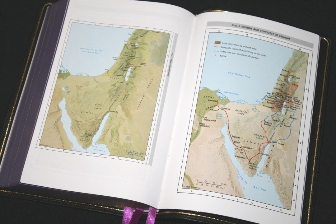

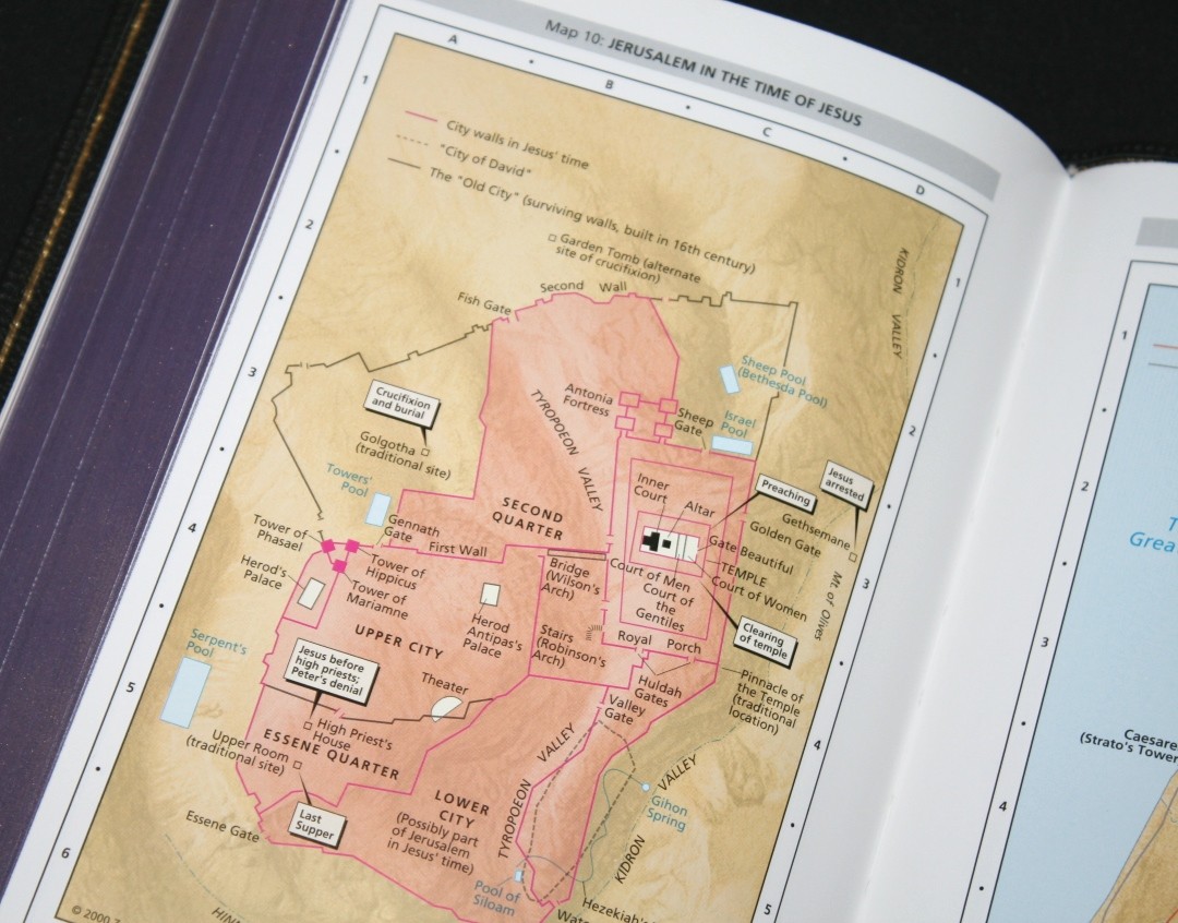
It has 14 pages of maps on thick glossy paper. They’re from Zondervan and cover topography with an elevation key, distance, routes of journeys, battle locations, cities, kingdoms, controlled territories, roadways, dates, annotations, etc. The colors are bright and bold enough to stand apart from each other, but not so bright that they look cartoonish. I like these types of colors for maps.
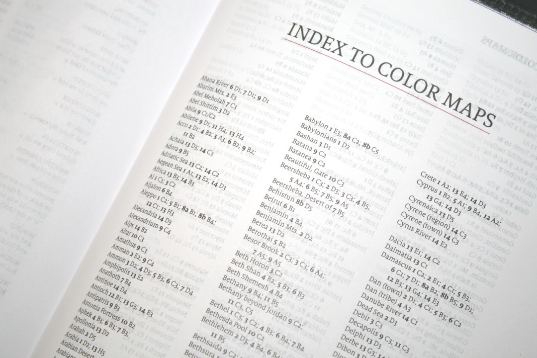
It has a 3-page index to maps. I’m glad they’ve included the index. The maps are annotated, but the index has that much more.
Maps include:
- World of the Patriarchs
- Holy Land and Sinai
- Exodus and Conquest of Canaan
- Land of the Twelve Tribes
- Kingdom of David and Solomon
- Kingdoms of Israel and Judah
- Prophets in Israel and Judah
- Assyrian and Babylonian Empires
- Holy Land in the Time of Jesus
- Jerusalem in the Time of Jesus
- Jesus’ Ministry
- Apostle’s Early Travels
- Paul’s Missionary Journeys
- Roman Empire
COMPARISONS
Here’s how Humble Lamb’s NKJV looks next to the NKJV Clarion, NKJV Quentel, and Schuyler NKJV. All of these use higher-quality materials, but they’re also more expensive.
NKJV Clarion
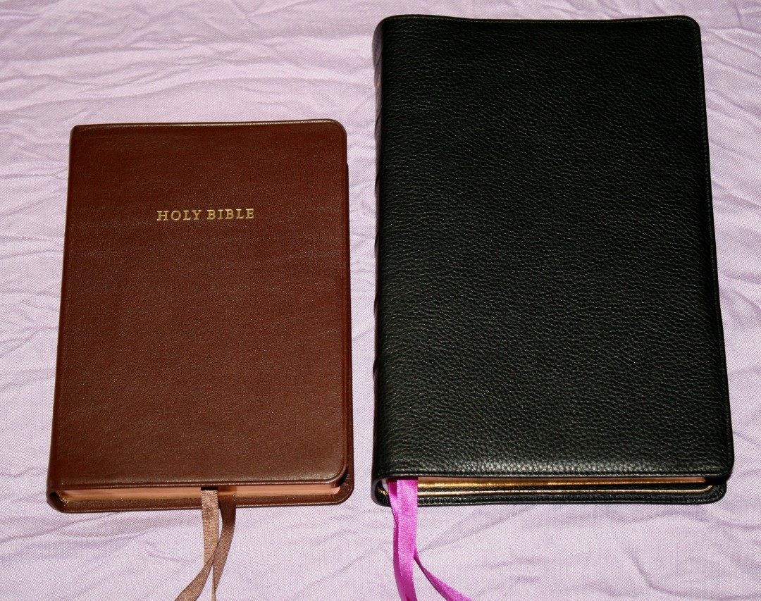
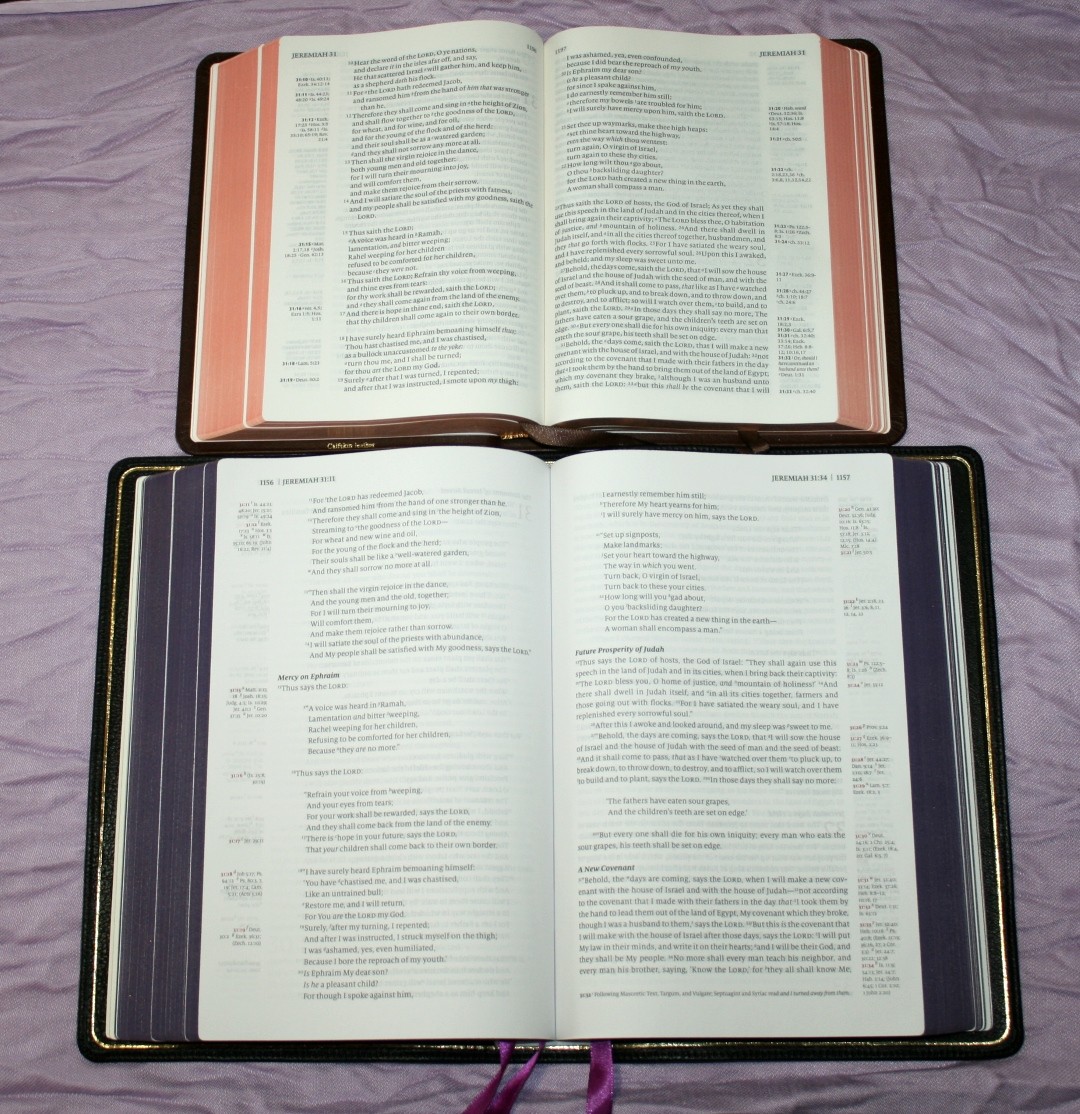
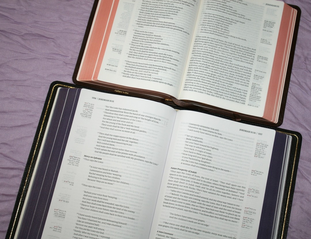
The Humble Lamb is based on the Clarion’s design. The Clarion has about the same size font but has a much smaller footprint. It also has less space between the lines (even though it has a good amount). I prefer the Clarion for carry, but the Humble Lamb would be better for marking. The Clarion is black-letter.
NKJV Quentel


The Schuyler Quentel has about the same footprint as the Humble Lamb. The double-column layout allows the Quentel to have a larger font and thicker paper. The poetic settings look great, but they don’t look as elegant in double-column (imo).
Schuyler NKJV
The Schuyler NKJV is an enlargement of the Single Column NKJV from Thomas Nelson. It doesn’t include cross-references, so the text doesn’t have to share precious space on the page. This allows the Schuyler to have a much larger font.
A FREE BUDGET BIBLE TO SOMEONE IN NEED
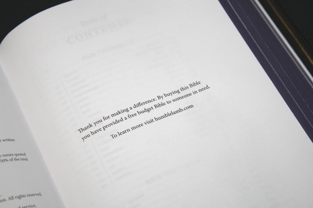
A page in the front says that by buying this Bible you’ve provided a free budget Bible to someone in need. The website also mentions this, but it doesn’t provide information about what that Bible is or what information it might contain. The company is SDA, so it could be related to that. I recommend contacting them for more information.
FINAL THOUGHTS ON HUMBLE LAMB NKJV
I’m very pleased with the quality of this Bible. It looks and feels like a premium edition, and I wouldn’t know it was made in China just by looking at this Bible. I’ve seen a lot of editions from China that I couldn’t consider a premium edition, but this one is absolutely a premium edition. I’m also glad to see the price reflects the quality and that it was made in China. Considering the price, it doesn’t need to have the same materials as premium editions that are much more expensive. I won’t mistake it for a Jongbloed Bible (Schuyler, Allan, or Cambridge), but it’s in a different price range, so I don’t expect it to be the same quality as the more expensive editions.
The typeface and layout are great for reading. I found the pages easy to turn while preaching. I had no trouble finding the verses or reading the text aloud. Having different art-gilt colors with matching ribbons while using the same cover is an interesting design choice. I love Bible art, so seeing art from Gustave Doré is a special touch that I appreciate.
It’s larger than I expected. I was thinking Clarion when I should have been thinking Quentel. It does feel a little large for the size of its font. This is where a tradeoff comes in, and it’s a trade I’m willing to make. This is normal for a single-column setting with poetry in stanzas, but the amount of white space from the extra leading adds even more space needed to present the text. This makes this Bible more readable than other single-column editions. I’m willing to trade the font size for a beautiful layout. In my opinion, this should be a standard design that all publishers produce.
Humble Lamb has produced a nice single-column edition of the NKJV. I’m interested to see what they do next.
_________________________________________________________
This Bible is available at HumbleLamb.com

_________________________________________________________
Photography by hannah C brown
Humble Lamb provided this Bible in exchange for an honest review. I was not required to give a positive review, only an honest one. All opinions are my own.