

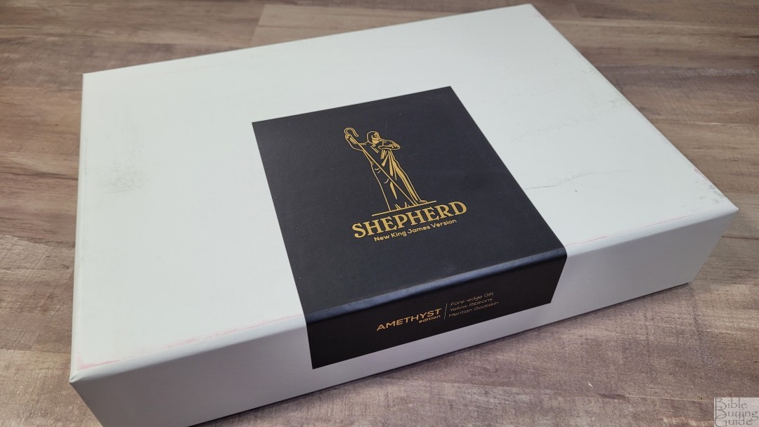
Humble Lamb’s Shepherd is an update to their original single-column NKJV. It’s made several improvements that place this edition several notches above the original. It’s now available in goatskin with several cover colors to choose from and with several page edge options including art-gilding and fore-edge art. In this article, I’m reviewing the NKJV Shephard in purple Amethyst with fore-edge art.
Humble Lamb provided this Bible in exchange for an honest review. I was not required to give a positive review, only an honest one. All opinions are my own.
_________________________________________________________
This Bible is available at Humble Lamb’s Website
_________________________________________________________
Table of Contents
- Video Review
- Binding
- Paper
- Typography and Layout
- References
- Concordance
- Bible Atlas
- Illustrations
- Comparisons
- Conclusion
Video Review

Binding
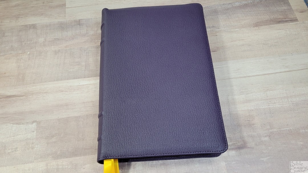
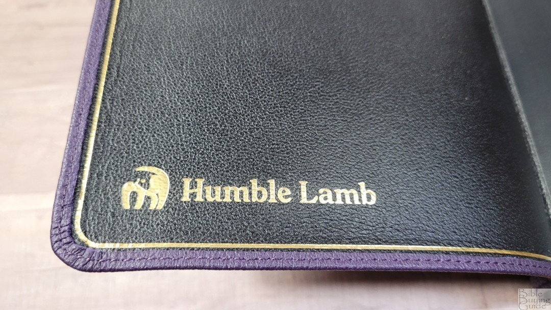
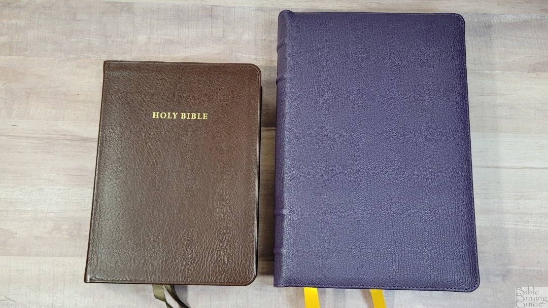
The cover is purple Meritian goatskin. The purple is dark and would work great for men and women. This is a thick leather with a pronounced grain. The cover is a touch stiff, but not too stiff, which makes it easier to hold open in one hand. It has a small yapp, but it’s shaped to bend around the page edges. The cover has perimeter stitching.
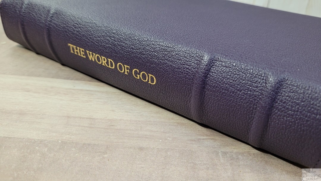
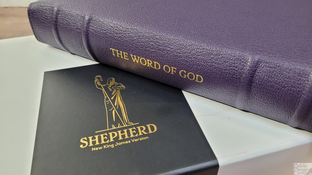
The spine is rounded. This is my personal preference, so this stands out to me. The spine includes 4 raised hubs, with 2 on each end, leaving the middle clear for the text, The Word of God, which is printed in gold. The spine does not show the translation or the publisher’s logo. Instead, this information is stamped in gold onto the liner in the front. The liner in the back has the type of leather stamped in gold. the gold in both the front and back is embossed.


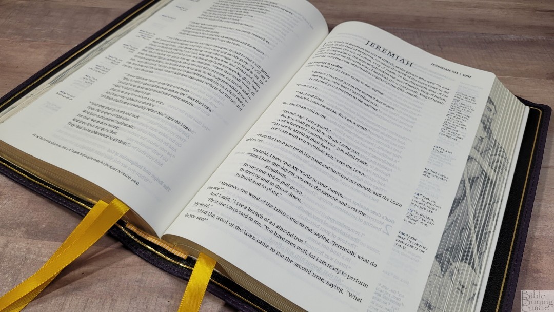
The liner is edge-lined goatskin. It includes a gilt line around the edges. The tab is glued with thick pages that are glued all the way to the end. This page is stiff, but the tab doesn’t feel overly stiff. The block is sewn. It does stay open on the first page of Genesis. It tries to close, but it doesn’t close.
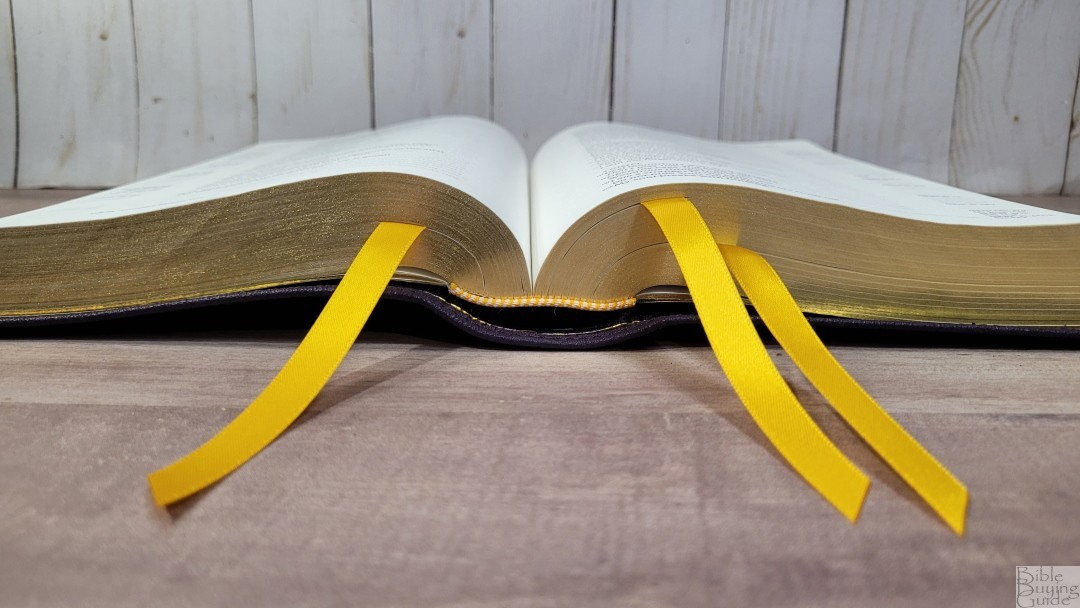
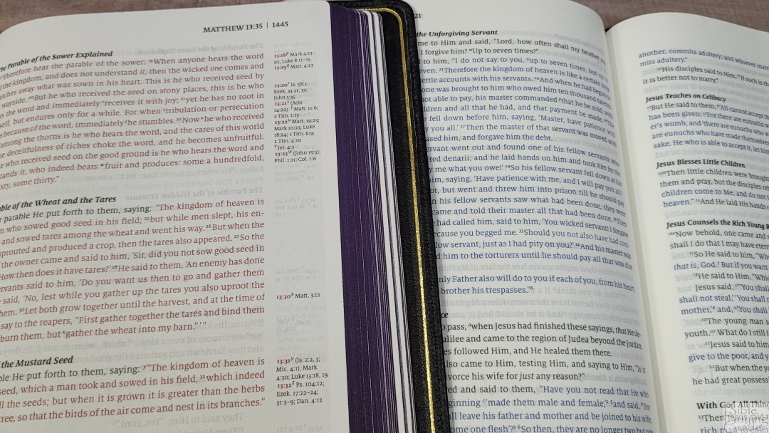
It has three gold 3/8″ double-sided satin ribbons. They come past the block by 3″, which is more than enough to pull to the corner to open easily. The head/tail bands are gold and white. The overall size is 6.5 x 9.5 x 1.75″ and it weighs 2 lbs, 12.8 oz.
Paper

The paper is 32gsm. It’s ivory in color, which is great for reading. It has no glare under direct light. It does have show-through, but it’s only noticeable in the poetic settings or when there’s an illustration on the other side of the page. Even then, I didn’t find it distracting. The texture is just rough enough to make the pages easy to grab and turn.
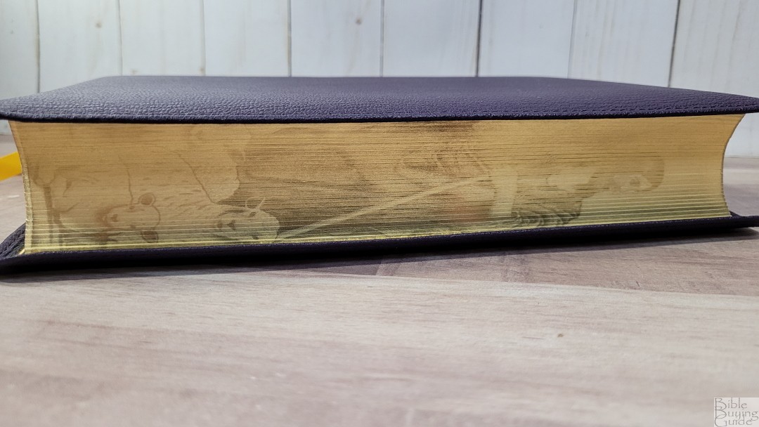

The page edges are gold and have fore-edge art of Jesus as a shepherd with lambs that shows when the Bible is opened. It looks great. I prefer this page-edge design to standard art-gilt. The foredge art uses the pointillism art style and closely follows Gustave Doré’s art style.
Typography and Layout
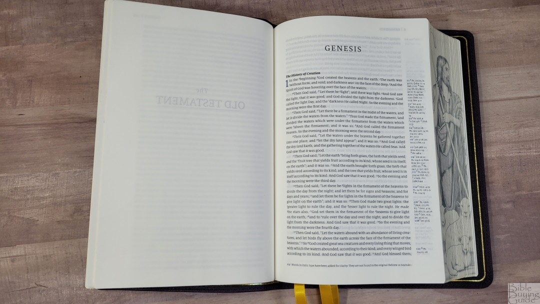
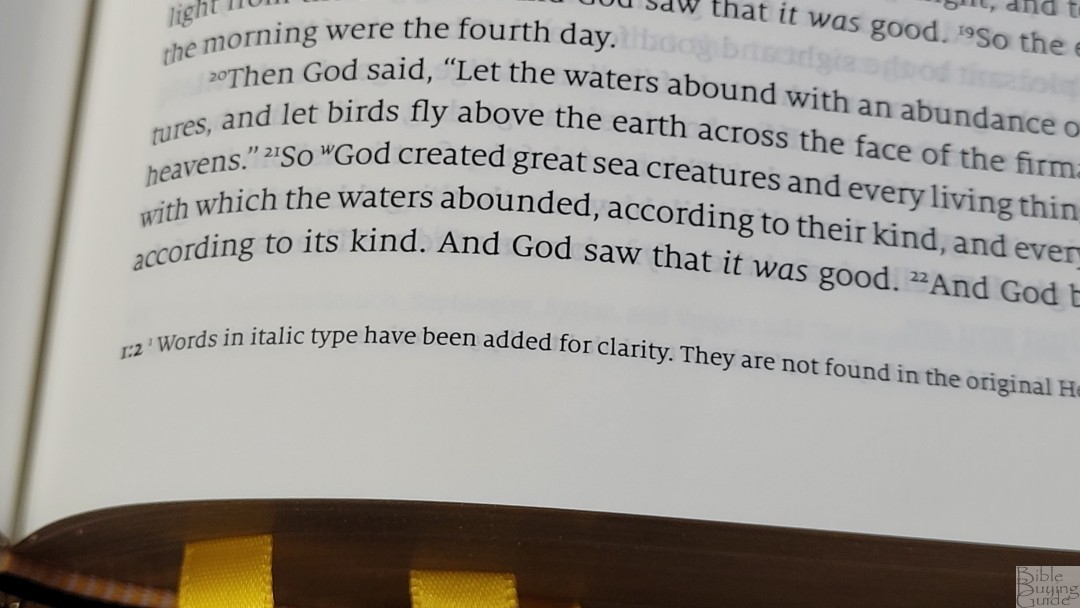
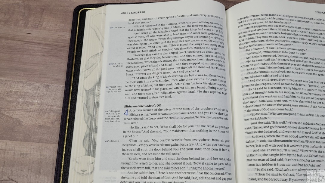
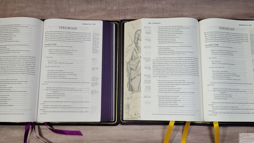
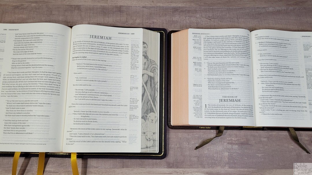
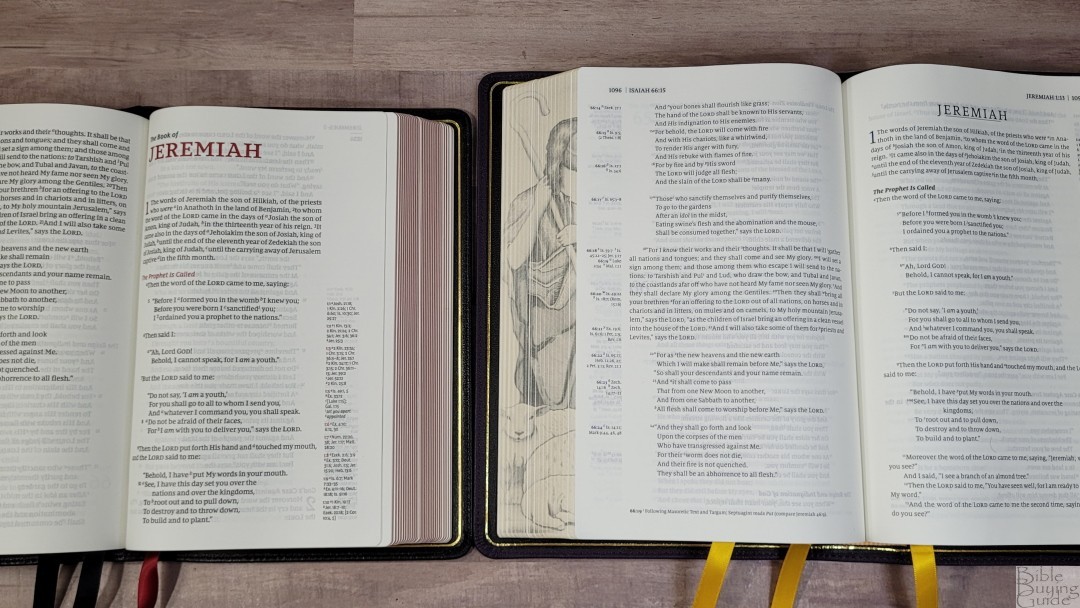
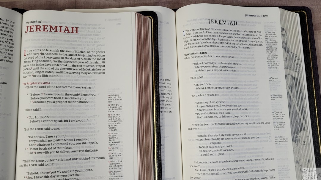
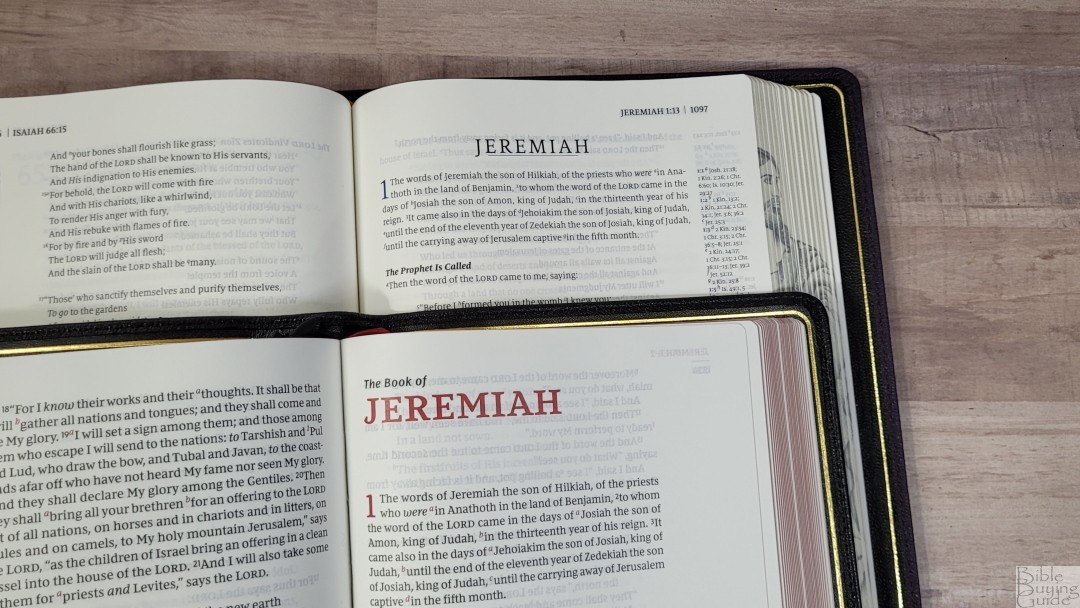
The text is presented in a single-column, paragraph layout with poetry set to stanzas and letters indented. The NKJV cross-references are placed in the outer margin next to the verses they correspond to. The reduced set of NKJV translation footnotes is placed in the footer. The header shows the page number in the outer margin and the book name with chapter and verse numbers next to it. Section headings and the text in the header are printed in a bold black font. This edition uses the same setting as their first NKJV, but with blue for the chapter numbers.
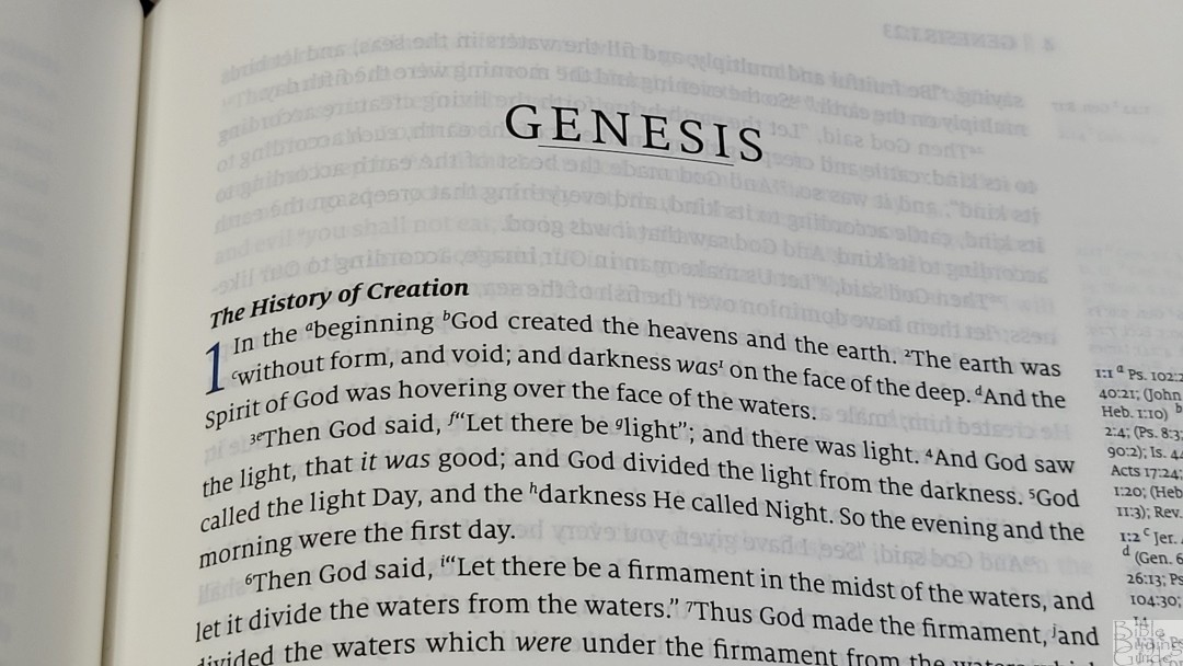
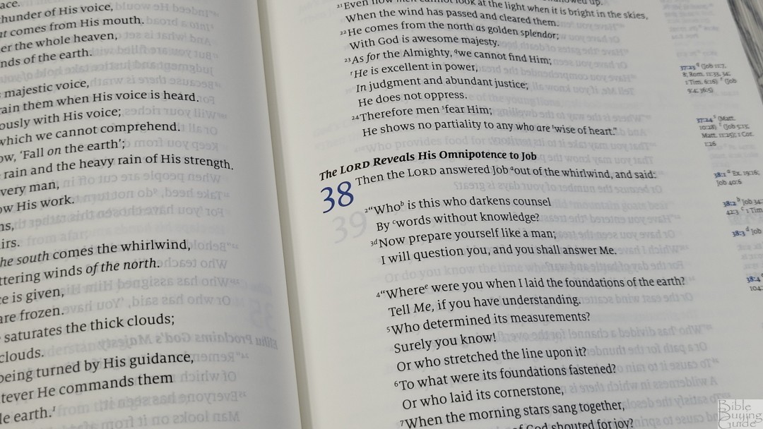
The typeface is a 9-point Milo font. It has lots of leading (the size of the font plus the space to the next line), which gives the text extra white space. This makes the 9-point font more comfortable to read than most 9-point fonts. Also, the Milo typeface design has larger lower-case letters than many other Bible typefaces, so it read larger than it is. The words of Christ are in blue through the book of Revelation. Both the blue and the black are highly consistent throughout. The blue isn’t vibrant, but it stands out more than it does in the Lion.

It has between 14-16 words per line. This is perfect for poetry. The inner margin is wide, so the lines of text are mostly straight. This keeps the text easy to read even with this high word count. The extra leading also helps a lot. I never had any issues losing my place. It’s printed with line-matching, meaning the lines of text are in the same location on both sides of the page. The paper is opaque enough that the text doesn’t appear gray because of the text on the other side of the page.
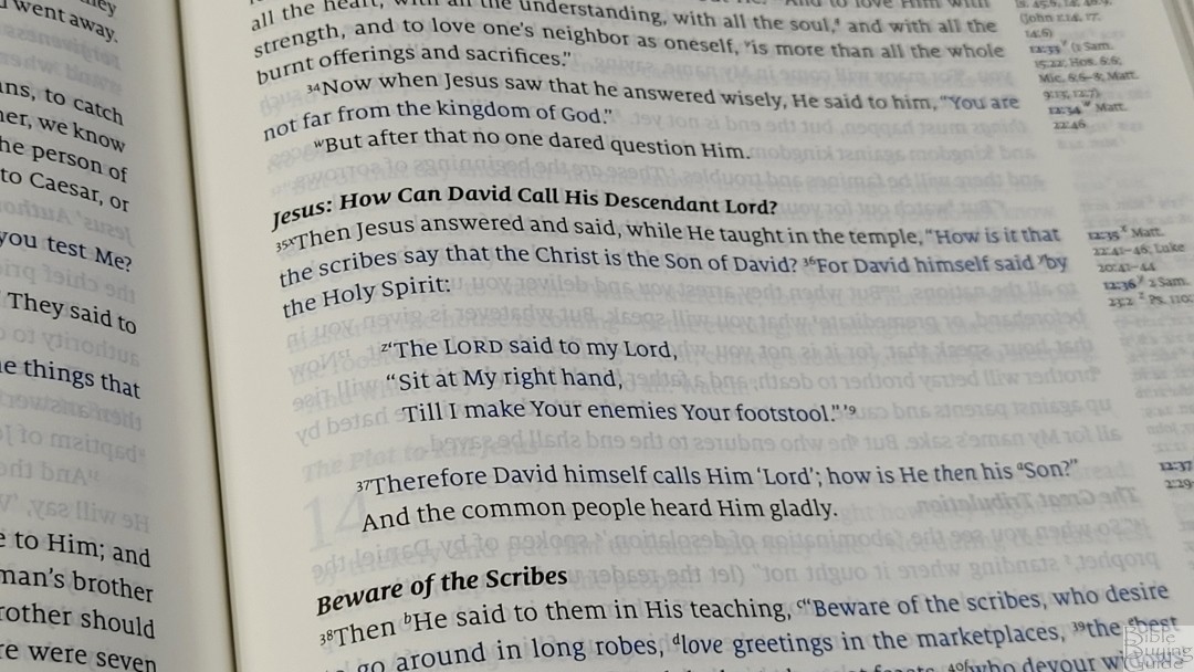
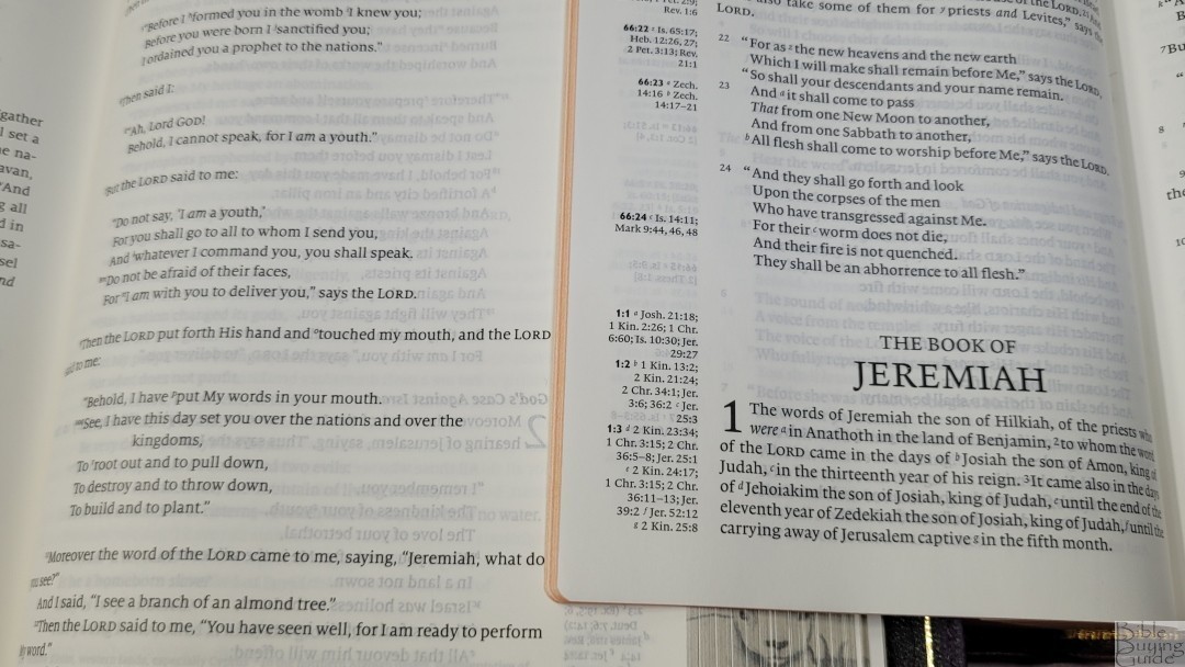
Old Testament quotes are not placed in a different font. This follows Thomas Nelson’s current design. Verse numbers are small and are sometimes hard to find. The references in the margins help because they’re next to the verses they correspond to. Supplied words are in italics. Footnote and reference callers are small, so they’re easy to ignore while reading. Paragraphs have a large amount of indention, so they’re easy to see at a glance.
References

This edition includes the same 32,523 cross-references as the last edition, which are the standard NKJV cross-references. They’re keyed to the text with letters and placed next to the verses they correspond to. This makes them easy to find quickly. It also makes the verses easier to find. The pilot chapter and verse numbers in the margins are printed in blue and in bold, but it’s hard to tell without looking closely. They do stand apart, though.
Here are some example references to help you compare:
- Genesis 1:1 – Ps 102:25; Is 40:21; Jn 1:1-3; Heb 1:10; Gen 2:4; Ps 8:3; 89:11; 90:2; Is 44:24; Acts 17:24; Rom 1:20; Heb 1:2; 11:3; Rev 4:11
- Deuteronomy 6:4 – Deut 4:35; Mark 12:29; John 17:3; 1 Cor 8:4, 6
- Isaiah 9:6 – Isa 7:14; Luke 2:11; John 1:45; Luke 2:7; John 3:16; 1 John 4:9; Matt 28:18; 1 Cor 15:25; Rev 12:5; Judg 13:18; Titus 2:13; Eph 2:14
- Matthew 17:20 – Mat 21:21, Mk 11:23, Lk 17:6, 1 Cor 12:9
- Mark 11:23 – Matt 17:20; 21:21; Luke 17:6
- Mark 12:29 – Deut 6:4, 5; Is 44:8; 45:22; 46:9; 1 Cor 8:6
- John 1:1 – Gen 1:1; Col 1:17; 1 John 1:1; John 1:14; Rev 19:13; John 17:5; 1 John 1:2; 5:20
- John 2:19 – Mat 26:61, 27:40, Mk 14:58, 15:29, Lk 24:46, Acts 6:14, 10:40, 1 Cor 15:4
- Acts 2:38 – Luke 24:47
- 1 John 1:1 – John 1:1; 1 John 2:13, 14; Luke 1:2; John 1:14; 2 Pet 1:16; Luke 24:39; John 2:27; John 1:1, 4, 14

It also includes the standard NKJV reduced set of footnotes. They show the manuscript variances from the Nestle-Aland / United Bible Societies, Majority Text, Septuagint, Targum, Vulgate, Syriac, and shows the literal renderings from Hebrew and Greek. The NKJV footnotes are some of the best in my opinion.
Concordance
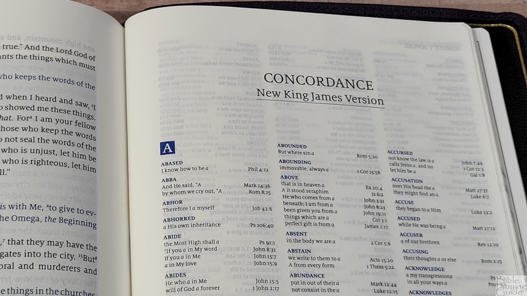
The concordance is the same as the original edition with a color change. It’s not a large concordance, but it has a good amount of entries to help in Bible study. It has 63 pages with 3 columns per page. The entries are in blue and include drop caps for the index letter. Here are some example entries and the number of references they provide:
- Christ – 9
- Christian – 1
- Christians – 1
- Christs – 1
- Faith – 38
- Faithful – 18
- Faithfulness – 5
- Faithless – 2
- God – 39
- Goddess – 2
- Godhead – 2
- Godliness – 4
- Godly – 3
- Gods – 5
- Praise – 25
- Praised – 4
- Praises – 2
- Praiseworthy – 1
- Praising – 3
- Pray – 15
- Prayed – 2
- Prayer – 16
- Prayers – 5
Bible Atlas

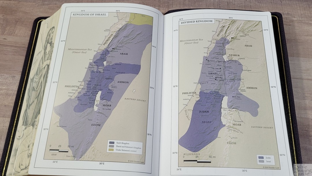
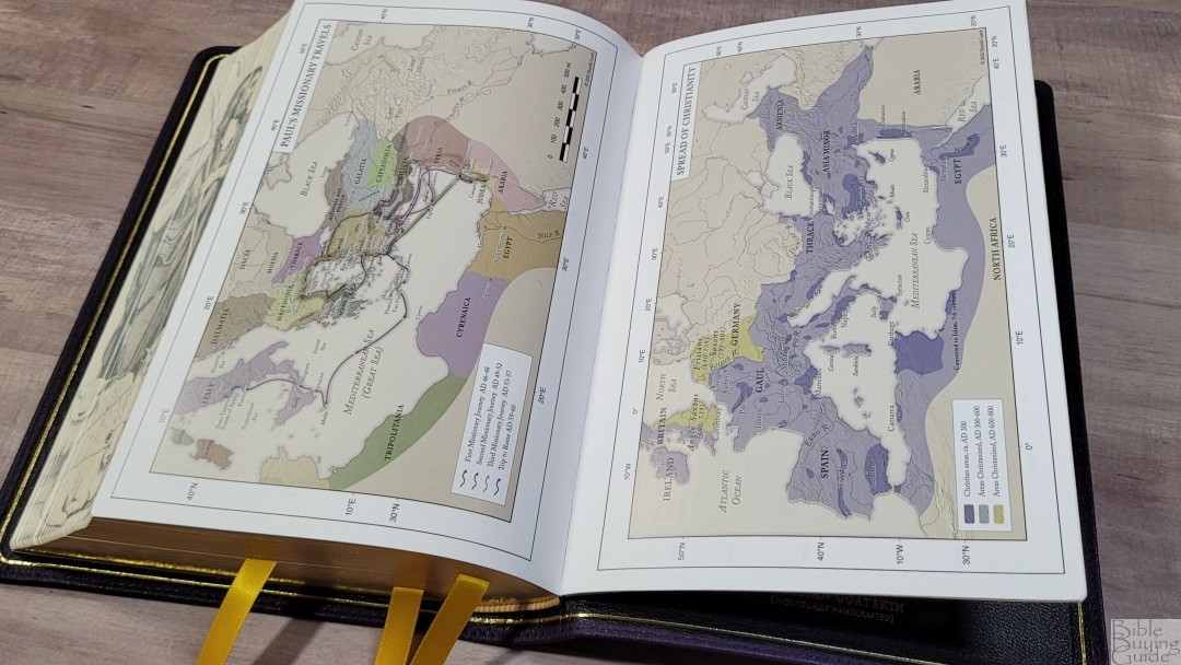
The Zondervan maps have been replaced with maps from Humble Lamb. This one does not include an index. It does have longitude and latitude, which I like. The colors are earth tones and include bold red, green, blue, yellow, over tan backgrounds. They show distance, routes, events with Scripture references, borders, dates, territories of rulers, etc.
Maps include:
- World of the Patriarchs
- Exodus from Egypt
- Twelve Tribes of Israel
- Kingdom of Israel
- Divided Kingdom
- Assyrian and Babylonian Empires
- Greek Empire
- Topography of Israel
- Israel at the Time of Jesus
- Jerusalem at the Time of Jesus
- The Life of Christ
- Paul’s Missionary Travels
- Spread of Christianity
- Roman Empire
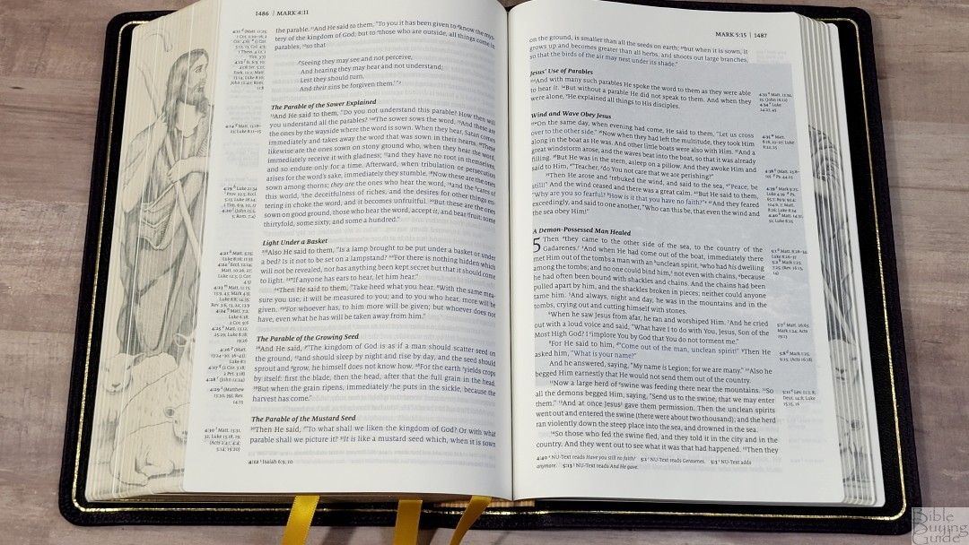
Illustrations
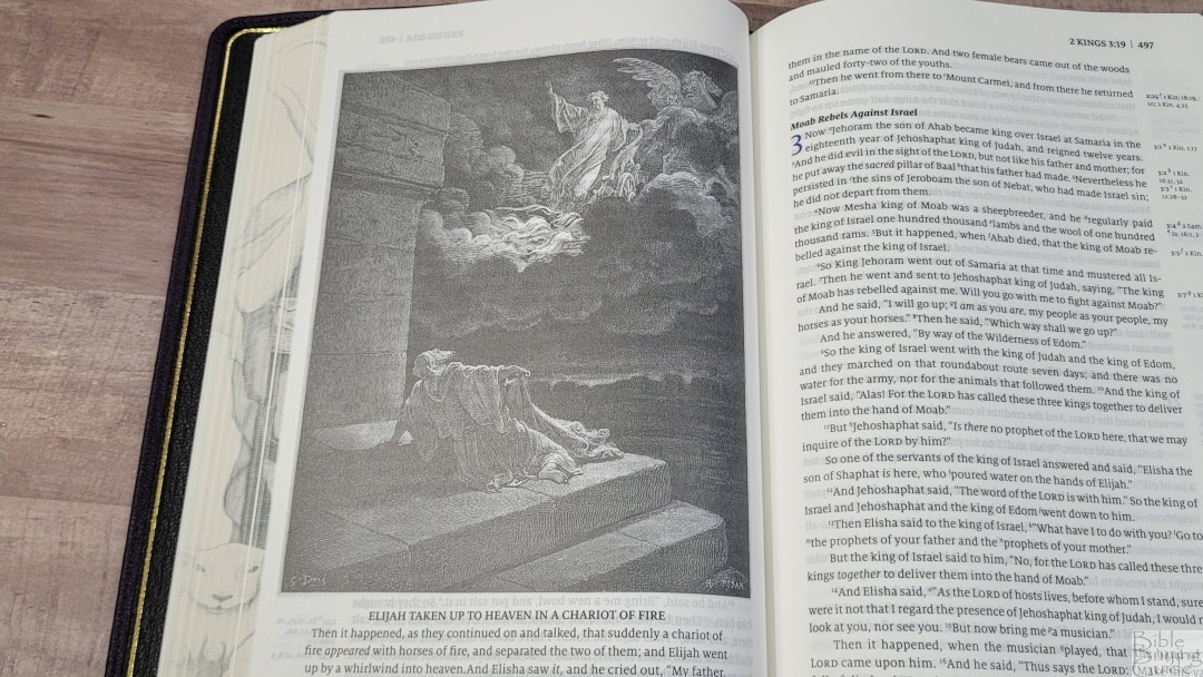

Throughout the Bible are 66 full-page illustrations by Gustave Doré. They’re placed near the text they correspond to. They include the illustration, the title printed under the illustration in bold, and the verse printed under the title. The darker illustrations do have a more prominent show-through, but I didn’t find them too distracting. The darker areas can be a little difficult to see, but Cambridge has shown that it takes thick paper to display Doré’s illustrations perfectly. I’m a fan of biblical artwork, especially Gustave Doré’. They’re printed well and they’re great for imagining the setting.
Comparisons

Here’s how the Humble Lamb Shepherd compares to a few similar NKJVs. In the video above, I’ve compared the Shepherd to their KJV Lion.
Humble Lamb First Edtion NKJV


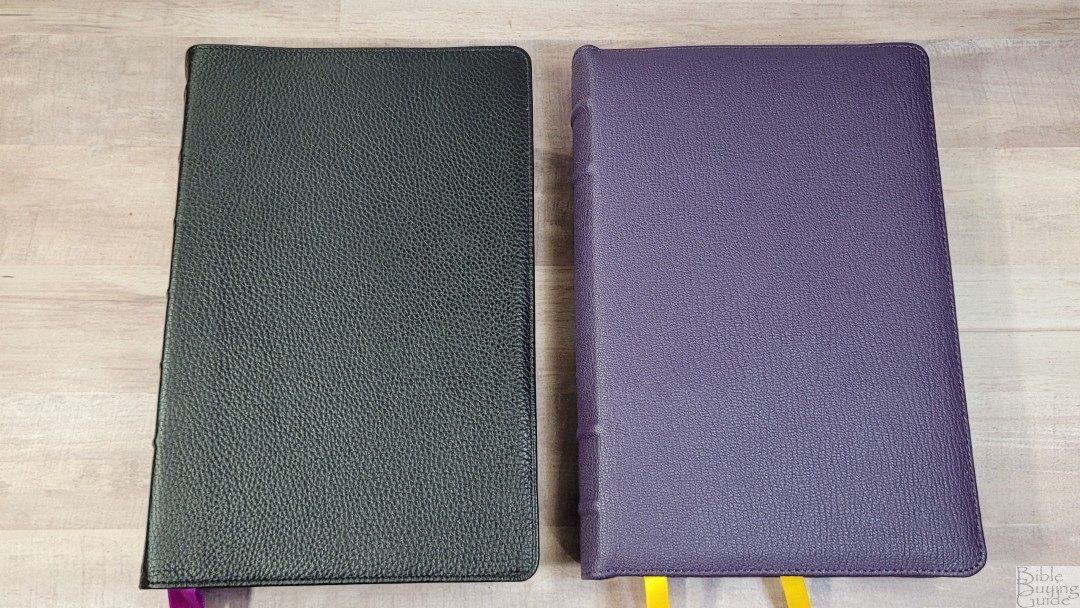

The original NKJV Word of God has the same layout but with red highlights. The paper is whiter and slightly thinner. The leather is thinner and softer. The original had 3 single-sided ribbons. The spine was square instead of round and it has a more traditional design with 6 raised hubs and the text printed upright with the translation and logo. The leather is the standout difference between the two, followed by the paper. The Shepherd is more elegant overall.
Clarion


The Clarion is the Bible with the most similar in design. The Humble Lamb feels like a large print Clarion, with the same layout and reference placement. The Clarion is a lot smaller overall, but the font is about the same size. The main difference in the layout is the Humble Lamb has more words per line and more space between the lines. The Clarion has thinner paper with a touch more show-through, and it’s a black-letter edition.
Thomas Nelson Single Column Reference


The Thomas Nelson Single Column Reference in the Premier Collection is the closest rival for size and quality. It’s thicker and has a slightly smaller footprint. This size makes it feel a little less balanced than the Humble Lamb. The font size is slightly larger and it has fewer words per line. It has red highlights that include the verse and footnote callers in the text. The leather is soft, but it’s a notch under the quality of the Humble Lamb.
Conclusion
The Humble Lamb Shepherd is one of the best NKJVs I’ve reviewed. The design, materials, and construction are of high quality. The layout is highly readable and the artwork helps in understanding the settings. The print for the art is sometimes difficult to see, but that’s understandable on thin paper. The current price is a touch higher than I’d like to see from something made in China, but the quality is so high that I wouldn’t have guessed it was made there. If you’re interested in a high-quality NKJV that’s great for reading, the Humble Lamb Shepherd should be high on your list.
_________________________________________________________
This Bible is available at Humble Lamb’s Website
_________________________________________________________
Humble Lamb provided this Bible in exchange for an honest review. I was not required to give a positive review, only an honest one. All opinions are my own.