


Foundation Publications has several NASB editions that I’ve been eyeing lately. Among them is the Large Print Ultrathin Reference Bible. All the basic reference Bible tools are here: center-column references, translation notes, concordance, and maps.
Pros
- Large 10-point font is sharp and bold
- 95,000 cross references
- Smyth sewn
Cons
- No table of weights and measures
- No Harmony of the Gospels
- No reading plan
Features
- NASB, 2003 updated edition
- Bonded leather
- Smyth sewn binding
- 10-point font
- Black-letter
- 2 column
- Verse format
- 95,000 cross references
- Section headings
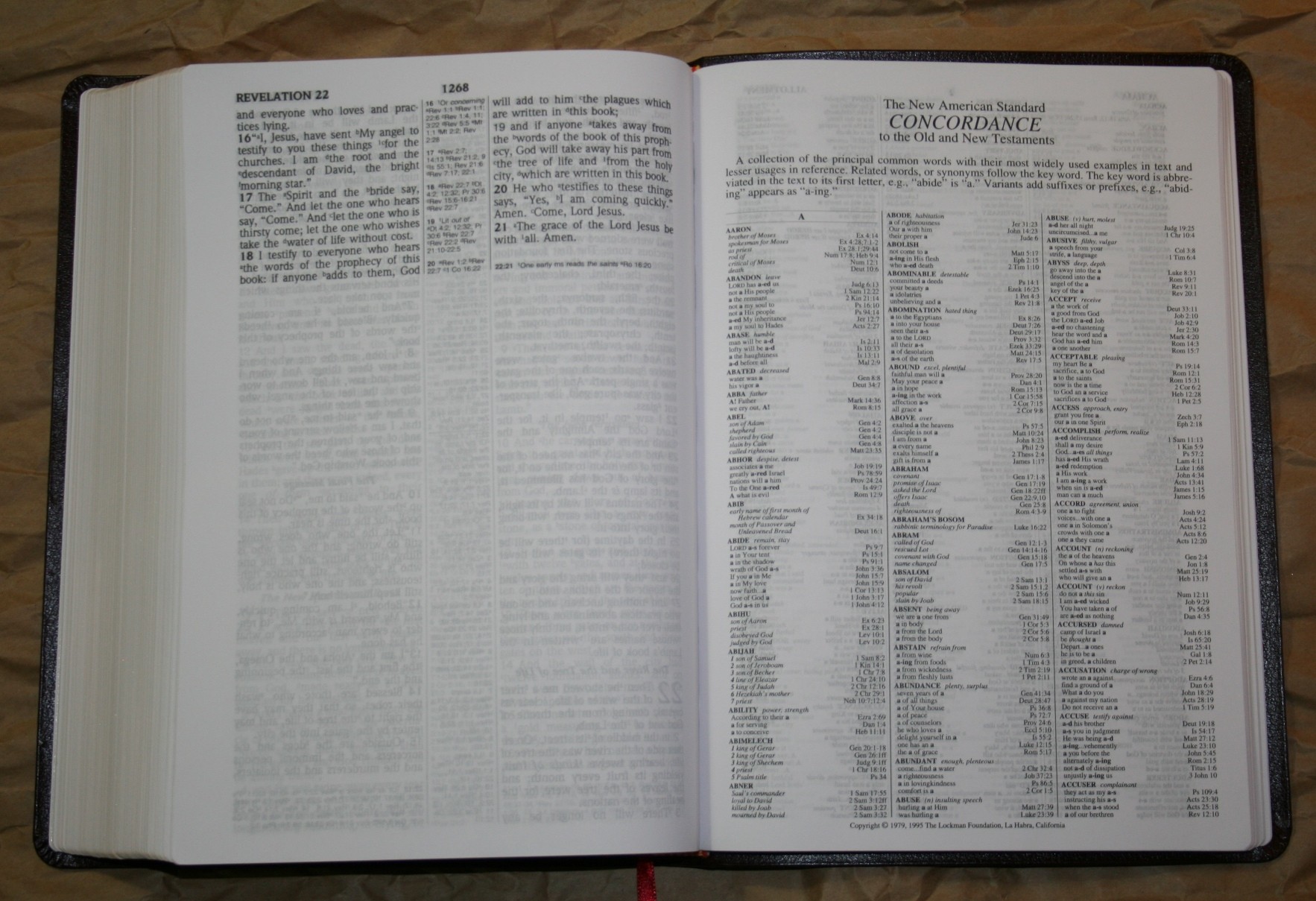
- 66 page Concordance
- 8 Maps
- Ribbon marker
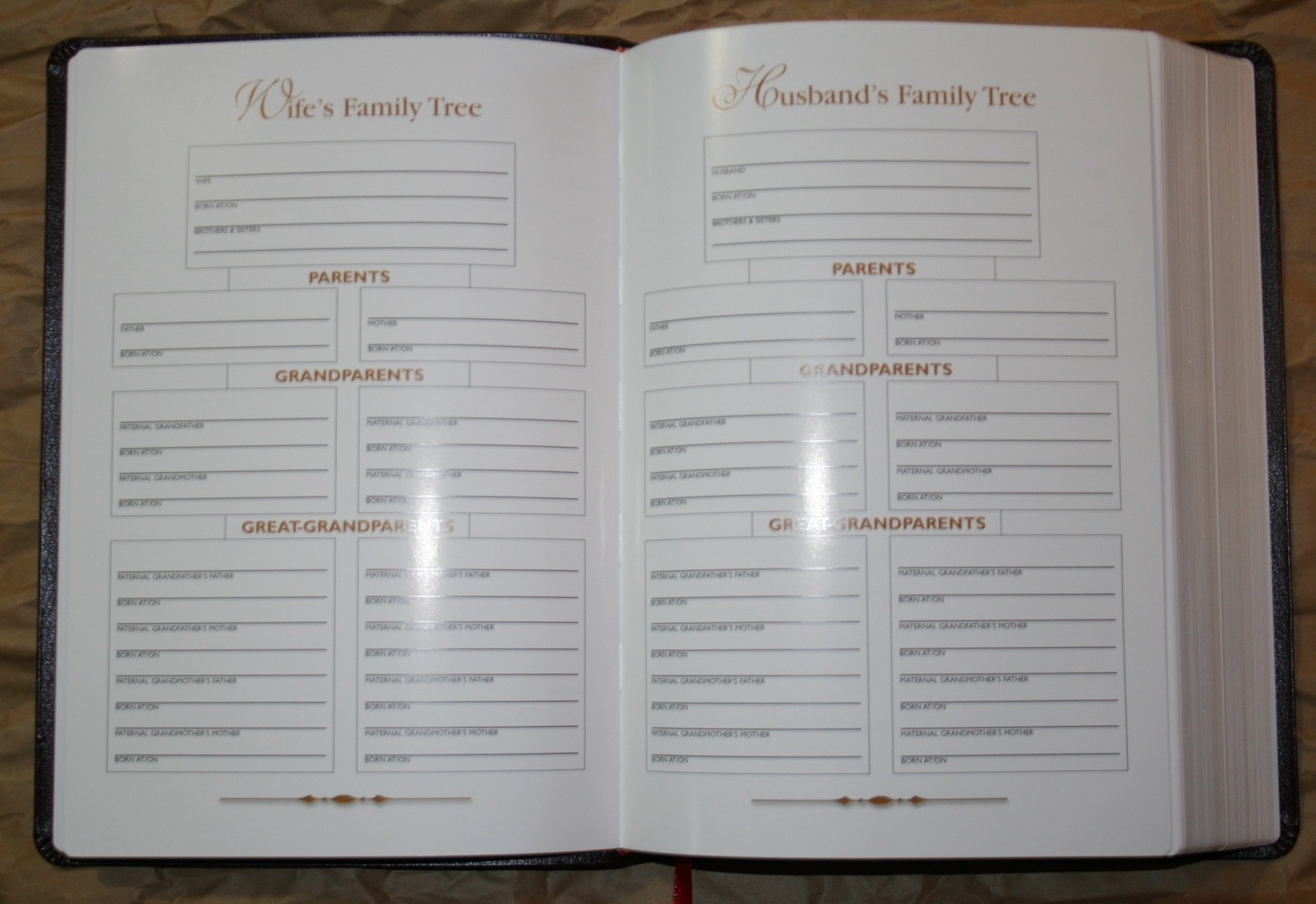
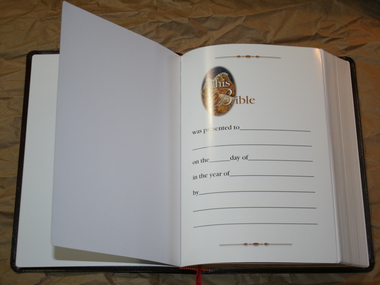
- Presentation and family pages
- 9.6 x 6.75 x 1
- ISBN: 9781581351354
- List price $34.95
- Printed in China
Buy from Amazon: Foundation Publications Large Print Ultrathin Reference Bible
Cover and Binding
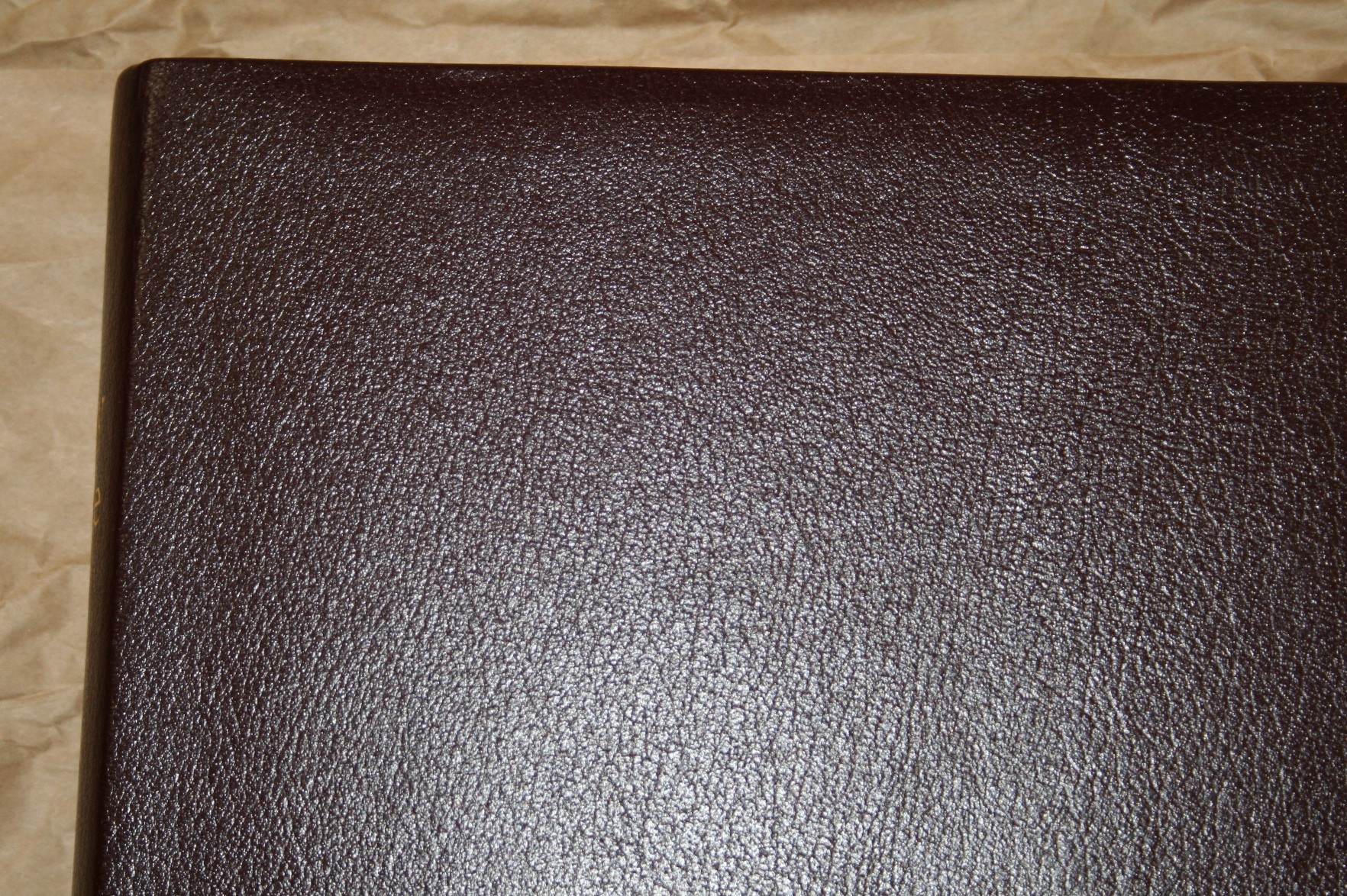
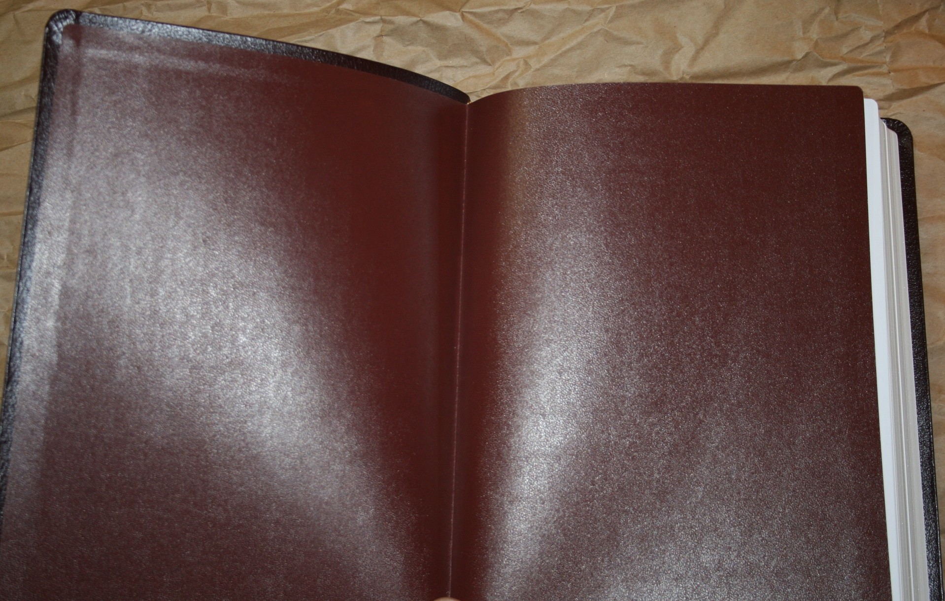
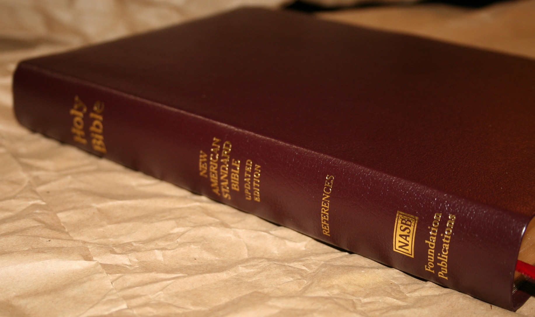
My review copy is burgundy bonded leather. It is stiff and has a card stock liner. It looks nice. For ten more dollars I recommend getting the genuine leather edition.
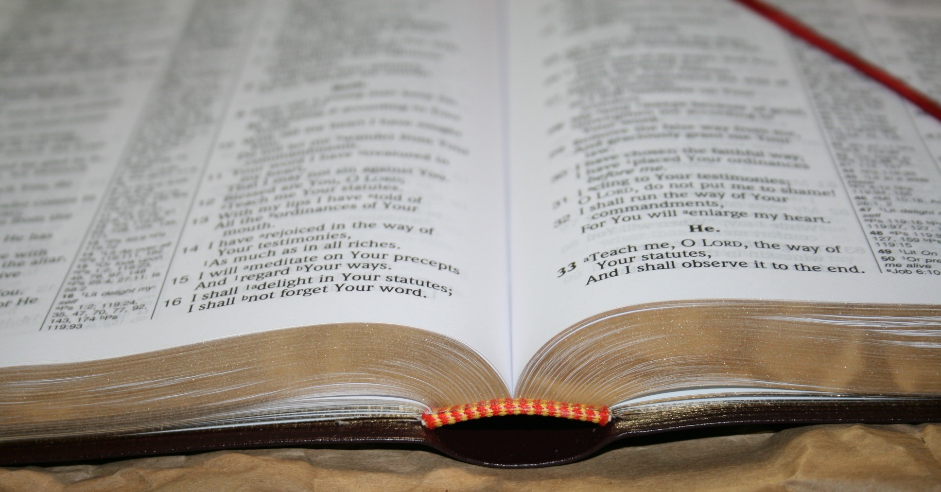
The binding is Smyth sewn. Even the bonded leather edition lays flat right out of the box.
Paper and Print
Since this in an ultrathin edition I would expect the paper to be thin and less opaque than I like. It could be more opaque, but it’s really not that bad. I can read this and not be distracted by the writing on the back of the page.
There are 8 heavy pages in the front and 8 in the back for writing. This is always appreciated as I like to write Scripture references, color-codes, and notes in my Bible.
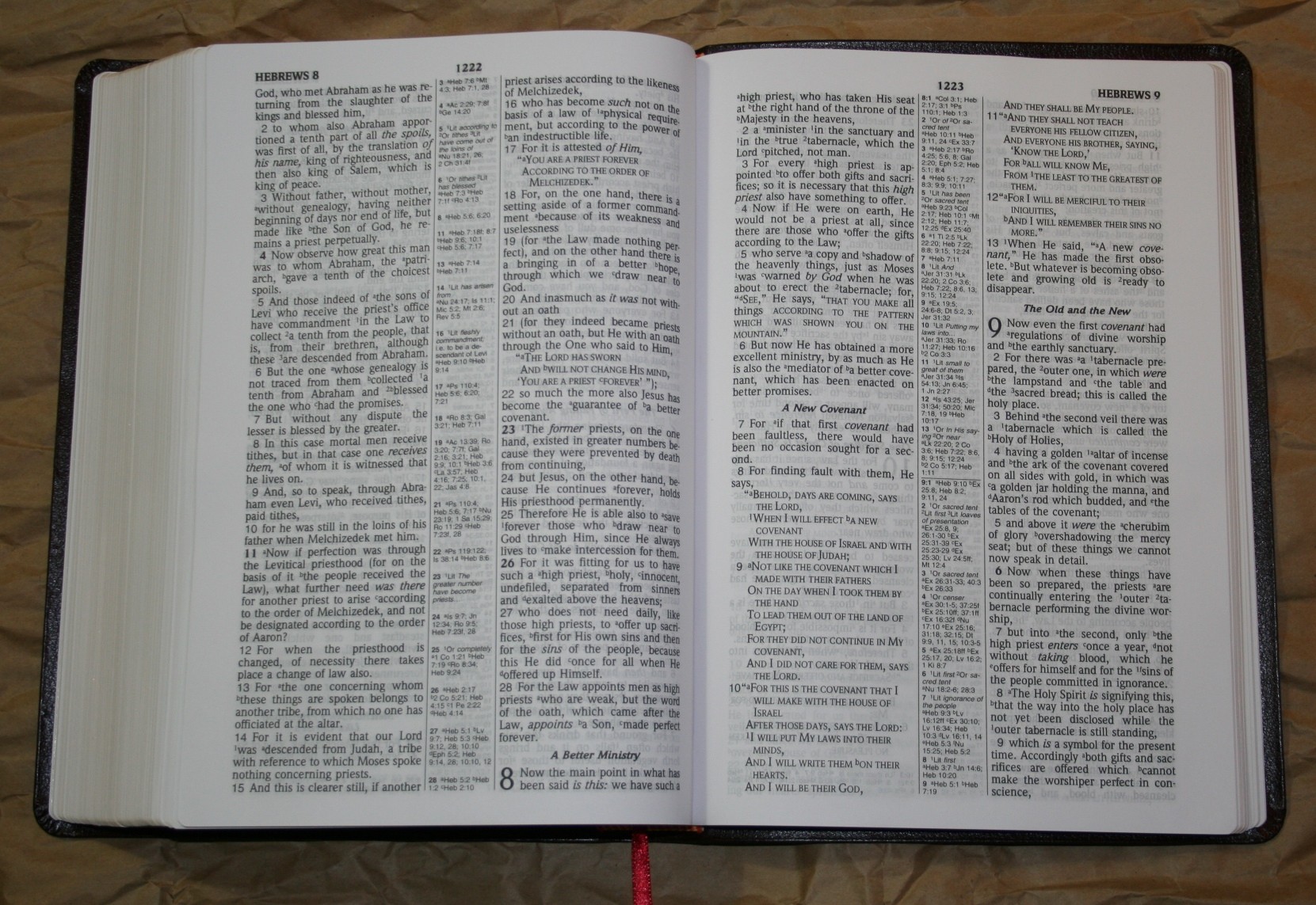
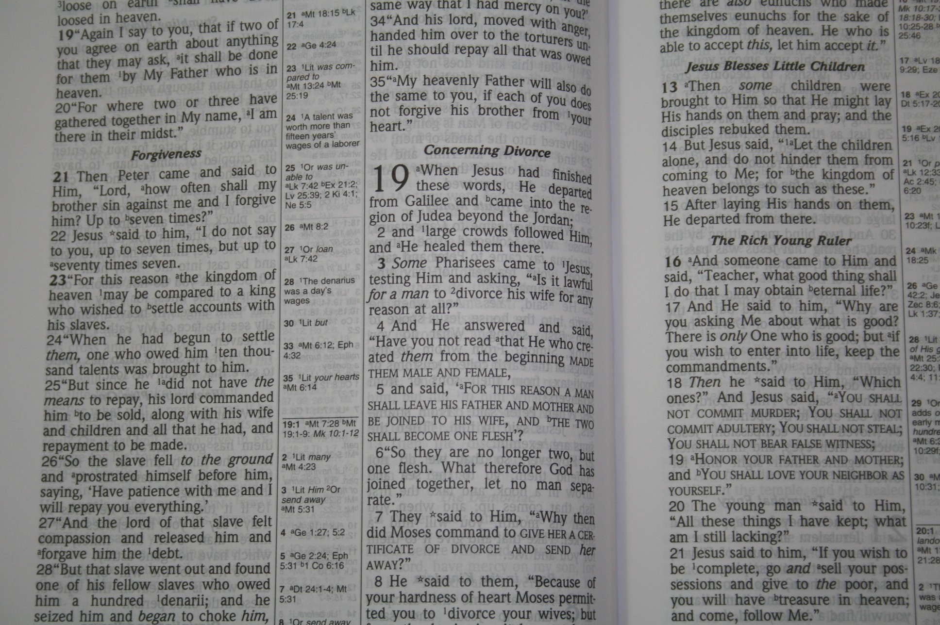
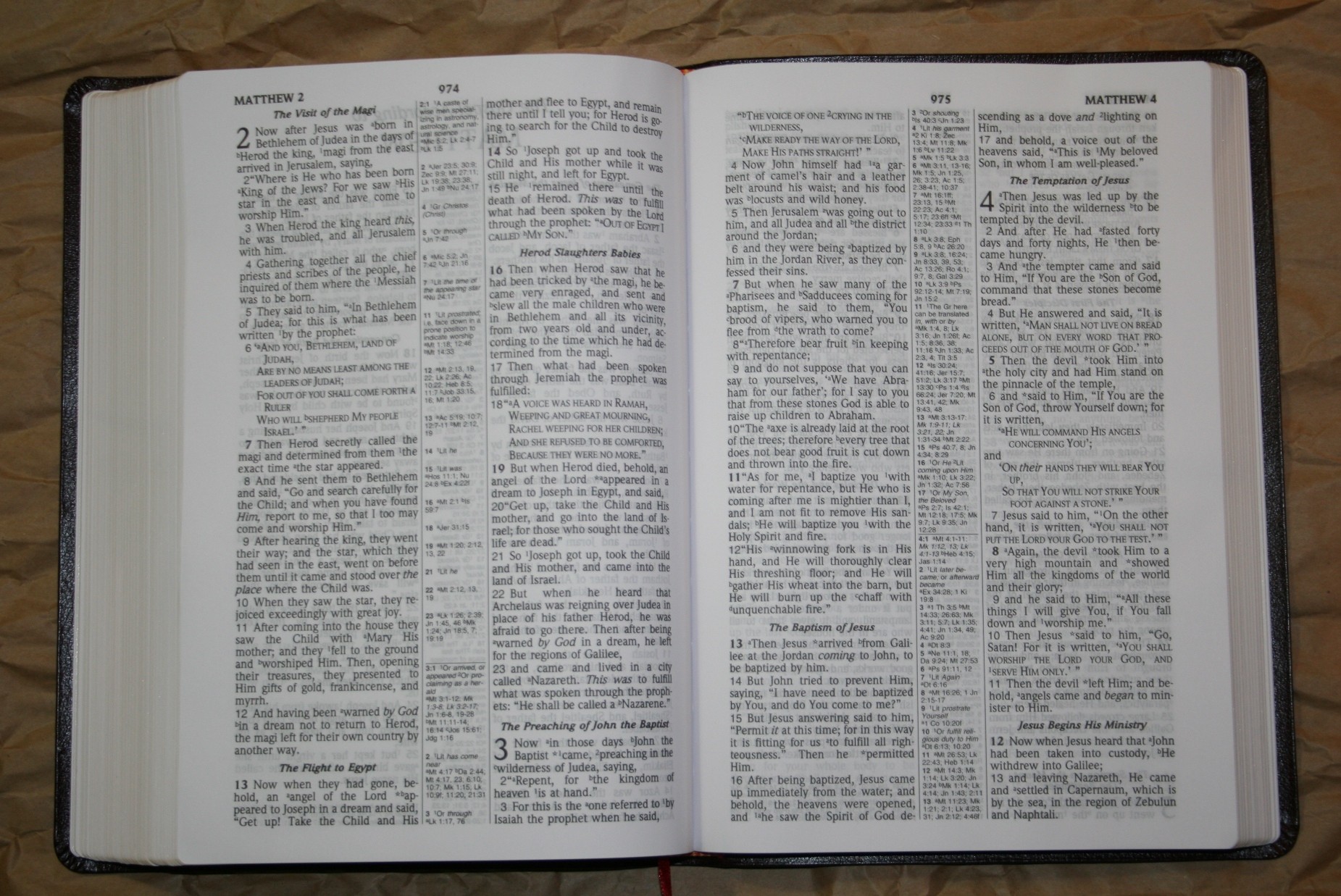
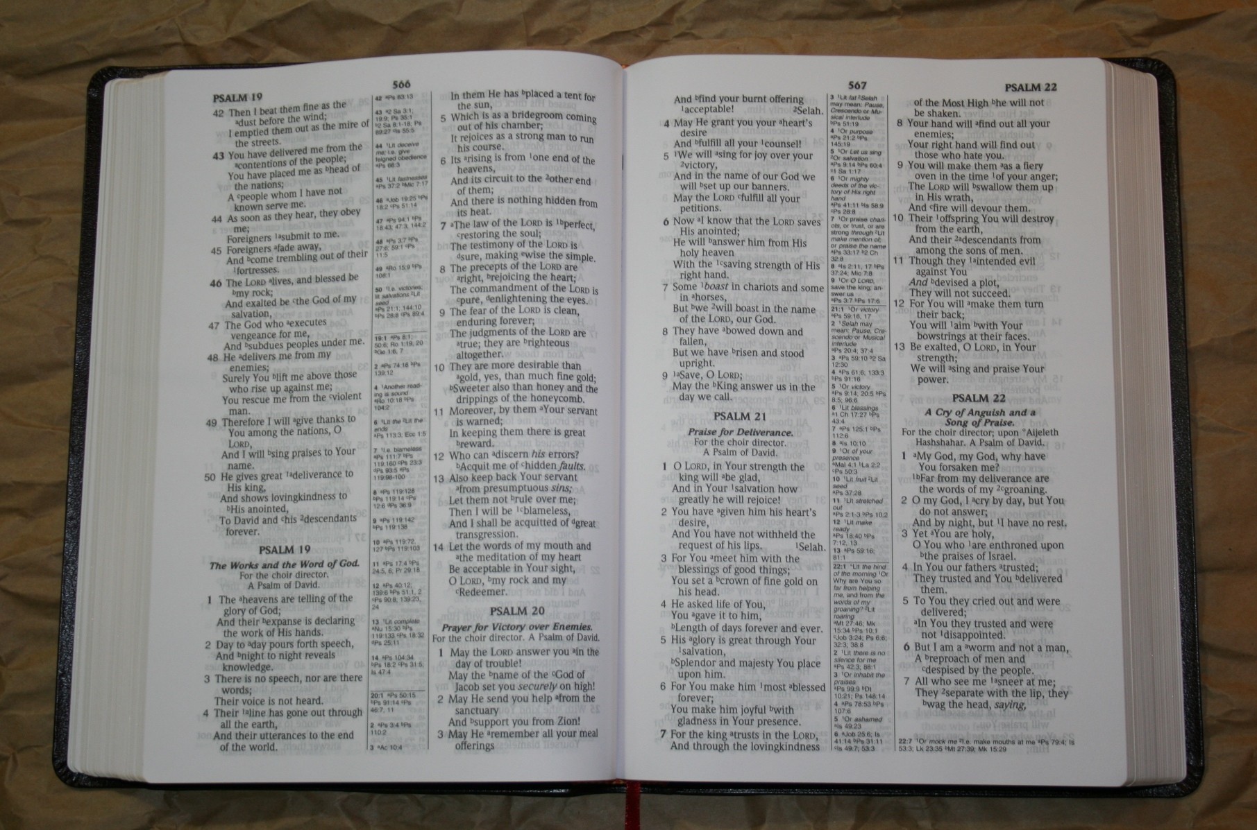
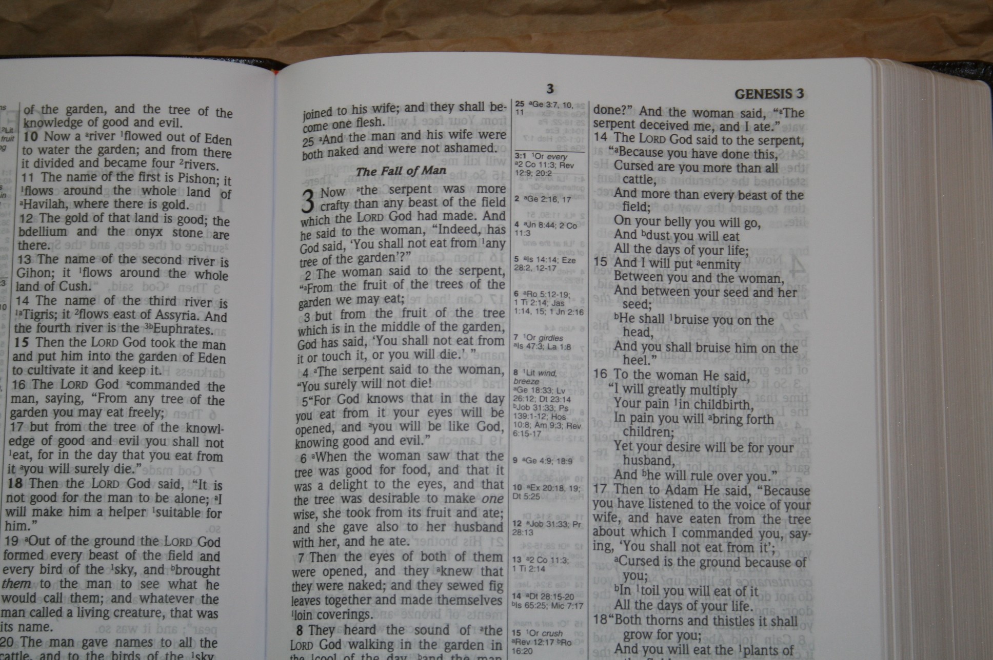
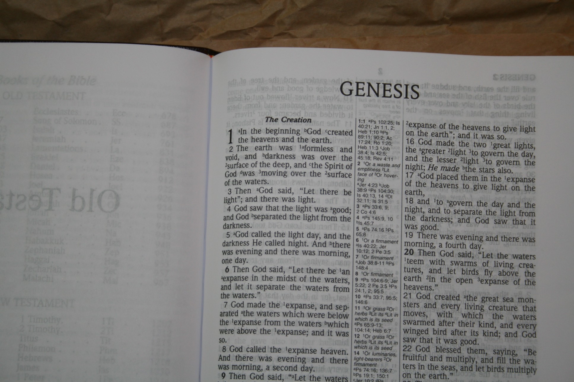
I love the print in this Bible. It has a 10/11 font that is sharp and bold (about a medium-dark). It is a black-letter edition. The print quality seems consistent throughout.
Italics are used to show supplied words that are implied in Greek, Aramaic, or Hebrew. Capitols are used to show Old Testament quotes in the New Testament. Words that are spoken by someone are in quotations. Paragraphs are marked with bold verse numbers. Personal pronouns for God are capitalized. This makes the text more modern but can sometimes show a Theological bias. Some words are marked with a star. These are words that are ‘historical present’ tense in Greek but shown as ‘past’ tense in English to better fit with modern usage. I appreciate having this identified because it helps in serious study.
Layout
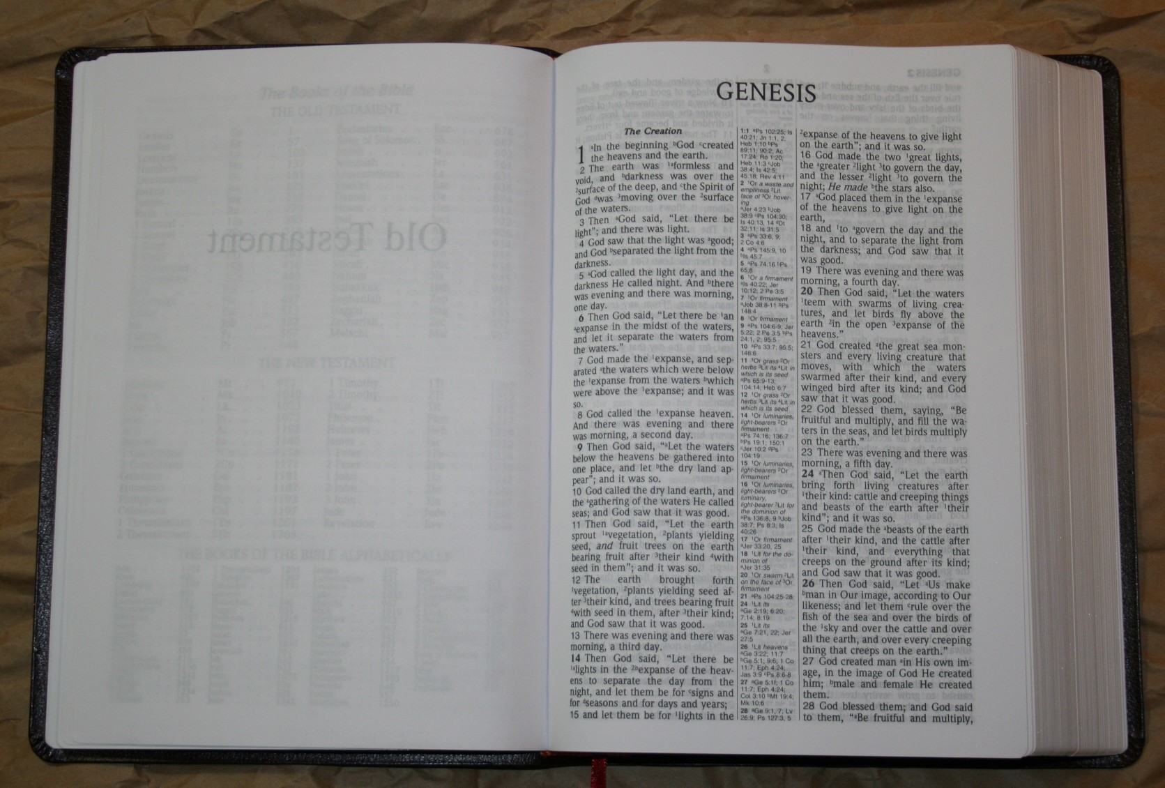
The layout is two-column, verse-by-verse format. Poetry is set to verse, meaning that the text is indented slightly. References and notes are in the center column. There are bold section headings that separate passages. Every book starts on a new page. It even has a half inch margin on the inner and outer margins. This is plenty of space for writing references and drawing symbols.
The layout is very clean and easy to read and use. I like the way the bold section headings look against the text. The all-caps for OT quotes and poetry set to verse look great and make it easier to read. I wish this was the standard layout for KJVs.
References and Notes
The references and notes are some of the most impressive features in this Bible. With 95,000 references, there are plenty to help in study, witnessing, and sermon-prep. There are 14 for Genesis 1:1. They are keyed to the text with letters. Translation notes are keyed to the text with numbers. The center column contains the chapter and verse numbers with all the letters and numbers following. The chapter number is only given on the first reference. There is a line drawn to show where the references for a new chapter start. Matthew 10:33 contains references to Mark 8:38, Luke 9:26, and 2 Timothy 2:12. I like this because it builds the harmony of the Gospels in the references. This is especially needed in this Bible because it doesn’t include it in the back. Plus, more references equals better for study.
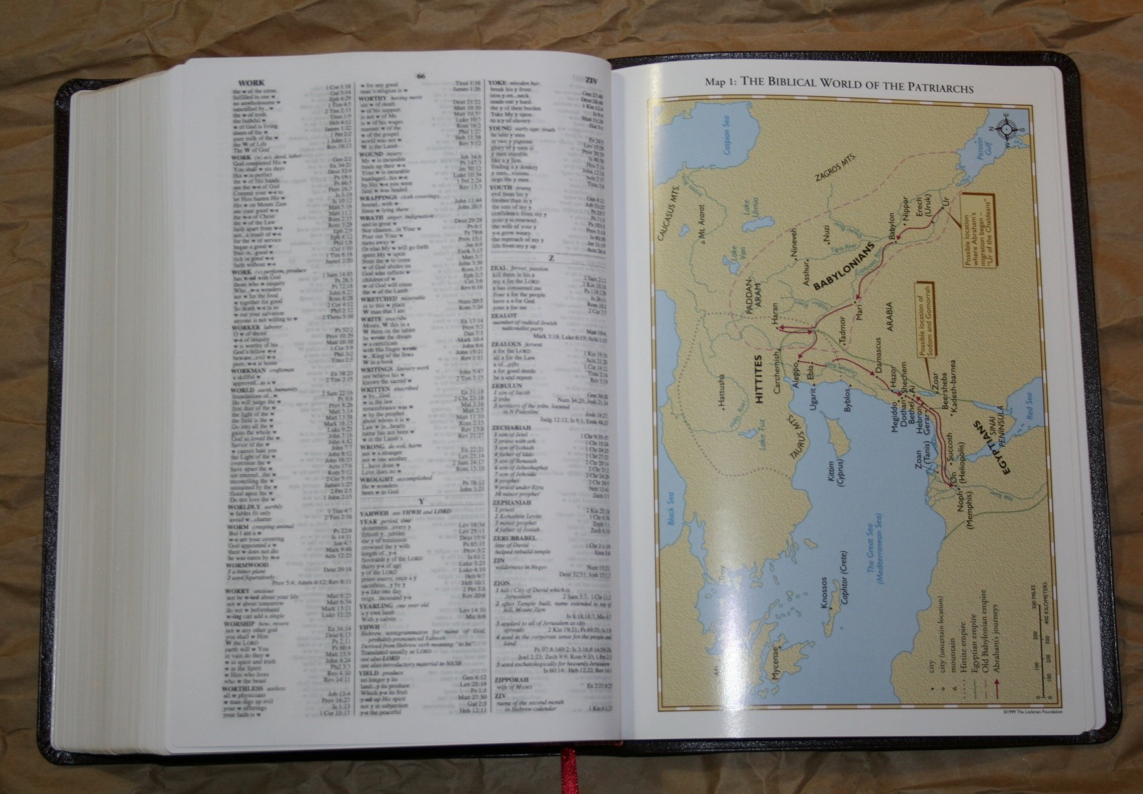
Concordance
The concordance is 66 pages with three columns per page. There is one verse per line, making it easy to use. It has 37 entries for God (Deity, Eternal One) and 8 for God (false deity, idols).
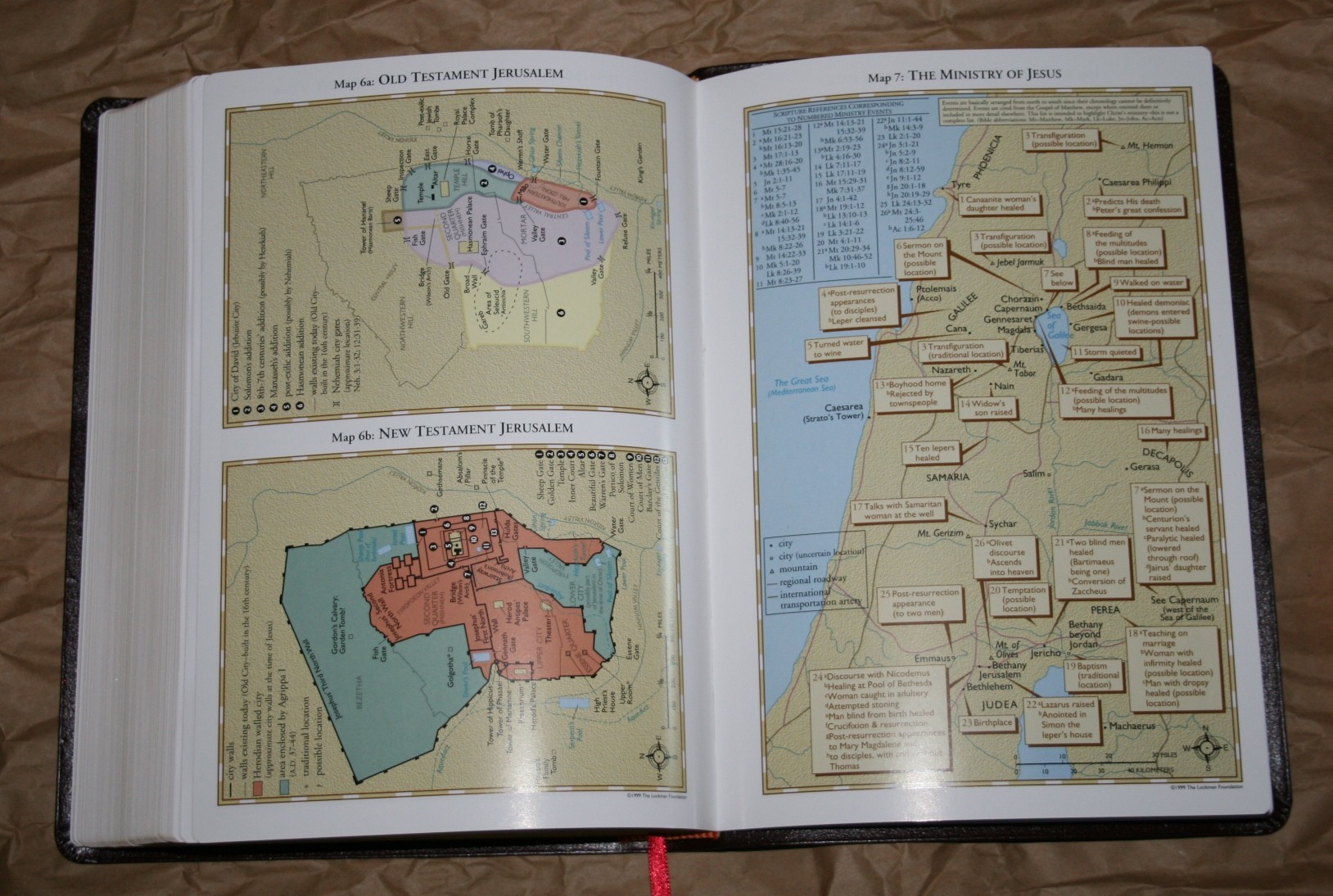
Maps
There are 8 full-color maps on heavy card stock. They look great. Most of them are annotated and marked, making them easy to use even with the lack of an index. Still, an index to maps would improve usability. In my opinion, an index to maps should be standard in Bible publishing (just like having maps in your Bible).
Conclusion
Foundation’s Large Print Ultrathin Reference Bible NASB has the basics that you would expect in a reference Bible and it even excels in the reference area. There are a few things I would like to see added: a reading plan, harmony of the Gospels, tables of weights and measures, and an Index to maps. These are the things that I’ve come to expect in a great reference edition and they are missing from this one. Nevertheless, for the money this is a hard NASB to beat. It is great for reading and study, and for preaching and teaching from. The half inch margin gives enough space to make small annotations. I do recommend spending a little extra for the genuine leather edition.
Buy from Amazon: Foundation Publications Large Print Ultrathin Reference Bible


Foundation Publications provided this Bible free for review. I was not required to give a positive review- only an honest review.