
image from https://evangelicalbible.com/schuyler-treveris/
-Updated 1-16-2019
Schuyler Bibles has revealed their latest design: the Schuyler Treveris Series. Unlike the Quentel/Canterbury series which focuses on referencing (like most Bibles on the market), the Treveris Series is designed with reading as the primary focus. The series will complement the Quentel/Canterbury series, so they’ll have one for reference, preaching, and study, and one for reading. This series takes a different approach to Bible design by taking the verse numbers out of the text and placing them in the left margin. It also removes all of the added features such as references, footnotes, and section headings. The series will start with the KJV.

image from https://evangelicalbible.com/schuyler-treveris/
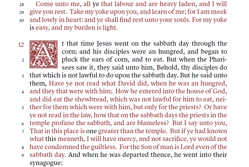
For the KJV, this is a major change from the common verse-by-verse layout. It takes a text-first approach. The text is presented in single column paragraph format while at the same time reuniting sentences that have been divided by verse numbers. The verses have traditionally printed the first letter as a capital even if it continues the sentence. This continues that feature, which helps in finding where the verses begin and end.
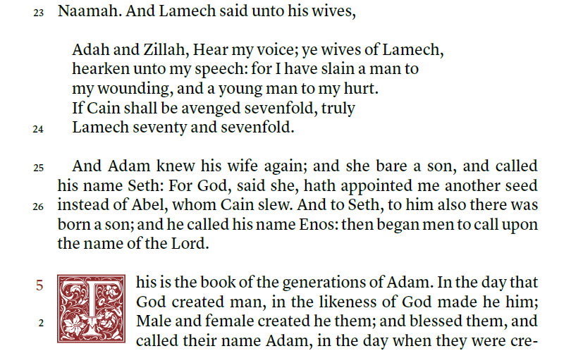
image from https://evangelicalbible.com/schuyler-treveris/
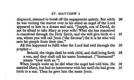
Poetry and letters are usually not identified in the KJV. The Treveris will print poetry to look like poetry, letters to look like letters, and prose to look like prose. This includes all poetry the New Testament. Until now, the Cambridge Clarion, Pitt Minion, and New Cambridge Paragraph Bible are the only Bibles that solve those issues, but they still add the verse numbers within the text and have very little poetry in the NT.
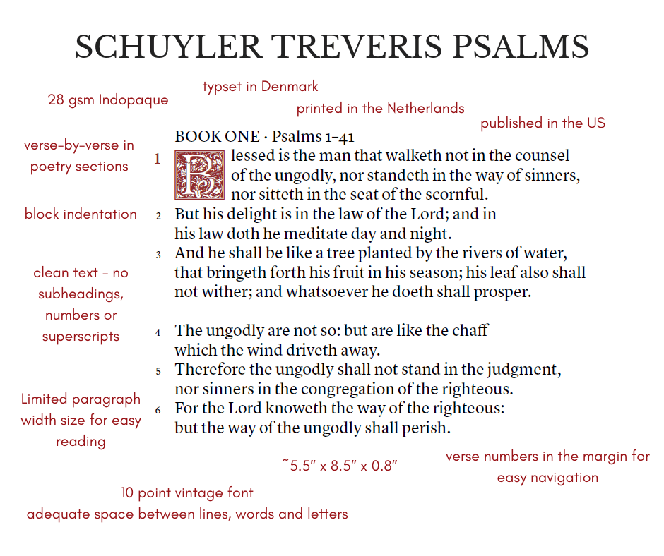
image from https://evangelicalbible.com/schuyler-treveris/
Here’s a look at the specs they’ve published so far.
- Trim Size: 5.5″ x 8.5″ x 0.8″ (140mm x 215mm x 22mm)
- 28 GSM Paper, Font: 10 pt.
- Single Column Paragraph format.
- Single Column, Verse-by-Verse format for Psalms, Proverbs, Song of Solomon, Poetry and Quotations.
- Ornamental Drop Caps
- Red letter (for King James Version)
- Italics for supplied words
- Epistle Dedicatory & Translators to the Readers
- Line Matching to avoid “see through”
- Art Gilt Edging
- Schuyler Bible Maps
Thoughts on Design

image from https://evangelicalbible.com/schuyler-treveris/
This sounds like it will be a large print thin-line edition with the footprint of the Concord. The 28gsm paper is the same that’s used in other editions such as the Omega, Legacy, Turquoise, the NIV Clarion, Personal Size Quentel, and the Personal Size Canterbury. This paper is highly opaque and even more expensive than the 36gsm used in other Schuyler editions. I’m glad they’re using this premium paper as it brings the size down and makes a Bible that’s great for carry to read, to visit other Churches, hospital and home visits, and anything I’d need a Bible for on the go. I’m more likely to carry a Bible in the 1″ range than the 1.5-1.75″ range.
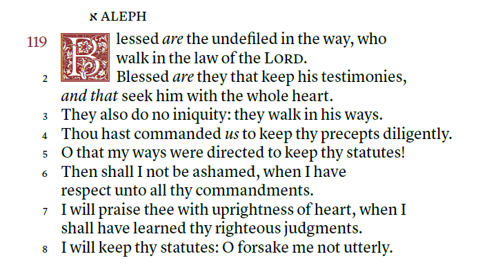
image from https://evangelicalbible.com/schuyler-treveris/
The ornamental drop caps from the Canterbury are here, but they take four lines of prose instead of five. It will include italics for supplied words. Italics is great to identify added words, but they’re not complete and they can be confusing to today’s reader because they’re often seen as emphasis. I personally still like having them, so I’m glad to see they’ll be included. It won’t have self-pronouncing marks. This will help improve readability.
The word-count per line is around 14 words. This brings the text in line with the ESV Legacy. This is on the high side for me (I personally prefer 10-12 words), but it is within the range of ideal.
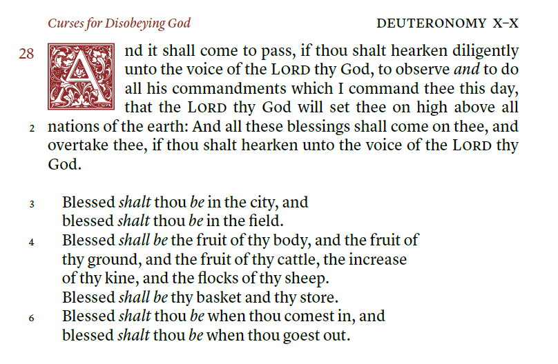
image from https://evangelicalbible.com/schuyler-treveris/
The emphasis is on readability. This is a good thing. We have hundreds of Bibles available that emphasize study and include references, footnotes, and verse-by-verse layouts that are designed for use with concordances and commentaries. This is why I’m glad they’re starting with the King James Version. The numbers are here if you need them, but the text isn’t a slave to the man-made verse divisions.
I know it’s designed for reading, but I plan to use it for preaching and teaching. I think it will be better for preaching in context. I prefer no distractions and I usually back up to the beginning of the sentence or paragraph anyway. The verse numbers in the margins will get me to the line I want, just like I do now with the Clarion. ‘Most’ of the time a verse starts at the beginning of the sentence or after punctuation, so it won’t be that difficult to figure out where a verse starts. It still has the capital letters, so it shouldn’t be difficult to find the verses.
The Schuyler Treveris isn’t the first design to ever move verse numbers to the margins. Here’s a look at just a few…
Other Editions with Verse Numbers in the Margin
The original Cambridge Paragraph Bible, the 1873 Scrivener, presented the KJV in double column paragraph with verse numbers removed from the text and placed in the margins, but it still included cross-reference and footnote keys in the text.
It’s also been done for Hebrew and Greek Bibles. I mentioned in this review that I wanted an edition in English. PubAssist has discussed the advantages of the design for readability. I even mentioned wanting this design in my LCBP Paragraph Bible review.
The New Testament in Modern English uses this design.
The New Jerusalem Bible uses this design.
Ending Thoughts
I’m looking forward to the Treveris series. Not every Bible needs to have references, footnotes, and focus on study. I read more than anything else and this looks like a good series for reading. Verse numbers are accessible, just in case you need them, but they’re not in the way when you don’t need them. It makes sense for Schuyler to complement the already popular Quentel/Canterbury series rather than compete with it.
I’m glad to see a KJV with reading in mind. The layout will match modern designs, making the most poetic translation have the most poetic layout.
You can see more about the Treveris series at Evangelical Bible.
Do you think the Teveris series will make a good edition for reading?