
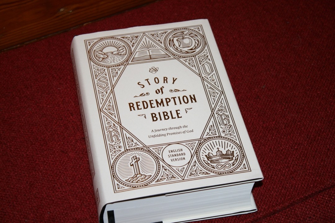
This is a new study Bible with commentary from Pastor Greg Gilbert. As its name suggests, the focus is on the promise of redemption and how it unfolded throughout the Scriptures from the Old Testament to the New Testament. The books are printed in normal biblical order, but the notes follow the redemptive narrative and suggest a reading order based on that narrative. It’s available in hardcover, TruTone, and top grain leather. I’m reviewing the hardcover edition, ISBN: 9781433554629, made in China.
Crossway provided this Bible in exchange for an honest review. I was not required to give a positive review, only an honest one. All opinions are my own.
_________________________________________________________
This Bible is available at (includes some affiliate links)

and many local Bible bookstores
_________________________________________________________
Video Review

Cover and Binding
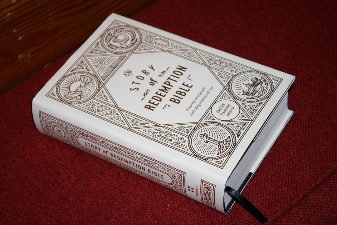
This is the hardcover edition with a dust jacket. The dust jacket is cream and includes gold foil patterns on the front, spine, and back. Under the dust jacket is a dark gray cover with a gold foil pattern stamped onto the spine.

The text-block is Smyth sewn. It includes one small black ribbon that’s just long enough to pull to the corner to open the Bible easily. The overall size is 9.25 x 6.25 x 2.125″ and weighs 3 lbs, 10 oz. It does feel a little chunky and heavy.
Paper
This paper is amazing. It’s 42gsm. It has a rich cream color, similar to journal editions but not as deep of a yellow as many are. I’m not sure, but it could be the same paper as the ESV Journal Bible. It’s smooth to the touch, but not so smooth that it’s difficult to turn. It has no glare under direct light. It’s highly opaque and it’s excellent for reading for long periods of time. Reading can be a little more difficult in bad lighting, though, as this does lower the contrast.

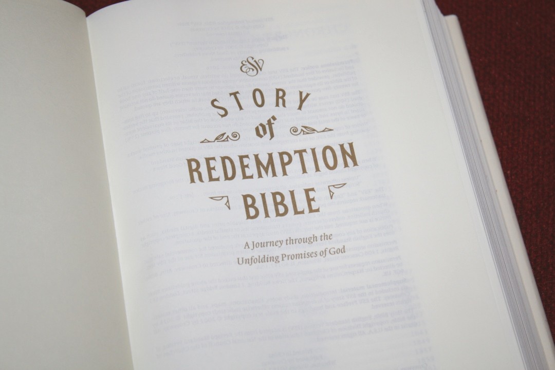
It has a gorgeous presentation page that continues the gold pattern. It also has gray bars along the sides, which match the next page.
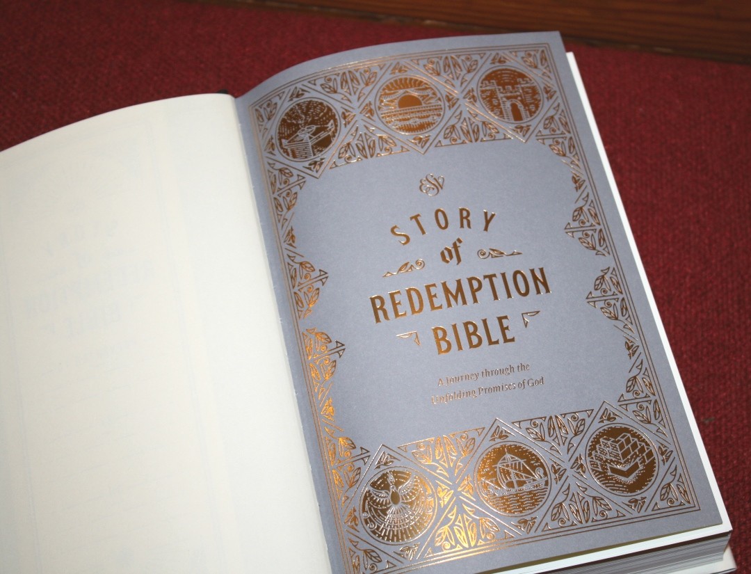
This page prints the gold patterns over gray, creating a nice title page. The designs within the circles match the illustrations that are seen in the book titles.
Typography

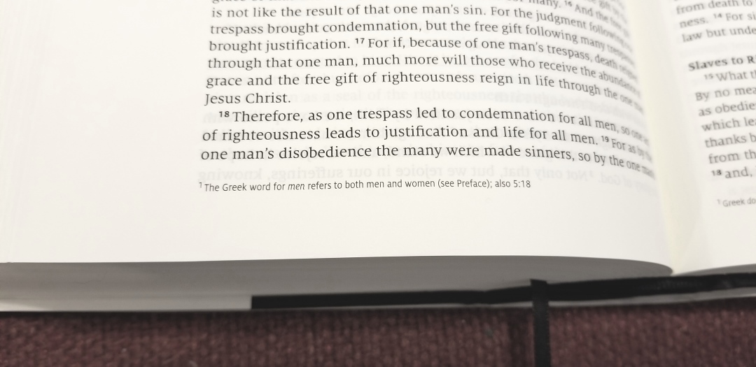
The text is presented in single-column paragraph format. The header shows the page number in the center and the book name, chapter, and verse number in the outer margin. The translator’s footnotes are placed in the footer.
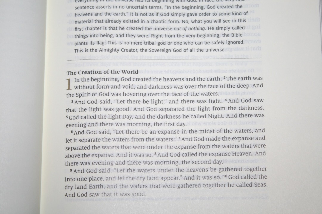
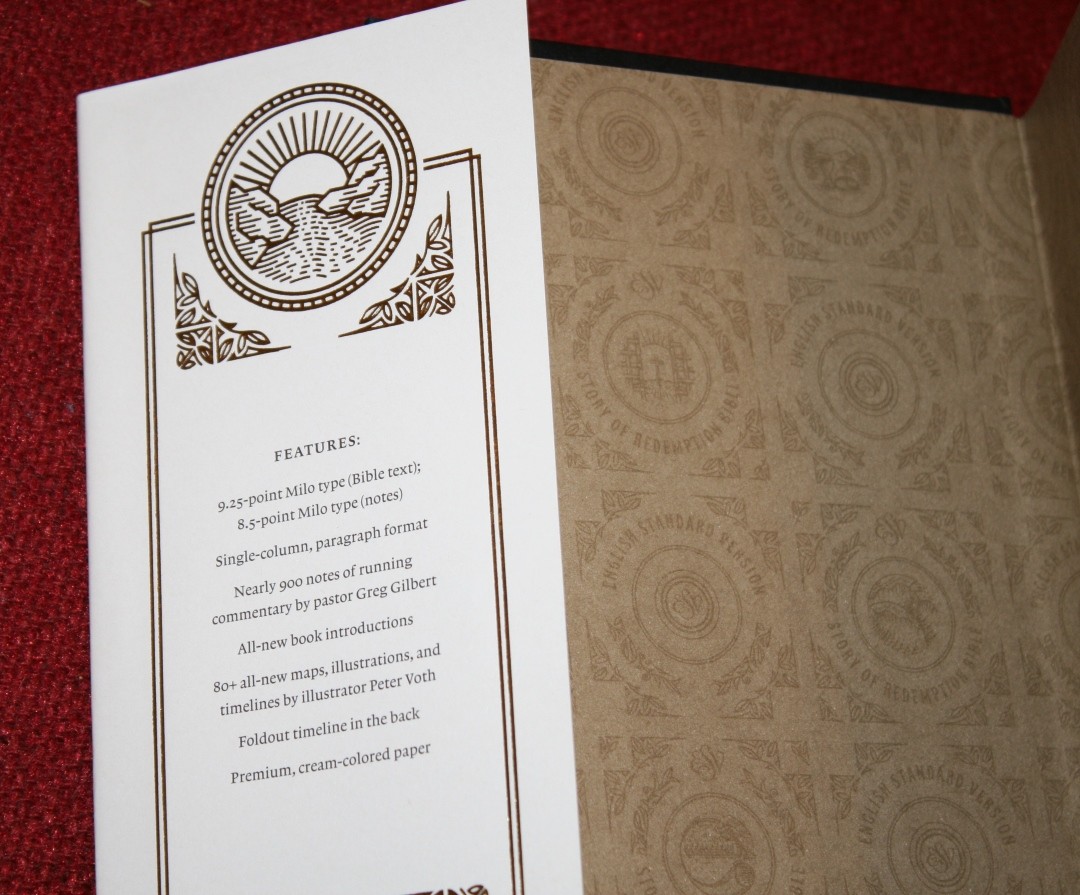
The typeface is 9.25-point Milo black letter with the notes in 8.5-point Milo. It’s dark, sharp, and highly readable. The words are never too close. There’s enough room in the gutter to help keep the text from bending too far. The page mostly stays flat, which helps keep the line of text straight to improve readability.
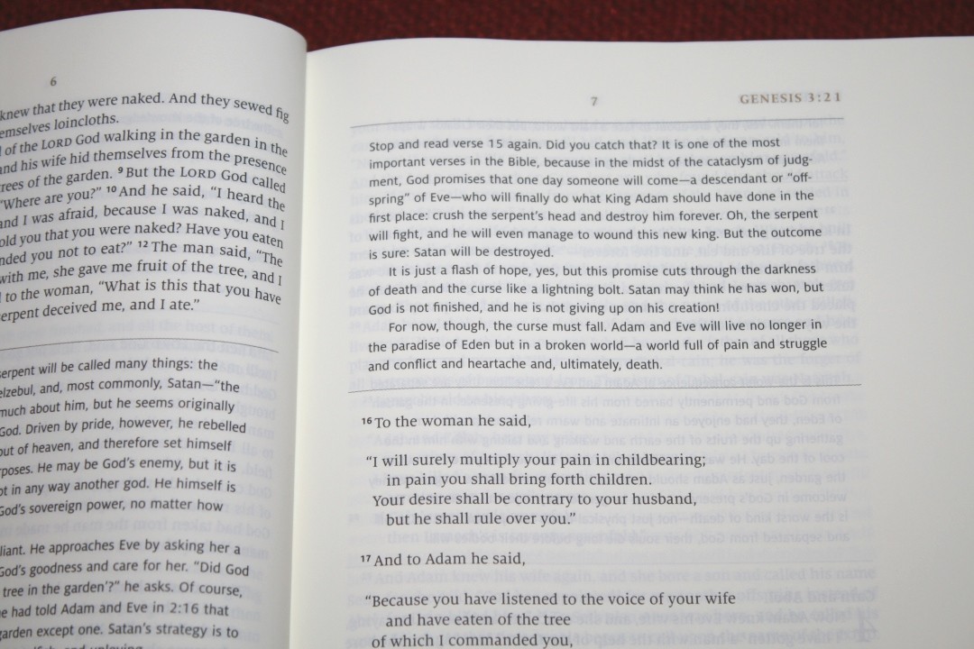
It has around 80 characters per line with around 14 words per line. This is a little more than I like, but I didn’t find it too difficult to read. This also makes poetry look cleaner because there aren’t a lot of broken lines. The biblical text is printed with line-matching (meaning the lines on both sides of the page are placed in the same position, improving readability). The commentary isn’t line-match (they’re printed in a smaller typeface), but after the commentary, the biblical text picks back up with line-matching.
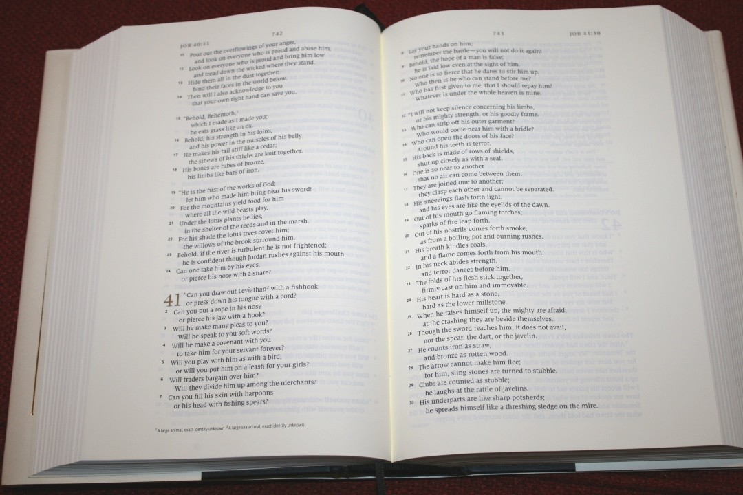
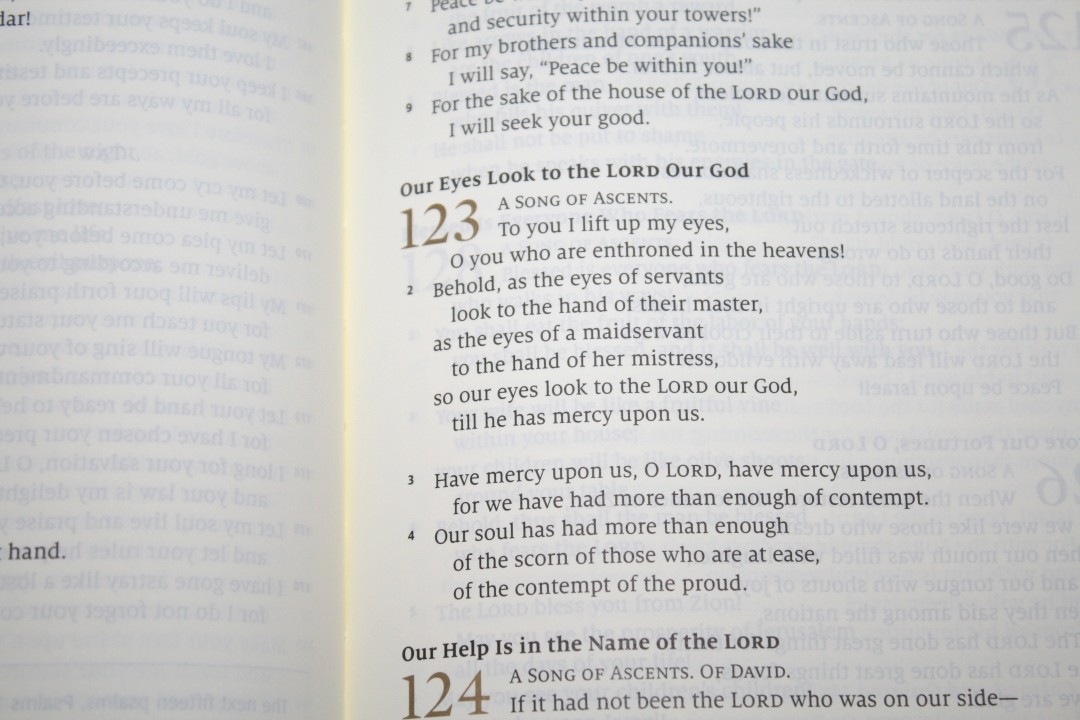
The header text and the chapter numbers are printed in gold. Section headings are in bold black. Footnotes are keyed with numbers. I find them easy to ignore while being easy to use at the same time. Verse numbers are small, but they do have enough space around them and they’re just enough darker than the text that I can find them easily enough.

It has wide margins on the outside, which is excellent for notes.
Book Introductions
Book introductions typically take 1-4 paragraphs. They don’t all include all of this information, but they typically cover the author, setting, date, purpose, etc. What’s interesting is they cover this in a conversational style of writing. Even the book introductions feel like mini-devotionals.
Notes
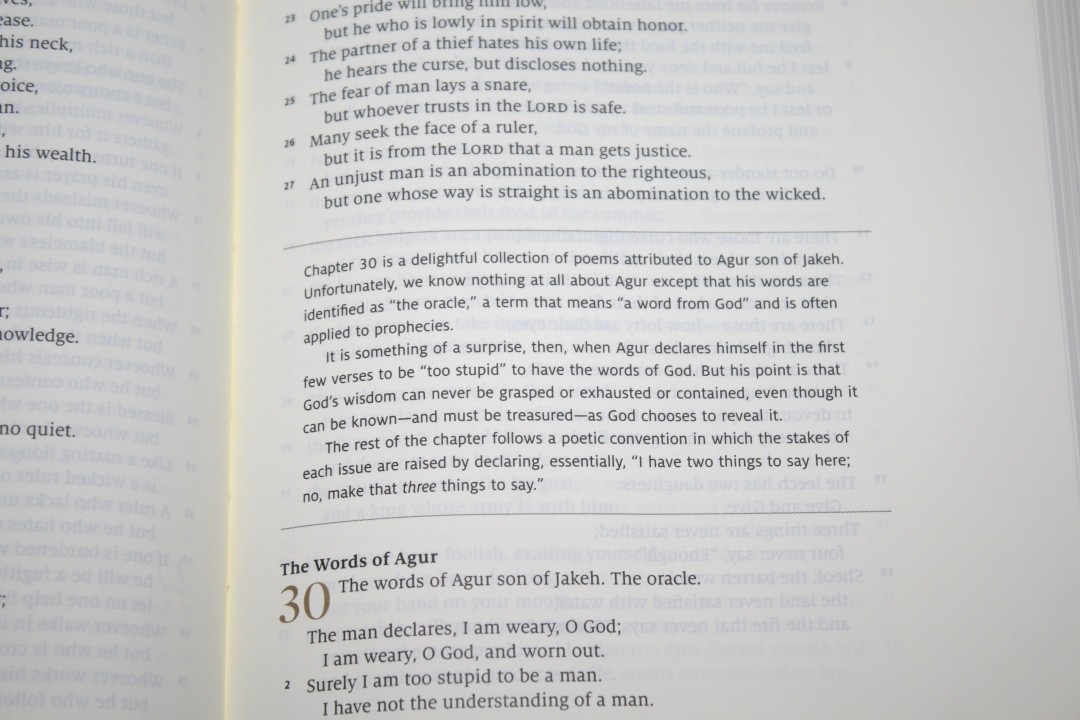

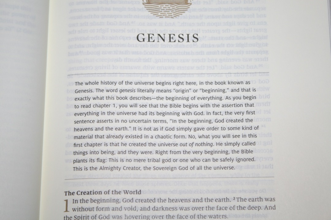
Commentary – It has over 800 notes that explain how passages fit together and point to Jesus as our Redeemer. They’re placed throughout the Scriptures. They focus on redemption in chronological order and suggest where to read next so that the redemptive story makes the most sense. A lot of the notes have a devotional quality. They do provide insights into the text, but they mostly do this without getting deep into theology- most of the time allowing the text to speak for itself. Of course, there are a few theological notes and opinions. Many of the notes would apply regardless of denomination. Most don’t include references.
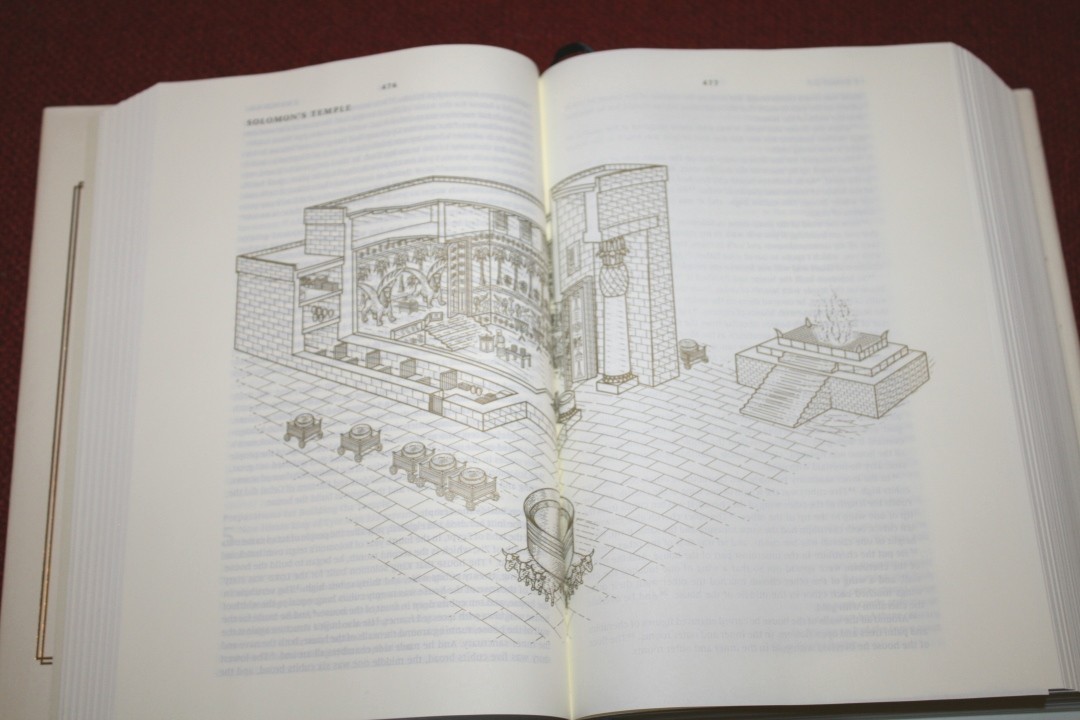

Maps and Illustrations – There are lots of maps and illustrations throughout the Bible. They’re either printed across the bottom of the page, or they take a whole page (with some taking 2 pages). They’re printed in gold. They don’t include annotations- just a title, city names, etc. This keeps them from interrupting the flow of reading, but also provides a visual for the setting.
Graphics
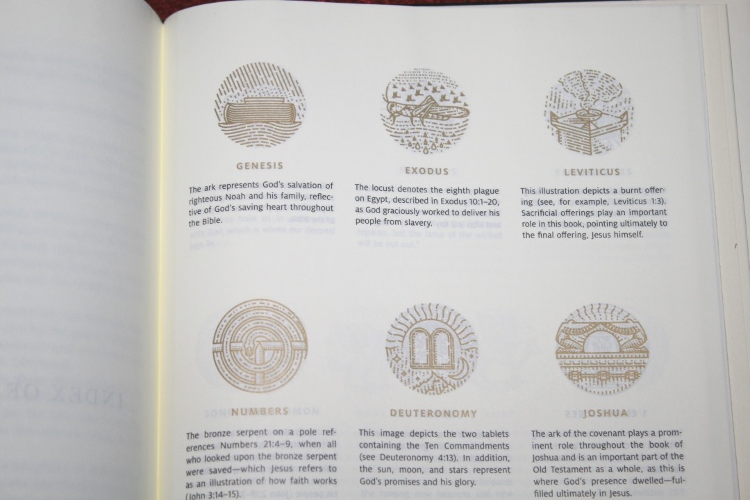
This shows the graphic for each book of the Bible. It provides the book name and an explanation of what the graphic represents. It’s interesting to see these in one place and I like reading why the graphic was chosen to represent each book.
Daily Reading Plans
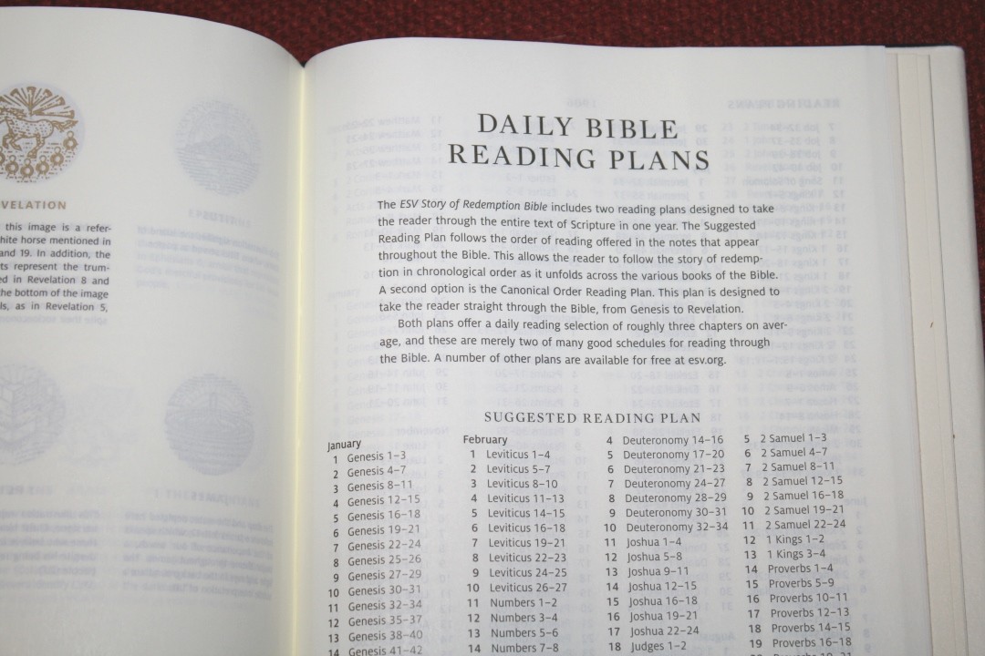
It has two daily reading plans in the back. Both show the month, date, and the reading for that day. The Canonical Order Reading Plan takes you through the Bible in canonical order. This one takes you straight through, from Genesis to Revelation in standard biblical order.
The Suggested Reading Plan takes you through the Bible in the order that’s suggested in the notes. It’s mostly close to the biblical order, but it does have you skipping around a little. For example, it inserts a reading in the middle of 1 Kings, taking you to Proverbs, Ecclesiastes, and then Job, and then it picks up where it left off in 1 Kings. It takes you to where a prophet is preaching when the events took place. The New Testament has you skipping around a little more and places Luke as the last of the Gospels to read, which connects it with Acts. Acts has several readings in the middle and then at the end. It takes you to books that were written during the time the events took place.
Foldout Timeline
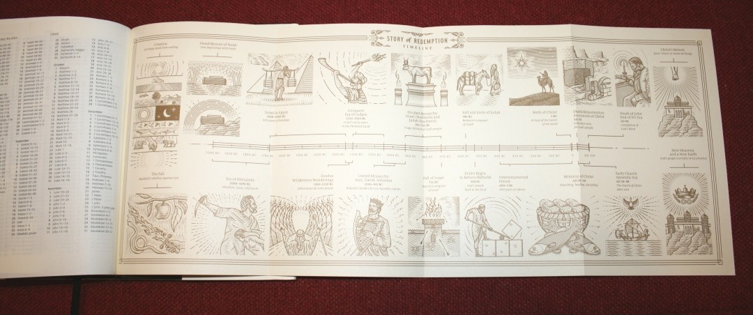
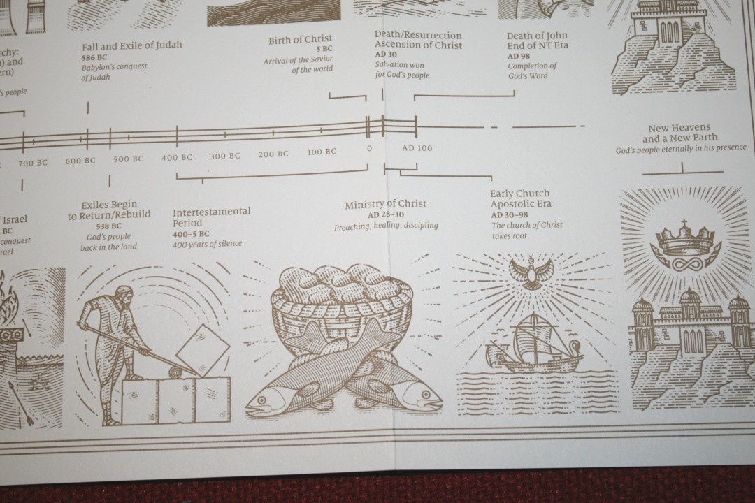
The Story of Redemption Timeline is a foldout page that shows the redemptive work of God through gold illustrations along with the dates on a timeline. It includes the title, date, and description of each one. This is printed on thick non-glossy paper and is excellent for seeing the overall story of the Bible visually.
Conclusion
The ESV Story of Redemption Bible is one of the most interesting study Bibles I’ve used. It’s a simplified study Bible to the greatest extent: only focusing on one topic and then covering the topic in more general thoughts rather than theological detail. Most of the commentary has a devotional quality and they don’t get in the way of reading. I like having the maps within the text, as it helps in visualizing the setting. It removes the clutter that’s typical of study Bibles and only provides information that supports the main point; creating the cleanest design for a study Bible that I’ve seen.

I also like that it has wide margins. The paper is great for note-taking and highlighting, and the typeface is large enough to read comfortably for long periods of time. The design makes it an excellent Bible for reading. I recommend the ESV Story of Redemption Bible to anyone interested in a study Bible that’s light enough on study notes to focus on reading the text and wide margins for your own notes.
_________________________________________________________
This Bible is available at (includes some affiliate links)
and many local Bible bookstores
_________________________________________________________
Crossway provided this Bible in exchange for an honest review. I was not required to give a positive review, only an honest one. All opinions are my own.