
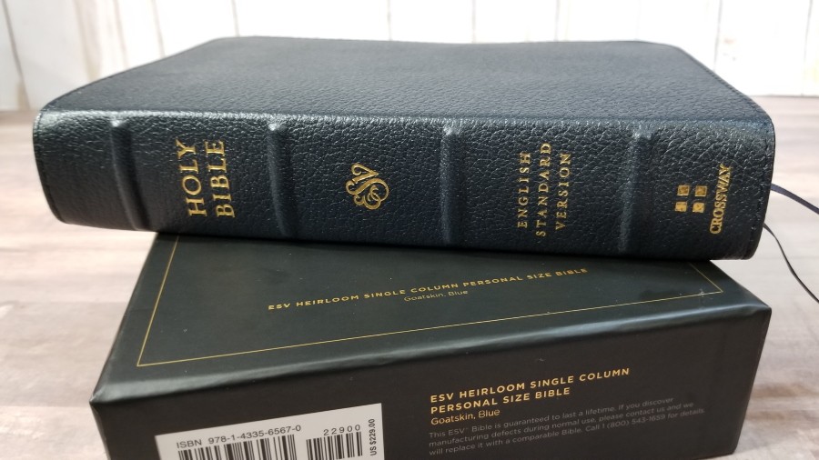
Crossway’s Single Column Personal Size Bible was designed to be a readable edition that’s easy to carry and use. It’s a text-only edition, so the focus is on the text. The single-column layout makes for a highly readable design and its poetic setting is gorgeous. Unfortunately, that readability is hampered by one major flaw. It’s available in black and blue goatskin covers. I’m reviewing the blue goatskin, ISBN: 9781433565670, made in China.
Crossway provided this Bible in exchange for an honest review. I was not required to give a positive review, only an honest one. All opinions are my own.
_________________________________________________________
This book is available at (includes some affiliate links)

and many local Bible bookstores
_________________________________________________________
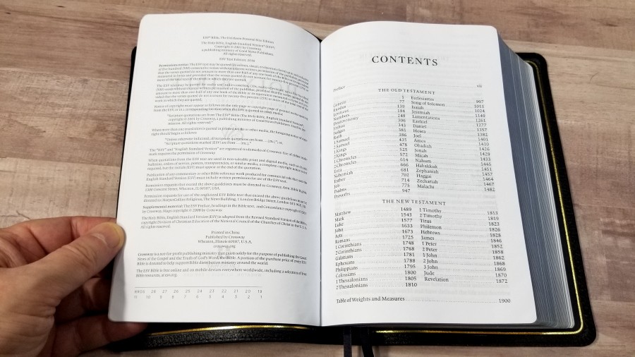
Table of Contents
Video Review

Cover and Binding
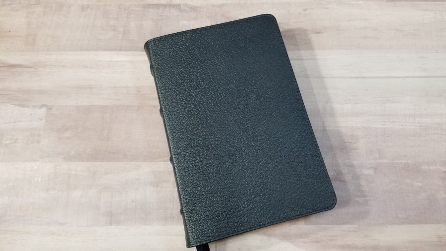
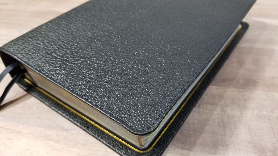
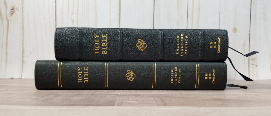
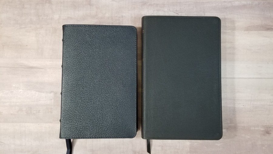
The cover is blue goatskin. The blue is so dark that it’s easy to think it’s black. It has a pebbly grain and it has perimeter stitching. The front has no printing. The spine has 4 spine ribs and HOLY BIBLE, ESV, English Standard Version, and the Crossway logo stamped in gold. The leather is a little thinner than most Heirloom editions that I’ve seen. It does feel like a good quality cover.
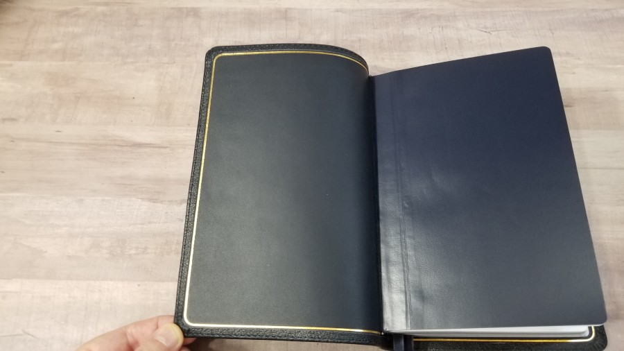
The liner is leather. It has a gold line stamped around the perimeter. It’s edge-lined. The tab of leather in the edge-lining does feel a little stiff. It doesn’t want to stay open in Genesis, but I think that will break in with enough use. The text-block is Smyth sewn. It has a lot of cockling throughout the Bible. It’s mostly noticeable in the front and back.
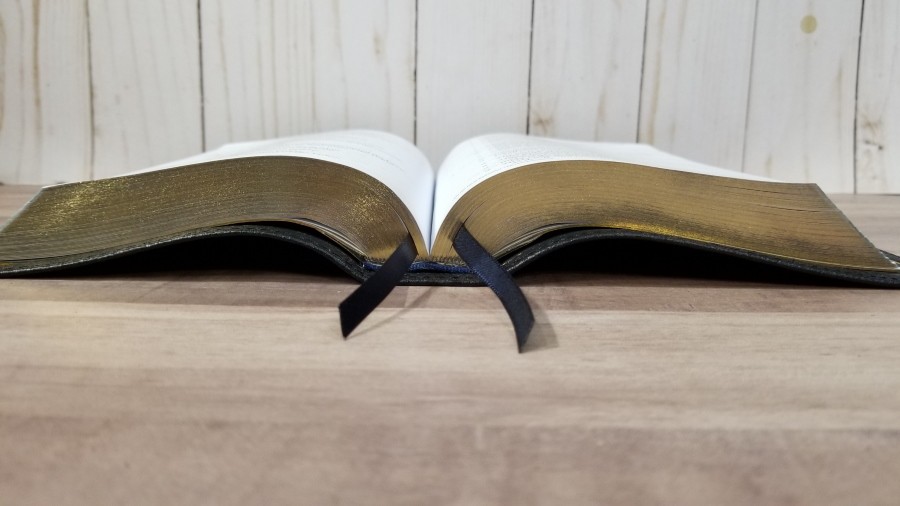
It has 2 black ribbons. The overall size is 5 1/4 x 8 x 1 1/2″. It weighs 1 lb, 8.3 oz. This size is great for carry and holding to read.
Paper
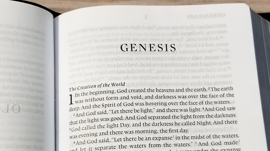
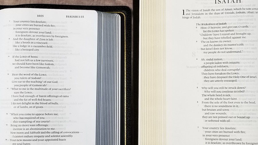
I’m not sure of the gsm, but the paper seems to be the same that’s normally used in the imitation TruTone leather editions. It’s probably somewhere in the upper 20’s or low 30’s in gsm, but that’s just a guess. It can be a little difficult to grab and turn. It has a slight glare under certain lighting and at certain angles. It does have more show-through than I’d like. In some places, it makes the text have a gray tint because of the text on the other side of the page. The page edges have a slightly blue tint to create the art-gilt effect. It has lots of ripples in the paper. The paper is my main complaint and it’s the element that makes it not feel like an heirloom quality Bible to me.
Typography
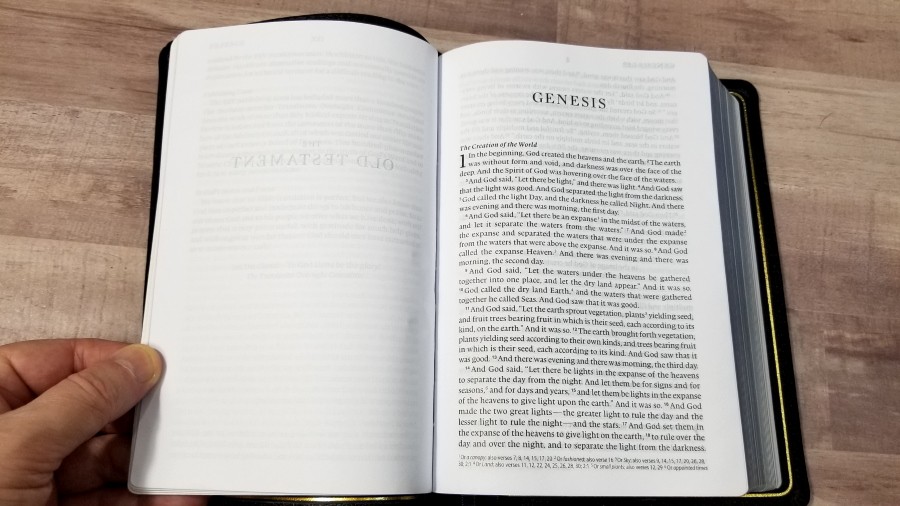
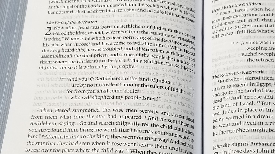
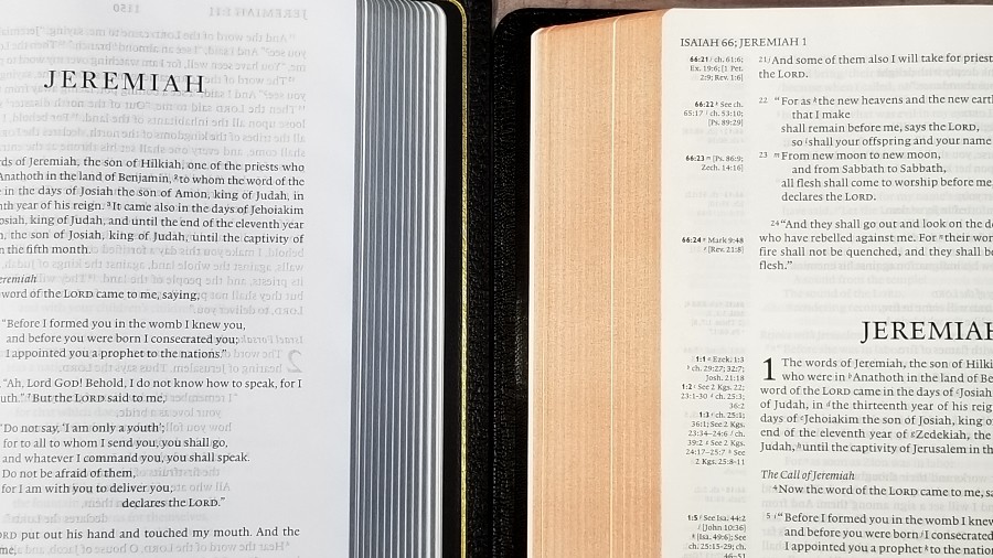
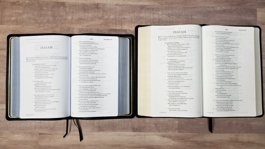
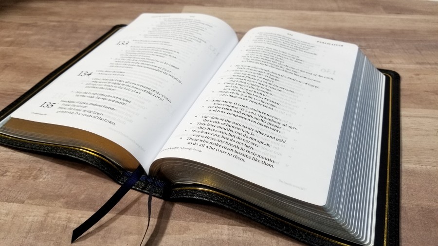
The text is presented in a single-column paragraph format with poetry set to stanzas. The header displays the book name, chapter, and verse numbers in the outer margin, and the page number in the center. Translation footnotes are placed in the footer.
The typeface is 9-point, black letter. It has more than average space between the lines, making the text comfortable to read. With 12-14 words per line, the extra spacing makes it easier to keep your place. I’d love to see more Bibles with this level of line-spacing. The text never feels cramped.
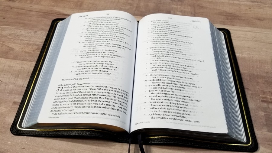
It’s printed with line-matching, meaning that the lines of text are printed in the same location on both sides of the page. This does improve readability, but the paper has enough show-through that the text appears slightly gray in some places. The poetic settings look great in this word-count and line-spacing. Most lines are divided in the perfect location within the poetic line and they’re centered, making poetry a joy to read.
Section headings are in italics. They don’t’ stand out too much, so I find them easy enough to use when I want them and ignore when I don’t. Footnote keys are are a small number in italics. I find them easy to use. Verse numbers are larger than the footnote keys and might be a touch darker than the text (but that’s hard to tell). They do stand out just a little bit, making them easier to find.
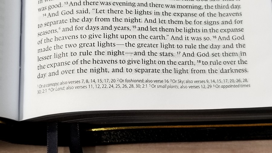
Footnotes are in a small print at the bottom of the page. They include the number key, Hebrew and Greek explanations, manuscript variations (without identifying the manuscript), information about objects, places, names, money, references where something is quoted, etc.
Extras
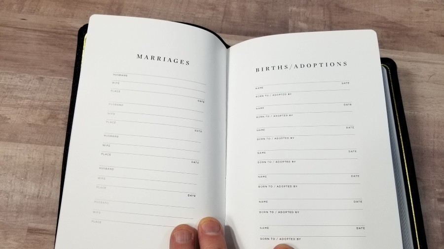
In the front, there is a presentation page and a few family pages on thick paper. Family pages include marriages, births/adoptions, and deaths.
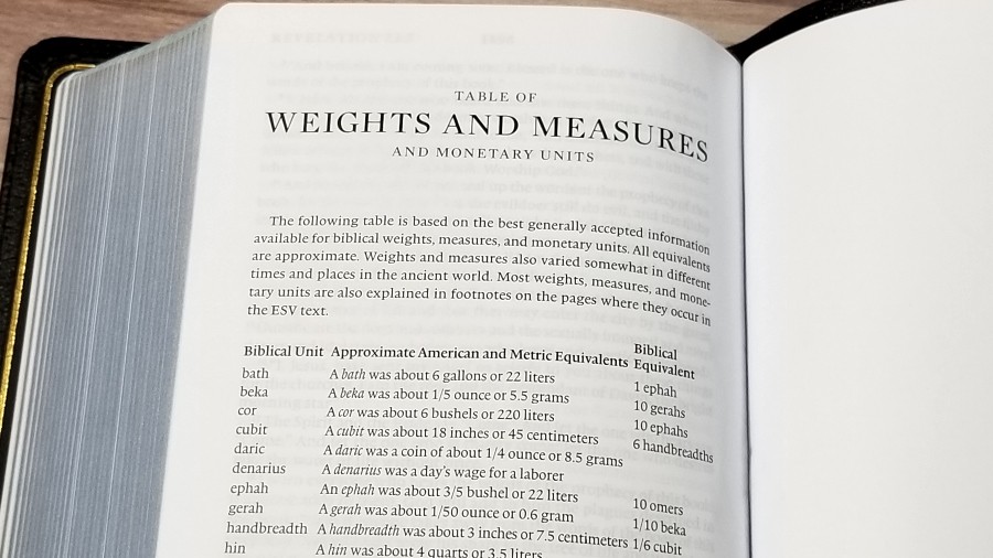
In the back is the table of weights and measures. It’s a small table, and this information is also covered in the footnotes. It shows the biblical unit, approximate American and metric equivalents, and biblical equivalents.
Maps
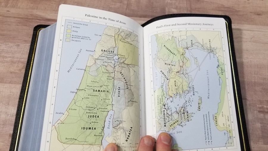
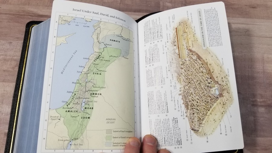
It has 8 maps printed on thick semi-glossy paper. They’re printed in earth-tone colors. They include distance, topography, borders, routes, rivers, kingdoms, etc. It doesn’t have an index to maps, but they are labeled well and I find them easy to use.
Maps include:
- The World of the Patriarchs
- The Exodus from Egypt
- The Twelve Tribes of Israel
- Israel Under Saul, David, and Solomon
- Jerusalem in the Time of Jesus
- Palestine in the Time of Jesus
- Paul’s First and Second Missionary Journeys
- Paul’s Third Missionary Journey and His Voyage to Rome
Comparisons
Here’s how the Heirloom Single Column Personal Size ESV compares to the Cambridge Clarion and Crossway Legacy.
Cambridge Clarion
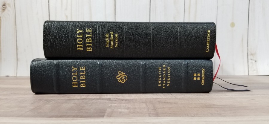
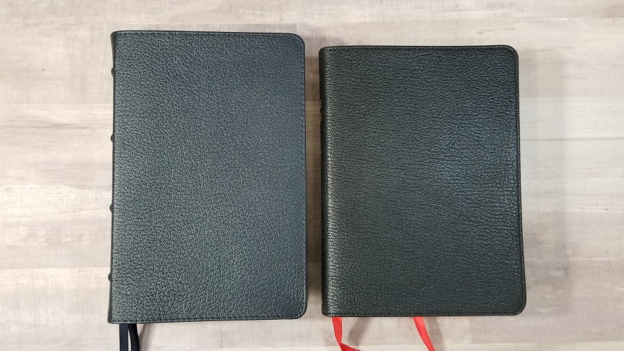

The Clarion is a reference edition, but it’s about the same size. It’s made with higher quality materials. The Clarion is shorter and thicker. Its size and shape don’t feel as natural as the Single Column Paragraph. The Clarion font is slightly smaller. The Clarion has a concordance and more maps. Its goatskin is thicker, but the liner is synthetic. If quality is your goal, the Clarion is still the best choice for a single column ESV in personal size.
Crossway Single Column Thinline Bible
The Single Column Thinline Bible is a cheaper Bible, but I prefer it’s paper to the Heirloom Single Column Personal Size. It’s taller and slightly thinner. The font seems to be the same size, but the column isn’t as wide. This is most noticeable in poetic settings.
Conclusion
The Heirloom Single Column Personal Size ESV is a nice Bible, but the quality isn’t to the same level as the Heirloom Legacy. Most of the materials are fine, but the paper and cockling reduce the heirloom feel. I love this size, and I want to be drawn to this Bible, but I’m not. If it had better paper it could easily be one of the best ESV’s on the market. If they keep the paper it has, I’d prefer they rebrand it, as it doesn’t strike me as an heirloom edition. The information on Amazon says that it has a concordance, but this Bible doesn’t have one.
If it had better paper, this would easily be the ESV I’d carry, as this is the size and design that I’m drawn to the most. The single-column layout is beautiful. I’d love to see this Bible with better paper. If you find it on a good deal, and you’re not worried about the paper, the Heirloom Single Column Personal Size is a good ESV to carry and use.
_________________________________________________________
This book is available at (includes some affiliate links)
and many local Bible bookstores
_________________________________________________________
Crossway provided this Bible in exchange for an honest review. I was not required to give a positive review, only an honest one. All opinions are my own.