
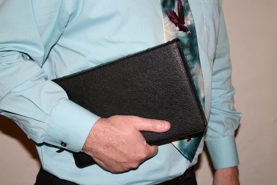
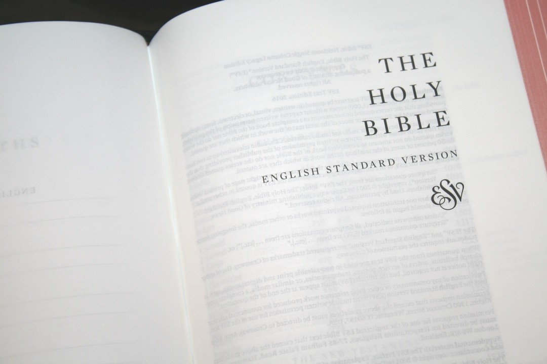
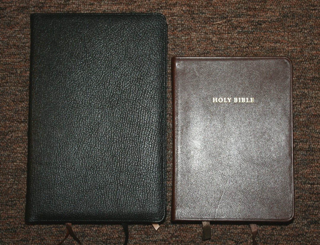
Crossway’s Heirloom Legacy is a special edition of their ESV Single Column Legacy built by Royal Jongbloed using the best materials including goatskin leather, leather edge-lined liner, four ribbons, and elegant Inopaque paper It includes the 2016 ESV text and improves on the previous Heirloom edition. It’s available in black or brown from Amazon, Crossway, and many other Bible retailers. Evangelical Bible has several exclusive colors including Ocean Blue, purple, and green. I’m reviewing the black goatskin, ISBN: 9781433544484, made in the Netherlands by Royal Jongbloed.
Crossway provided this Bible in exchange for an honest review. I was not required to give a positive review. My opinions are my own.
______________________________________
Buy from Amazon
______________________________________
Video Review

Cover and Binding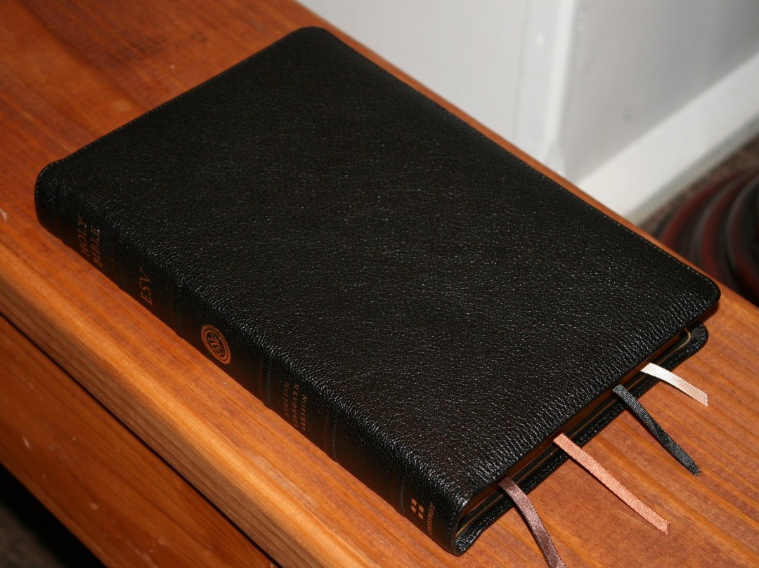

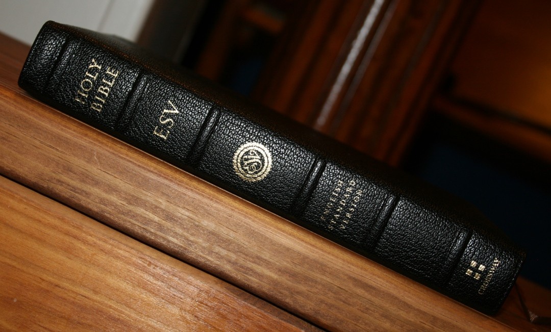
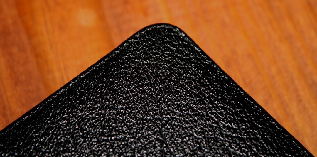
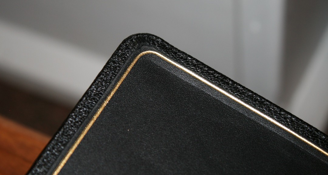
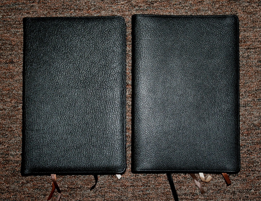
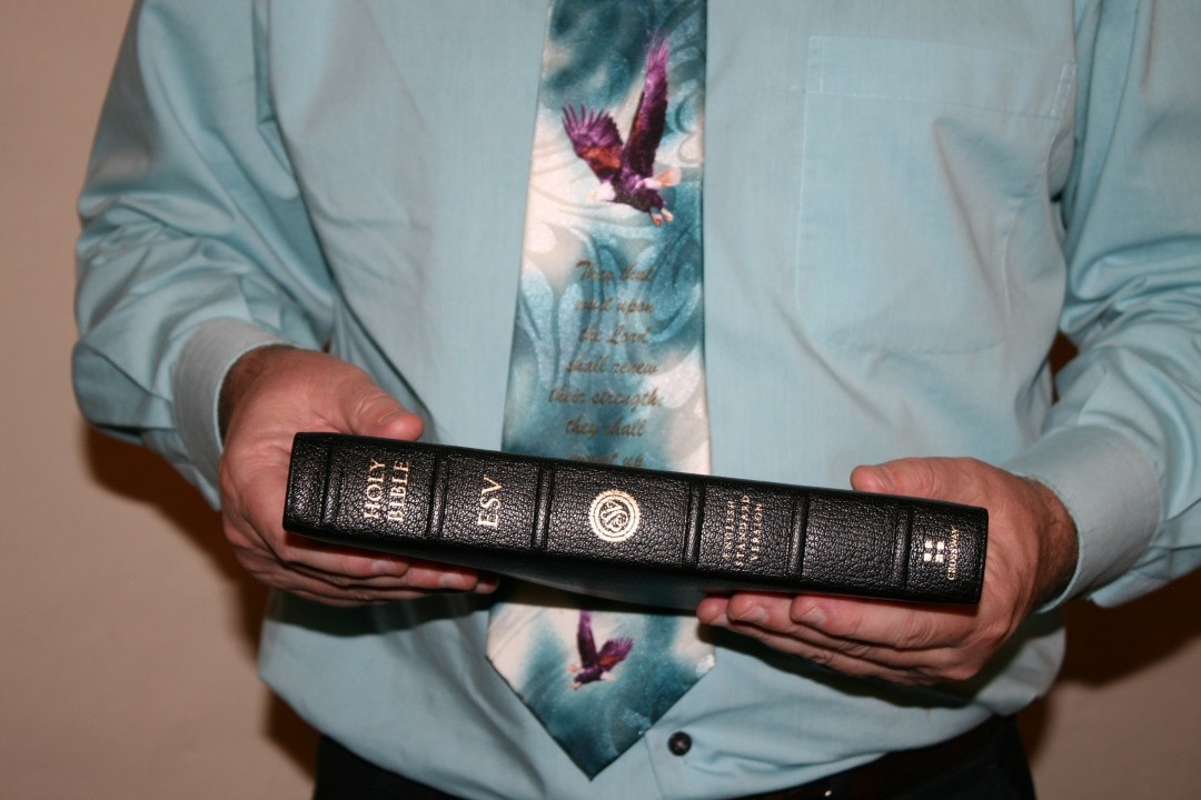
The cover is black goatskin leather with a leather edge-lined liner and a decorative gold line around the perimeter of the inside cover. I love the elegance that this line gives the cover. This feels missing in other editions like the Turquoise. The leather is thick and has a beautiful grain. It has 6 spine ribs with the ESV and Crossway information stamped in gold. The ESV logo is difficult to read on the spine but the rest is legible enough.
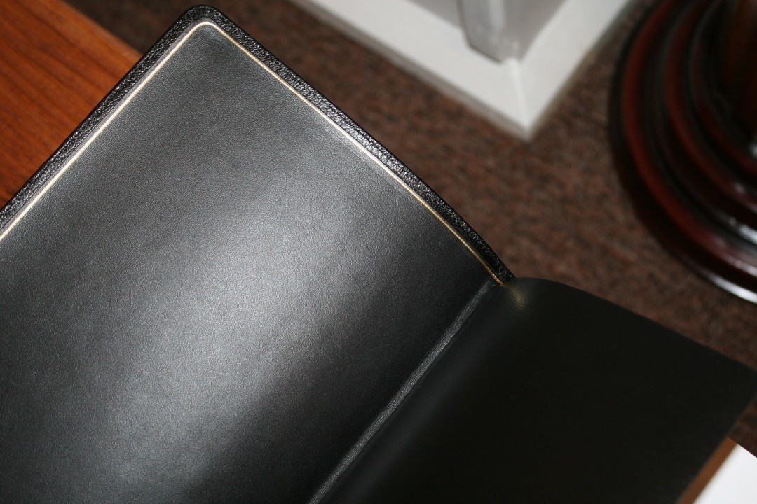
The cover is floppy but it’s not so floppy that it’s difficult to use. I have no issues holding this Bible in one hand to read. It’s Smyth sewn and stays open in Genesis 1 out of the box. It also includes several thick end-sheets in the front and back, which helps add structure to the binding. The edge-line hinge almost feels stiff if you move the end-sheet it’s attached to, but when you turn to the next page it falls on over and stays fully open. It isn’t noisy when you open or close it.
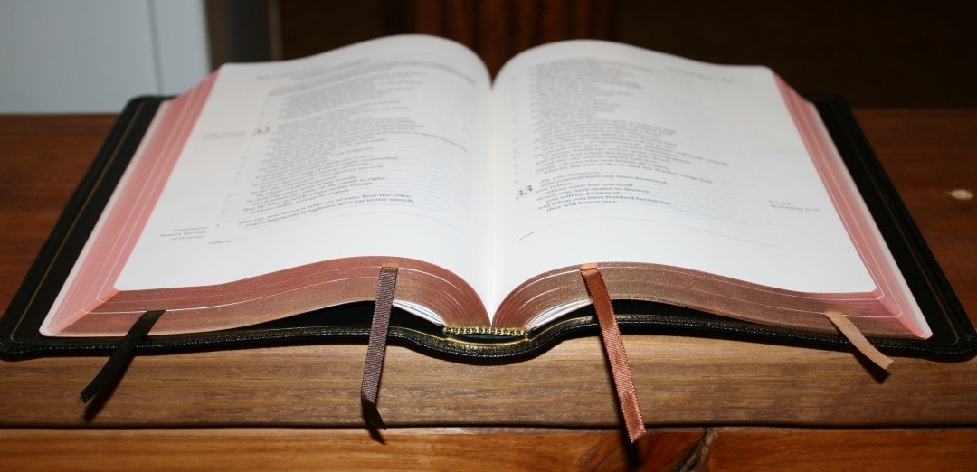
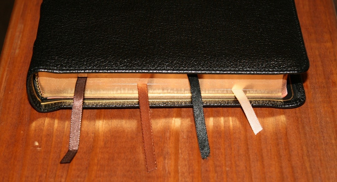
It comes with 4 ribbons: black, dark brown, light brown, and beige. The ribbons are thin. I used to want thicker ribbons for this Bible, but I find that the thinner ribbons stay out of the way better than the thicker ribbons. I like that the 4 ribbons are different colors. They’re long enough to pull to the far corner and open the Bible.


The overall size is 9.75″ x 6.5 x 1.25″. It weighs 2 lbs, 4.1 oz. It feels balanced – not too large, not too thick, and not too heavy. This is a good size to hold, carry, and read from.
Paper
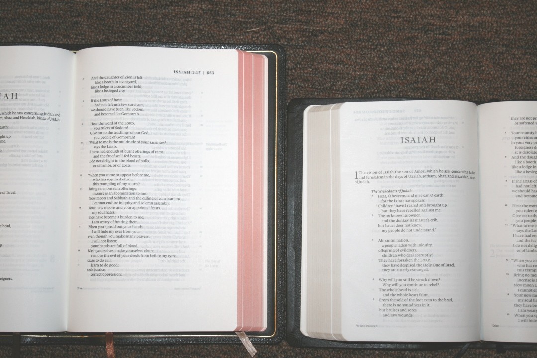
The paper is 28 gsm Indopaque. It feels thicker and it’s as opaque as some paper with a higher gsm. This is the same paper that’s found in the Schuyler Personal Size Quentel, Personal Size Canterbury, Cambridge Turquoise, and many others. It’s coated and has a slight cream color and that texture and is great for reading. It has the perfect contrast with the ink. I had no issues turning the pages. I’m sure the coating helps with that.
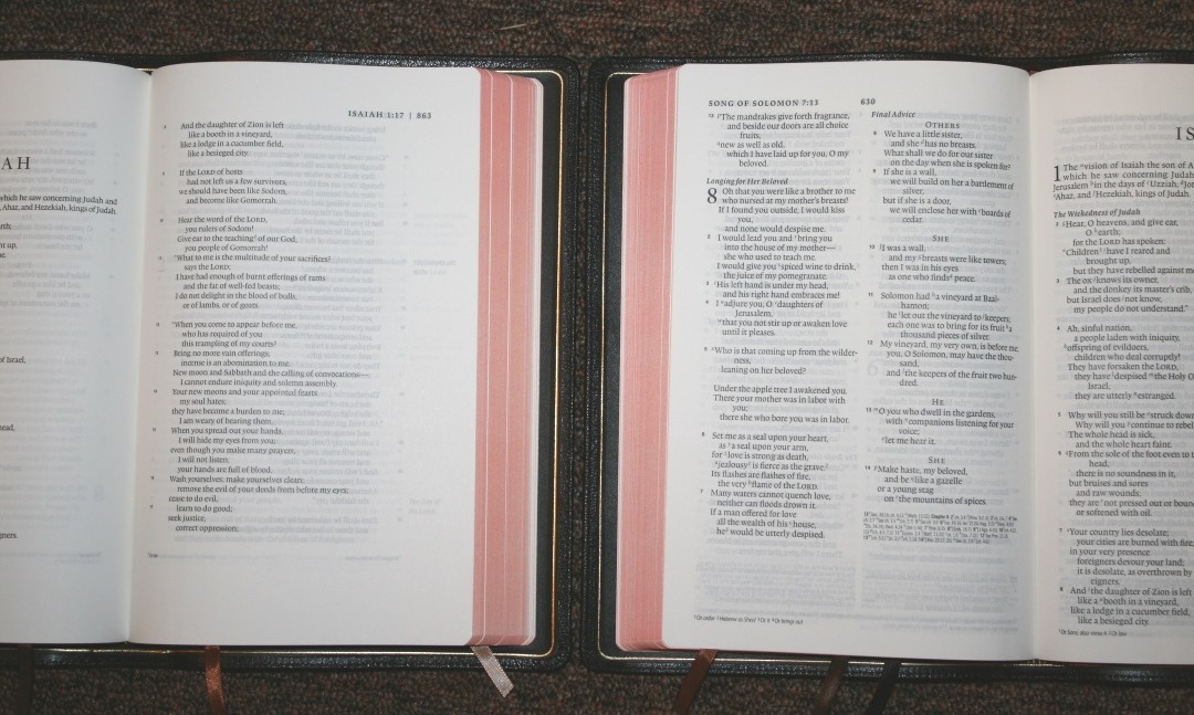
It does have some show-through, but it’s not bad. Indopaque is my favorite of the thinner papers for Bibles and it was a great choice for this Bible. In my experience, this paper doesn’t crinkle as bad as most Bible paper. The red under gold art-gilt has a dark salmon look and adds to the elegance.
Typography

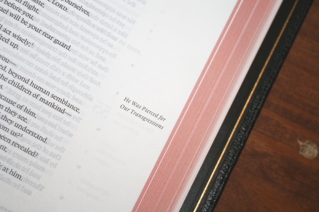
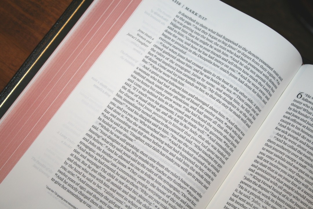
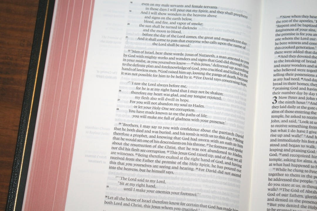
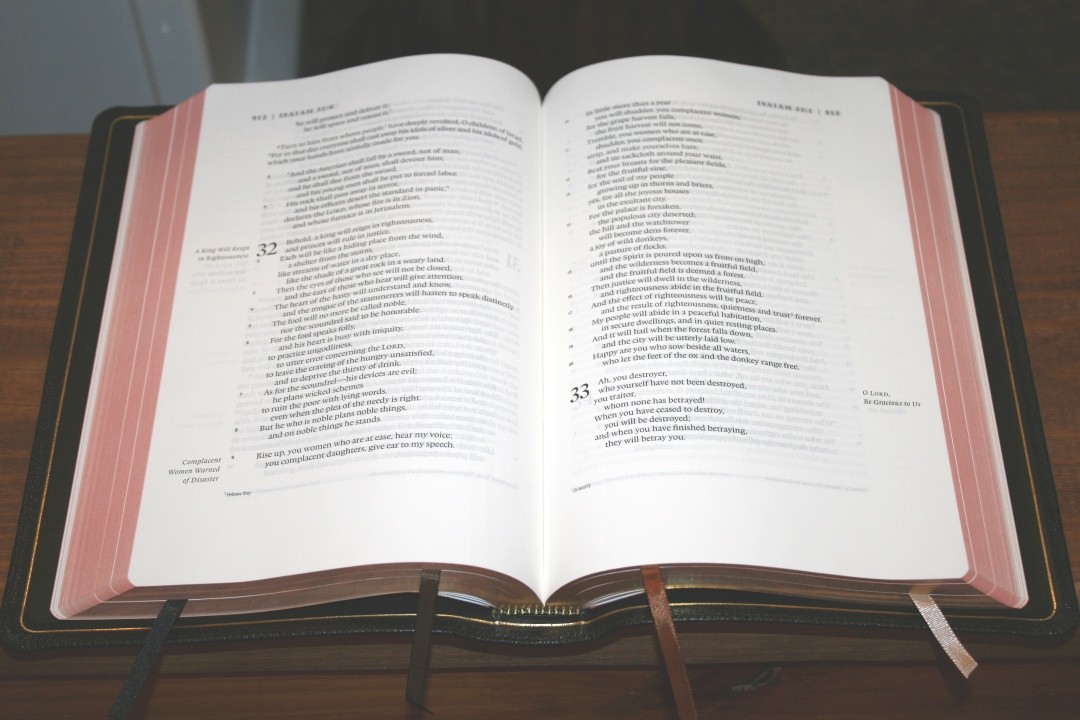
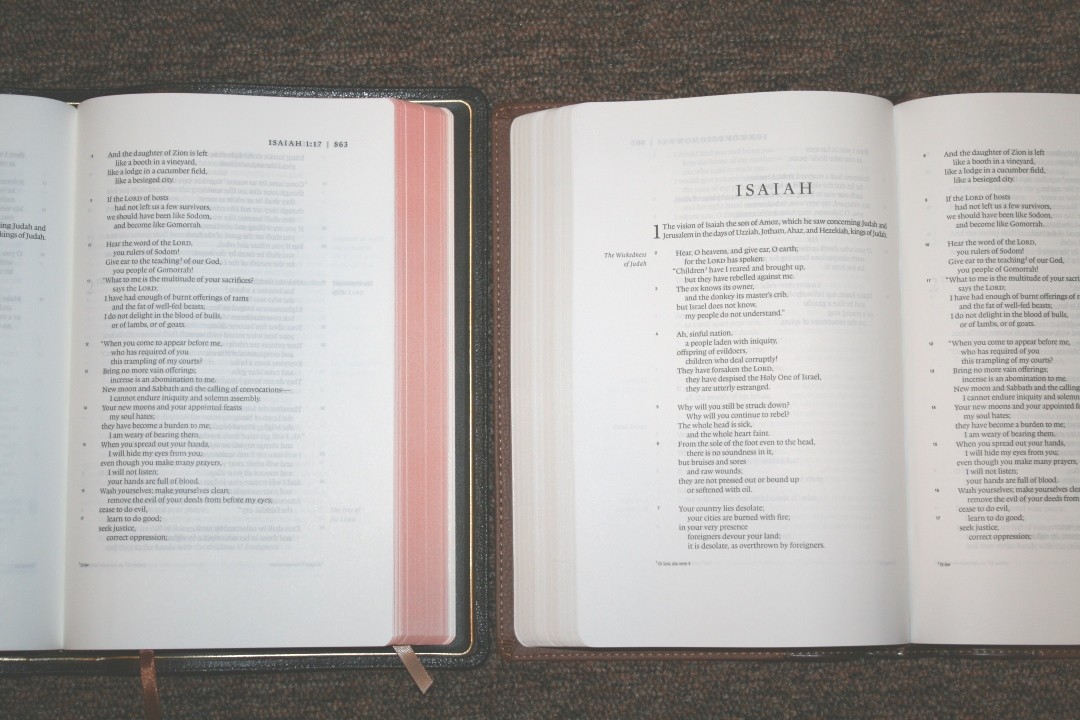
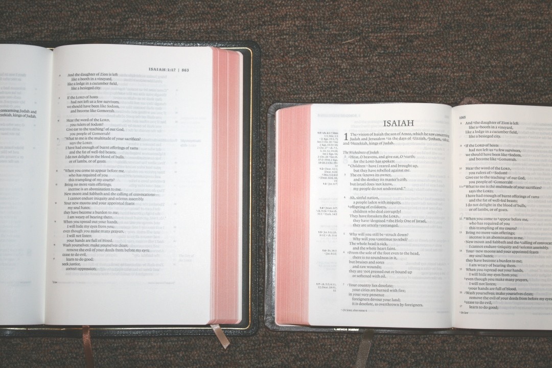
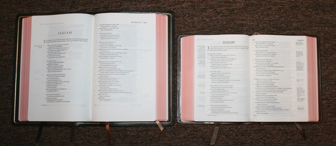
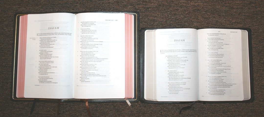
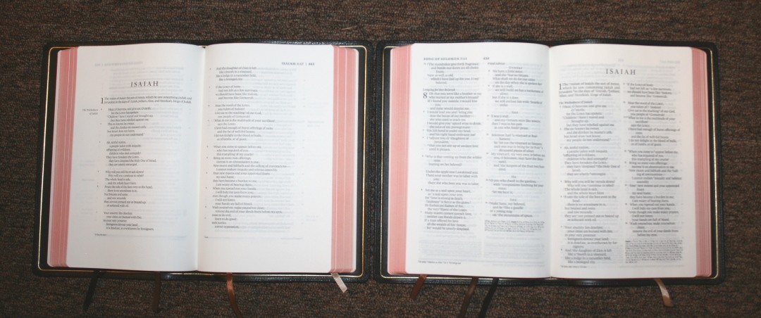
The text is presented in a single column with poetry in stanzas. The header shows the page number in the far outer corner and the book name, chapter number, and verse number of the first verse that starts on that page in the outer margin. Section headings are moved to the outer margins so they don’t interrupt the text. The footer contains the translation footnotes.
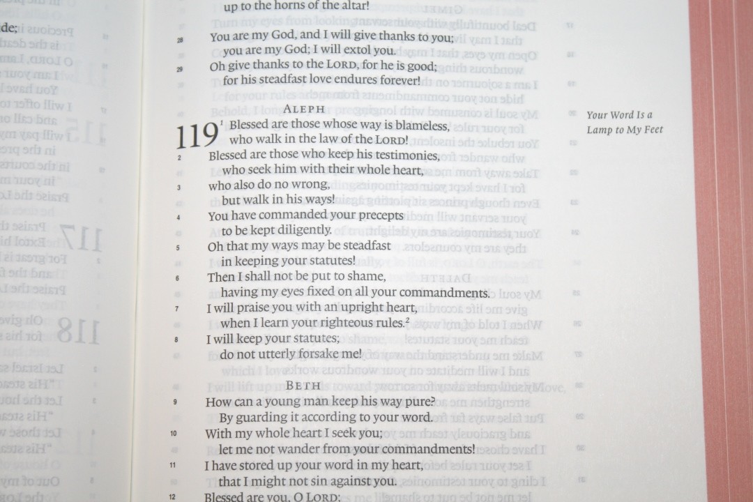
The font is a black-letter 9-point lexicon with a 10.75 leading. The size and spacing are excellent for reading and underlining. It’s sharp and dark, and it’s extremely consistent throughout the Bible. It does include numbers for the footnotes, but I don’t find them distracting. The verse numbers are superscript in about a 5-point font. They’re not bold, but I had no issues finding them quickly due to the space around them.
It has around 74 characters across with around 14 words per line. The column of text is 4″ wide, which is a little wide for my taste, but this also makes the poetic settings look the best they possibly can, so I’m willing to make that trade. In my dream world, the poetic settings would be 4″ and the prose would be closer to 3-3.25″.

It’s printed with line-matching so each line is printed in the same location on the page. This helps reduce the effect of show-through. The show-through is mostly visible in the poetic sections. Fortunately, the paper is opaque enough that the line-matching doesn’t make the text too gray.

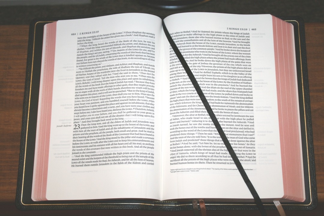
The layout was designed with the idea of the Renaissance perfect page, which has around a 2:3 ratio page geometry. This is an excellent layout for reading. For preaching, I sometimes lose which line I’m on because of how long the lines are. Fortunately, the spine isn’t too thick which would cause the lines to bend into the gutter. These lines remain mostly flat on the page, which helps a lot. Holding an index card under the line you’re reading helps to keep your place.
Following the Renaissance perfect page design, it has wide margins around the text to give is space. The outer margin has 1.25″, the inner has around .625″, the top has 1″, and the bottom has .875″.
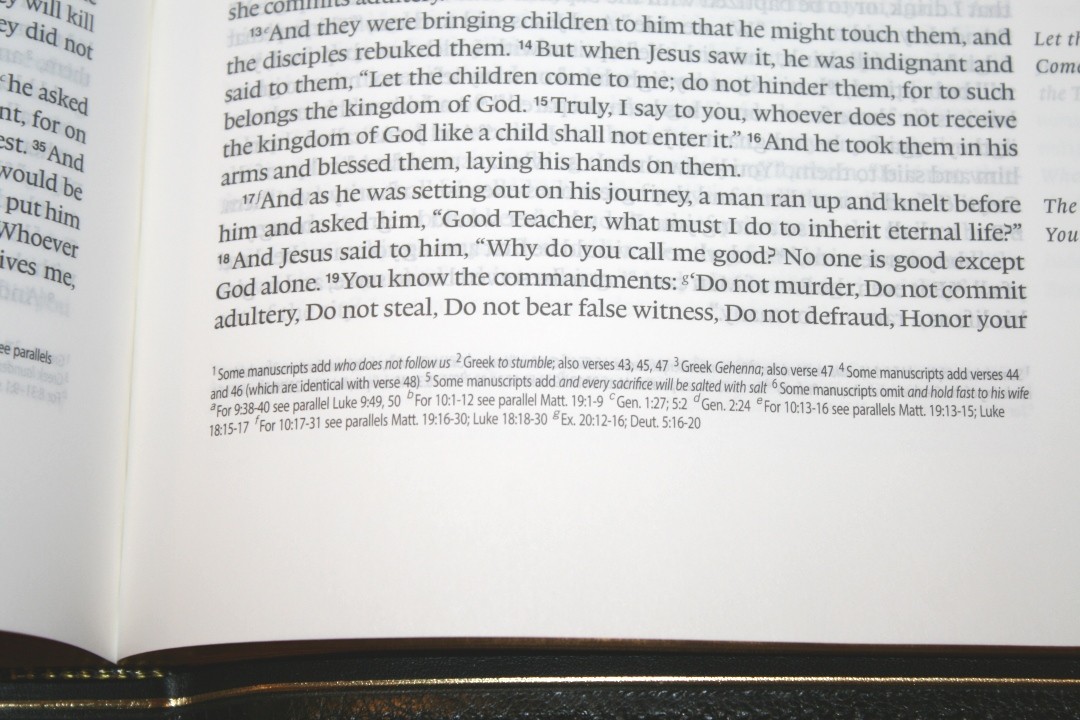
Translation notes are placed in the footer and include the numbers to key it to the text. They include information on the Hebrew, Greek, Septuagint, weights and measures, parallel passages, OT references in the NT, translation variants, etc.
I find the distractions and road-bumps in the text to be easy to ignore, making this an excellent reading Bible. Since it does include the chapter numbers, verse numbers, footnotes with keys, and section headings in the margins, it’s still usable for study and to follow along in Church.
Presentation Pages
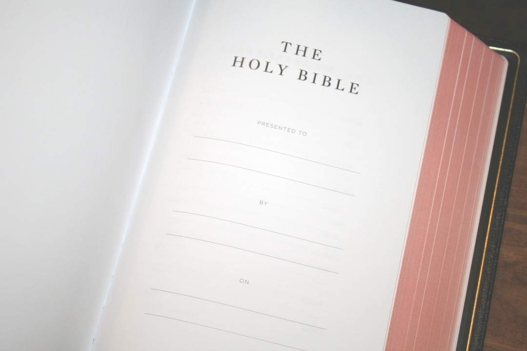
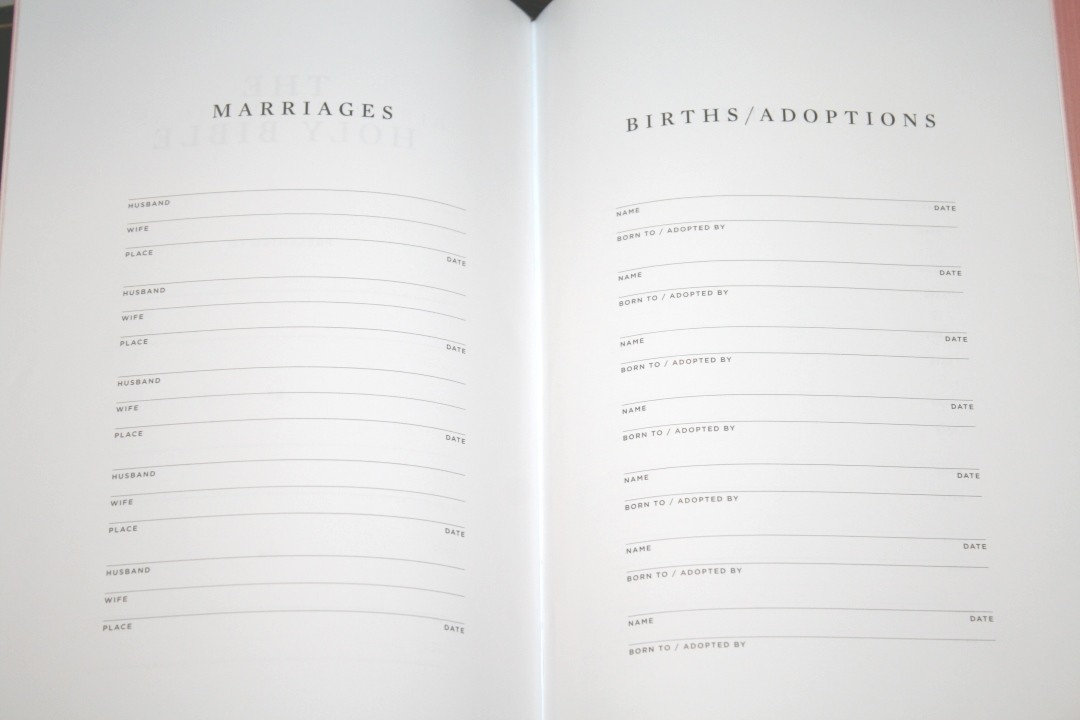
Pages in the front include Presentation, Marriages, Births/Adoptions, and Deaths.
Table of Weights and Measures
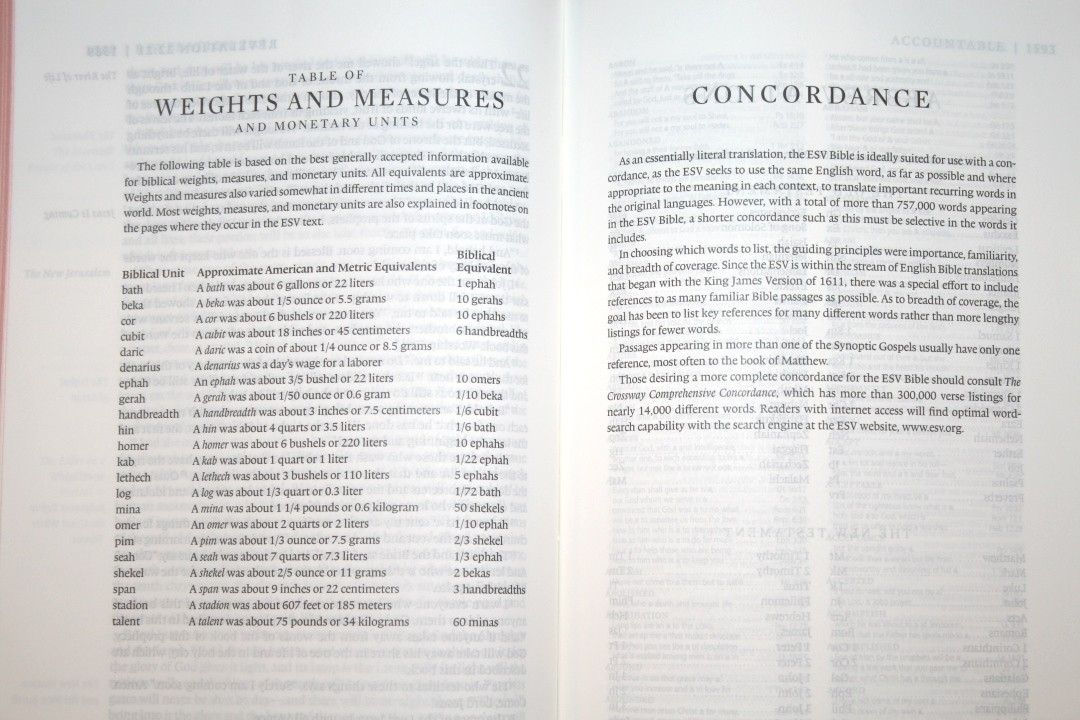
This is a one-page table that shows the biblical unit, approximate American and metric equivalents, and biblical equivalent. Most are also placed in the footnotes, but it’s still helpful to have it in a table.
Concordance
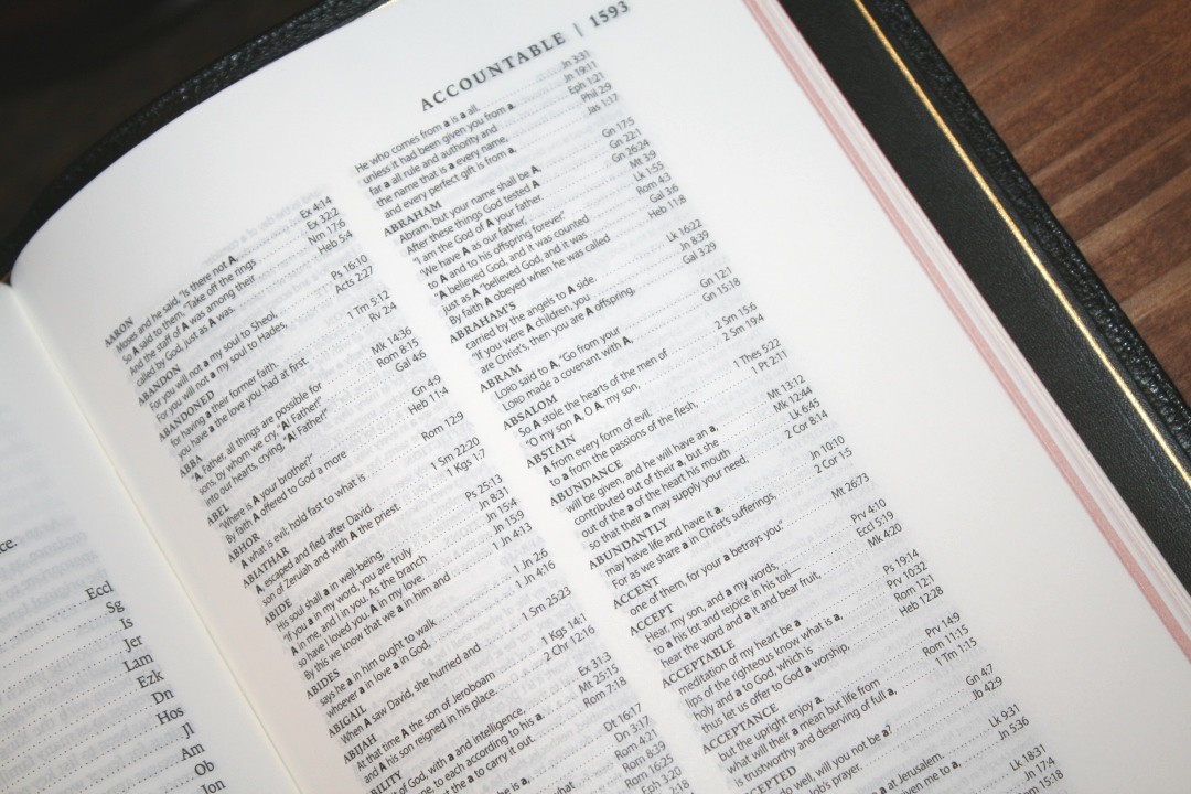
The concordance is 71 pages with 2 columns per page. It’s a decent concordance with enough references for sermon prep and study. The concordance also includes wide margins so you can add even more references if you want. This would even be a good place to add word studies. Here are some sample entries and the number of references given:
- Christ – 16
- Christ’s – 4
- Christian – 2
- Faith – 28
- Faithful – 10
- Faithfulness – 6
- Faithless – 1
- God – 49
- Godliness – 4
- Godly – 3
- Gods – 2
- Praise – 19
- Praised – 2
- Praises – 2
- Pray – 11
- Prayer – 10
- Prayers – 6
- Praying – 3
Maps

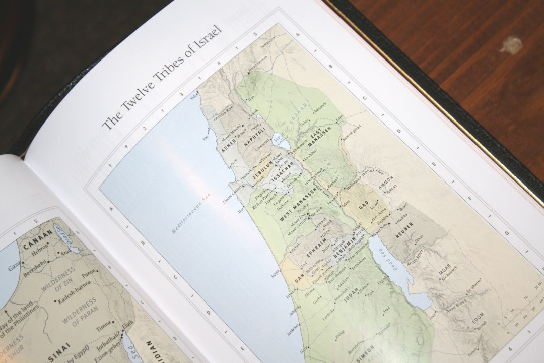

There are 8 pages of maps printed on thick glossy paper. This isn’t my first choice because glossy paper shows glare from lights. The colors are earth-tones, so there aren’t any bright colors here. It doesn’t include an index but the maps are annotated and labeled well. They include routes, distance, borders, rivers, kingdoms, references, dates, and simplified topography.
Maps include:
- The World of the Patriarchs
- The Exodus from Egypt
- The Twelve Tribes of Israel
- Israel Under Saul, David, and Solomon
- Jerusalem in the Time of Jesus
- Palestine in the Time of Jesus
- Paul’s First and Second Missionary Journeys
- Paul’s Third Missionary Journey and His Voyage to Rome
Comparisons
Here’s a look at how the Heirloom Legacy looks next to the original Single Column Legacy, Clarion, Single Column Heritage, and Heirloom Omega.
Single Column Legacy

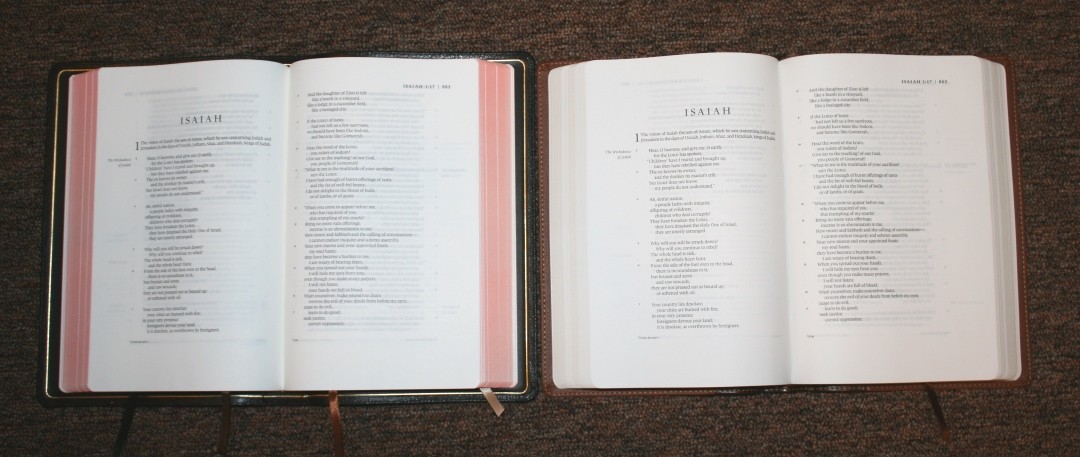
The original Single Column Legacy has the same layout but different materials. It was made by LEGO and had 36gsm paper, which was more opaque but also made the Bible thicker. It’s not as elegant but it is an excellent choice.
Clarion
The ESV Clarion also has a single-column layout. It’s a reference edition, so the margins are taken up for that. It’s a shorter Bible, which I find easier to carry and hold. The paper isn’t as nice and the block is thicker, which can sometimes feel unbalanced.
Single Column Heritage
The ESV Single Column Heritage is a lot shorter and I find it easier to carry. It isn’t an elegant Bible like the Heirloom series, but it is a nice single-column text edition that’s easy to carry, hold, and read.
Omega Heirloom
The Omega Heirloom has about the same footprint, but it’s thinner and has a larger font due to its 2-column setting. It also has references. Prose looks great, but poetry just can’t compete with a single-column design.
Conclusion
The Heirloom Legacy is an elegant Bible in every way possible and it’s an improvement over the last edition with better paper and a better cover. The paper looks amazing and helps keep the size and weight down. The layout is the star of the show, providing the best poetic setting available and creating a nice readable Bible. The cover is everything you’d expect from a Jongbloed goatskin Bible. I especially like the gold line that frames the inside of the cover. It’s a simple touch, but it makes the design look finished.
The layout of the Legacy is the best compromise between a true reader’s edition and an edition with chapter and verse numbers. The chapter and verse numbers, as well as footnotes and section heading, are here so you can follow along in study, and they’re easy to ignore while reading. This current edition is the best version of the Legacy. I highly recommend the ESV Heirloom Legacy to anyone looking for a premium ESV that focuses on readability.
______________________________________
Buy from Amazon
______________________________________
Photography by hannah C brown
Crossway provided this Bible in exchange for an honest review. I was not required to give a positive review. My opinions are my own.