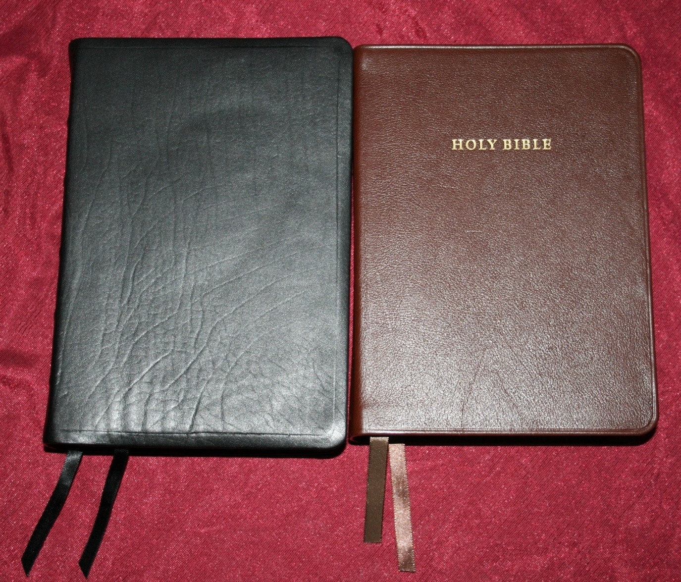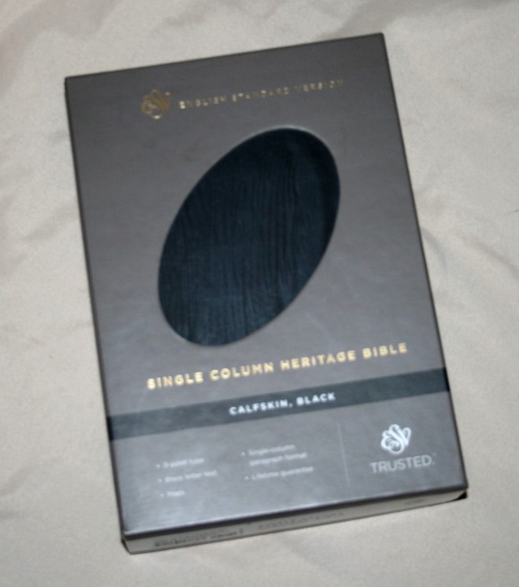
The Single Column Heritage Bible from Crossway is a hand size edition that is the perfect size for reading. It has a single-column paragraph layout and a large enough text to read comfortably, and it’s the perfect size for carrying and holding in one hand.
Pros
- Hand size
- 9-pont font
- Edge-lined calfskin cover
Cons
- Doesn’t lay flat in Genesis
Features
- ESV
- Black calfskin cover
- Raised hubs on the spine
- Leather liner
- Sewn binding
- Single-column
- Paragraph format
- 9-point font
- Black letter
- Line matching
- 2 ribbons
- Presentation page
- Family information pages
- Translation notes
- Maps
- Gilted edges
- ISBN: 978-1-4335-3738-7
- Made in China
- $95
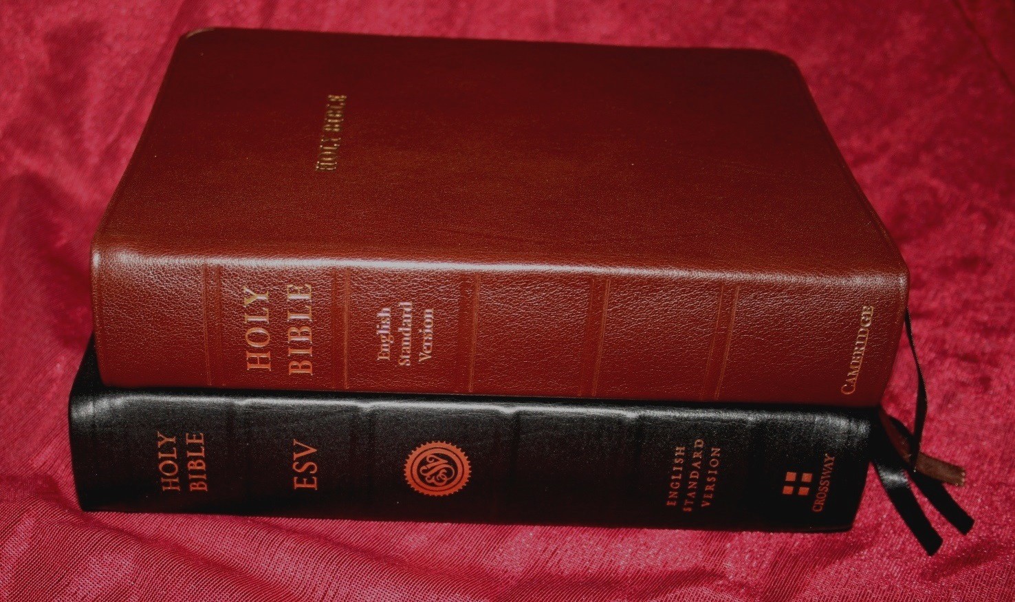
Cover and Binding

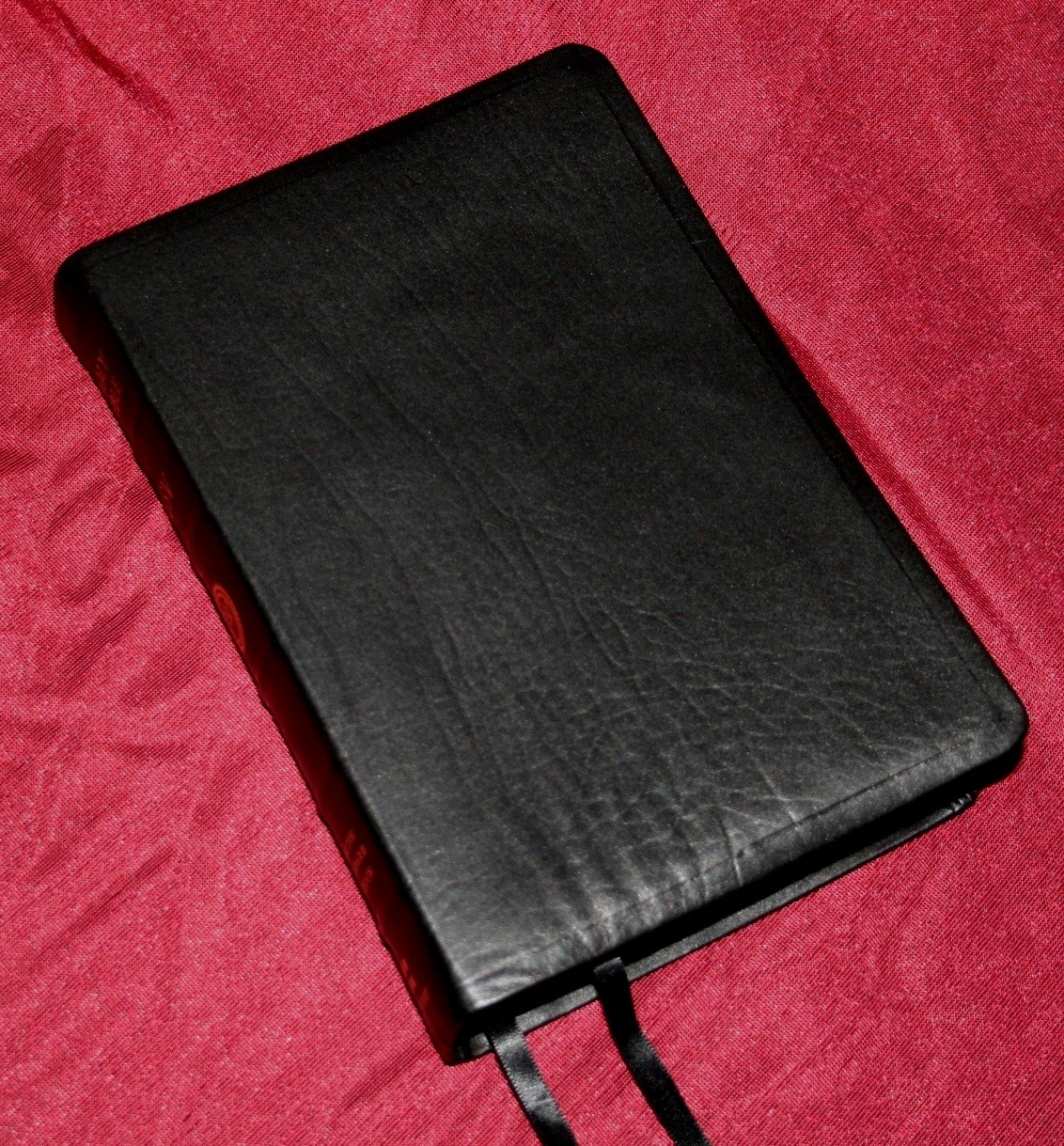
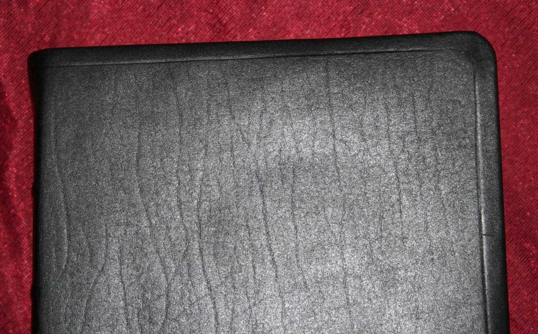
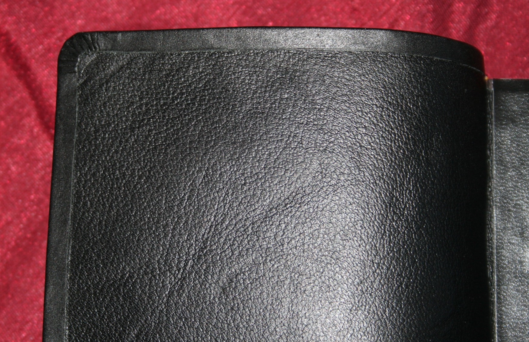
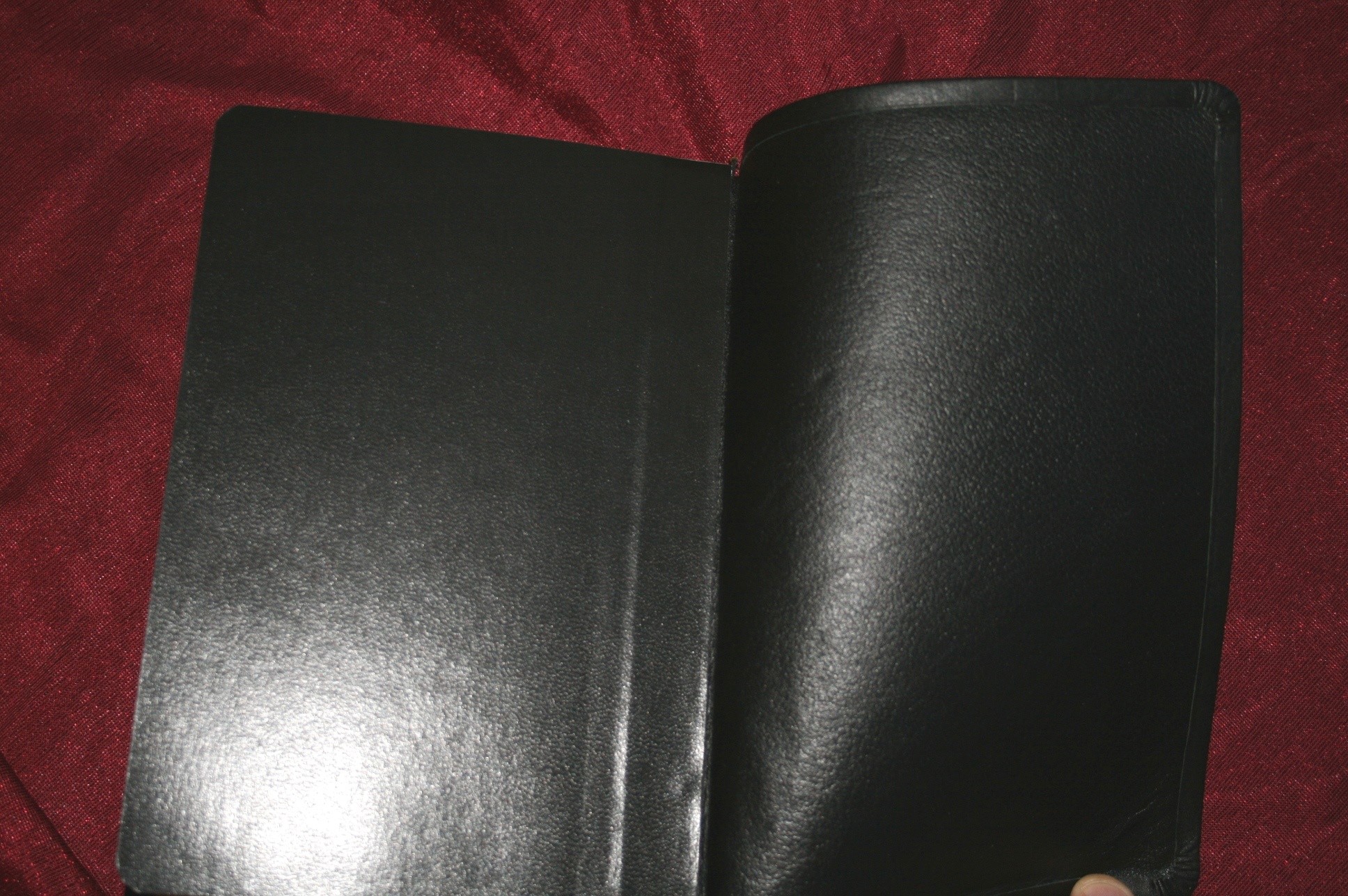
The cover on the edition I’m reviewing is black calfskin leather. It’s very soft. The cover wrinkles when bent. It also has a leather liner. The cover is glued to the liner rather than stitched. The outside edges fold back in over the liner. It looks clean.
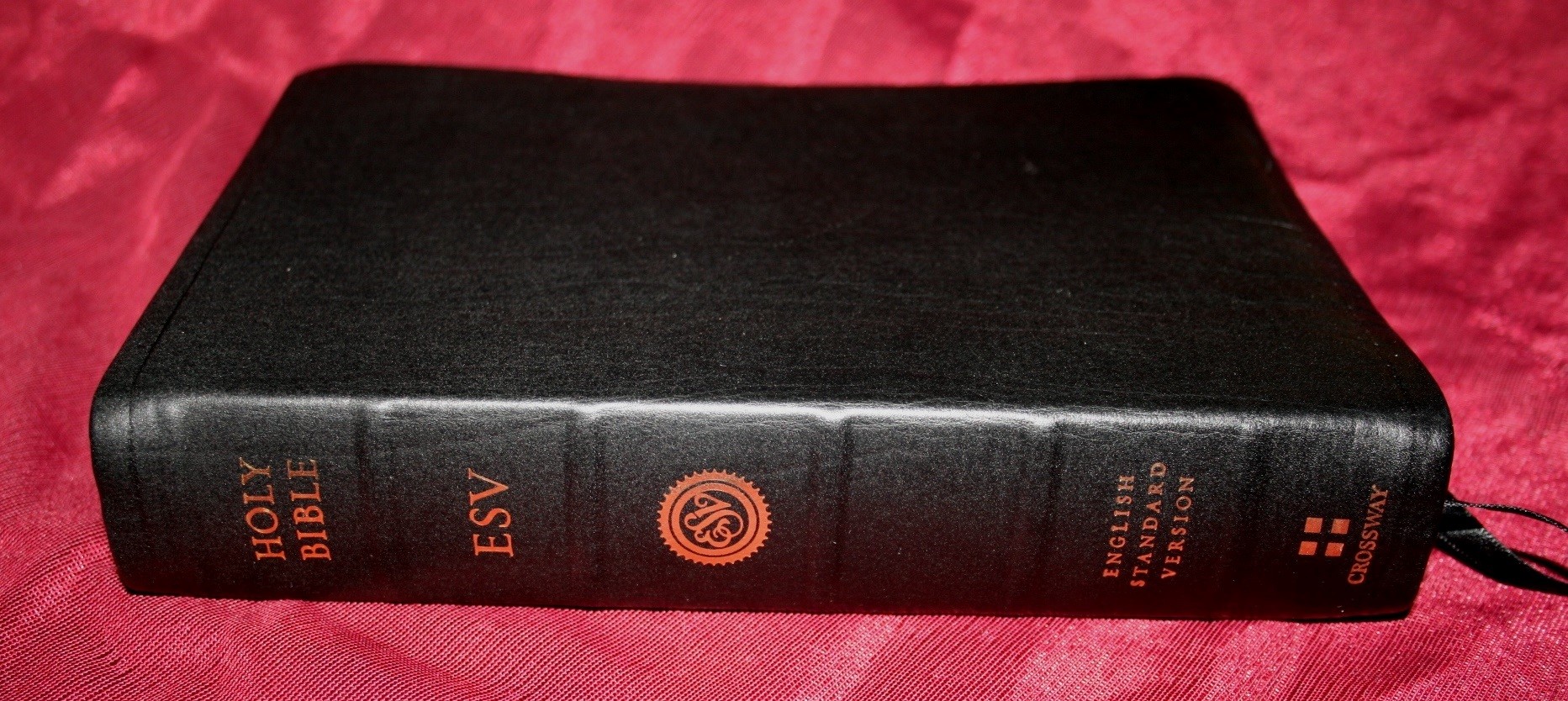
The spine has raised hubs, which I like a lot. I don’t know why, but raised hubs gives a Bible a look of quality in craftsmanship. It feels expensive and old-world. The raised hubs on this cover look as good as any I’ve seen and fit this Bible nicely.
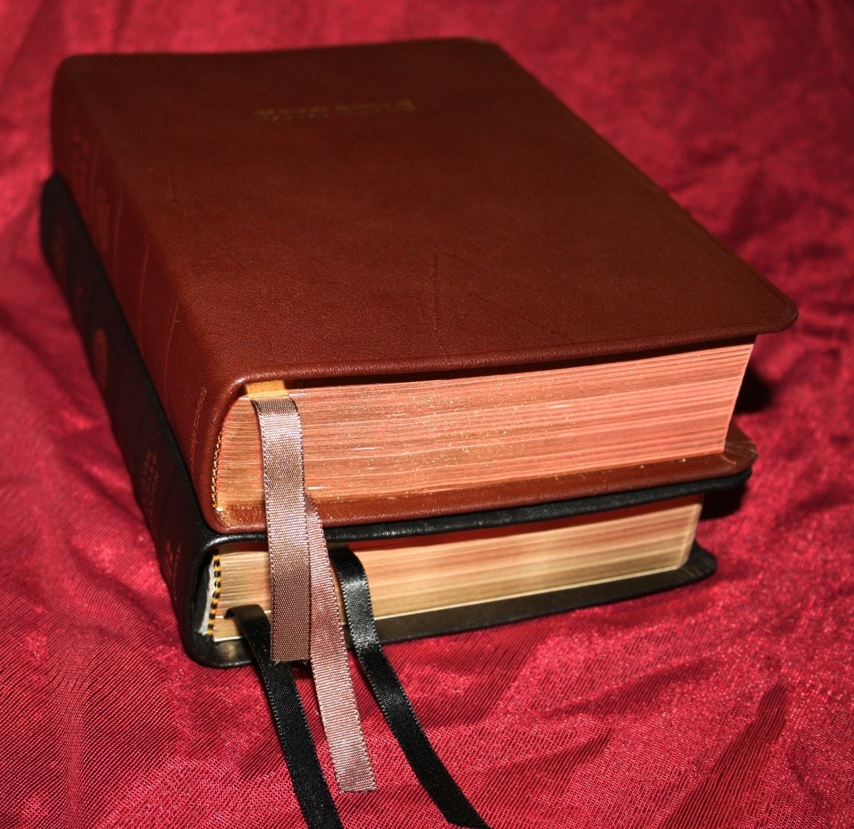
The binding is sewn. It has trouble lying flat in Genesis and Revelation. It starts to lay flat somewhere in Exodus.
Paper and Print
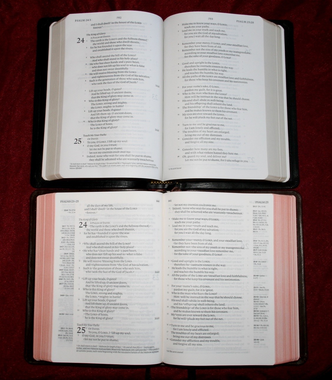
The 9-point font is very easy to read. It’s between a medium and semi-bold, which is just the right amount of boldness for me. The print quality is consistent throughout so there is no fading. There is also a lot of space between the lines. It’s at least a 10-point leading but it could be more. It has line-matching which greatly improves readability. This is a very readable text.
The paper is not as opaque as I would like. It has a white tint and is thicker than the Clarion, but has about the same opacity. I prefer the cream tint of the Clarion to the white tint, but that’s me. The white looks fine and the paper quality isn’t bad. I’m not sure of the gsm, but it’s not too thin.
Layout
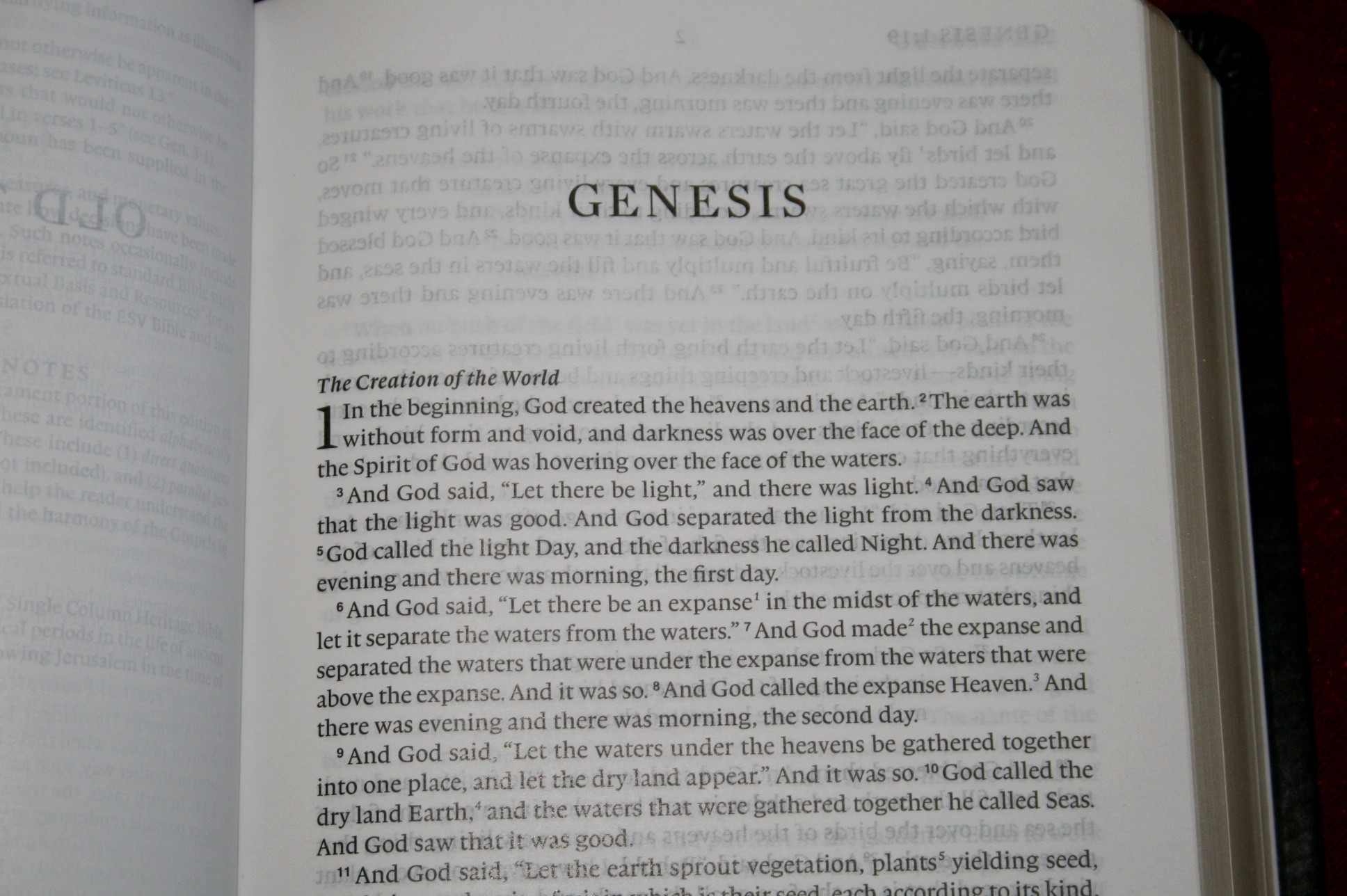
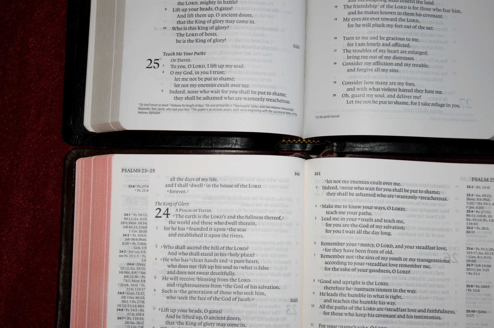
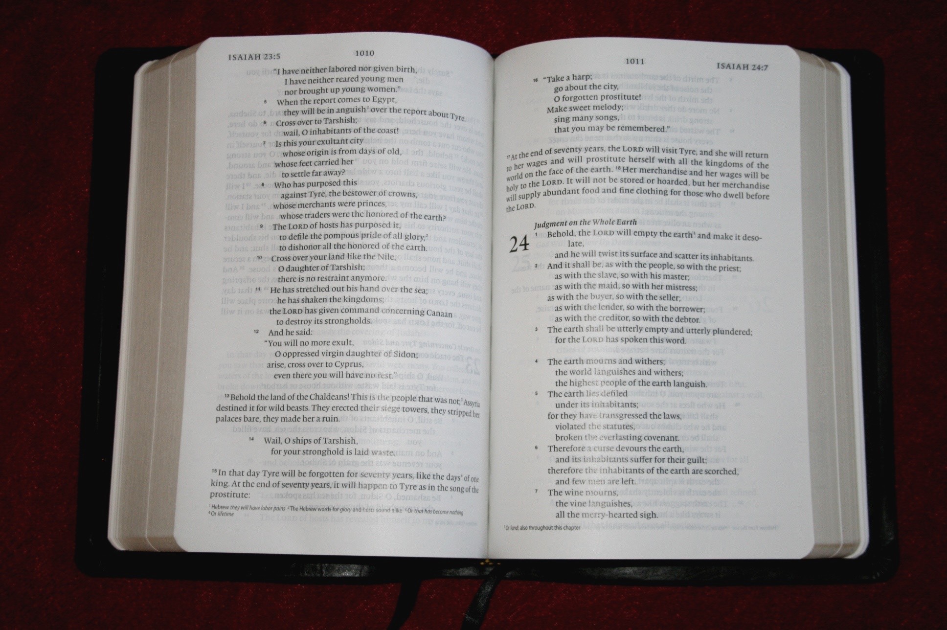
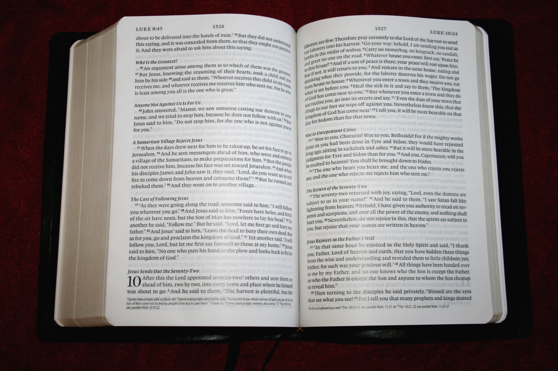
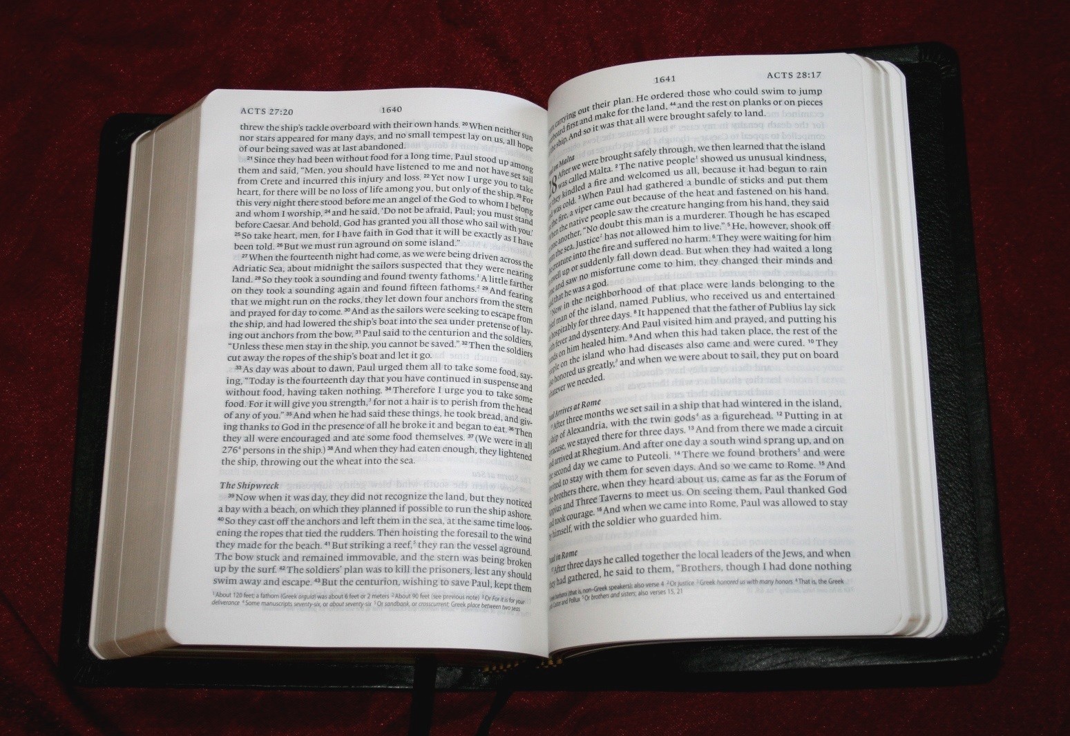
The text is presented in single-column paragraph format. Poetry is set in verse format. Old Testament quotes are also presented in verse format so they stand out really well. New chapters are indicated by very large chapter numbers. At the top of the page is the range of verses that appears on those pages. Verse numbers within the text are in smaller font than the Scriptures. There is a lot of space between the verses. This makes the verse numbers easier to find. I usually have trouble tracking down a specific verse in paragraph format, but this one is easier than most. Translation notes appear at the bottom of the page. They are keyed to the text with numbers. Section headings are in italics. They stand out nicely without being distracting.
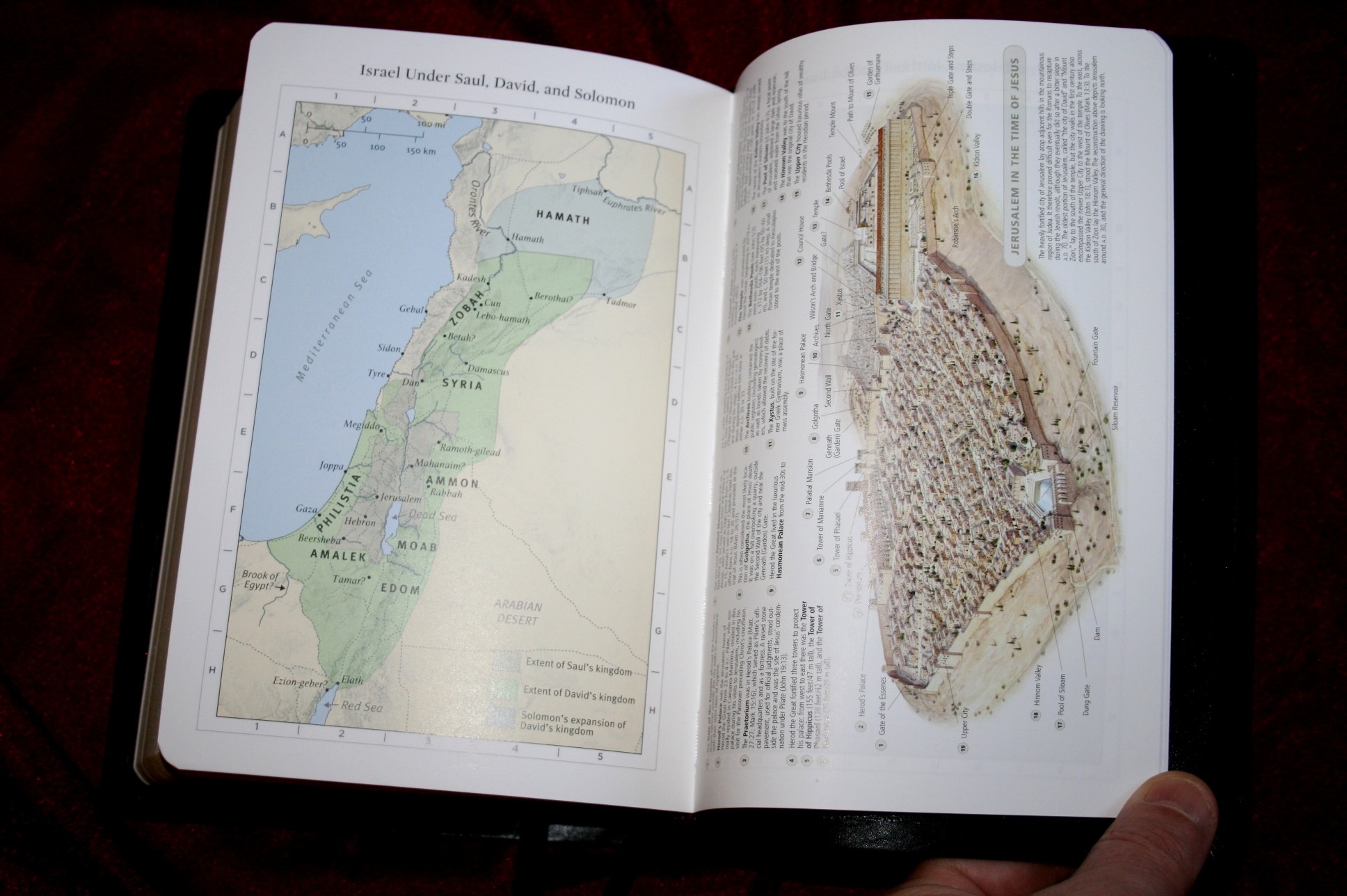
Maps
There are 8 color maps in the back. The colors are mostly earth-tones of green and tan. They’re the same maps found in the ESV Study Bible. I would like to see an index. That would make them more useful.
Ribbons
There are two black ribbons. They feel silky and they’re more than long enough to be useful.
Conclusion
For its size and price I can’t help but compare it to the Cambridge Clarion. The Clarion is slightly smaller, has an 8.75 font, references, and a concordance. The Single-Column Heritage is a little taller, has a 9-point font, and no references or concordance. Between the two, for the $100 price range, the Clarion gives you more (unless you’re not interested in a concordance or references). However, if you’re considering the imitation leather editions around the $40 price range the Heritage is hard to beat.
Crossway provided this Bible free for review. I was not required to give a positive review- only an honest review.

Here are a few comparison photos of Crossway’s Single Column Heritage and the Cambridge Clarion: