

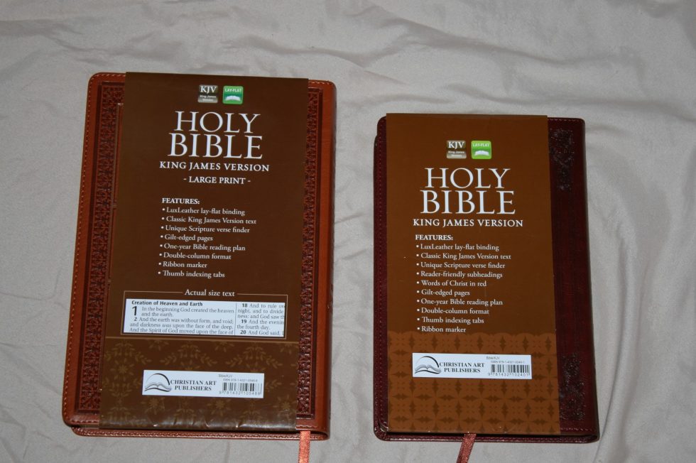
Christian Arts Publishers produces a variety of affordable KJV’s with sewn bindings and nice print. Among these editions is this regular and large print combo. These Bibles have the same font style, layout, paper, and features so I’ve combined them into one review so you can see how they compare.

Binding
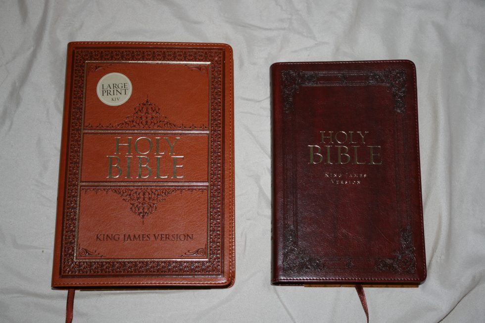
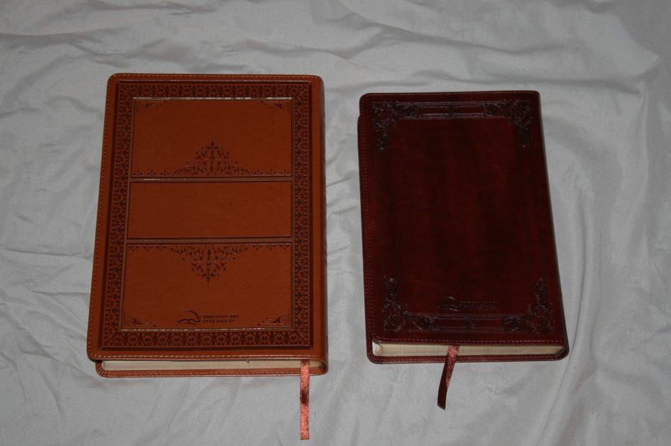
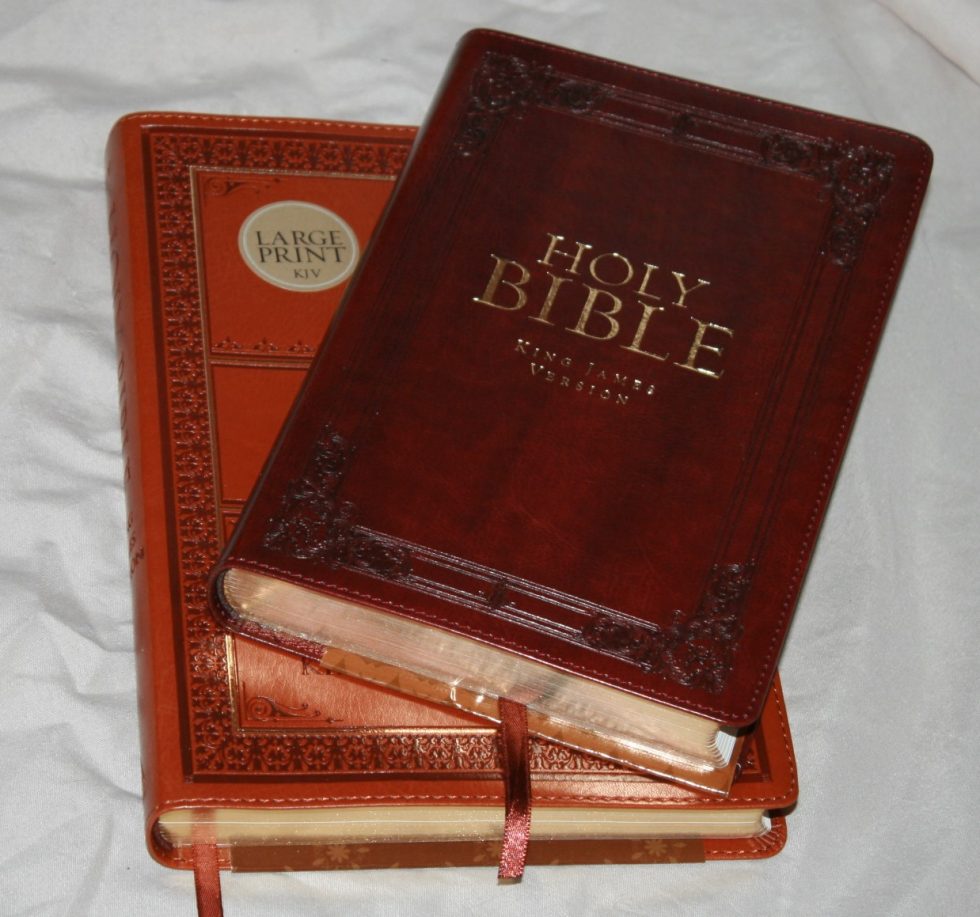
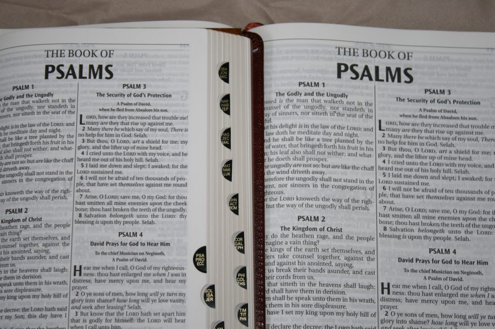
The covers are LuxLeather, which is their version of polyurethane. These are some of the most beautifully ornamented covers that I’ve seen. They have eloquently designed stamping patterns and rich colors that are bold and have a nice texture. The large print is tan and the regular size is a burgundy.
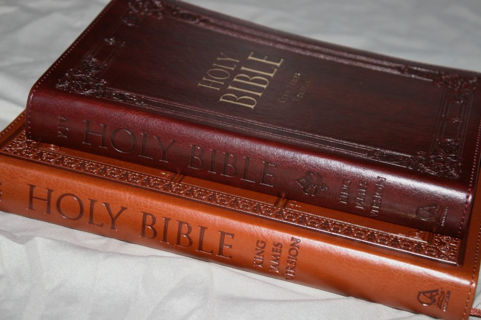
Both have Holy Bible stamped in gold. The large print has a gold outline around the front while the regular edition has King James Version in gold. They have a gorgeous grain. The spines are rounded and are embossed with Holy Bible and the logo.
They have a paper liner and are stitched around the perimeter. They’re sewn but the stiffness of the covers want to close in Genesis until they are broken in. The covers don’t want to close all the way. They also keep an imprint if something is sitting on top of them. The imprint does go away after a while.
Both have a mahogany ribbon and thumb-index.
The overall sizes are:
- Regular = 8.6 x 5.5 x 1
- Large Print = 9.6 x 6.5 x 1
Paper
The paper is cream and I’d guess it to be low 30’s in gsm. It doesn’t have a glare and it has that slightly rough texture that I love. This is the same paper as in my older Holman NKJV Minister’s Bible and the Hendrickson Large Print Ultrathin. I’ve had no issues with turning the pages or with page-curl.
The opacity is lower than I’d like. It isn’t that noticeable where the lines match, but most of the lines don’t match and the show-through can be distracting. Increase opacity (or at least line-matching) would greatly improve readability. I love this layout and print enough to use it anyway.
Typography
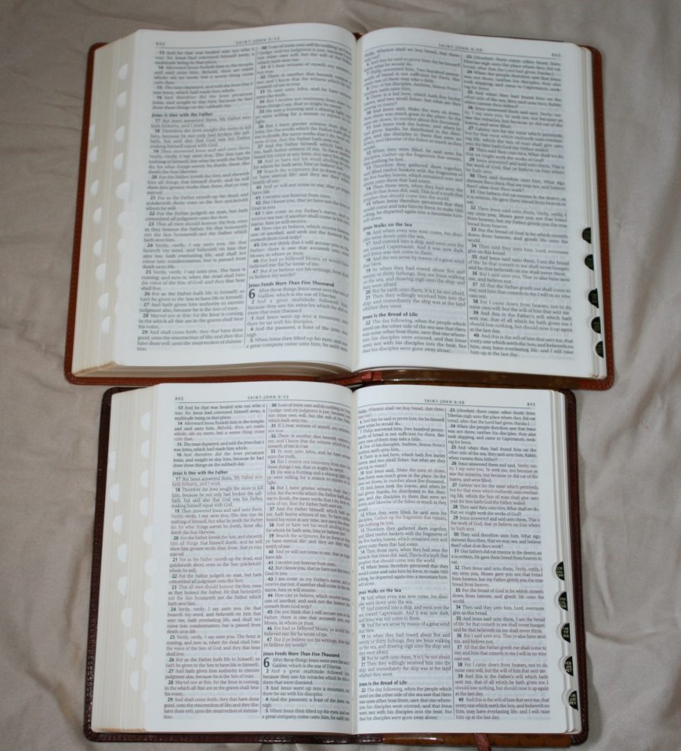

The text is presented in verse-by-verse format in double column. Verse numbers are indented and are in bold, making them more than easy enough to find. Chapter numbers are used as the drop-cap and they’re also in bold. There are lots of bold section headings throughout the text. Genesis 1 has 8, with each day having its own heading, which makes the topics easier to find and the page easier to scan.
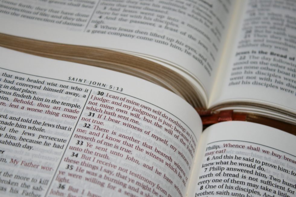
The font is sharp and has no pronunciation marks. It does have italics for supplied words (which I prefer). The print is medium dark and is consistent throughout. This is a highly readable typeface. The font in the regular edition is around 8.5 point and is red letter. The red is dark and looks burgundy. I love this red. The large print is around 9.5 and is black letter.
There are around 50 characters per line with around 9 words per line. A lot of lines have some extra space between words. Most are fine and fall within my preference. There are a few that almost have too much space but I prefer this to having a lot of hyphens. Genesis 1:1 Has 3 hyphens, which is far less than average.
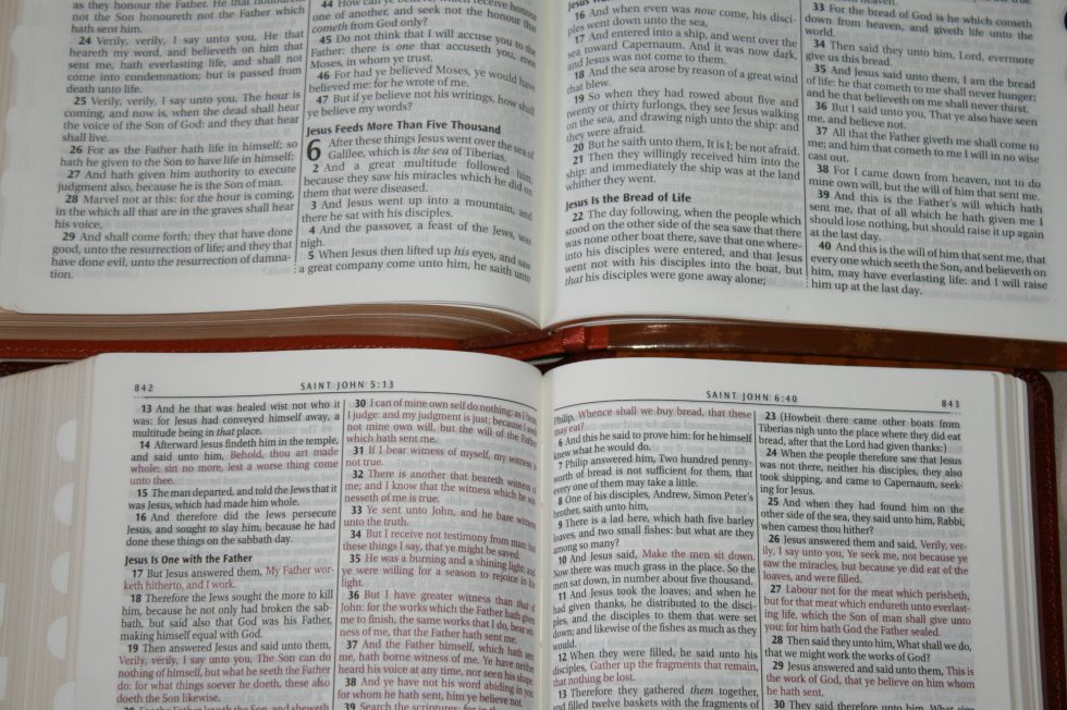
The header contains the book name, chapter, and verse numbers in the center and page numbers in the outer corners. I find this more difficult to preach from and I prefer them in the outer corners. Books start on the page where the previous book ended if there’s enough space. The inner margins are large enough to mostly bring the text out of the gutter. What little bend there is isn’t enough to worry about.
There are decorative lines separating the columns and the header. The outer edge of the line under the header and the bottom of the line between the columns ends with three dots. Above the book name is another line with three dots in the middle instead of the end. These little details makes the layout feel more refined.
These are text-only editions, so there are no references or footnotes. I do love text-only editions because the focus is on the text. I would like to see the translators’ footnotes added back in though as they are part of the translation.
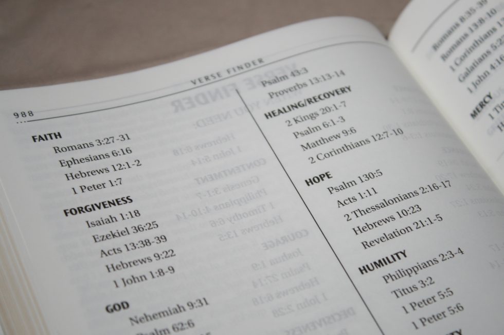
Verse Finder
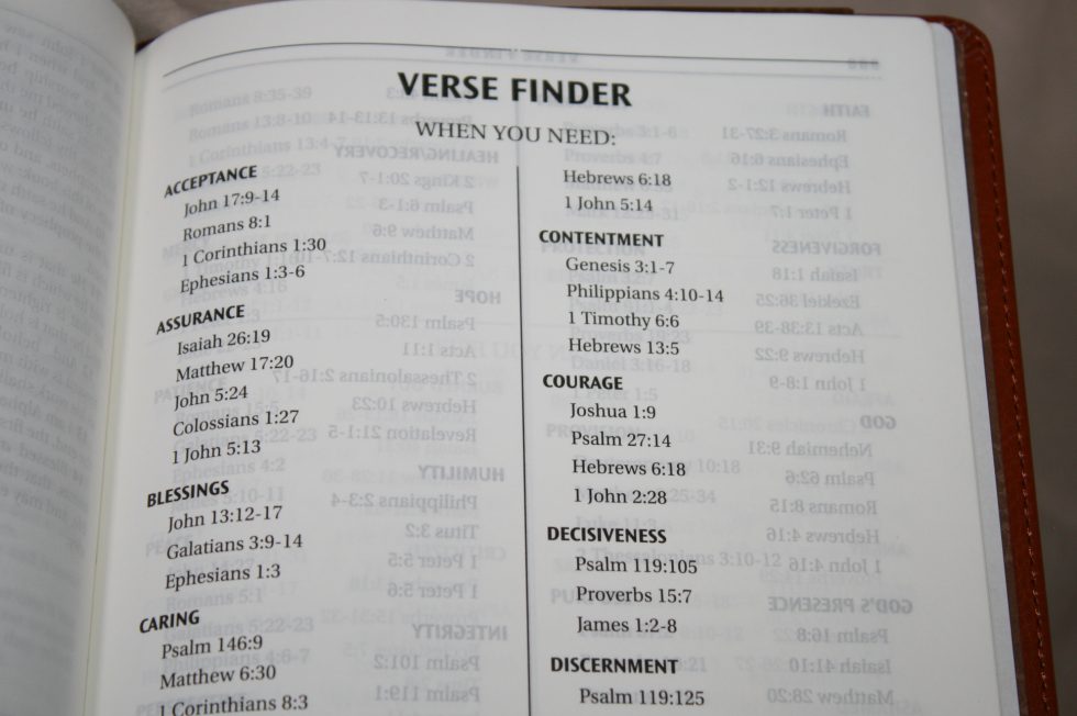
This is a small topical index with three major groups:
- When You Need
- When You Feel
- What the Bible says About
Within the groups are subtopics such as courage, hope, joy, peace, depressed, sad, weak, abortion, angels, creation, cults, legalism, purity, success, worship, and lots more. Most have around three verses per topic. It isn’t an extensive index but it would be good for simple study.
Reading Plan
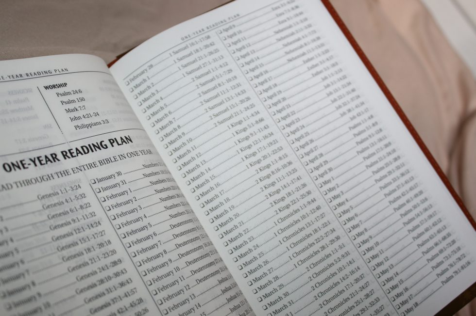
The reading plan takes you through the Bible in one year in biblical order. Each day shows the month, day, reading, and has a box for you to check when you’ve completed the reading.
Using Them
I’ve carried the regular edition around and found that it’s great for carry and reading on the go. I love the size of the regular edition but I prefer the font size of the large print. I love preaching and reading from the large print. The large print isn’t too large to carry but I almost always grabbed the regular print to take with me. Both Bibles are light weight and are easy to hold for long periods of time. They make a great combo for those times you need a different size but want the same pagination that you’re used to.
Conclusion
Christian Arts Publishers’ regular and large print KJV’s are excellent Bibles. The covers are decorative and the sewn binding and quality print makes them great candidates for rebinds. Although it could be more opaque I love the paper. It has my favorite color and texture. I’d like to see them available in non-thumb-index editions. I would also like to see the translator’s footnotes included. For the money they make a great combo and I highly recommend them to anyone looking for a KJV combo at a reasonable price.
Photography by hannah C brown
Christian Arts Publishing provided these Bibles free for review. I was not required to give a positive review – only an honest review. My opinions are my own.