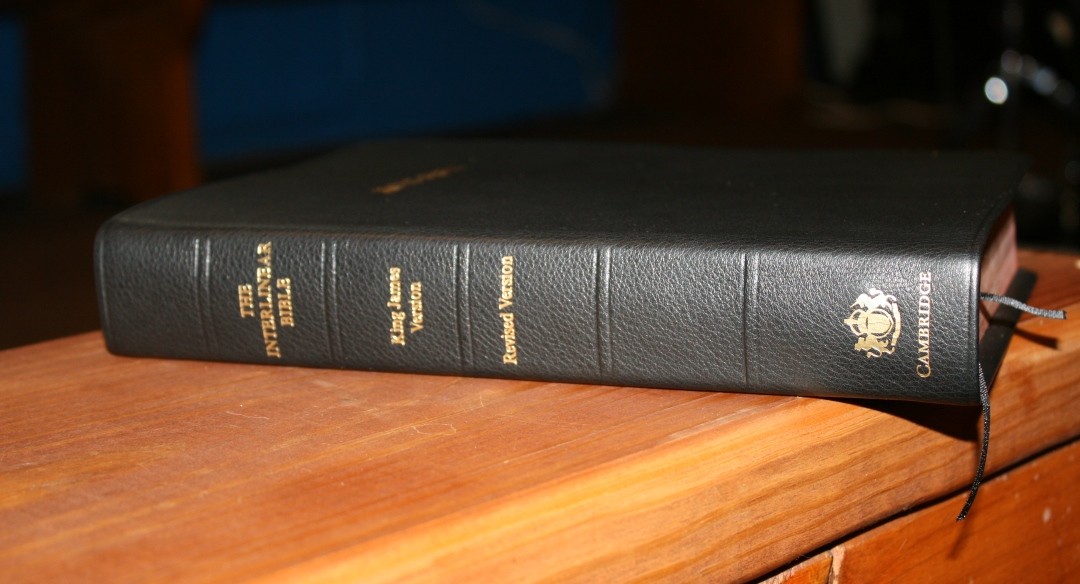
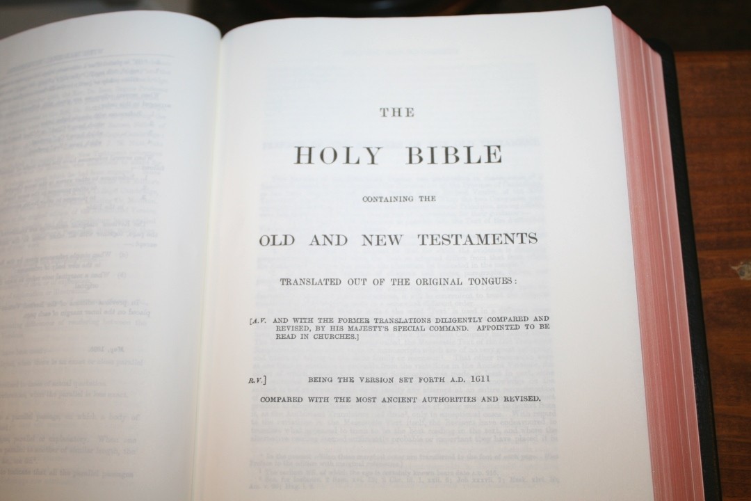
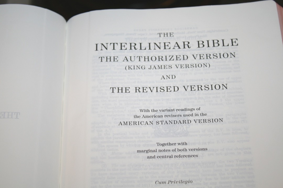
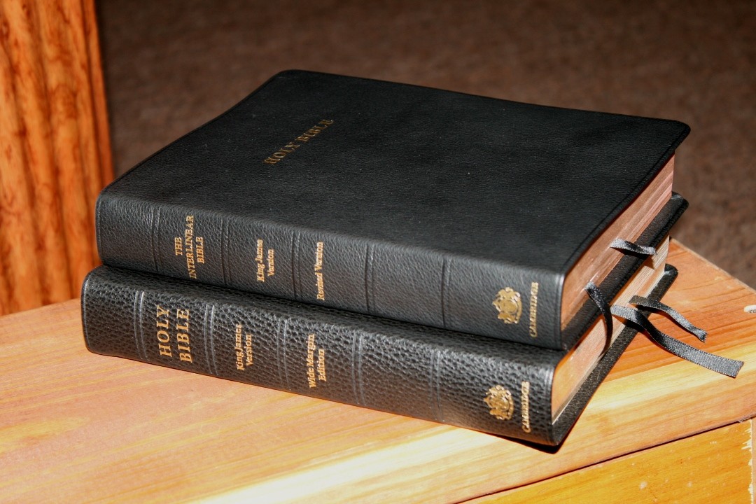
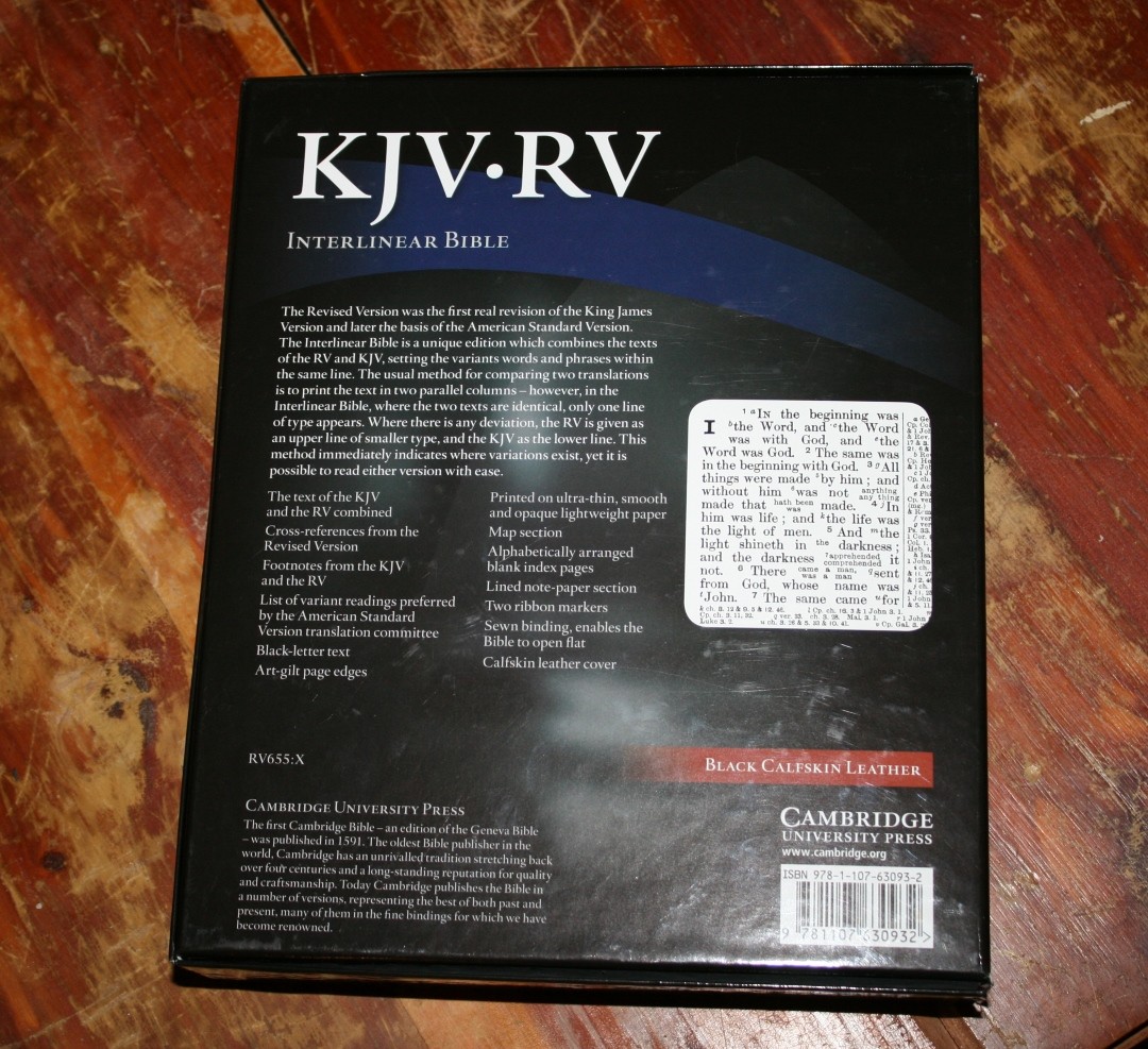
Cambridge’s KJV-RV Interlinear Bible is a unique design that shows the text of both the King James Version and the Revised Version within the same verse, creating a 2-in-1 wide margin reference Bible. It goes even further with notes in the back from the ASV where it’s different from the RV, providing access to 3 different translations within the same volume. It’s available in black calfskin, ISBN: 9781107630932, made in the Netherlands by Royal Jongbloed.
Cambridge provided this Bible in exchange for an honest review. I was not required to give a positive review, only an honest one. All opinions are my own.
_________________________________________________________
This book is available at (includes some affiliate links)
and many local Bible bookstores
_________________________________________________________
Video Review
Cover and Binding
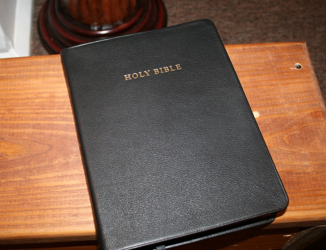
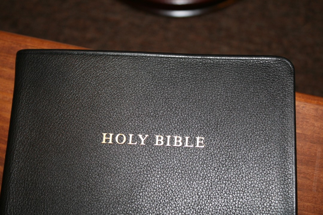
The leather is black calfskin with a paste-down vinyl liner. The leather is similar to the TBS Westminster but softer with a little more grain. It has a beautiful pebbly grain that you can see and feel. It’s not smooth but it’s also not pronounced like calf-split or goatskin. The front has HOLY BIBLE and the spine has the title, translations, and the Cambridge seal printed in gold. It also has 5 tooled ridges.
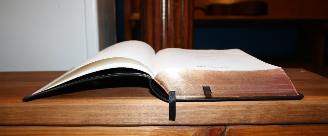
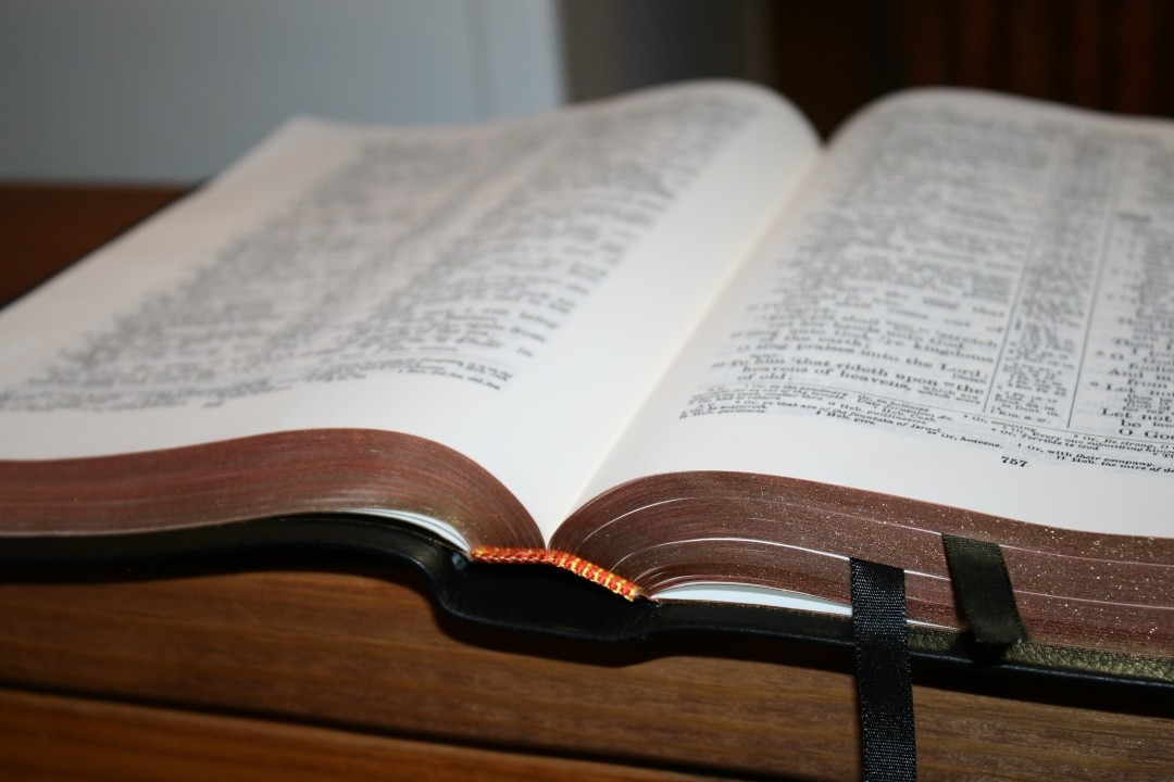
It’s Smyth sewn and has no trouble lying open completely flat on page one out of the box. The pages will also lay completely flat. It has two 3/8″ black ribbons, but they’re too short to be that useful.
The overall size is 9.5 x 7.25 x 1.5″ and it weighs 2lbs, 12oz. It’s roughly the size and weight of the Wide Margin Concord.
Paper
Cambridge calls this India Paper, which means it’s less than 30gsm. I’d guess it to be in the 27-28 gsm range. It has a cream color that looks great for reading. It’s smooth to the touch. It does have more show-through than I’d like, and the pages can sometimes be a little difficult to turn. About half the time I had no issues turning pages.
As thin as this paper is, it isn’t my first choice as a wide margin Bible. If wide margins for notes is your goal then I think the Concord wide margin would be a better choice because it has much thicker paper (38gsm). This paper is better for Pigma Microns than pencils or pens that can indent the page.
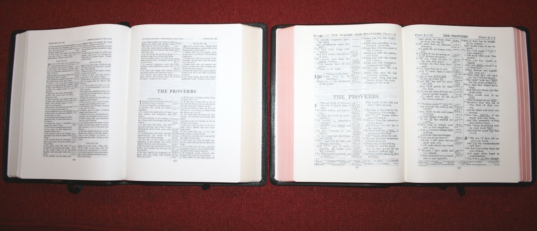
The page edges are art-gilt, red under gold. It’s even and has a nice shade of red.
Typography
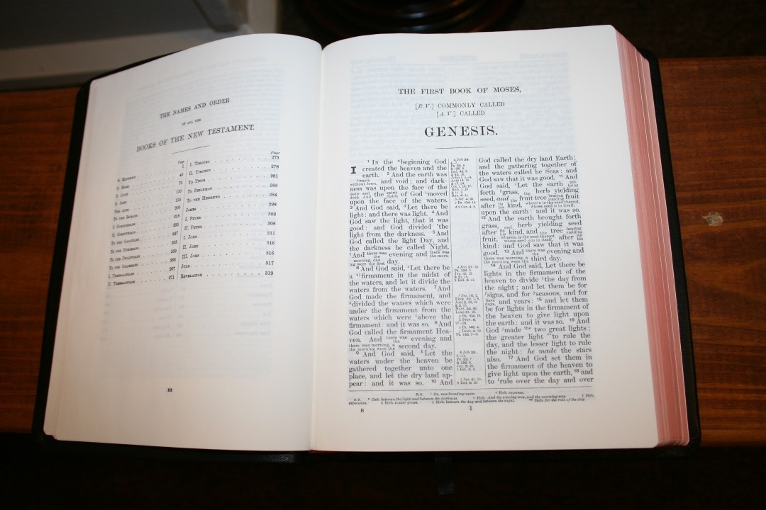
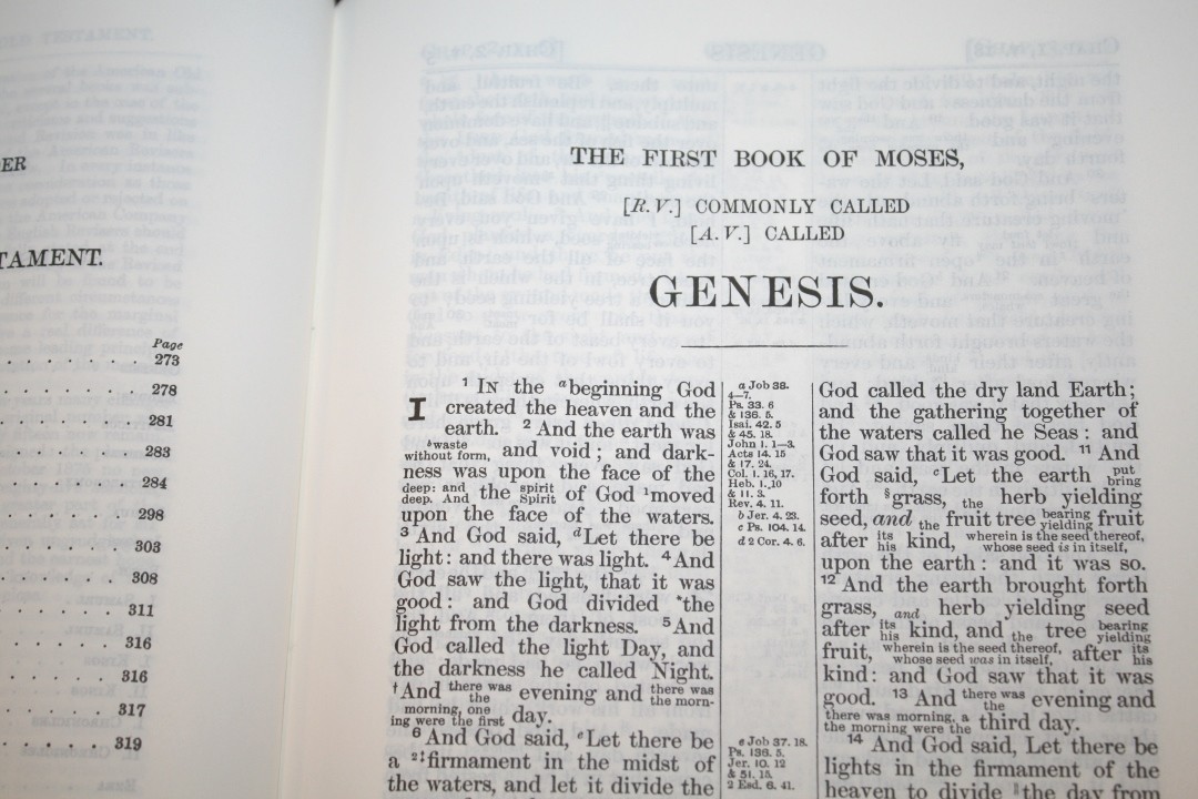
The text is presented in double-column paragraph format with center-column references. The header shows the chapter and verse number of the first verse that appears on the page in the left corner and the chapter and verse number of the last verse on the page in the right corner. The book name is in the center. The footer contains the footnotes and page number. This is a wide margin edition. The margins are 1 1/16″ outer, 7/8 inner, 5/8 upper, and 11/16″ bottom.
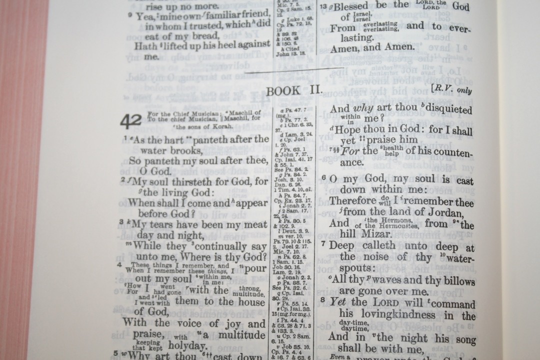
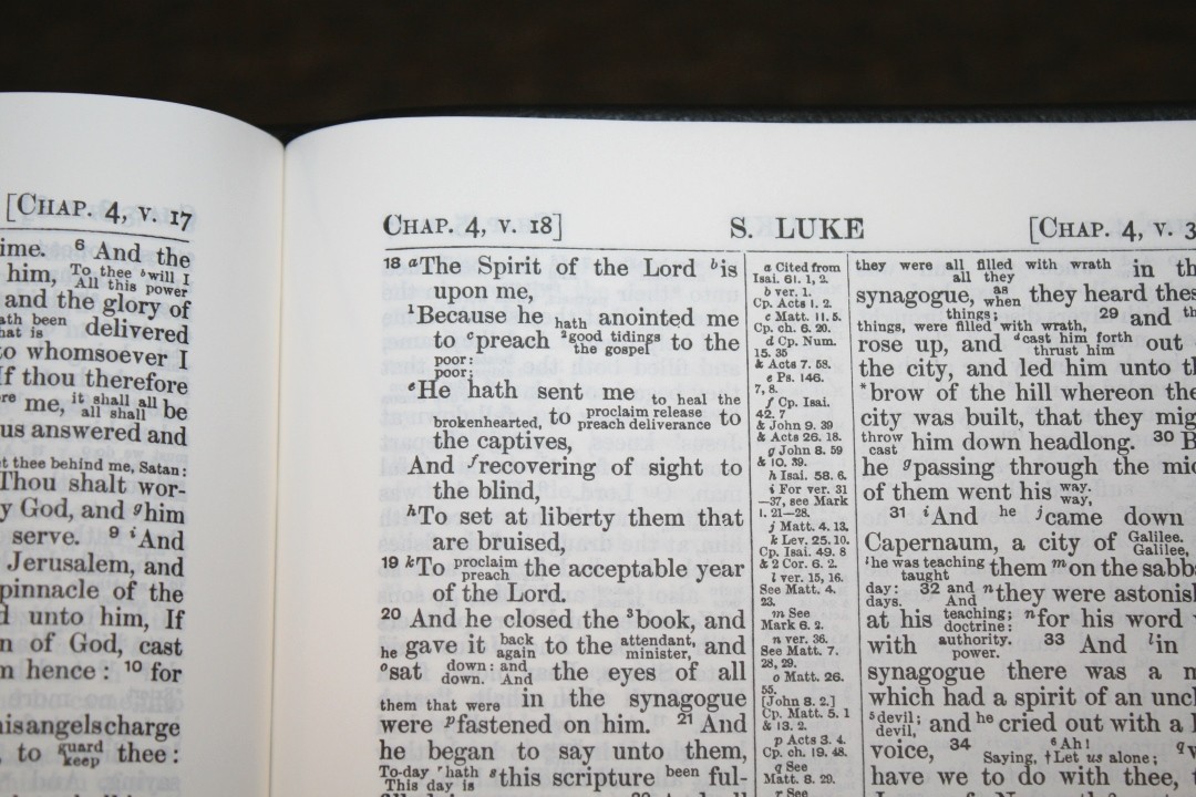
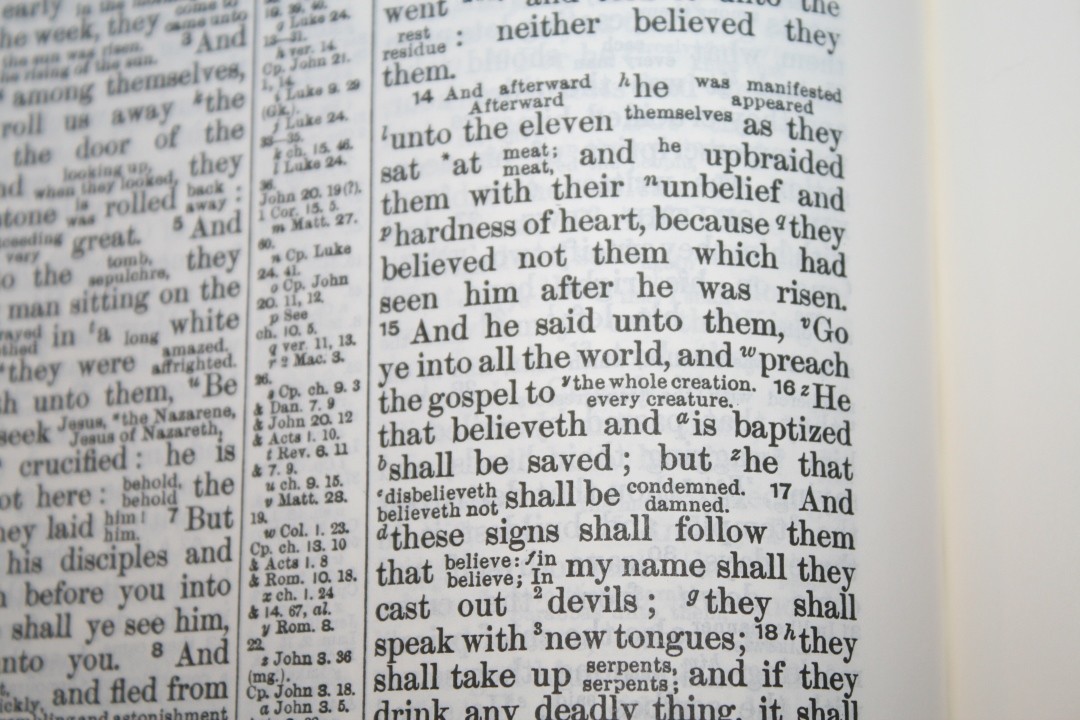
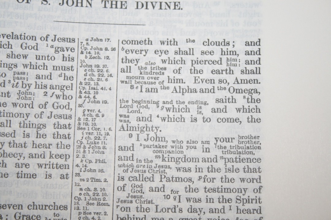
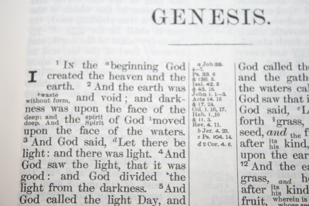
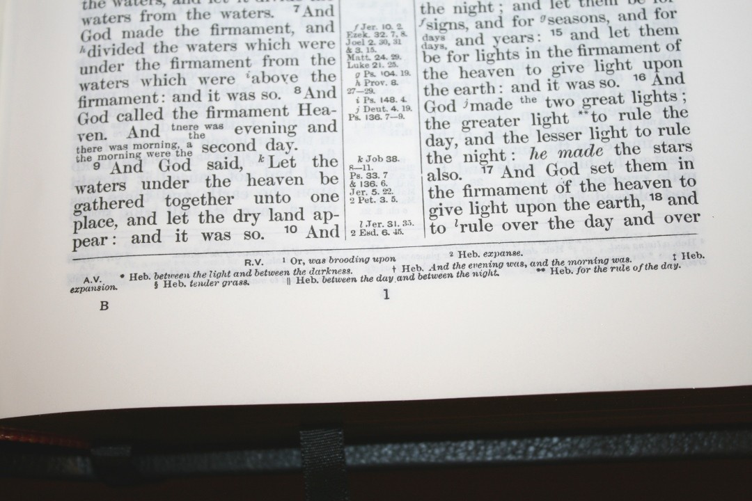
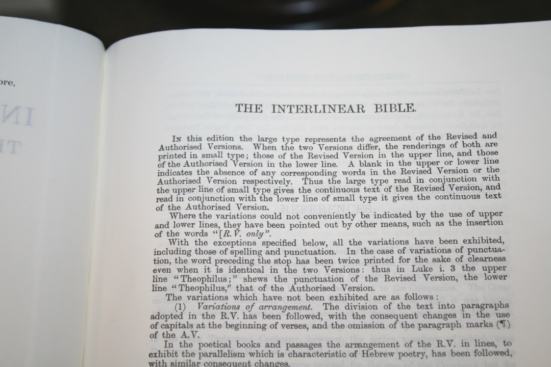
Where the two texts agree they’re printed in a 10/11, or 10 point with 11 point leading (meaning the font is 10 point and the size of the font plus the space to the next line is 11 points). Where they are different, the text is printed in two lines in a smaller font, around 5-6 point. The RV is placed on top and the KJV is placed on the bottom. The font is black-letter Millers 2n Small Pica No.4. This style looks like Times New Roman or something similar (which makes sense considering this setting is over 100 years old). It has no self-pronouncing marks in the text. I’m glad it doesn’t include them. That would make the text even more difficult to read.
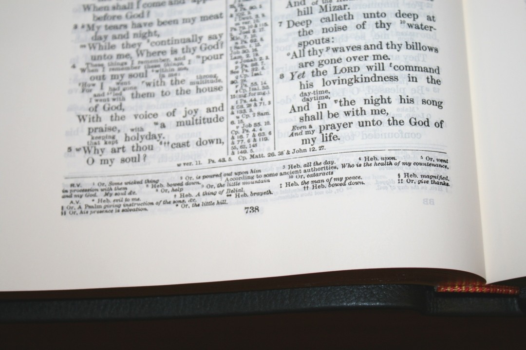
I love that it’s in paragraph format, but that’s since it does have the two texts, reference keys, footnote keys, and verse numbers that are difficult to find, it’s hard to see the advantage of the paragraphs. The poetic books and a lot of the poetry in the New Testament are set to stanzas. They look nice for a double-column layout. Old Testament prophets are not set in a poetic format like the Clarion or New Cambridge Paragraph Bible. Instead, they are in paragraph format.
It has around 32 characters per line with around 7 words per line. The text looks busy because of the amount of information that it has to show within a verse, but the words aren’t too close to each other on a line. It’s more likely to have extra space than not enough.
This is an excellent design for seeing the textual variants. I like that it shows updated words (up to 1885 at least), updated sentence structure, and updated punctuation.
Cross References
The cross-references are in the center column and are placed near the verses they correspond to. The reference keys go across the page regardless of the columns, so you might have an a in the right column, a b and c in the left column, and then a d in the right column.
References are indented, which helps make them easy to find. It has a lot of cross-references. This is the most I’ve seen in a KJV from Cambridge. They’re actually from the RV.
Here are some example references to help you compare:
- Genesis 1:1 – Job 38:4-7; Ps 33:6; 136:5; Isai 42:5; 45:18; John 1:1-3; Acts 14:15; 17:24; Col 1:16-17; Heb 1:10; 11:3; Rev 4:11
- Deuteronomy 6:4 – Mark 12:29; Isai 42:8; Zech 14:9; John 17:3; 1 Cor 8:4,6
- Isaiah 9:6 – Luke 2:11; John 3:16; Isai 7:14; Matt 28:18; 1 Cor 15:25; Isai 22:22
- Matthew 17:20 – John 11:40; Matt 6:30; 21:21,22; Mark 11:23; Luke 17:6; Matt 13:31; 5;19,20; 20:9; 1 Cor 13:2; Mark 9:23
- Mark 11:23 – Matt 17:20; Ps 46:2; 1 Cor 13:2; Rev 8:8; Acts 10:20; Rom 4:20; 14:23; James 1:6; Mark 16:17; John 14:12
- Mark 12:29 – Luke 10:27; Rom 3:30; 1 Cor 8:4,6; Gal 3:20; Eph 4:6; 1 Tim 1:17; 2:5; James 2:19; 4:12; Jude 1:25; Matt 19:17; 23:9; John 5:44; 17:3
- John 1:1 – Gen 1:1; Col 1:17; 1 John 1:1; Rev 1:4,8,17; 3:14; 21:6; 22:13; 19:13; Heb 4:12; 1 John 1:1,2; John 17:5; Phil 2:6; John 1:18; Rom 9:5
- John 2:19 – Matt 26:61; 27:40; Mark 14:58; 15:29; John 10:18
- Acts 2:38 – Acts 3:19; 20:21; 26:18,20; Luke 24:47; Acts 22:16; 8:12; Mark 16:16; Acts 10:48; 8:16; Mark 1:4; Acts 10:45; 8:15, 20; 11:17; John 7:39
- 1 John 1:1 – John 1:1; 1 John 2:13,14; Acts 4:20; John 19:35; 1 John 4:14; John 1:14; 2 Peter 1:16; Luke 24;39
Footnotes
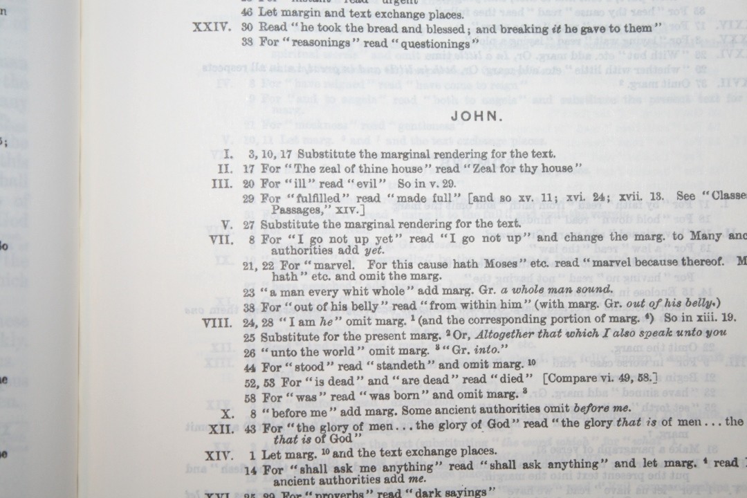
Footnotes are placed in a single column in the footer and are keyed to the text with numbers. The RV footnotes appear at the top of the footer and the KJV footnotes are at the bottom. The mostly shed light on the original languages and provide alternate renderings. These are helpful for study.
Prefaces
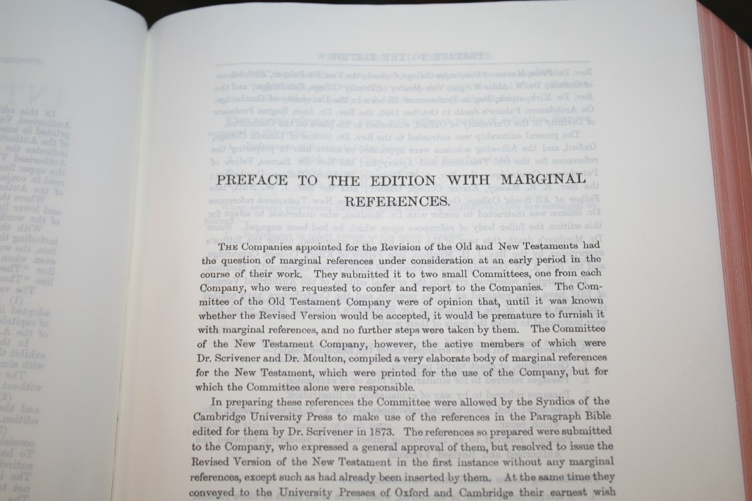
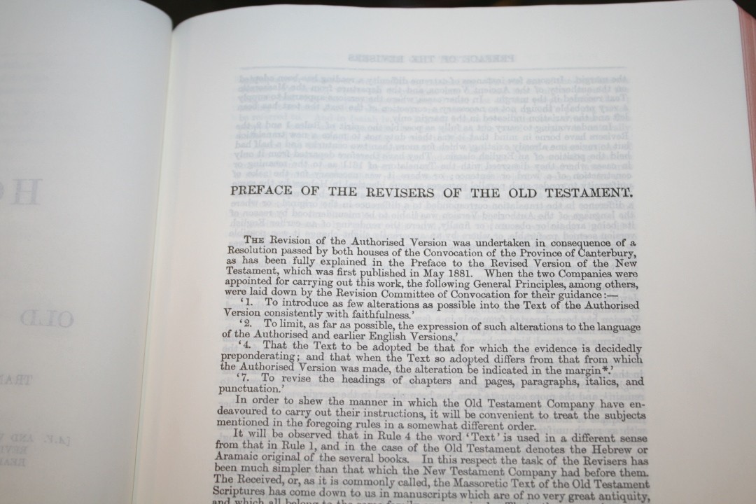
The preface is from the RV. The KJV prefaces are not included, so you won’t find the Epistle Dedicatory or the Translators to the Reader. They show the unique features of this Bible as well as provide the history of the Revised Version.
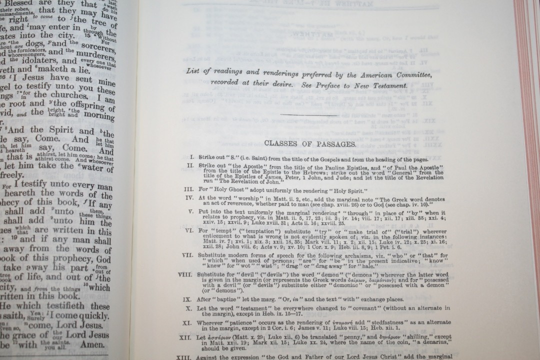
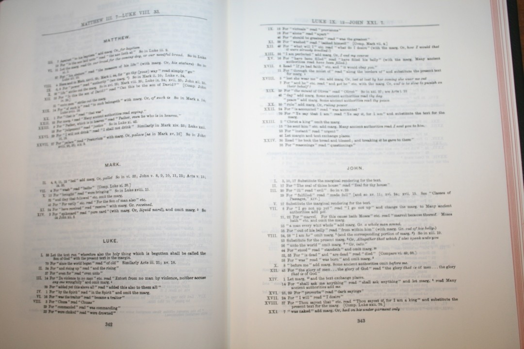
ASV Notes
The notes from the American Revision Company appear at the end of the Old and New Testaments. These notes were eventually added to the RV and became the ASV. It includes general notes and notes for specific verses. General notes include information about words and spellings they preferred. Notes for the verses show the book name, chapter number, verse number, and then the note.
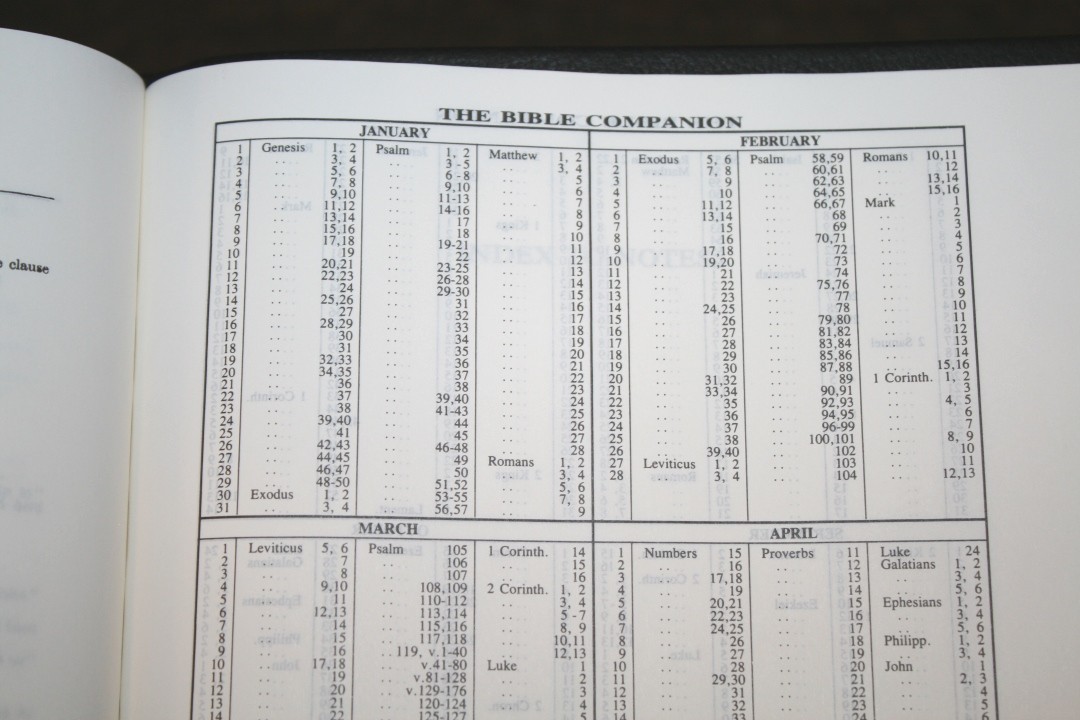
Reading Plan
The reading plan, labeled The Bible Companion, takes you through the Bible in one year with three readings per day from the OT, Psalms or Proverbs, and the NT. It’s a table that shows the month, date, book name (only printed for the first reading in that book), and chapters to read for that day. It seems to be a well-balanced reading plan.
Index to Notes
It has a blank page for every letter of the alphabet so you can create your own index to your notes. It has 4 completely blank pages after them. These 30 pages use the same paper as the rest of the Bible. This isn’t my first choice for the paper, but I’d rather have it than not. This would also be a great place to add topical lists, definitions, etc.
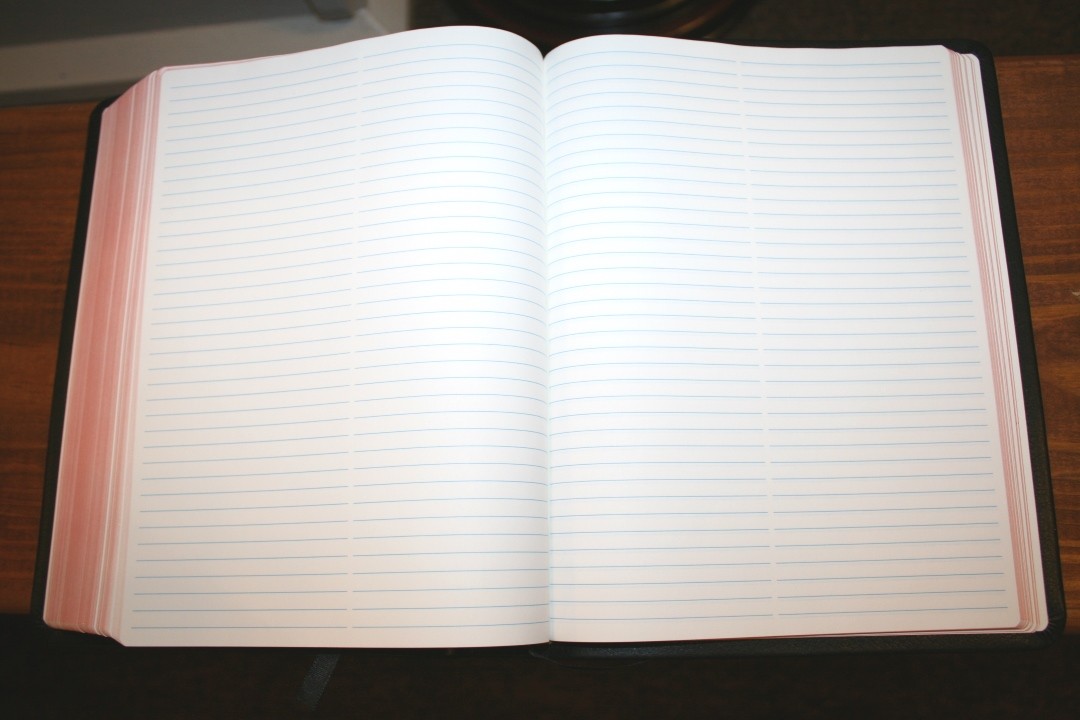
Ruled Paper
It has 64 ruled pages for notes. These pages are thicker notebook paper just like the paper in the back of the Wide Margin Concord. They have two columns of ruled lines on each page. They’re great for topical lists, thoughts, prayer lists, sermon outlines, sermon notes, etc.
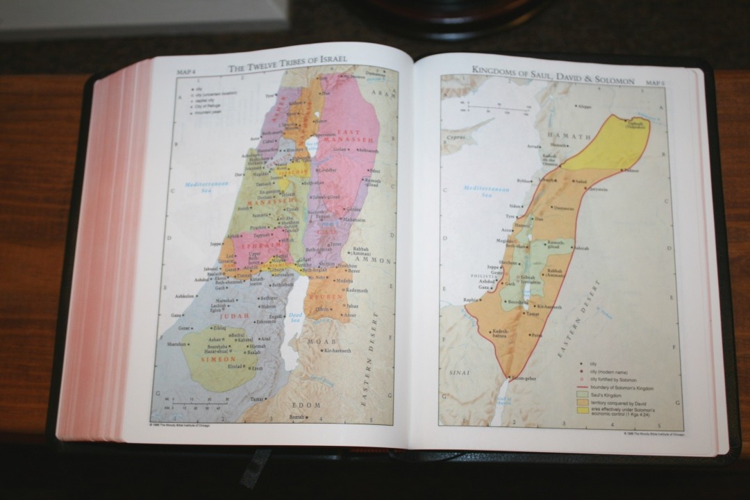
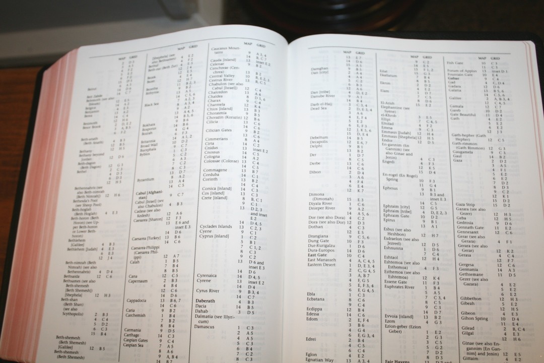
Maps
It has 15 Cambridge full-color maps printed on thick non-glossy paper. They include cities, routes, Scripture references, distance, mountains, territorial expansions with dates, topography, kingdoms, battle sites, locations of events, addressees of Pauline epistles, etc.
It also has an index, which makes finding locations much easier.
Maps include:
- The Biblical World of the Patriarchs
- Palestine: Political Regions
- The Route of the Exodus
- The Twelve Tribes of Israel
- Kingdoms of Saul, David & Solomon
- The Divided Kingdom: Israel & Judah
- The Assyrian Empire
- The Babylonian Empire
- The Greek Empire
- Old Testament Jerusalem
- New Testament Jerusalem
- The Ministry of Jesus
- The Missionary Journeys of Paul
- The Spread of Christianity
- Modern Israel
Comparing with the Wide Margin Concord
The Cambridge RV-KJV really is in a category of its own, but the Wide Margin Concord does include the wide margins and paper in the back. Here’s how the two compare as a wide margin edition.
The Concord has a smaller font overall, but it’s easier to read. The RV-KJV has two different size fonts and the larger font is really a result of the interlinear fonts. The Concord is much cleaner with no distractions and I prefer its font style. It has much thicker paper that’s far more opaque, so it’s better for writing and for turning pages. It’s verse-by-verse, so you don’t get the advantage of the paragraphs. It has a glossary in the back, so some of the words that are identified by the interlinear are available, although being in the back you’d just have to look at see what’s there since there’s nothing in the text to indicate a definition in the glossary.
If you just want a wide margin KJV, the Concord is the better choice. If you’re interested in studying the differences between the TR and CT, the RV-KJV is a great choice.
Concluding Thought on the Cambridge RV-KJV Interlinear Bible
The KJV-RV Interlinear is an interesting Bible. I do find the interlinear text distracting for general reading, teaching, and preaching. The verse numbers are a little difficult to find quickly and the interlinear portion can be confusing if there’s too much of it in the same place on the page. I would have to pause and think about which line to read next.
This is an excellent edition for study. It’s great for seeing the differences between the two texts and it has some excellent references. Some of the changes don’t really make any difference to comprehending the point. Sometimes it’s a sentence structure difference, other times it’s a new word, while other times it shows that the word or phrase is not in one or the other (usually not in the RV but sometimes not in the KJV).
I think anyone interested in seeing the differences between the KJV and RV would love this edition.
_________________________________________________________
This book is available at (includes some affiliate links)
and many local Bible bookstores
_________________________________________________________
Cambridge provided this Bible in exchange for an honest review. I was not required to give a positive review, only an honest one. All opinions are my own.