

With over a decade in the making, the Cambridge Family Chronicle Bible is a beautiful family heirloom Bible designed for those that want to chronicle their family tree. It combines the highest quality design and materials to create a Bible that will last for generations. Over two hundred engravings by Gustave Doré have been reproduced with the highest level of detail available in a Bible. It’s perfect for a family library. The Cambridge Family Chronicle Bible is available in three cover options.
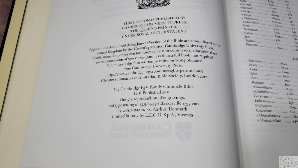
I’m reviewing all covers, each with its own article. In this article, I’m looking at the black calfskin over boards, ISBN 9781108718158, designed by 2K/Denmark, printed in Italy by L.E.G.O. Some of this information appeared in the blue hardcover review. All photos are from the black calfskin.
See the blue hardcover review
See the brown calfskin review
Cambridge loaned this Bible in exchange for an honest review. I was not required to give a positive review, only an honest one. All opinions are my own.
_________________________________________________________
This Bible is available from
_________________________________________________________
Table of Contents
- Video Review
- Binding
- Paper
- Typography and Layout
- Family Chronicle
- Chapter Summaries
- Illustrations
- The Cambridge Family Chronicle Bible Owner’s Pack
- Conclusion
Video Review
Binding
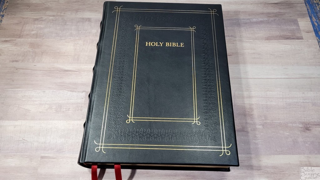
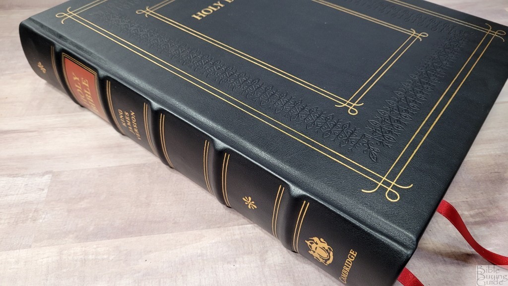
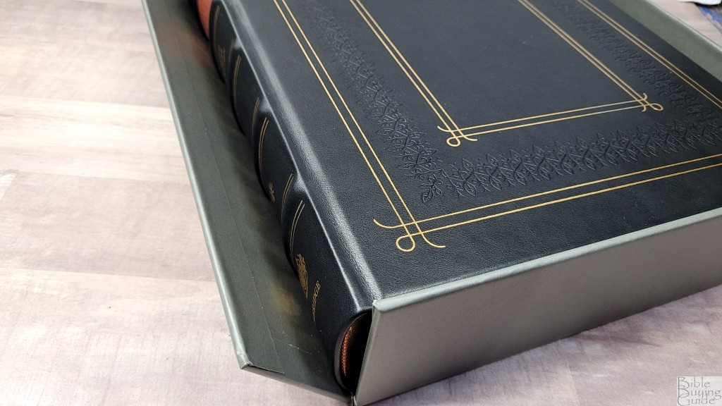
The cover is a black calfskin leather over boards. It has a fancy blocking on the front and spine. The front of the cover includes gold and stamping. The cover is smooth and has a touch of grain and it’s soft to the touch. The spine is slightly rounded and includes 5 thick raised hubs. The text is printed in gold, the spine hubs are outlined in gold, and two symbols (similar to asterisks) are stamped in gold. The text HOLY BIBLE is printed over a red block outlined in gold.


The liner is a thick endpaper with maps. I love maps and, for me, this is an excellent use of space. They’re printed on tan paper in monochrome with lots of gray shades. They have routes, dates, cities, borders, distance, etc. They’re drawn so well that they prove you don’t always need them in color.
They include:
- The Ancient Near East – Late Bronze Age
- The Kingdoms of Israel and Judah
- The Holy Land in New Testament Times
- Paul’s Missionary Journey’s

It includes two 3/8″ ribbons in red. The head/tail bands are red and gold. The overall size is 9.75 x 12.8 x 2.25 and it weighs 8 lbs, 1.1 oz. This large size is ideal for showcasing in a family library.
Protective Case
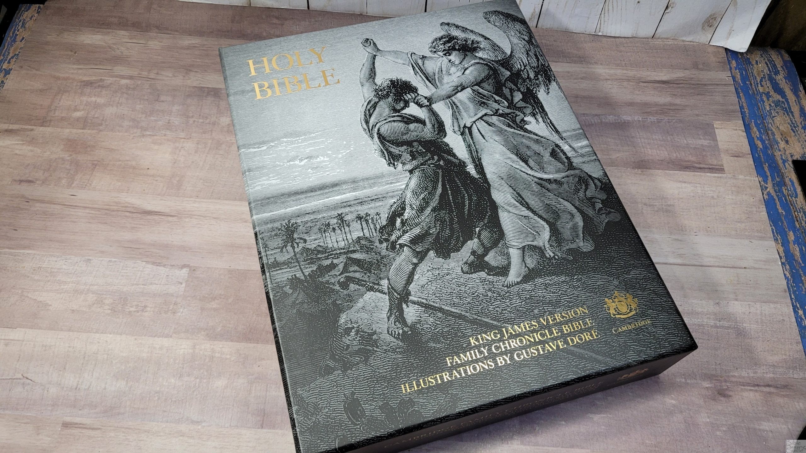

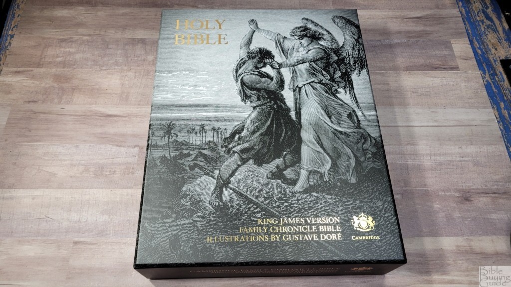
The black calfskin comes in an elegant two-piece black heavy card box with a print from Doré’s work on the front and wraps to all four sides. The left and right sides of the cover are rounded to make it easier to open. It has gold text on the front and the bottom.
The bottom piece has one flap that opens (creating a drawer), making the Bible easy to pull from the box. The box feels sturdy and looks great.
Paper
I’d guess the paper to be 50gsm. It feels elegant and has a slightly rough texture that’s easy to grab and turn. It’s off-white and extremely opaque. The main show-through that’s visible is the illustrations on the other side of the page. Even that is just noticeable and doesn’t have much impact on readability. It has a matte finish and is great for reading. The page edges are gold. The gilding is solid and consistent. The page corners are squared.
Typography and Layout
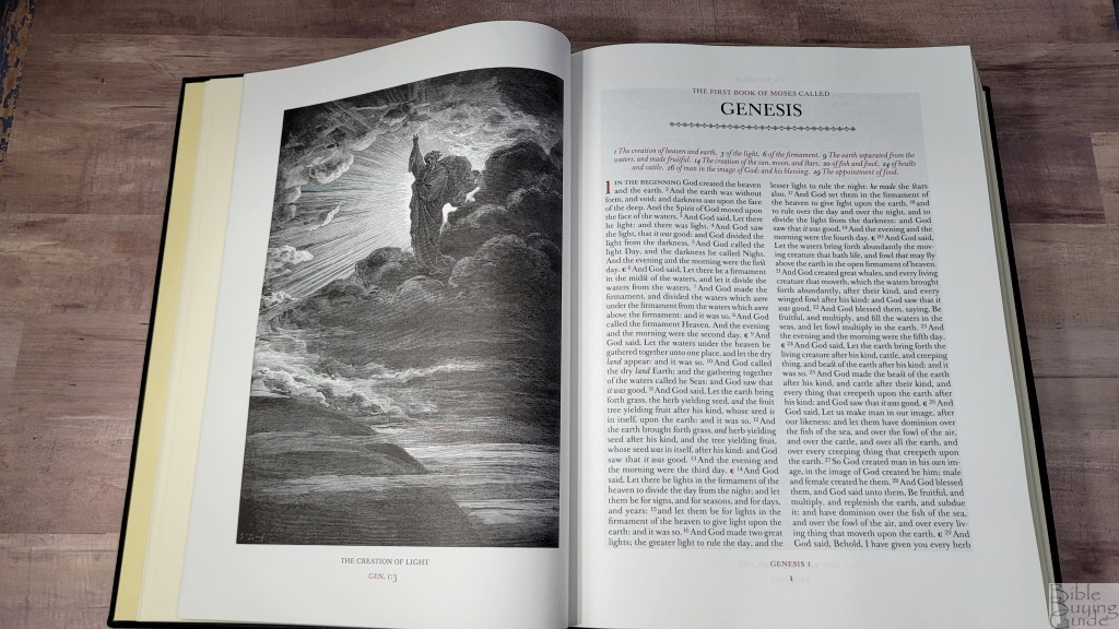
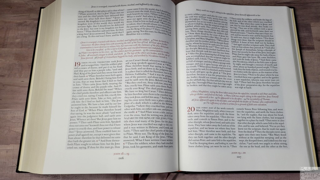
The KJV text is presented in a double-column, paragraph layout. The columns do not include paragraph breaks or any other formatting. The chapters include summaries that span both columns, so each chapter is divided from the others. The chapter summaries, chapter numbers, and pilcrows are printed in red. The header includes the page summaries centered across the top. They’re printed in black italics. The book name and chapter numbers are printed in red in the footer. They’re centered with the page number in black at the bottom. The headings for Psalms are also printed in red. The book titles have a styled line under them. The books end with a similar, but smaller, styled line.
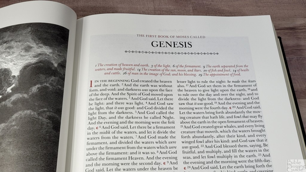
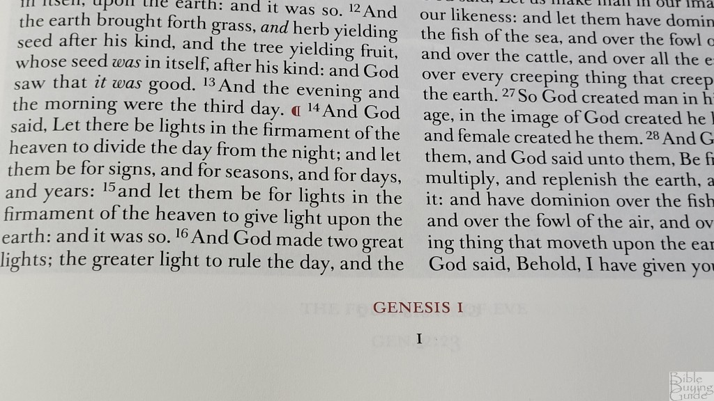
The typeface is a large print Classic Baskerville. It looks elegant. It’s based on the typeface that John Baskerville used in his Bible in 1763. He was a famous typographer and his Bible was recognized as one of the most beautiful books ever published. Considering the beauty of the Family Chronicle Bible, it makes sense that they would use Classic Baskerville. The typeface includes several unique design elements. A loop connects the letters s and t. The first few words of every chapter are in all caps. The red for the highlights is dark.
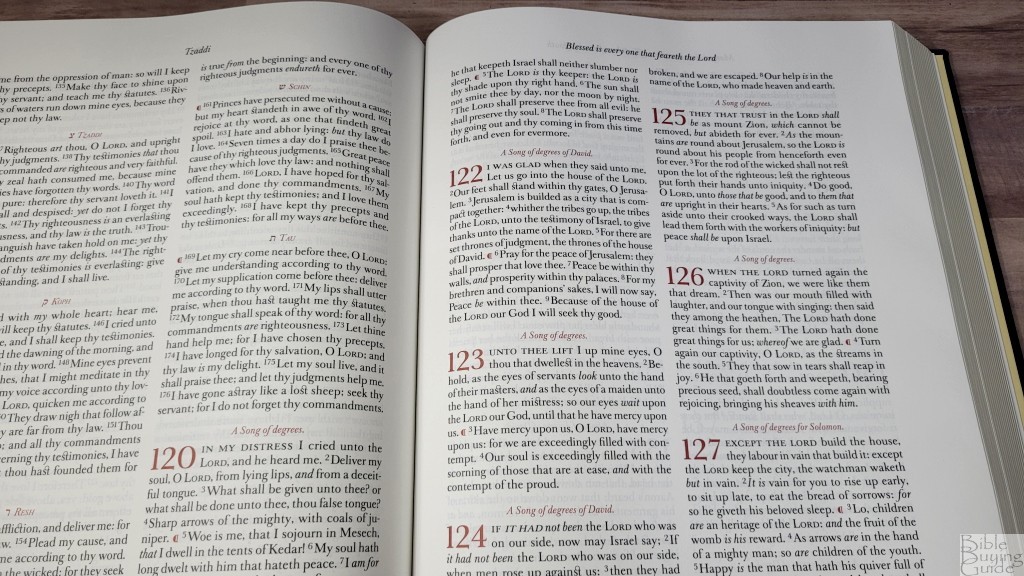
The font is 13.5-point. It’s sharp and consistent. It has 8-10 words per line. There are no paragraph breaks. The pilcrows that mark the paragraphs are placed within the columns. It’s printed with line-matching, but the paper is so opaque it’s not needed. The margin space brings the text out of the gutter and highlights the text. The margins measure: outer 1.25, inner 1, top .75, bottom .75″.
They couldn’t format the text because of the vast number of pages dedicated to the illustrations. I’d at least liked to have seen paragraph breaks. Even without them, this is a highly readable text.
Chapter Summaries
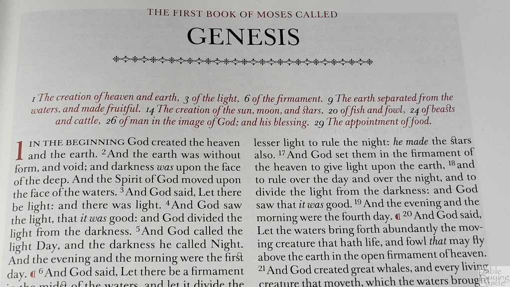
The chapter summaries are from the Trinitarian Bible Society. These are the same chapter summaries used in the Westminster Reference Bible. They’re centered at the top of each chapter. They’re printed with the same size font as the text, but they’re in red italics.
Family Chronicle
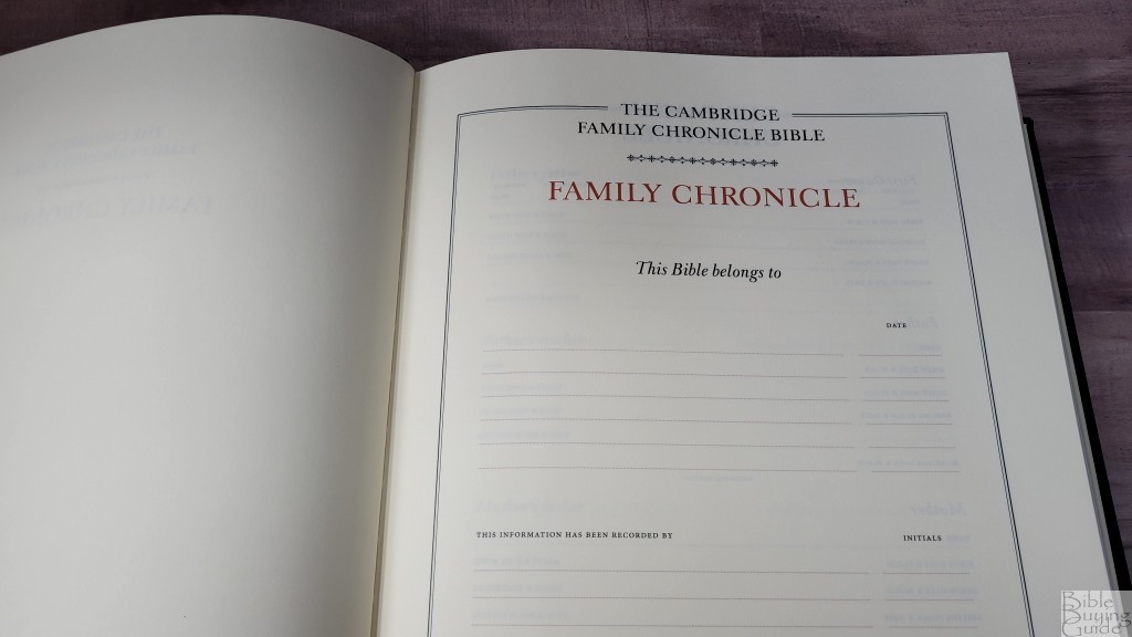
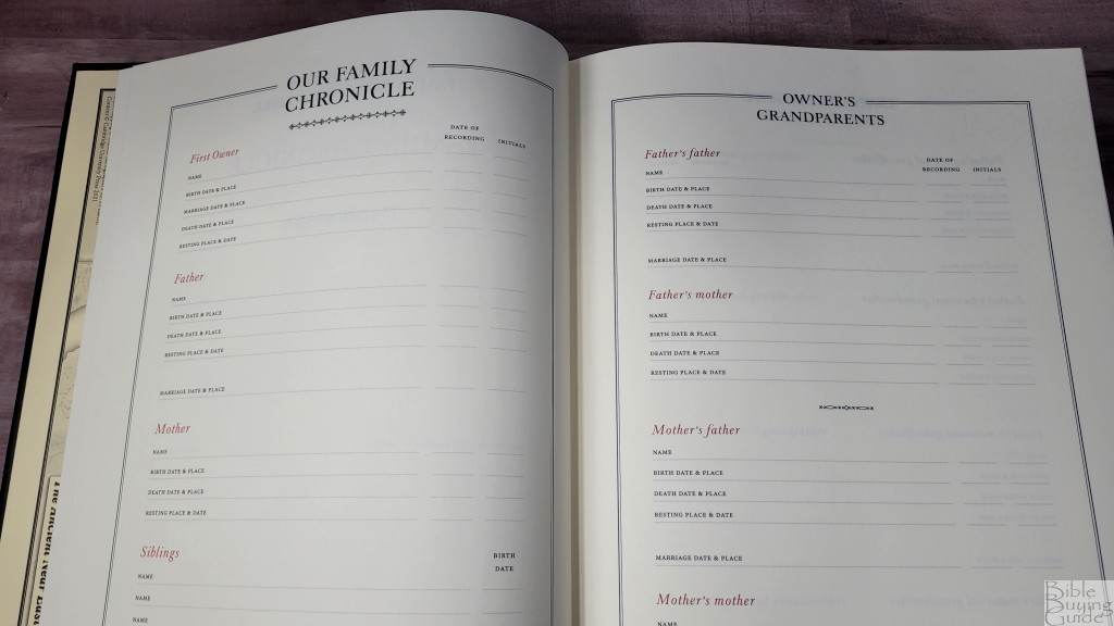
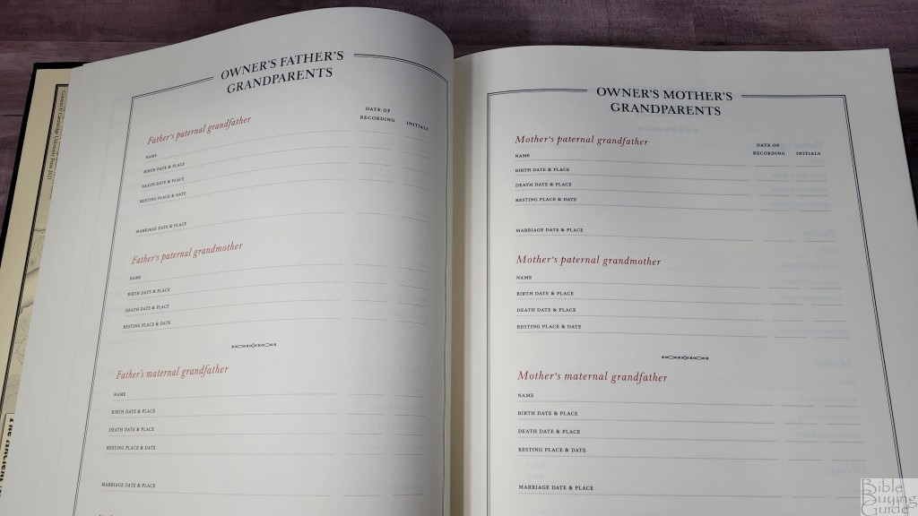

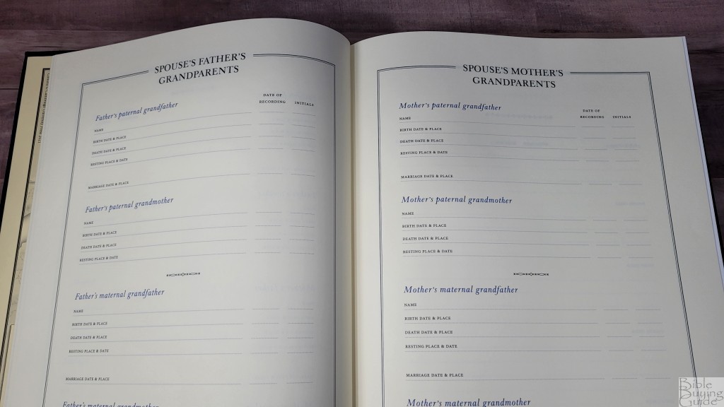
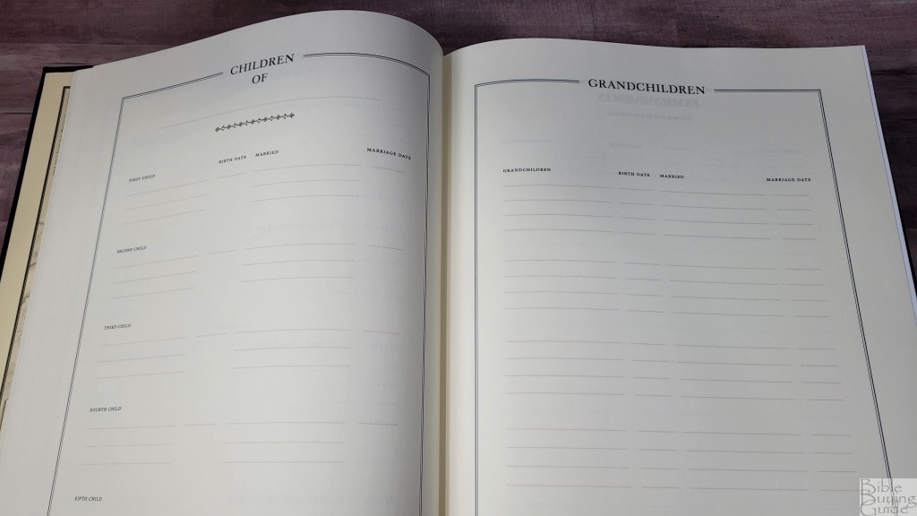
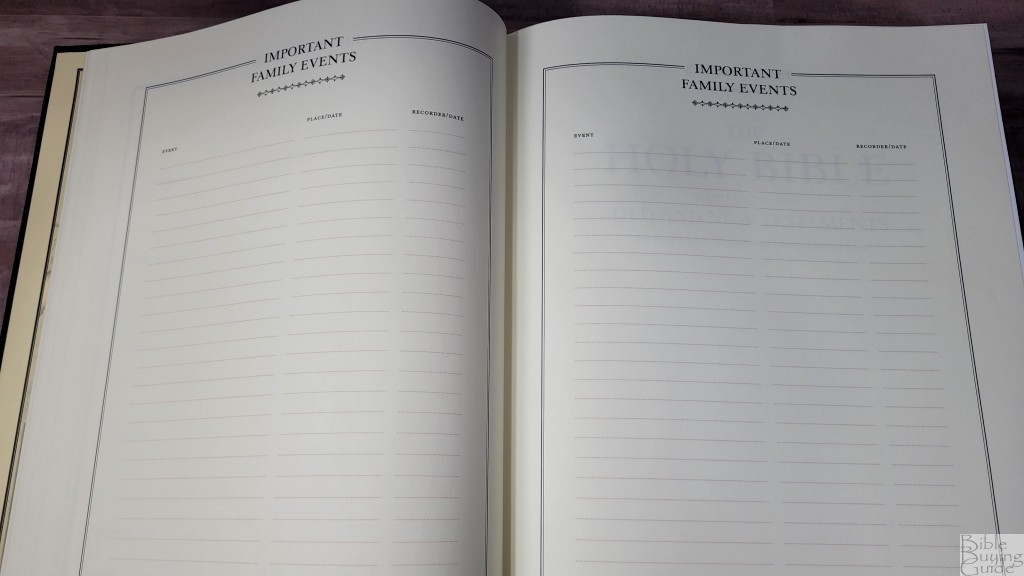
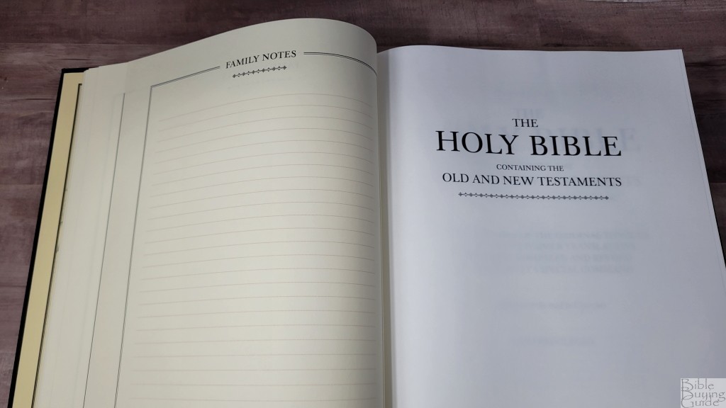
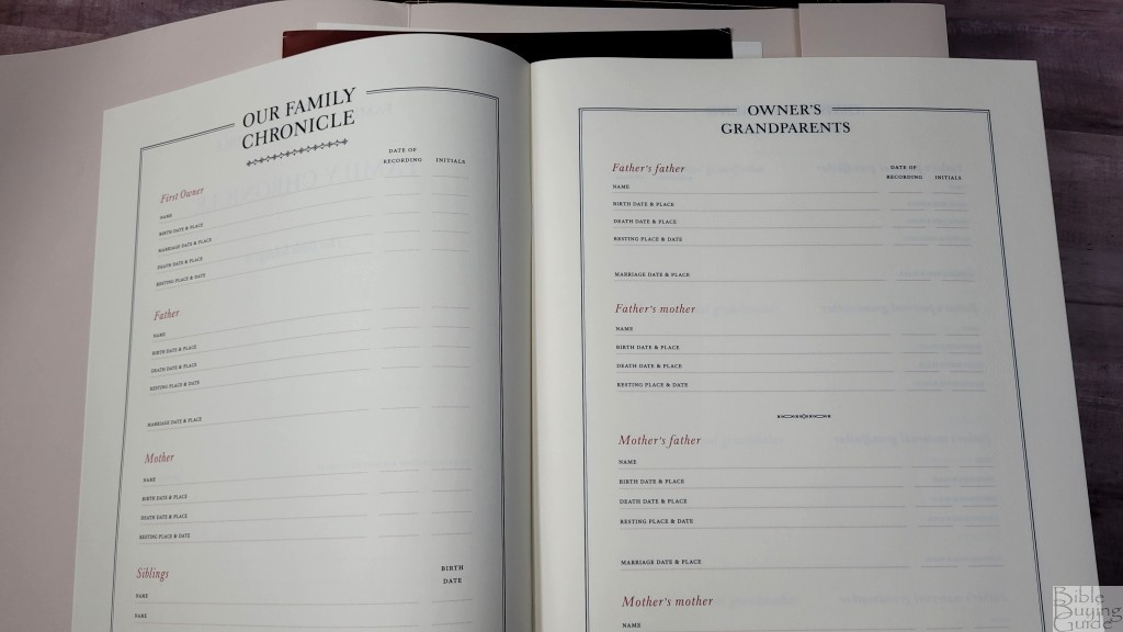
In the front are 14 pages to record 6 generations of family records. This is printed on a thicker paper than the rest of the Bible. It has a slightly cream color. A page is included inside the cover with information about how to write the notes and what types of writing implements you can use. I think this feature is what will appeal to families the most.
Records include who this Bible belongs to, who recorded the information, first owner, father, mother, siblings, grandparents, father’s grandparents, mother’s grandparents, spouses family, children of, grandchildren, important family events, and family notes. Each includes the name, birth date and place, death date and place, and resting place and date. Grandparents and parents include marriage place and date. The titles for the owner’s information are printed in red, while the spouse’s information is printed in blue. The records include fields for the date of recording with their initials.
Illustrations
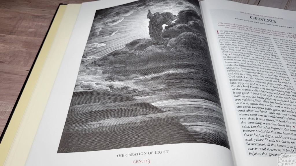
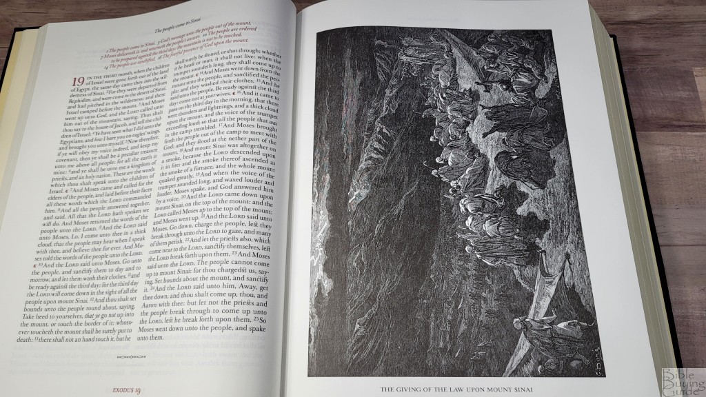

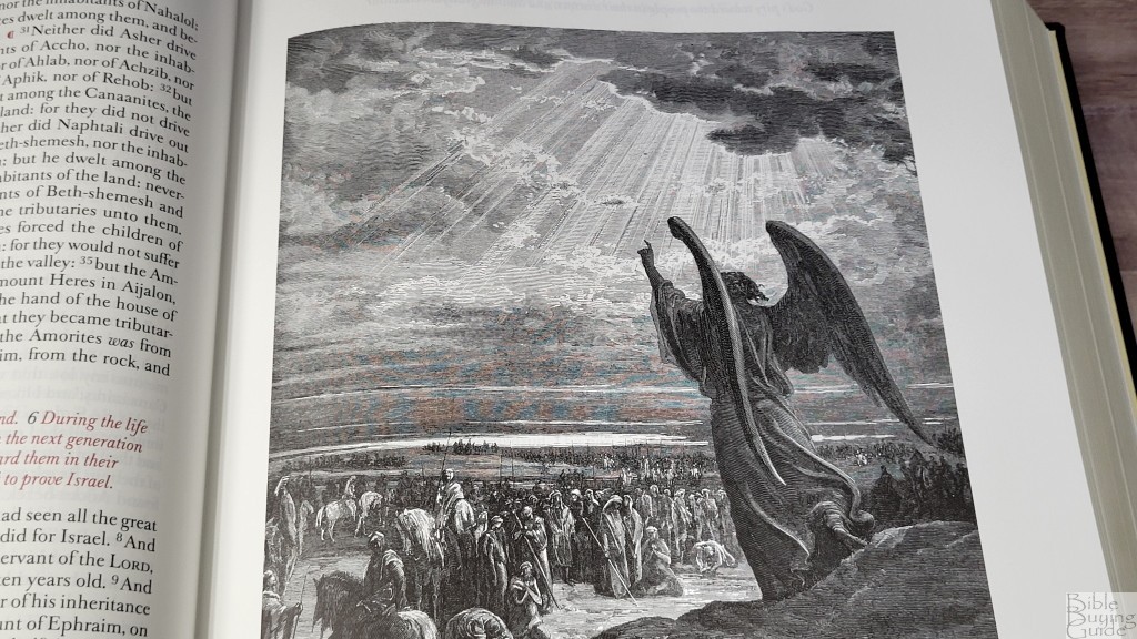
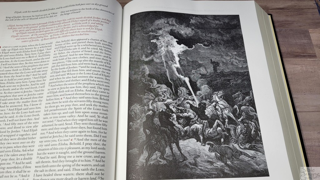
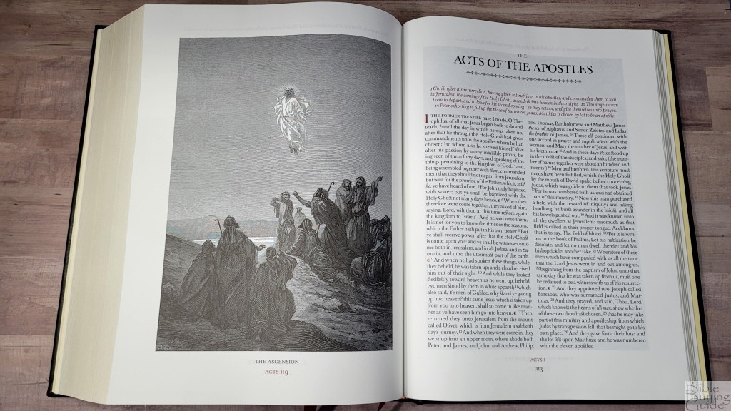

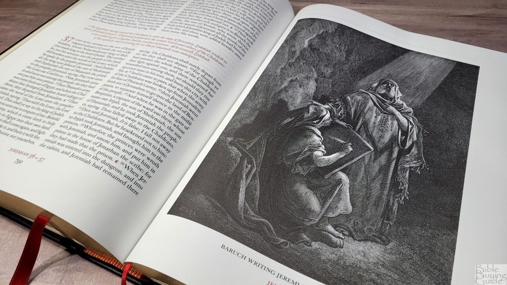
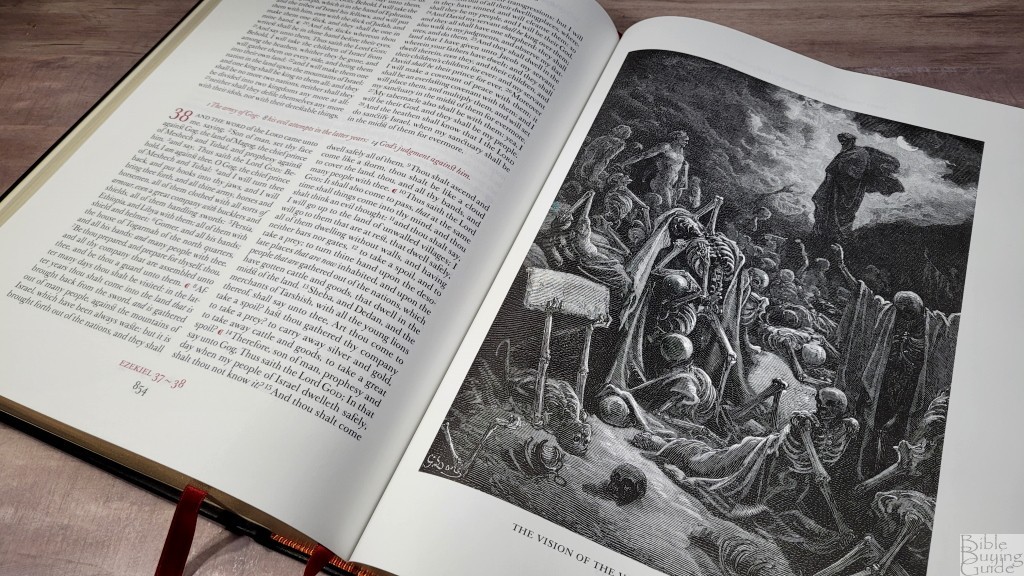
Throughout the text are all 221 of Gustave Doré’s woodcut illustrations. These illustrations were first published in 1866 and are considered some of the most famous images related to Scripture. They’re placed on the pages where the events are discussed and help the reader to visualize the setting. These illustrations are the star feature of this Bible. They’ve been remastered from the original printings for the most detailed and accurate printing possible. They look great on this paper. They take a full page. The title of the illustration is placed at the bottom along with the Scripture references they correspond to. It’s hard for me to imagine that these images were carved in wood. In the front is an index to the illustrations.
The Cambridge Family Chronicle Bible Owner’s Pack

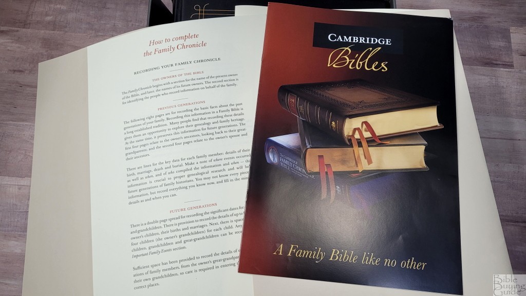
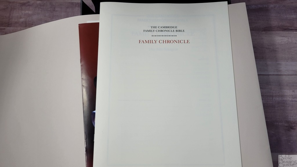
Inside the box is a white folder that contains The Cambridge Family Chronicle Bible Owner’s Pack. This includes a pamphlet about the Bible and a page with information on how to use it. I’m glad they’ve included this. I’d like to see this kind of information more often. It also includes the family chronicle pages printed as a separate booklet.
Conclusion on the Cambridge Family Chronicle Bible in Black Calfskin
The Cambridge Family Chronicle Bible in black calfskin is one of the most elegant Bibles I’ve seen. The design, materials, and print are ultra-high quality. The font design matches the elegance and the red highlights are gorgeous. The text looks great. I’d love to have seen paragraph breaks rather than have one paragraph per chapter with red pilcrows within the text, but it’s still highly readable. These are the highest quality printings I’ve seen of the Gustave Doré illustrations and the paper is perfect to bring out their detail. The Family Chronicle Bible Owner’s Pack gives provides good information about the Bible and its design and gives you another set of chronicle pages. The 14-page chronicle makes this Bible a great addition to any large family library.
See the blue hardcover review
See the brown calfskin review
_________________________________________________________
This Bible is available from
_________________________________________________________
Cambridge provided this Bible in exchange for an honest review. I was not required to give a positive review, only an honest one. All opinions are my own.