
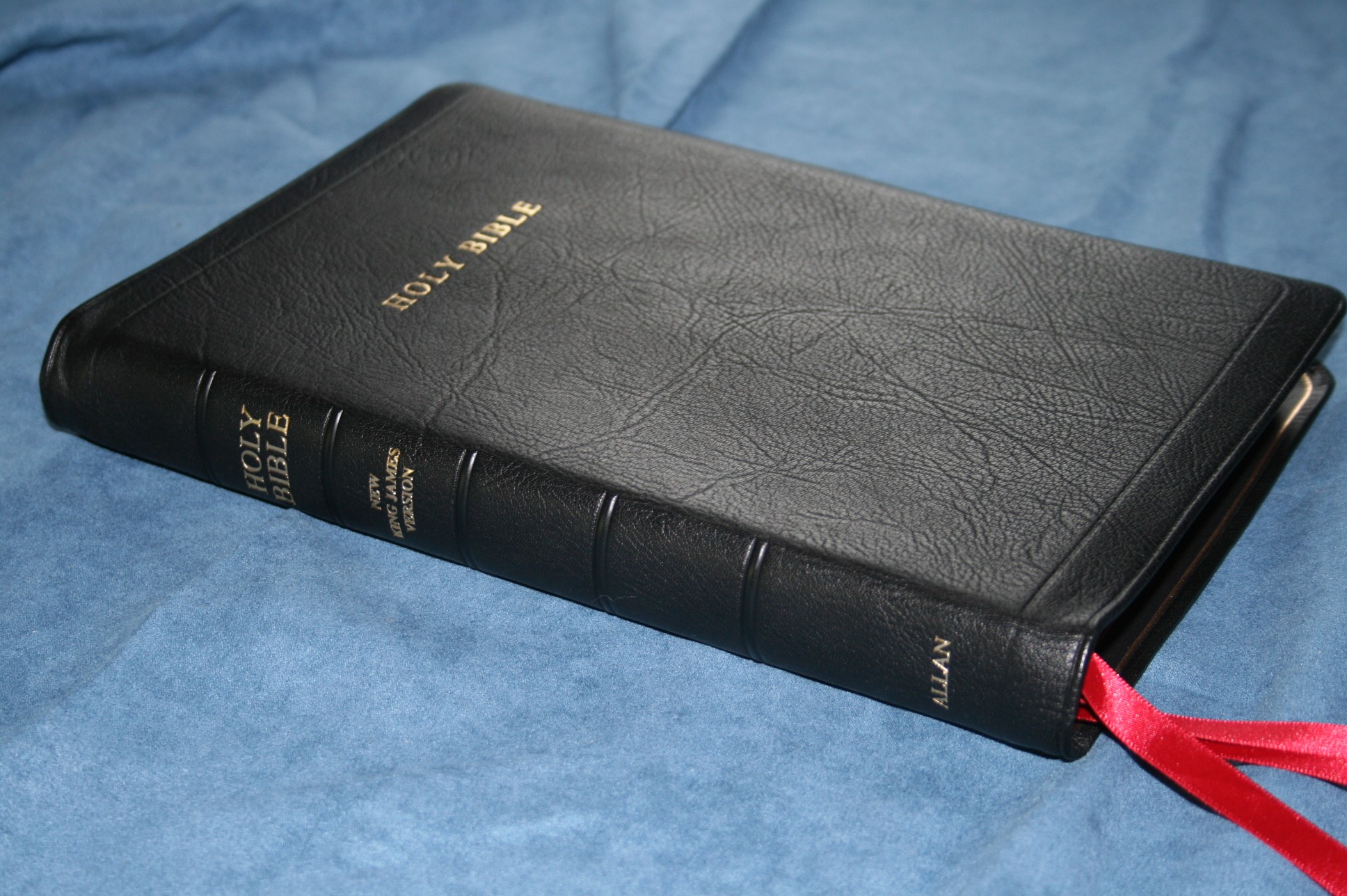
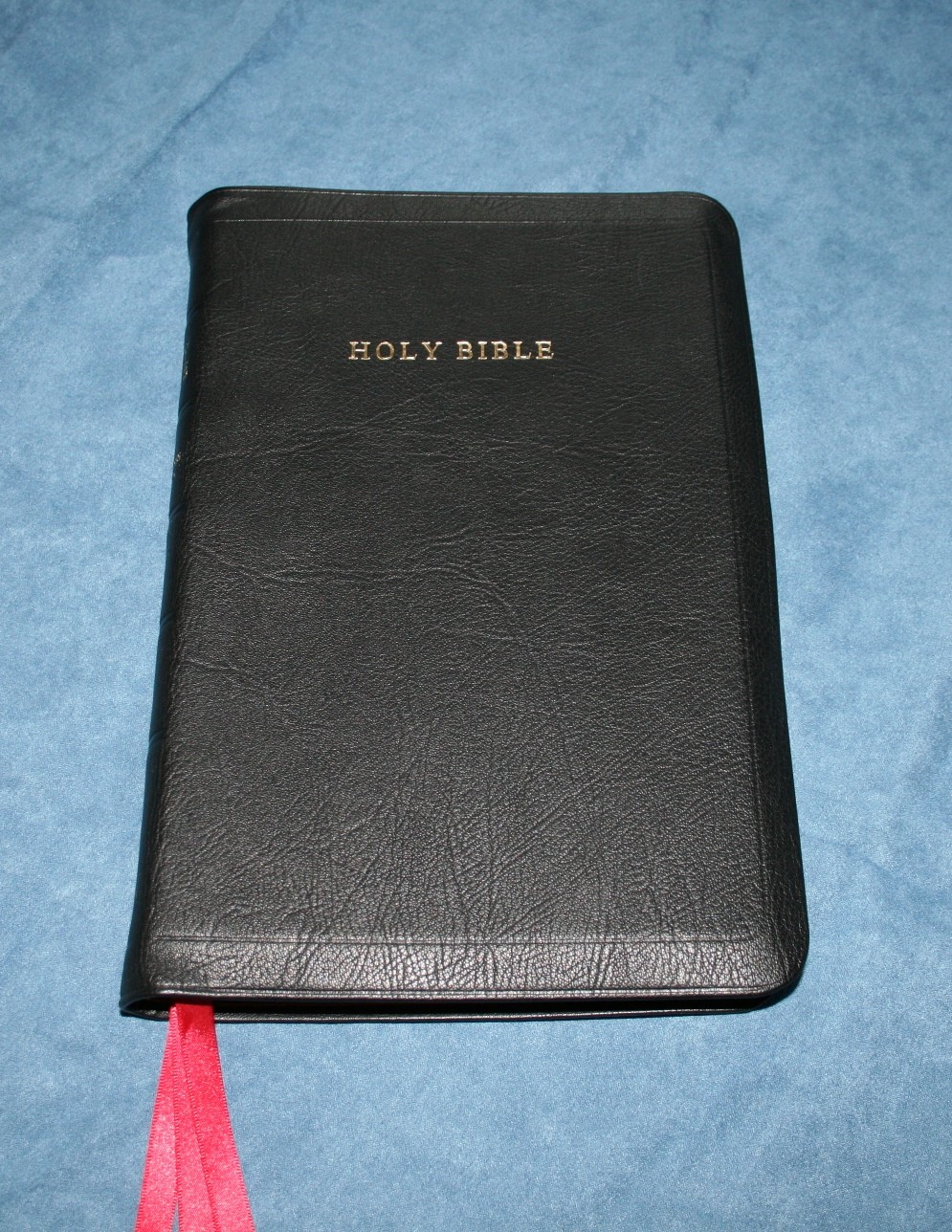
One of RL Allan’s latest editions is a Highland Goatskin treatment of Holman’s New King James Version Classic Reference Edition Bible. It’s a double-column, verse format, red-letter, reference edition with an amazing cover and a semi-bold print.
Pros
- Semi-bold font
- Highland goatskin cover
- 3 ribbons
Cons
- Too much show-through
- Text feels cramped
- No lined paper for notes
- No index to maps
Features
- NKJV text
- Highland goatskin cover
- Smyth sewn binding
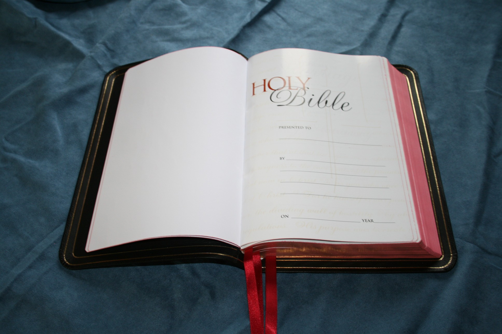
- Presentation page
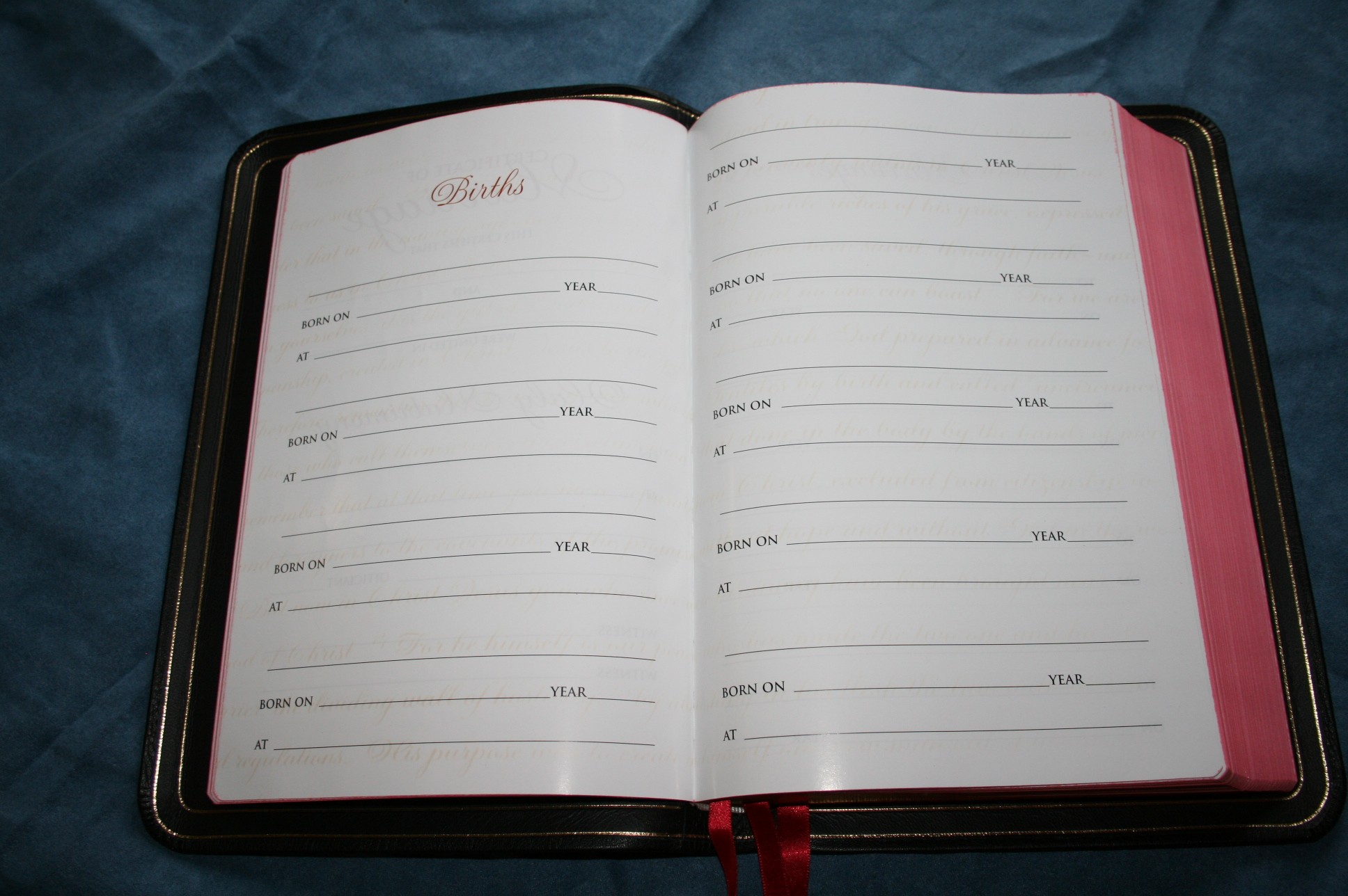
- Family history section
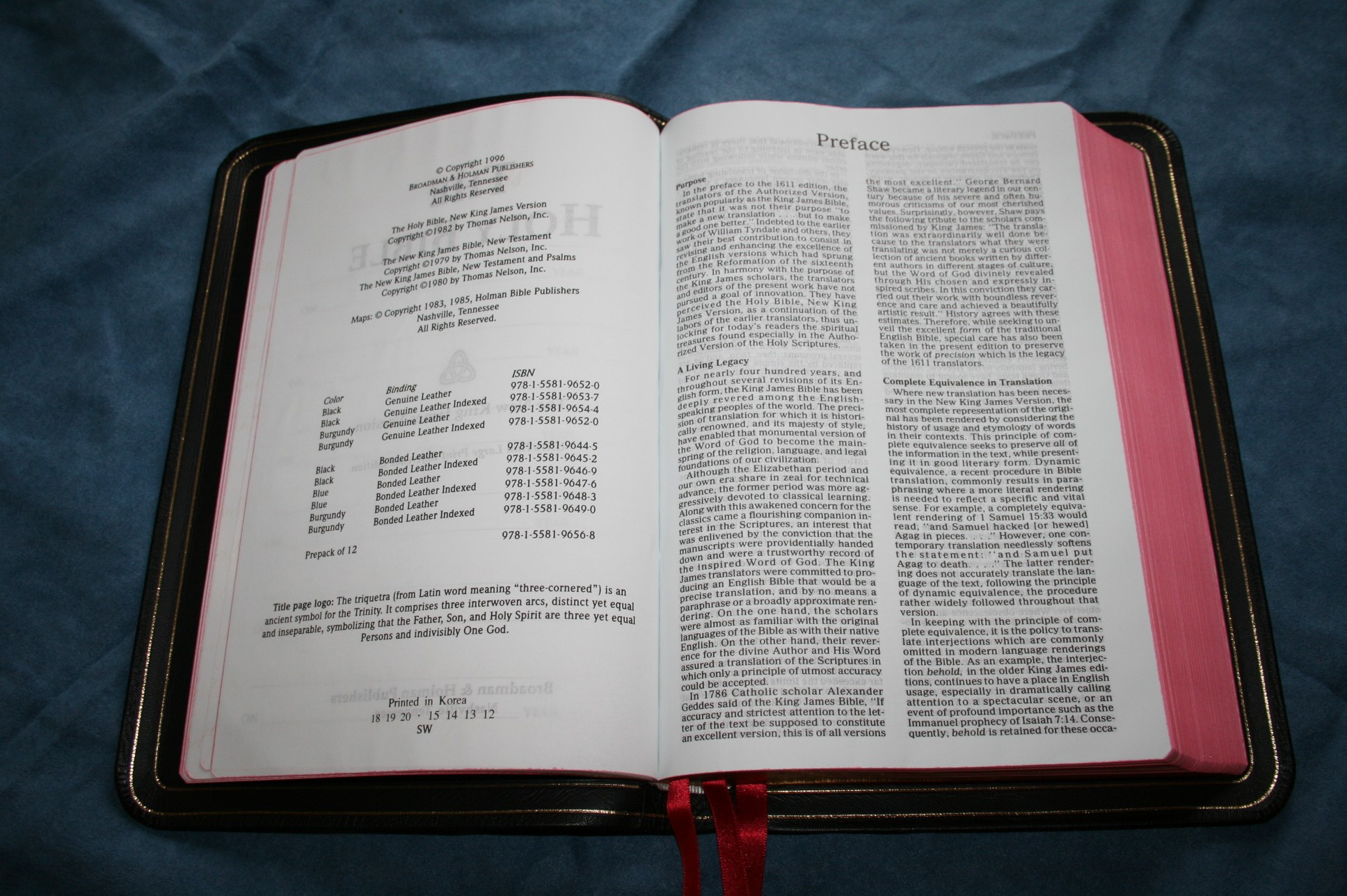
- Preface to NKJV
- 9/10-point font
- Red-letter
- 2 column, verse format
- Center-column references with translation notes
- Section headings
- Book introductions
- Harmony of the Gospels
- Concordance
- 8 Maps
- Double gilt-line
- Art-gilt edges
- Full-yapp
- 3 ribbons
- 9.25 x 6.25 x 1 (with yapp = 10.5 x 7)
- 1168 pages (+ preface and maps)
- Printed in Korea
- $180 – 188
Where to buy
Bibles-Direct: Allan New King James Version Classic Reference Edition
EvangelicalBible: Allan New King James Version Classic Reference Edition
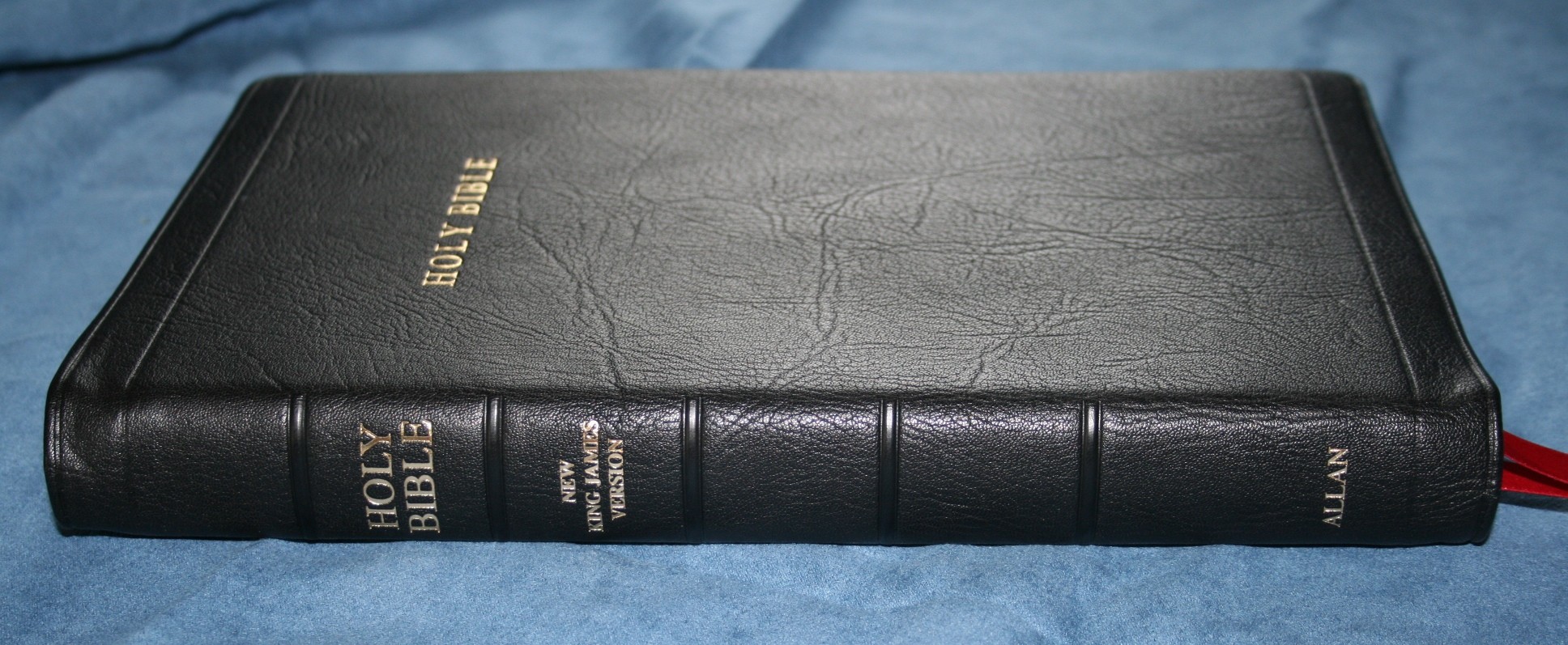
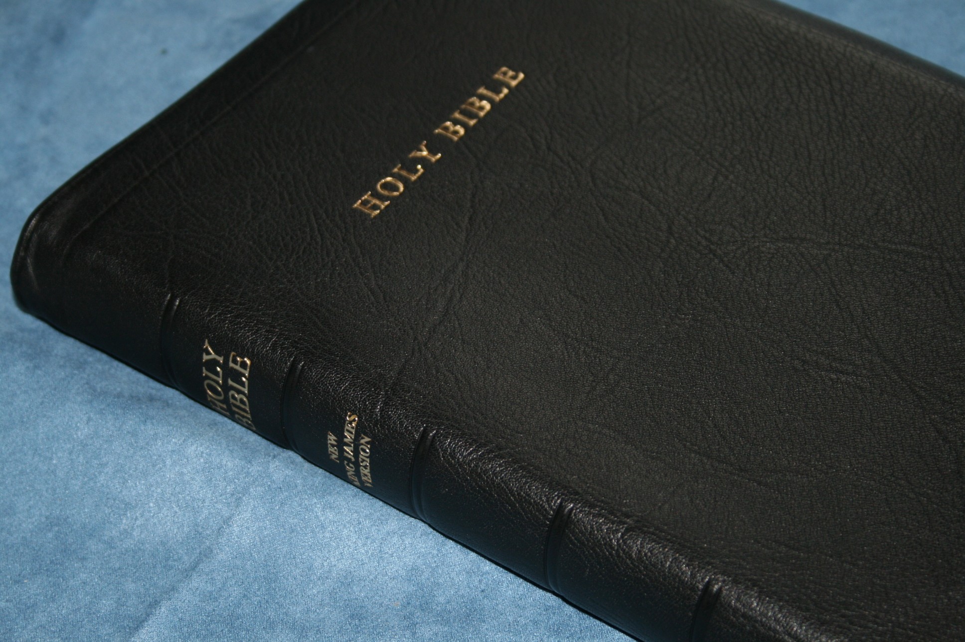
Cover and Binding
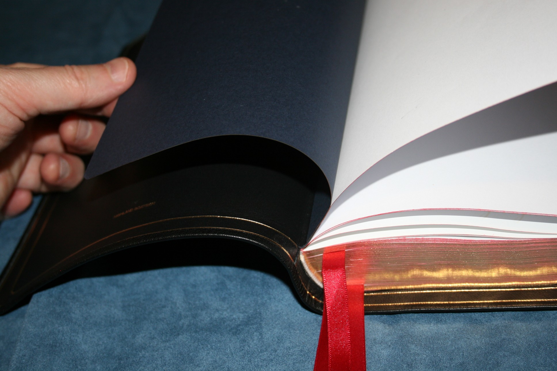
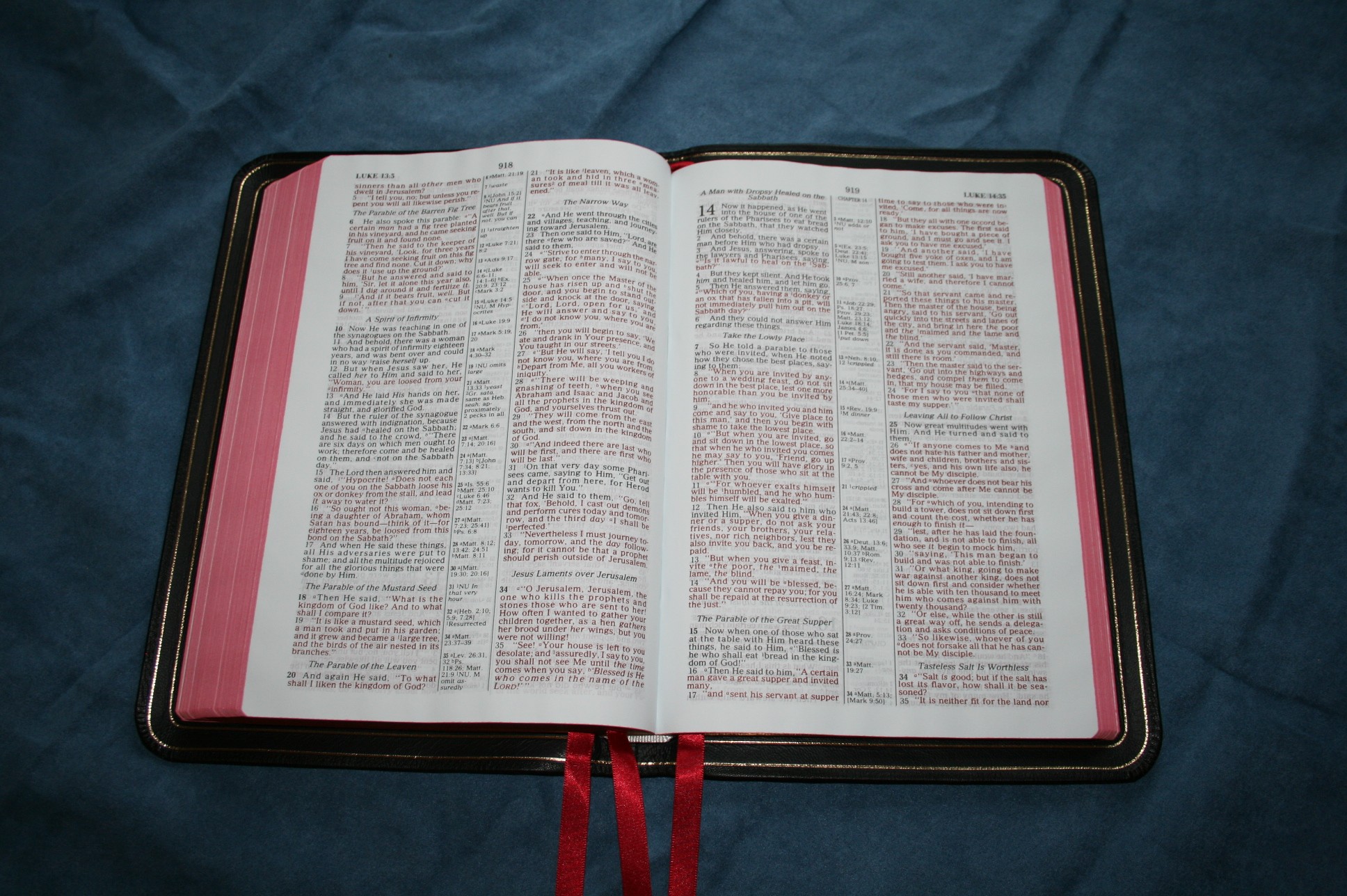
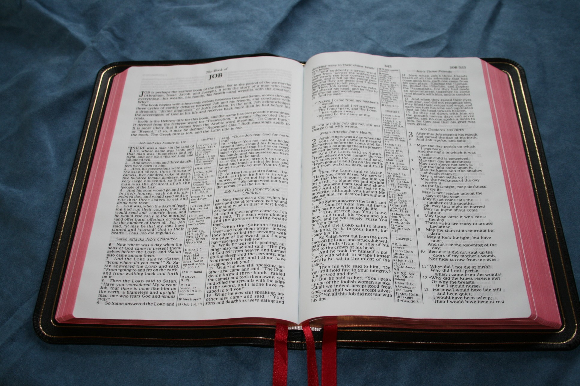
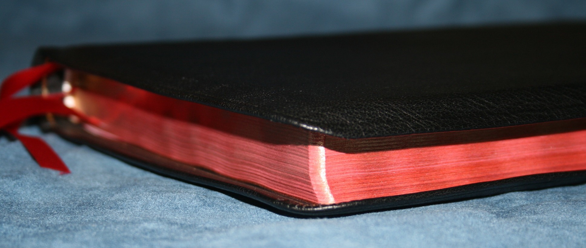
The cover is what you’d expect from an Allan binding: soft, flexible, supple, edge-lined goatskin with a natural grain. Allan’s goatskin covers are natural- meaning the grain is not pressed into the leather. Instead, it is the real grain of the leather. It also has a leather smell, which I like a lot. The cover has a full yapp – meaning there is enough leather past the page so the front and back cover can touch, fully covering the paper. This does seem to help protect the paper. This one feels very much like a Longprimer – just a touch taller and a little thinner.
The liner feels like leather, but I’m not sure what kind. It has a smooth grain. The inside edges contain a double gilt line, which helps gives this Bible an elegant look when opened. The perimeter is glued. I would like to see a fully stitched perimeter. Stitching just seems stronger to me.


The binding is, of course, Smyth sewn. It has no problem lying flat.

Paper
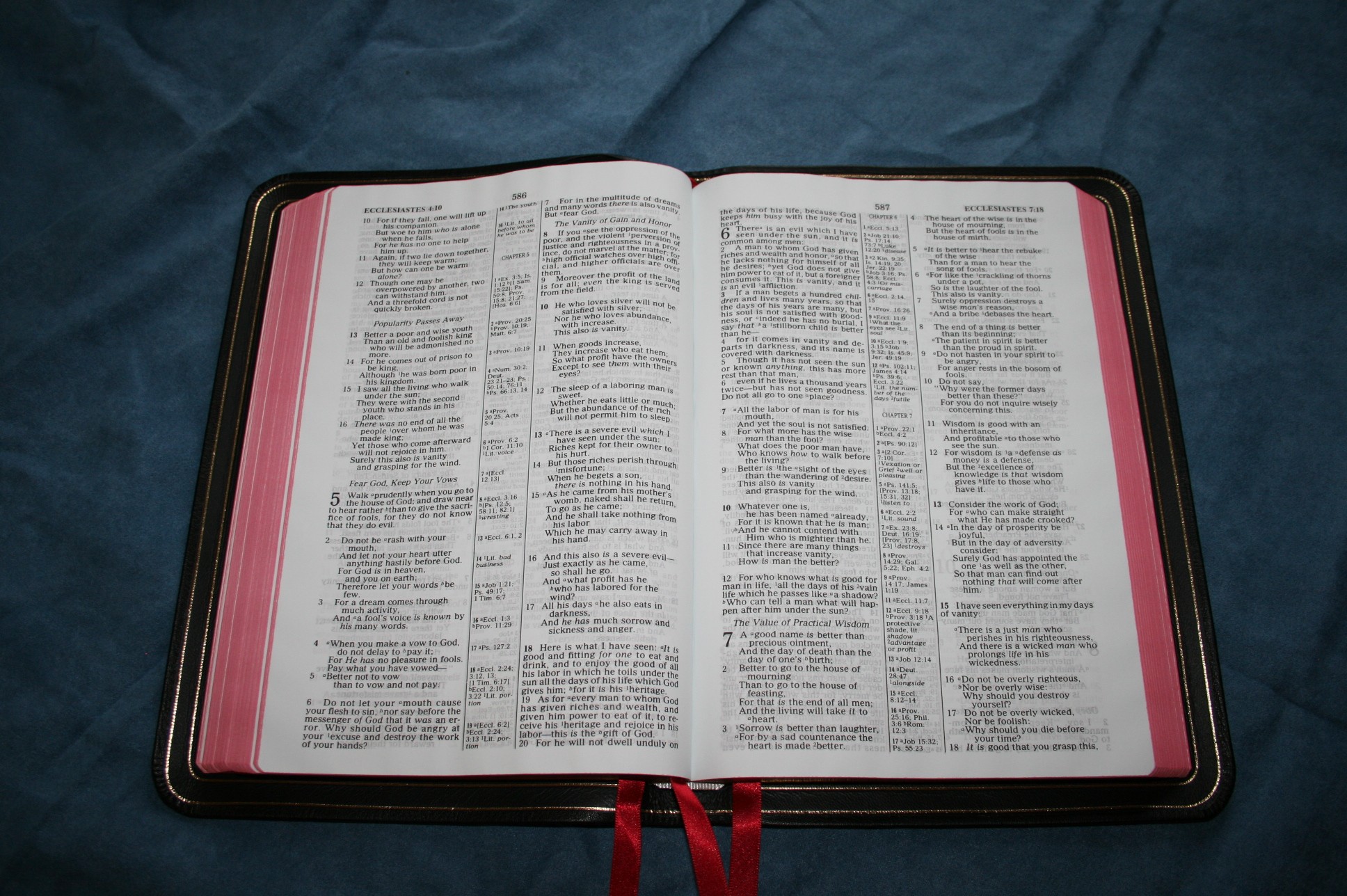
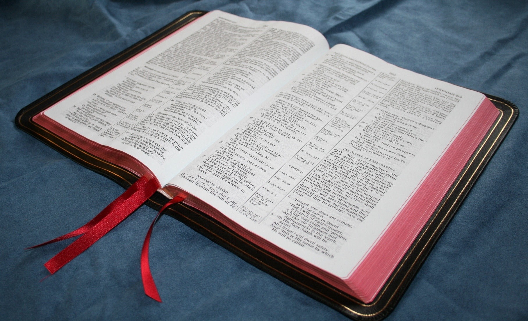
The paper is light-weight India paper and has a blue (and sometimes cream, depending on the lighting) tint which eases reading, but it’s not as opaque as I would like (look in the gutter to see the color tone). I’m not a fan of this paper. I like the Longprimer’s paper much better. There is more show-through than what is found in the Longprimer. I don’t know the gsm, but it feels thick enough. The opacity looks to be about the same as the Clarion. The font is bolder than the Clarion, so the paper could be more opaque but it just shows more because it’s bolder. It doesn’t bother me to read it; I just thought it would be better.
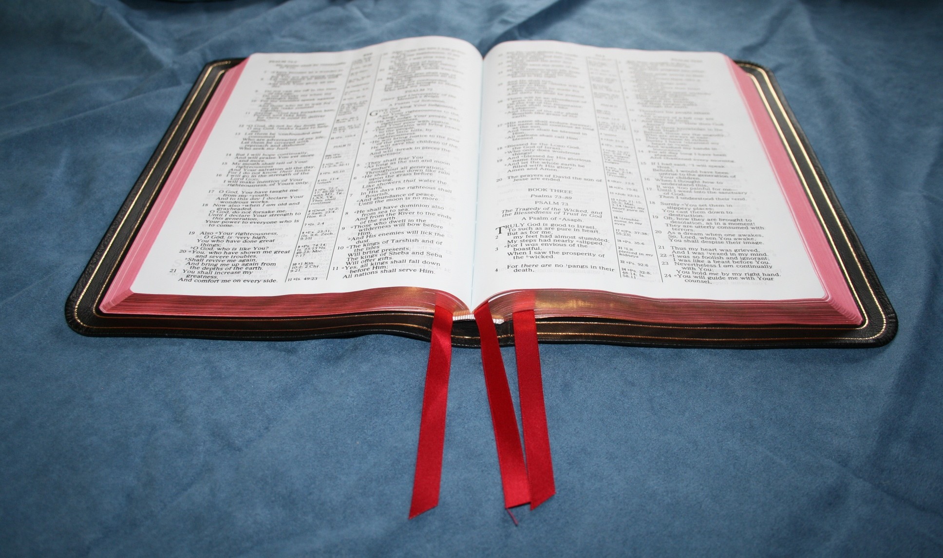
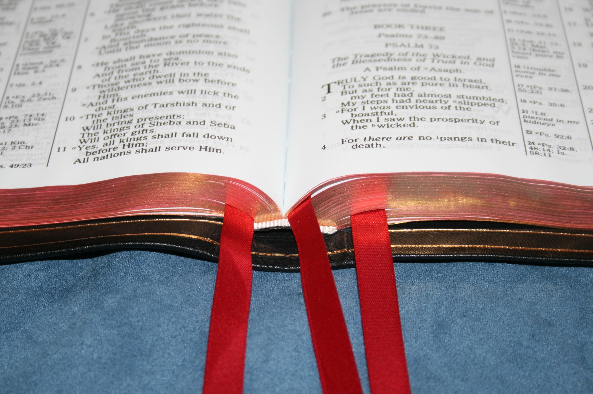
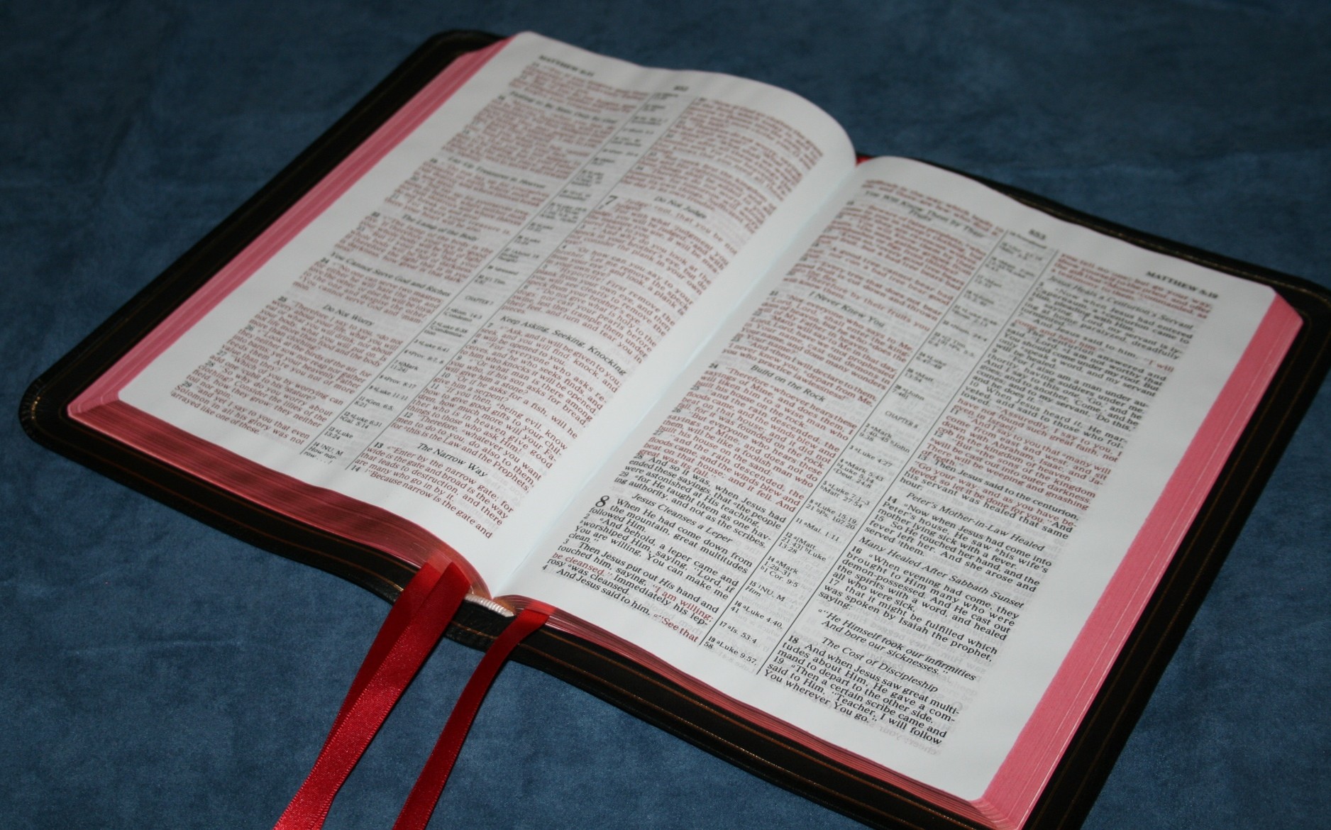
The edges are art-gilt- also known as red under gold. This gives the gilting a copper color, which I love the look of. When the Bible is open, the edges are an extreme red color. The red bleeds through the edge of the page just a little. This is normal, but some might find this distracting. Regular gilting looks white when opened which I think is better for reading, but I do love that copper color.
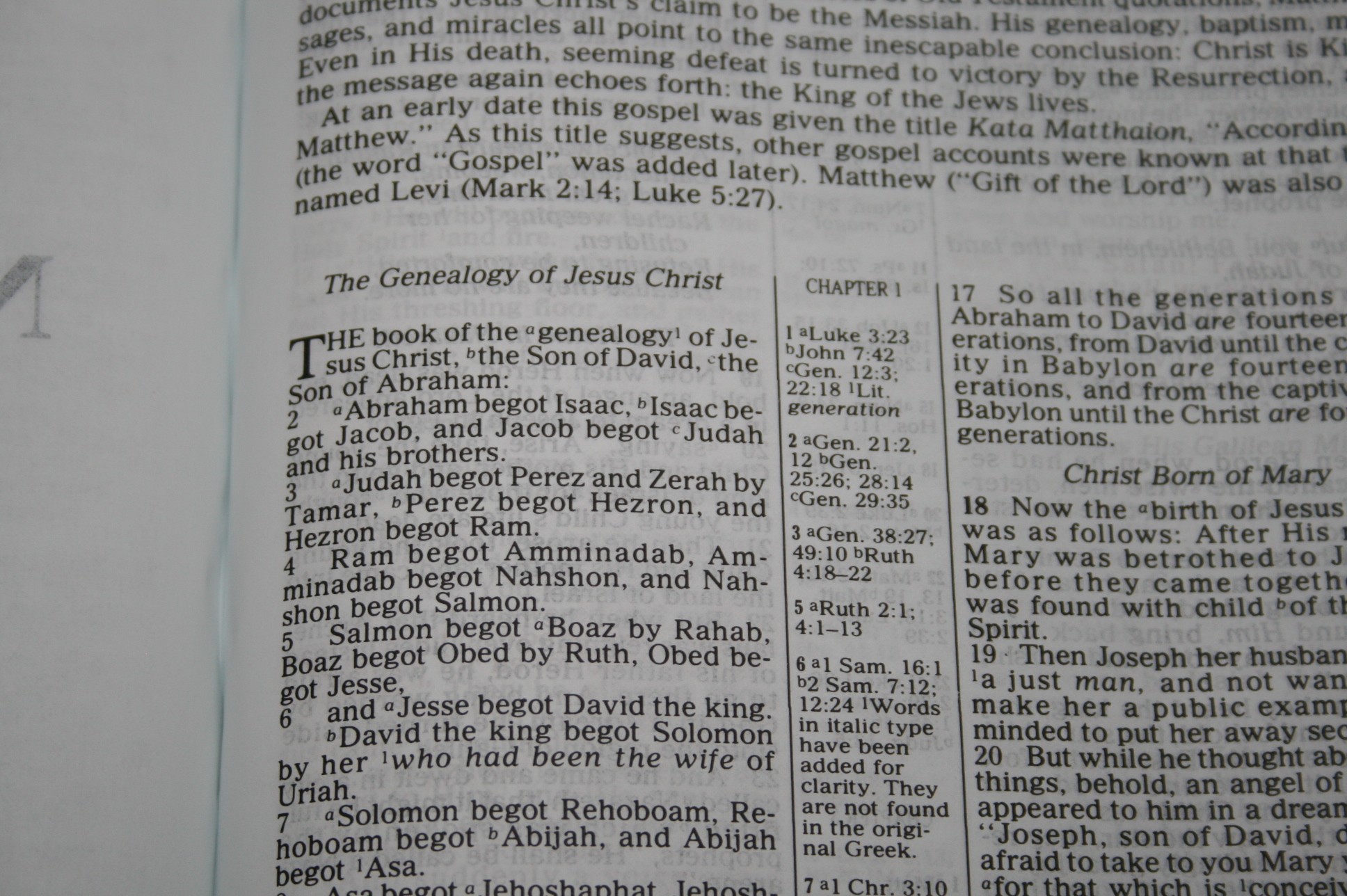
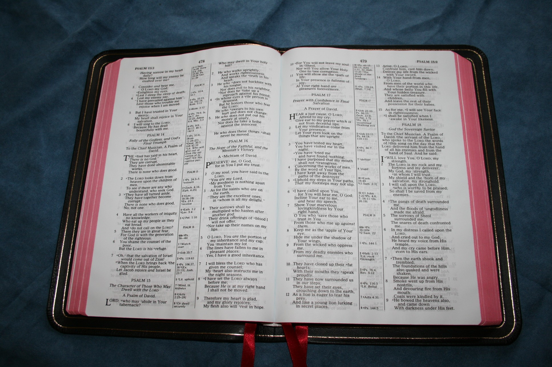
The font looks like a 9-point with not quite a 10-point leading. The font is not much larger than the 8.75 found in the Clarion and slightly smaller than the 10-point font in the Longprimer. I would call this a semi-bold font. The print is not as consistent as other Allan’s that I’ve used. It never gets faint, but it is noticeable.
There is .5 inch margin on the inner and outer margins, which will be useful for writing references, symbols, or even short notes. This also gives plenty of space in the gutter, so the text isn’t in the bend of the page. The page is still easy to read even with a ribbon in the gutter.
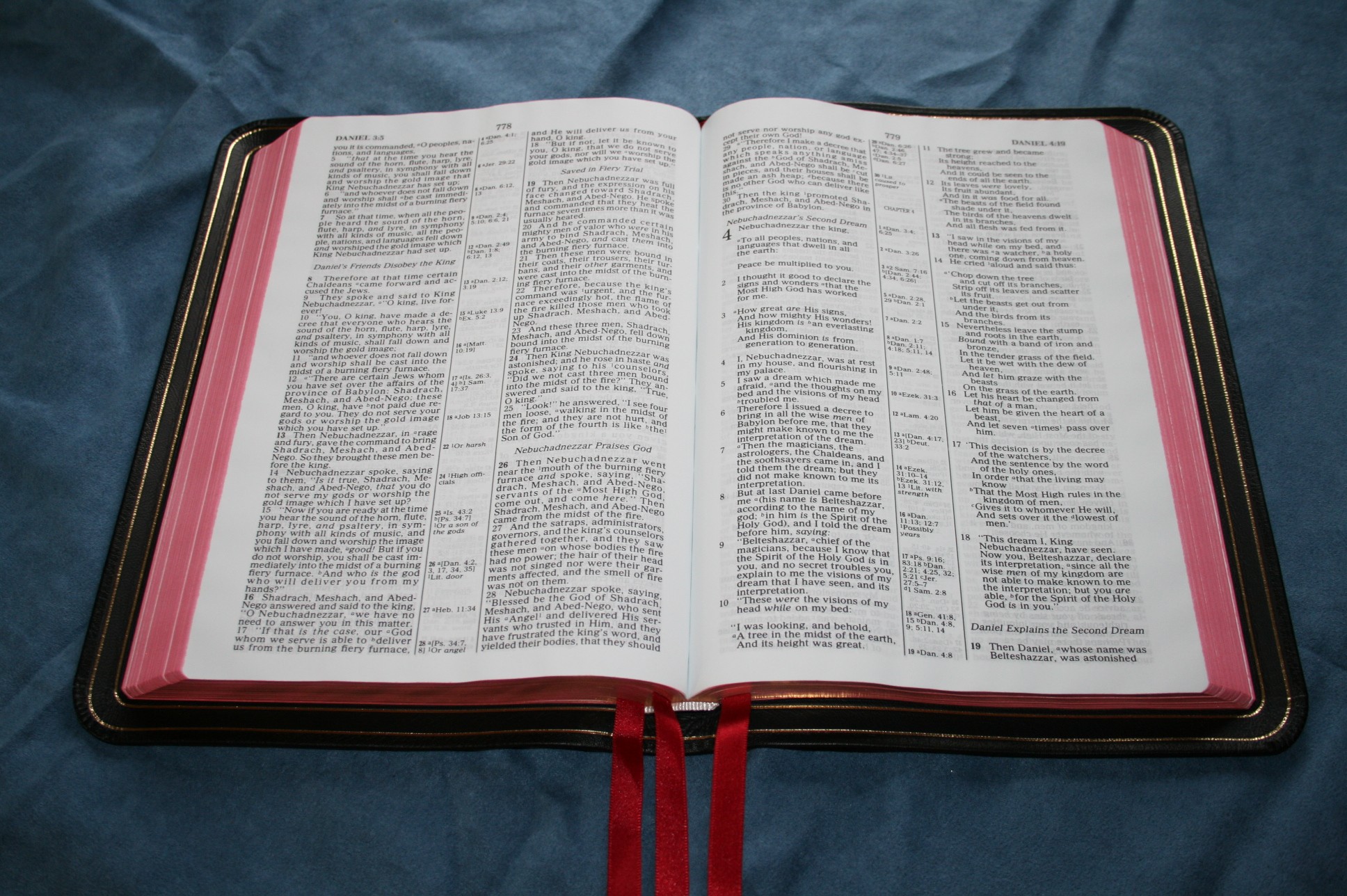
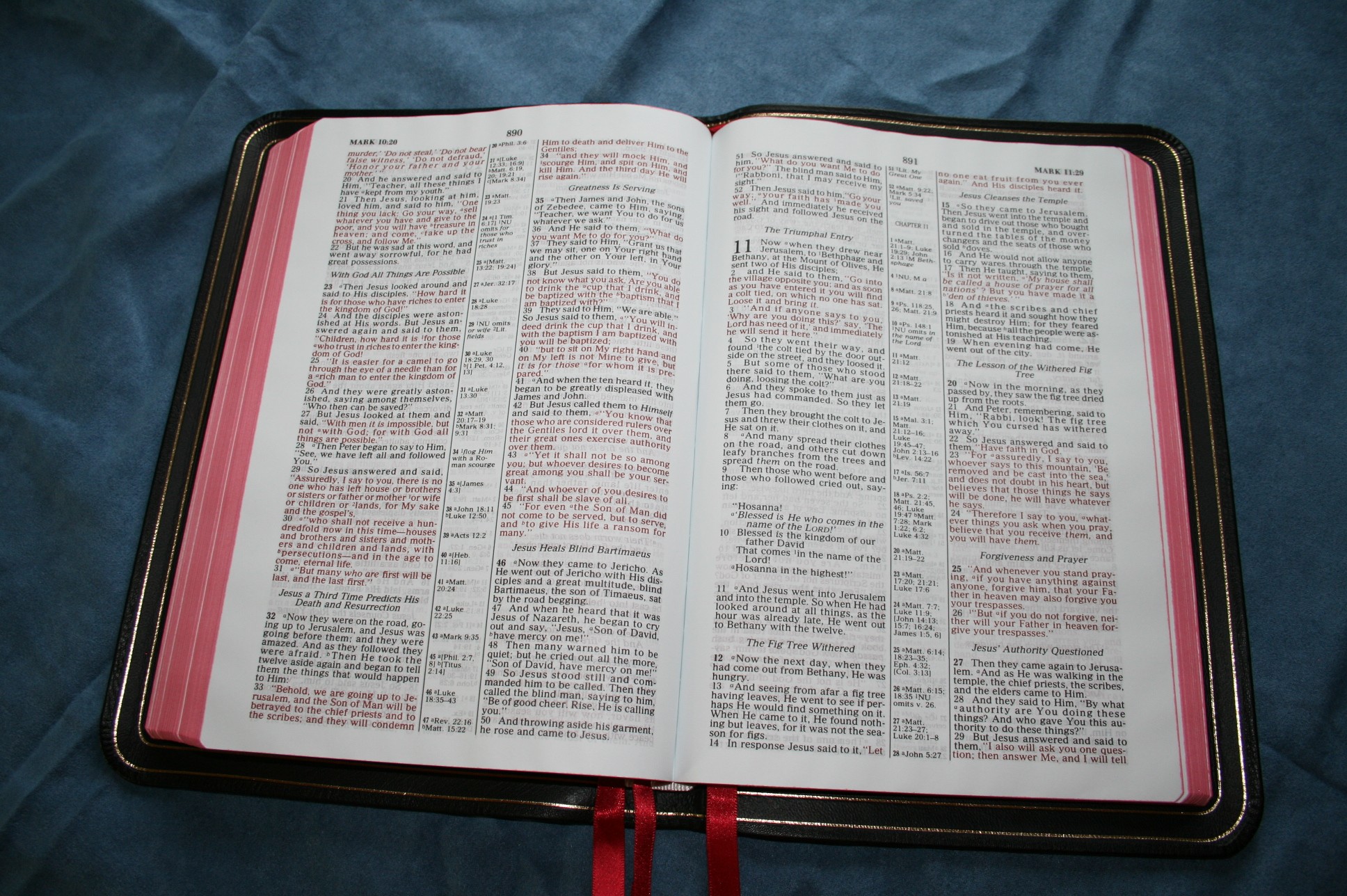
This is a red-letter edition with all of the words of Christ in red, all the way through Revelation. The red is fairly dark, but unfortunately, just like the black text, there is some variation in the print quality. It never gets light, but it is noticeable.
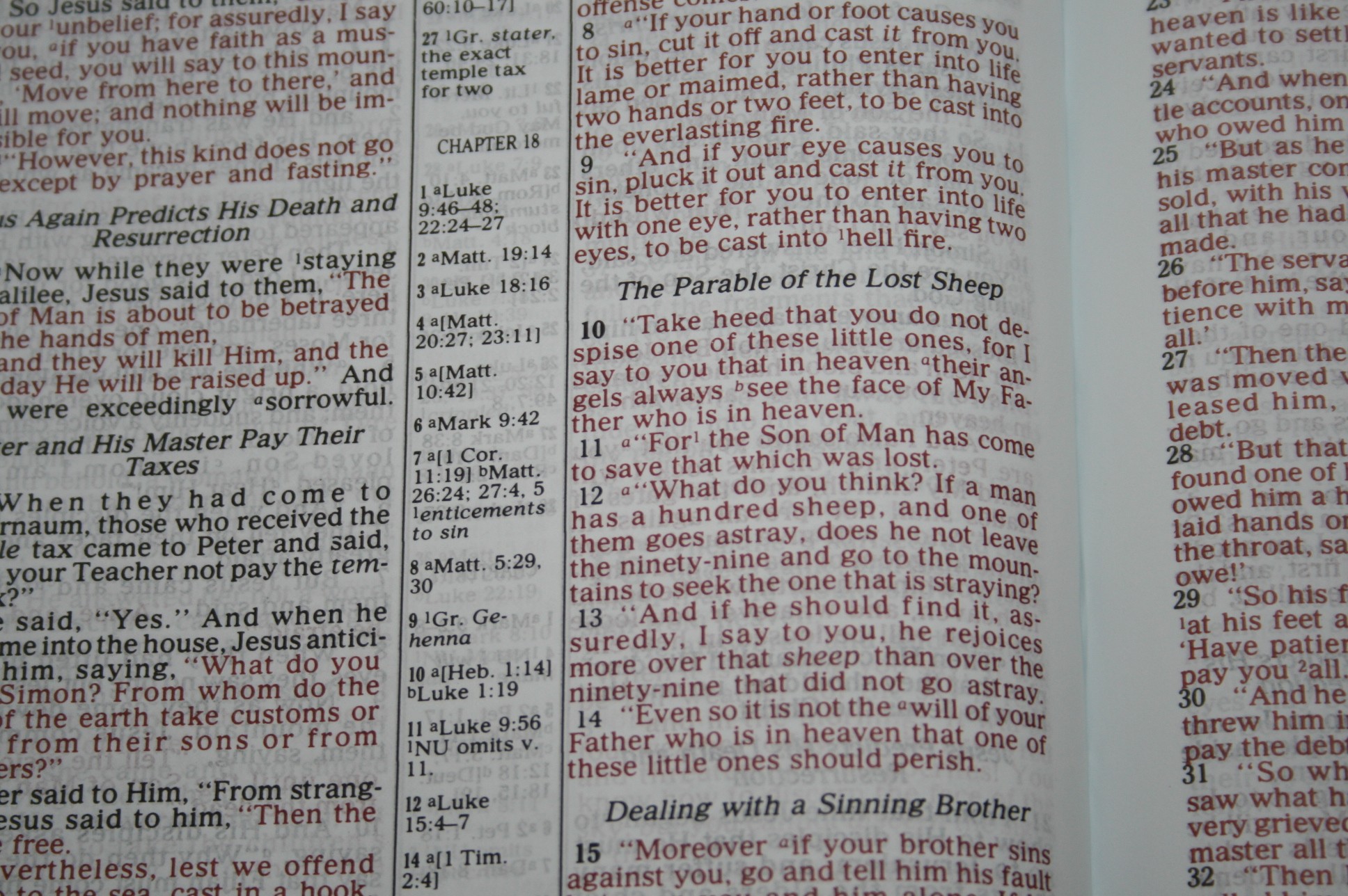
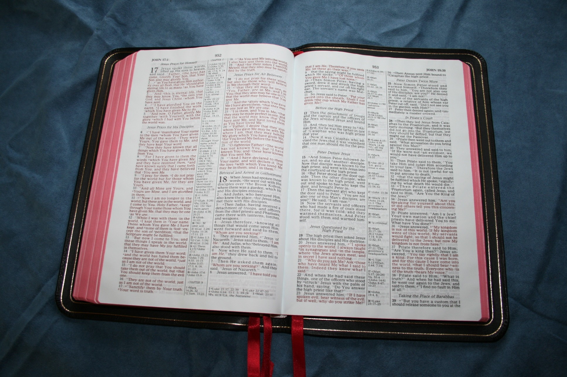
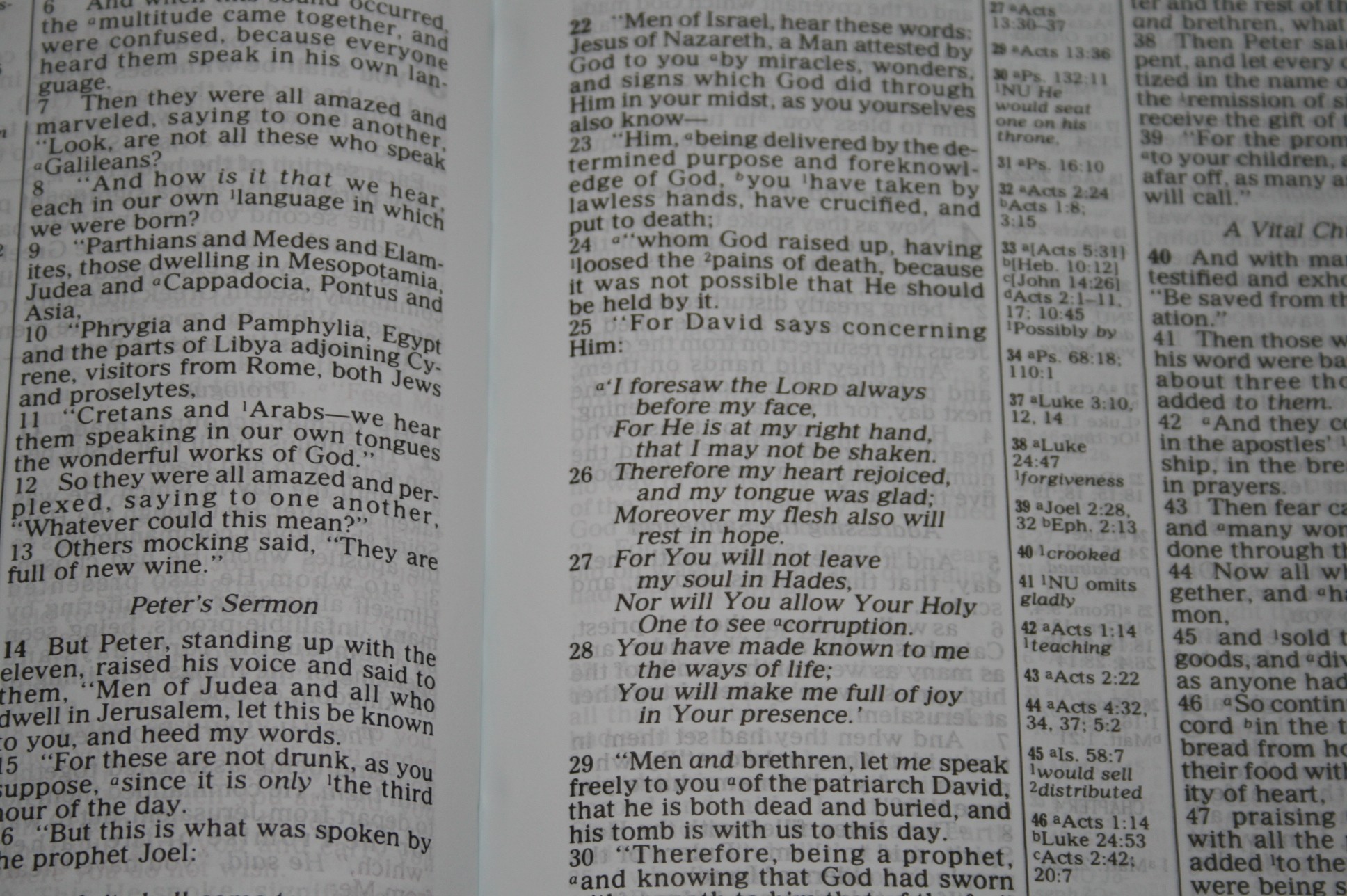
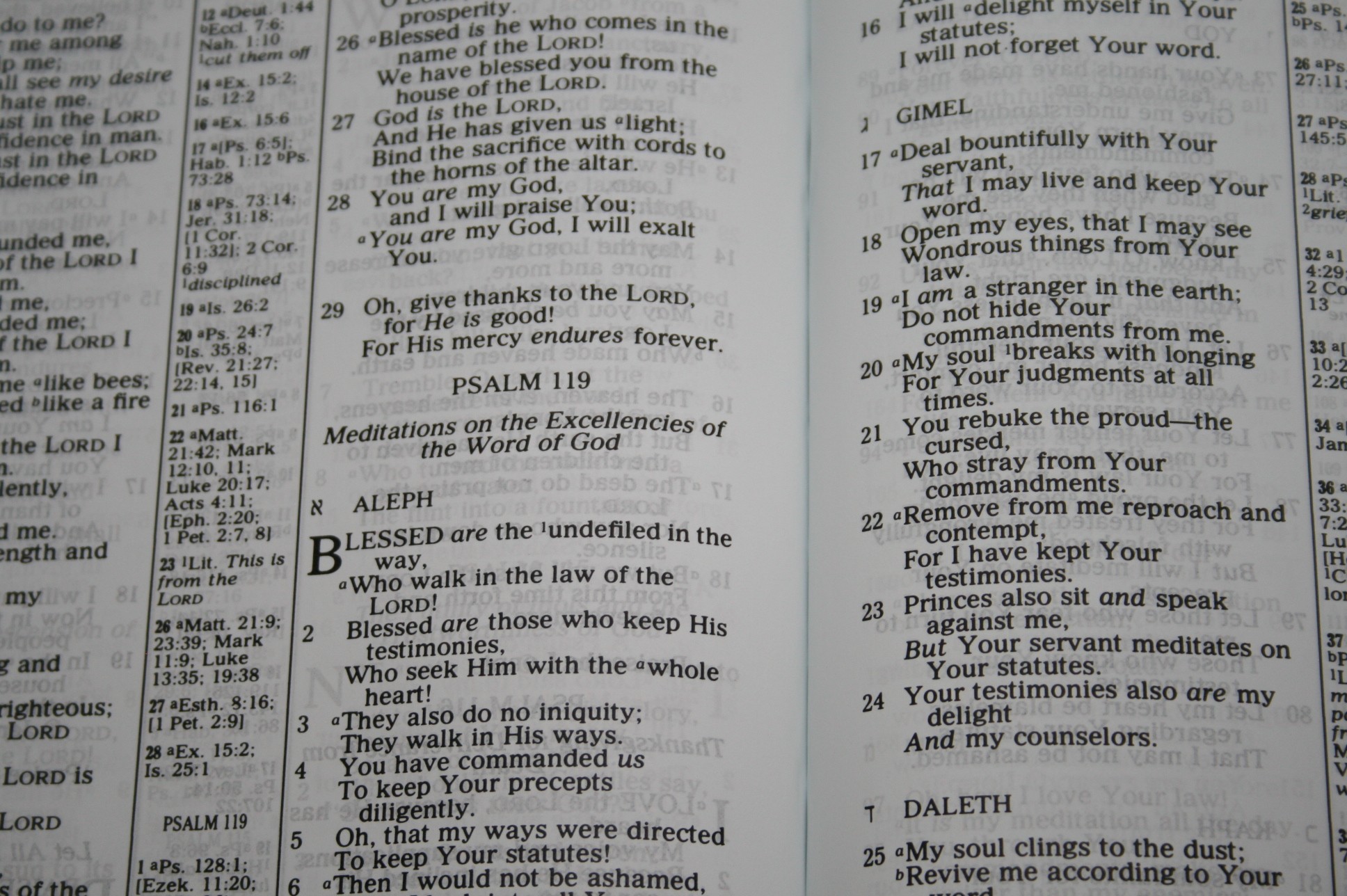
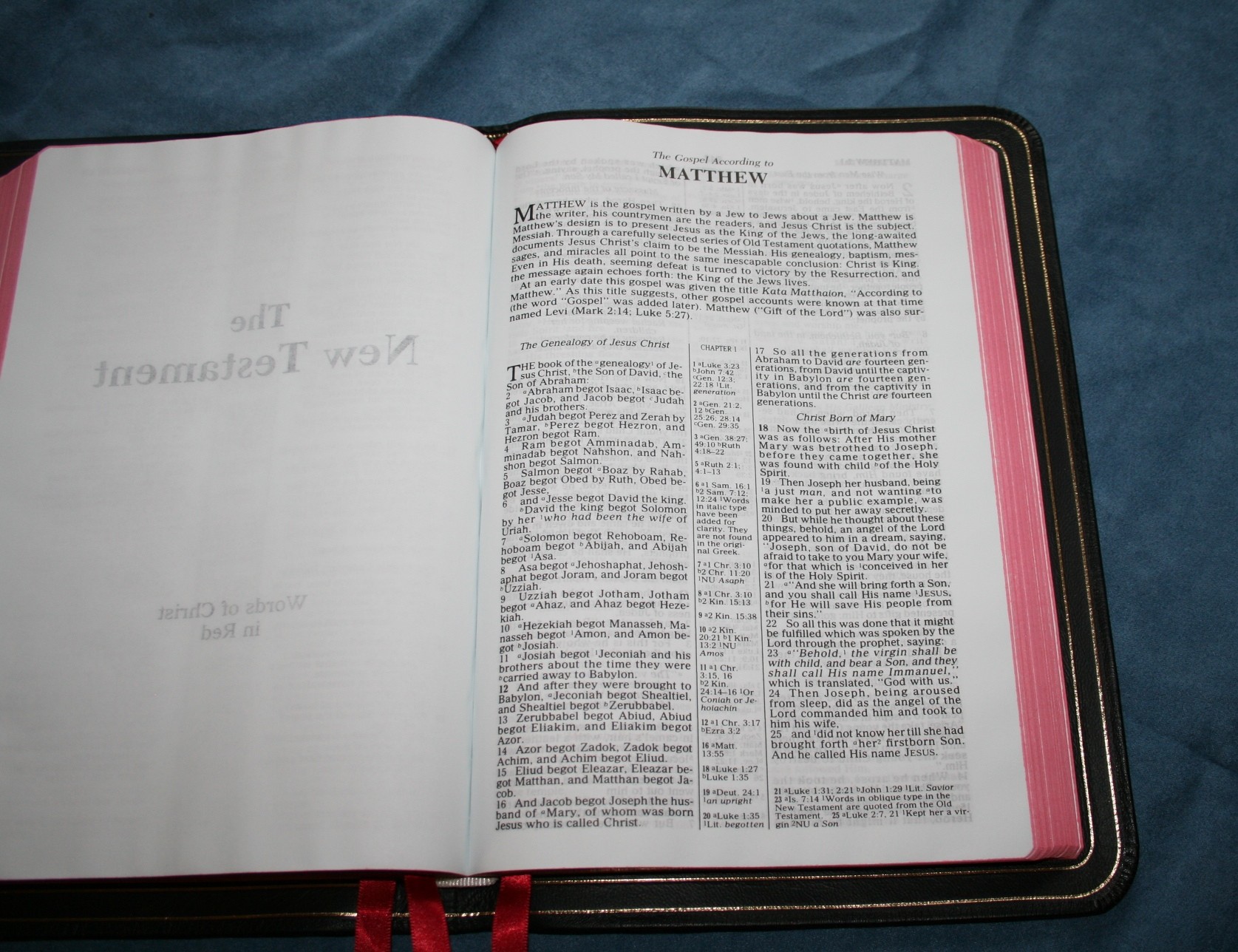
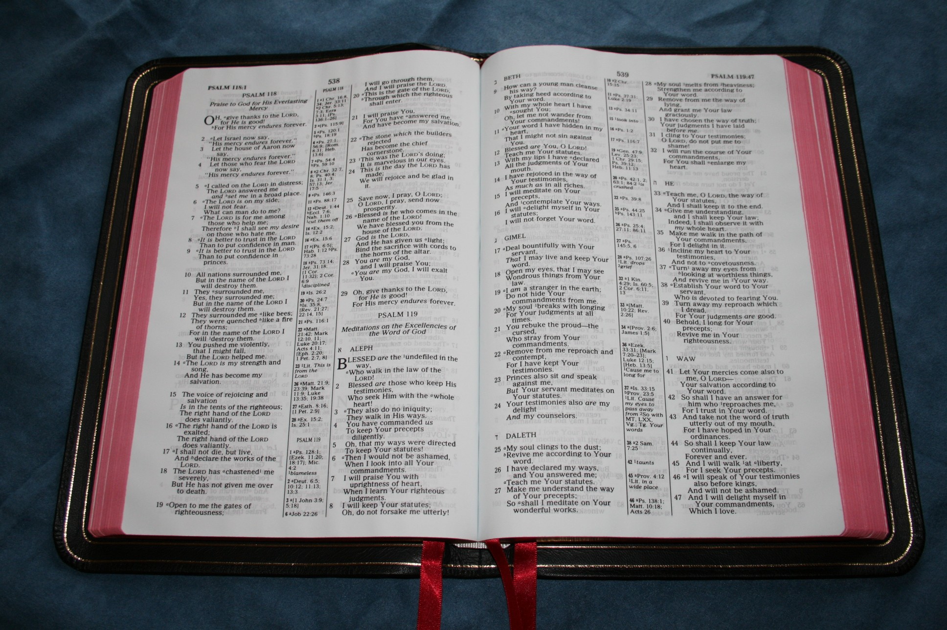
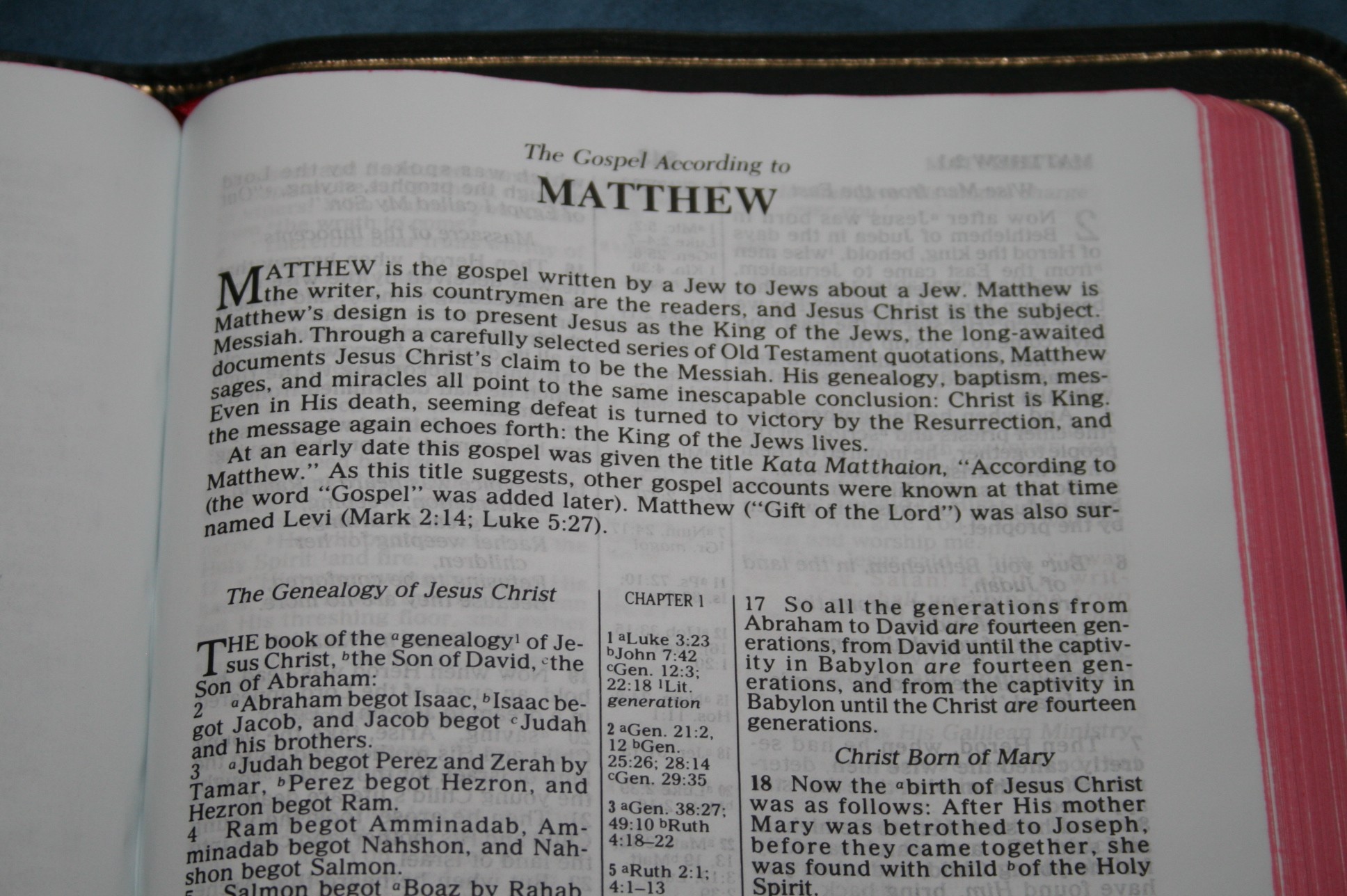
Verses are presented in 2-column verse-by-verse format. Paragraphs are marked with bold chapter numbers. Poetry is set to verse, so each line is indented. Old Testament quotes are in oblique text.


References and Notes
Cross references and translation notes are the standard supplied by Nelson for the NKJV. They are placed in the center-column and are keyed to the text with indicators. Verses are indicated with a bold verse number. References are presented in verse order and a new chapter is indicated with “Chapter” followed by the chapter number. If there are more references than will fit in the center-column, they appear in the second column of Scripture after the last verse. Translation notes include information about manuscript variances and possible alternate translations for words or phrases.
Section Headings
The section headings, like references and notes, are the standard supplied by Nelson for the NKJV. They appear centered above the verses and are in italics. They stand out enough to be searchable but not so much that they’re intrusive. I find them useful and still easy to ignore if I wish.

Book Introductions
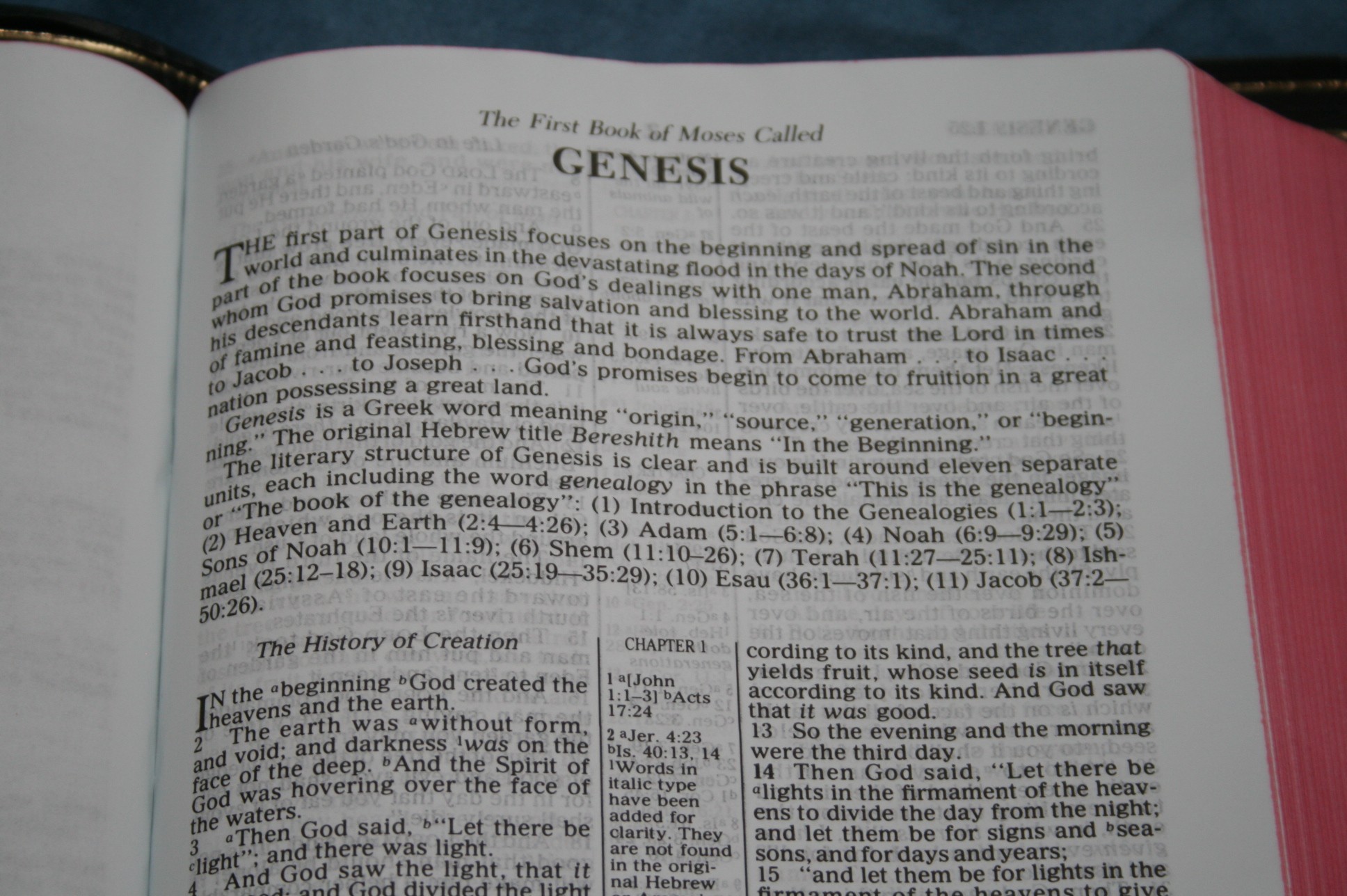
Books are introduced with 2-3 paragraphs of information about key characters, places, events, literary style, etc. The book introductions provide succinct information that helps in reading and study, but at the same time doesn’t get in the way. Each introduction focuses on different information, so they won’t all have the same kind of information.
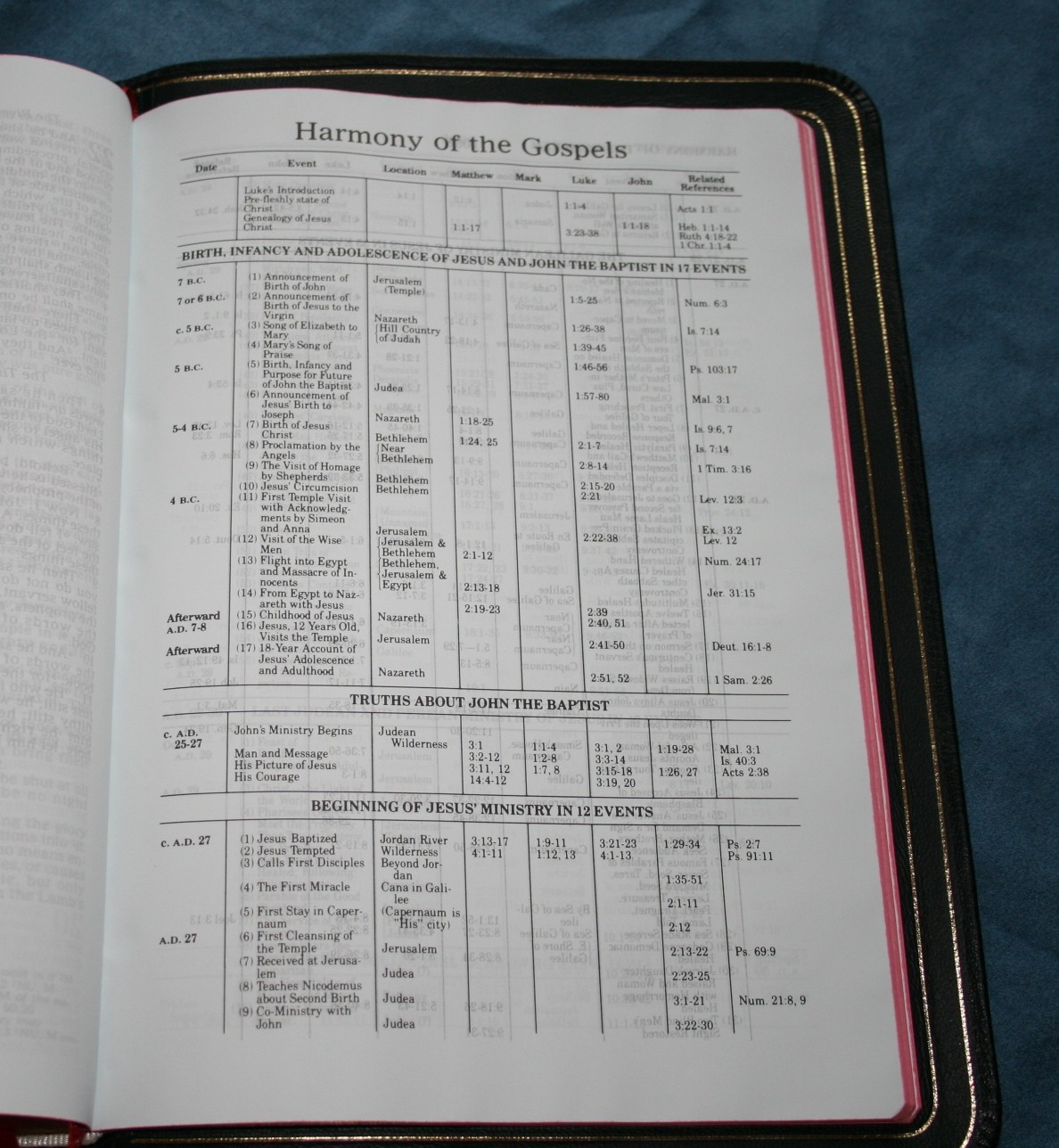
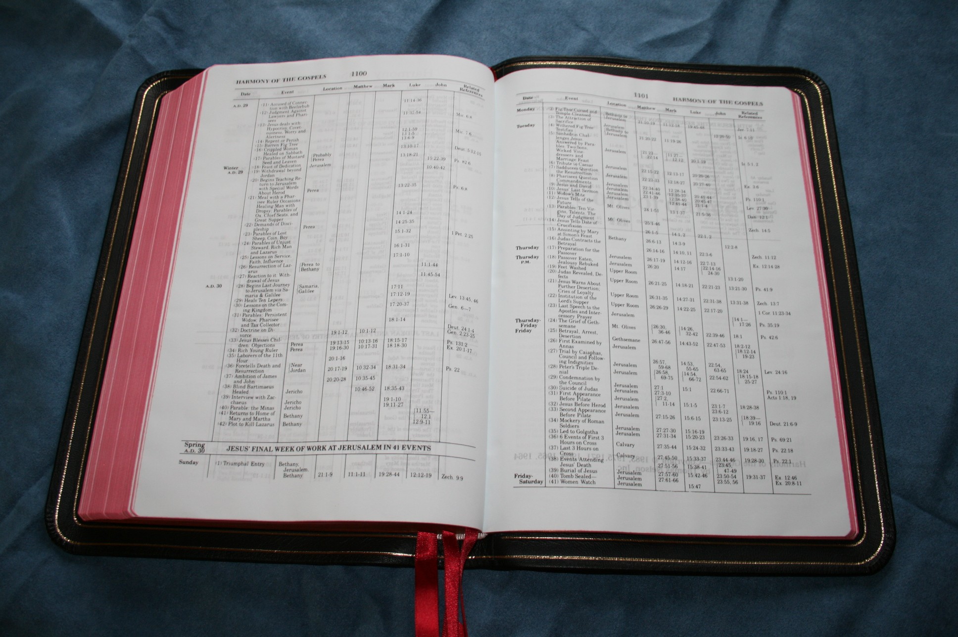
Harmony of the Gospels
A table showing the harmony of the gospels is the only extra feature in this Bible. It is presented in chronological order with dates given. Headings are used to separate dates into groups. It is 5.5 pages.
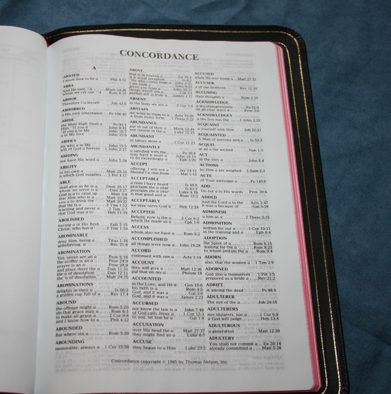
Concordance
The concordance is 66 pages and in three columns per page. There are actually more entries than I expected. There are 38 verses for “God”.
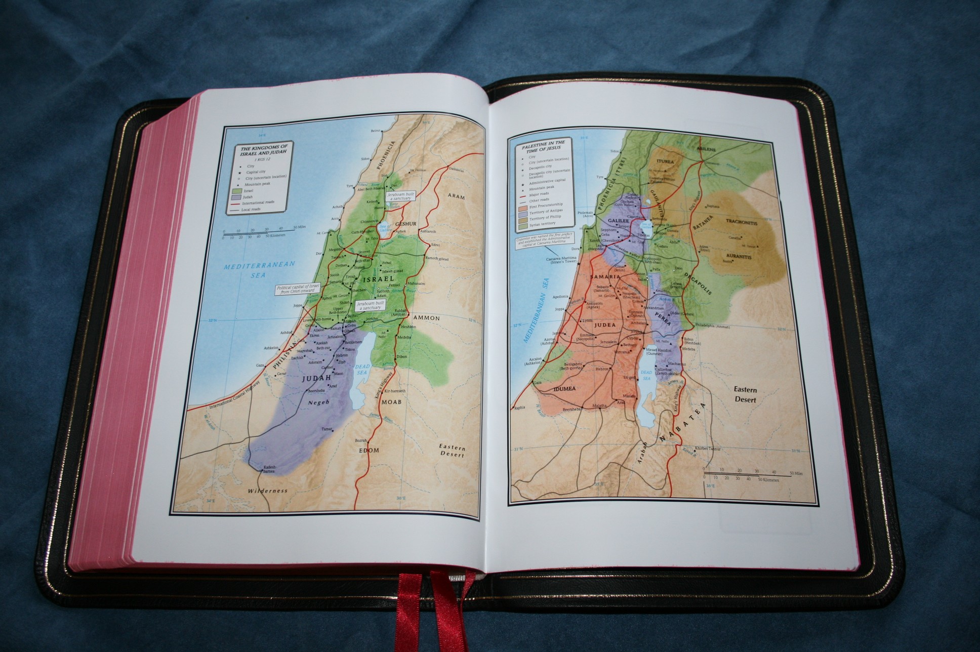
Maps
There are 8 full-color maps that are printed on thick glossy paper. They are very colorful and look nice, but for this price-point I expected 16 pages of maps with an index.

Ribbons
RL Allan’s ribbons are always the best available and these do not disappoint. There are three red satin ribbons that are 3/8 inches wide and extra-long, making them easy to use. They look great with the black highland goatskin.
Conclusion
RL Allan’s New King James Version Classic Reference Edition is a nice Bible, but it’s not an awesome Bible. I didn’t feel like it was the definitive NKJV. It’s not THE NKJV to own, but it is certainly worth owning. I’ve been looking forward to seeing this Bible for a while, hoping for a NKJV equivalent to Allan’s fine Longprimer. It’s a nice Bible, but it’s not a Longprimer. The cover is amazing. This is just me being picky, but it feels a little too tall. I would rather have it a little shorter and a little thicker – somewhere between this edition and the regular Concord would be the perfect size. The print is bold enough but does have some variation. Although it’s good quality, I’m not a fan of the paper. I don’t like the bluish tint and it has a touch too much show-through. Overall, it’s a good edition of the NKJV and if your preference is double-column, verse format, this is a good choice.
Comparisons
Since this review already has a lot of pictures I decided to post comparisons as a separate post. I’ll place the link here when the post is complete.