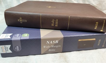
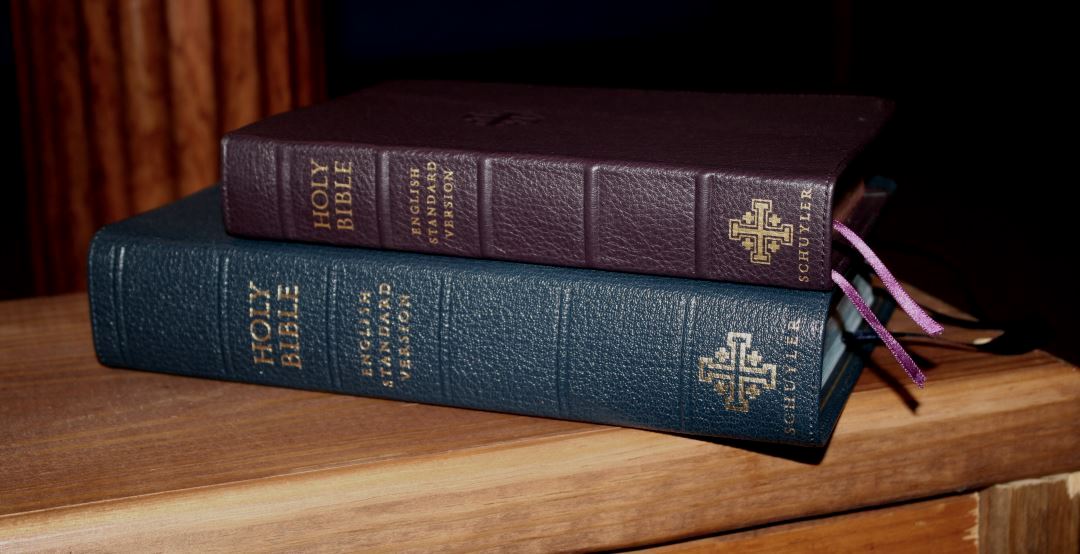
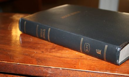
Schuyler ESV Personal Size Quentel Bible in Purple Calfskin – Review
Schuyler’s ESV Personal Size Quentel (named for Peter Quentel) is based their regular size Quentel. This edition is reduced in size (hence the ‘personal size’) and has the same pagination. It also has thinner paper, no concordance (to help reduce the thickness and avoid a concordance with a font that’s too small to read), and has added pages for notes. It’s available in goatskin and calfskin. I’m reviewing the purple calfskin edition. It was made in the Netherlands by Jongbloed and typeset by 2K/Denmark. The text is the 2016 edition of the ESV.
This Bible was purchased for review.
________________________________________________
Click here to buy from EvangelicalBible
________________________________________________
Cover and Binding
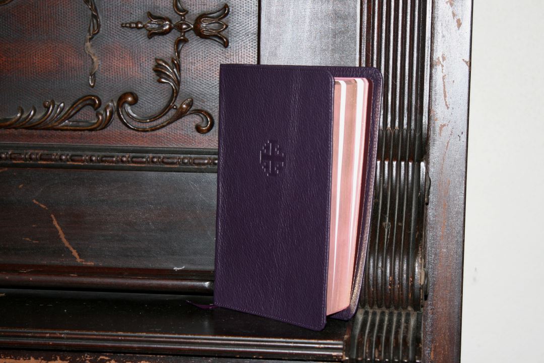
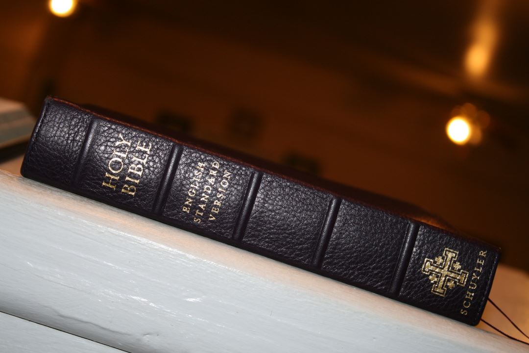
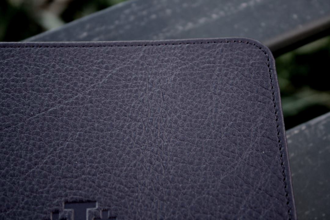
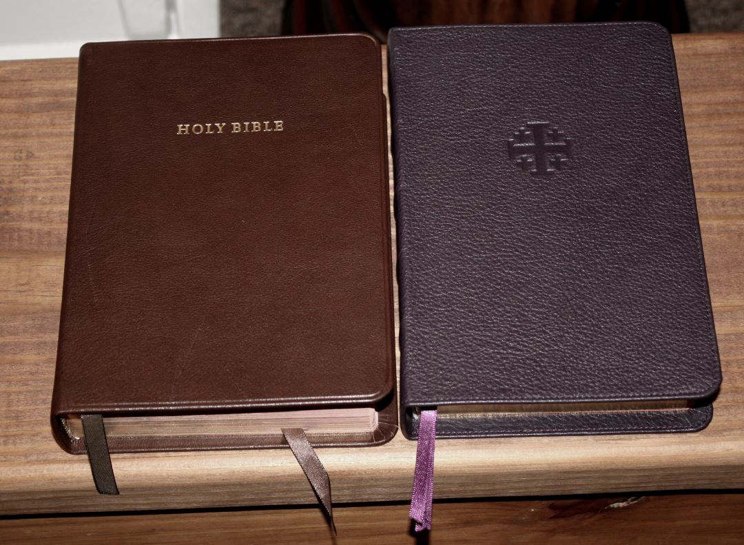
The cover is purple Meriva calfskin with a purple vinyl liner. This is a dark purple that doesn’t look out of place if a man is carrying it. I love this color. I’d carry it anywhere. The leather is soft to the touch and has a deep pebbly natural grain- much deeper than other Meriva covers that I’ve seen. It matches the Canterbury. This is my favorite calfskin. It’s much softer than calfsplit and more elegant than smooth calfskin. It isn’t floppy like goatskin. The cover is stitched around the perimeter.
The Jerusalem cross is debossed into the front. There are 5 raised spine ridges that separate the various sections. The text on the spine (which includes Holy Bible, English Standard Version, the Jerusalem Cross, and Schuyler) is printed in gold. It has a 9mm yapp (overhang).
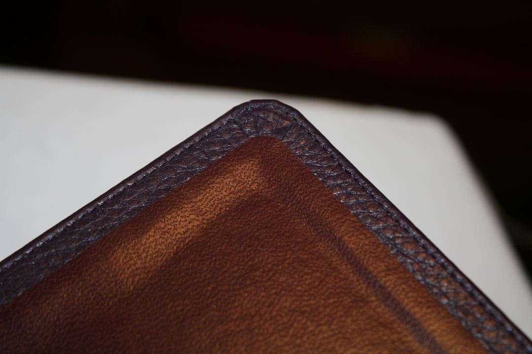
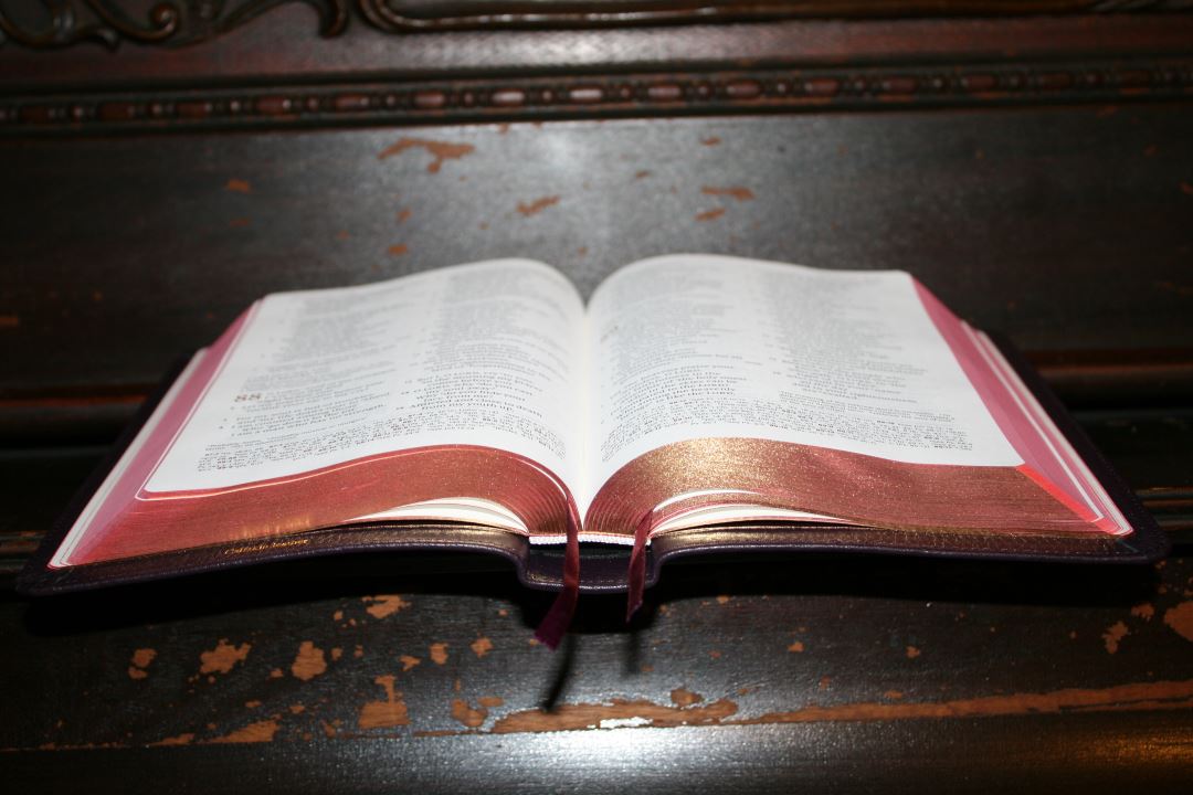
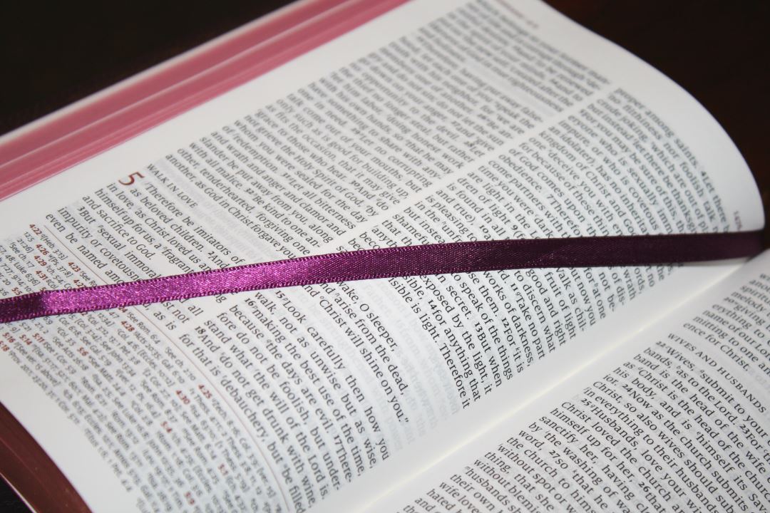
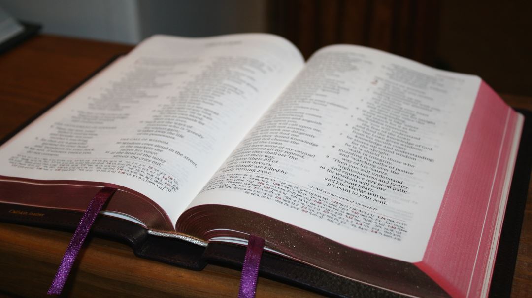
The text-block is Smyth-sewn and will lay open anywhere I want it to. The white head and tail bands blend well with the purple cover, two 5mm purple ribbons, and red art-gilt edges.
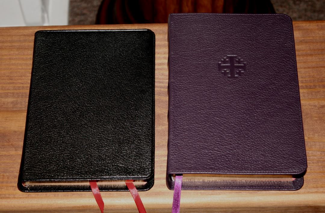
The text block size is 7 x 4.7 x 1.1″. The overall size is 7.8 x 5.18 x 1.3″. It weighs 1 lb 5.9 oz. This size is perfect for carry and for holding in one hand to read.
Paper
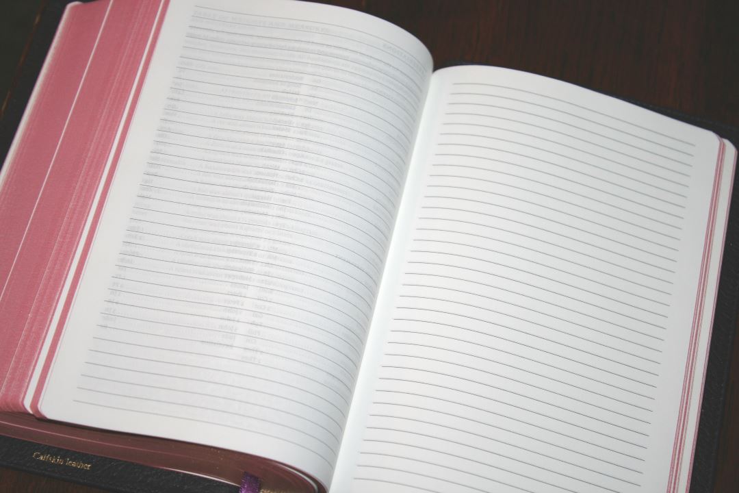
The paper is 28gsm Indopaque. It’s extremely opaque, which is especially impressive considering how thin the paper is. The paper doesn’t really feel thin to my fingers though. It’s white in color and has a texture that feels like it’s coated. I found the pages easy to turn and a joy to read. It has 9 lined pages in the back for notes (which is the one thing I wanted to be added to the regular edition). The art-gilt edges, with red under gold, are nice and dark.
Typography
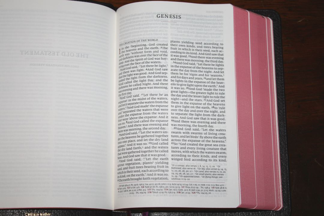
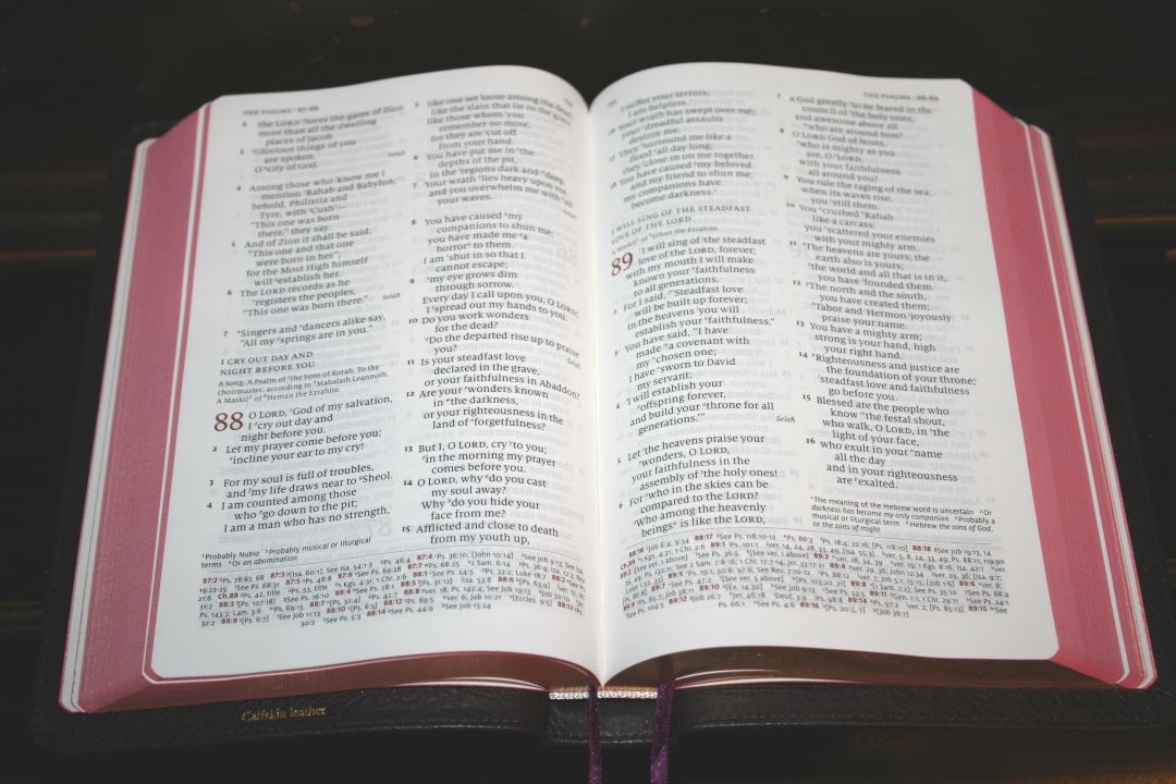
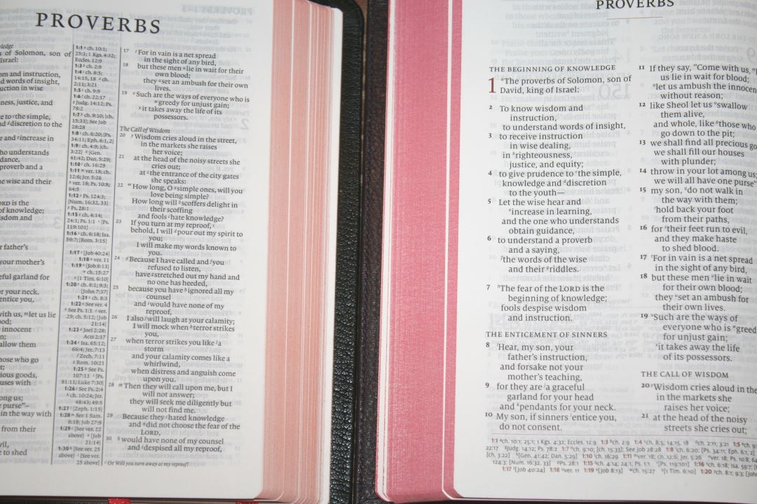
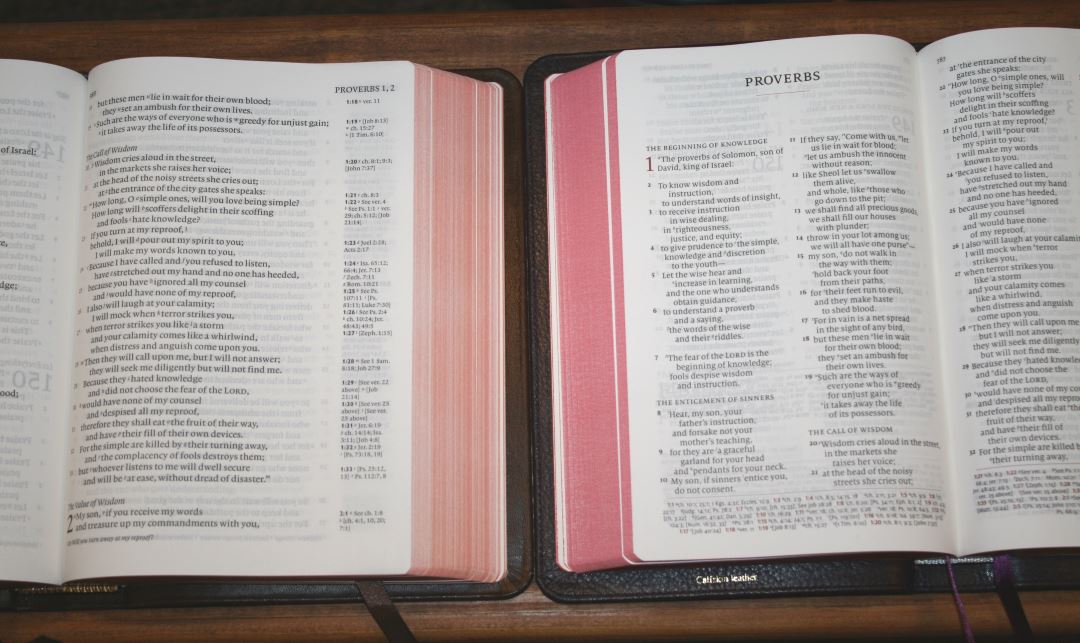
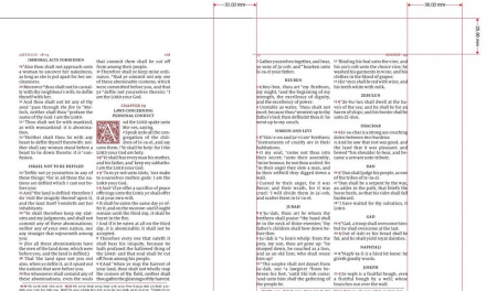
The text is in double-column, paragraph format with translation notes under the last verse in the outer column, and references across the footer. Poetry is set to stanzas. The header shows the book names and chapter numbers that appear on that page and the page number. The header text, chapter numbers, and chapter and verse numbers in the footer are printed in red.

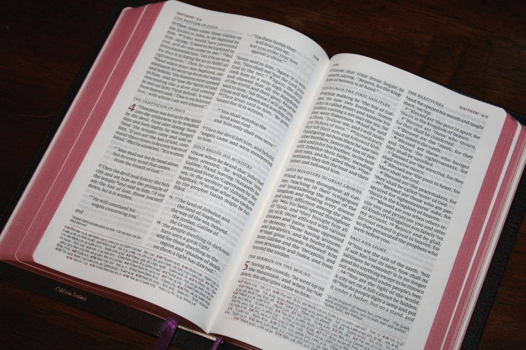
The text is a black-letter 8.5-point Milo serif font with around a 9.5-point leading. It’s dark but not too dark. It’s highly consistent throughout. The text is printed with line-matching, so the lines on the front and back of the page line up to keep the page cleaner. The columns contain around 35 characters with around 7 words per line. It has enough inner margin to keep the text out of the gutter. The spacing between the words looks natural even at this smaller size.
It’s difficult to get poetry to look right in double column layouts, but 2K/Denmark gets it right in the Quentel series. They break up the lines at the right places (just like musical lines). There aren’t any lines with a single word. It’s nice and readable at this smaller size.

To my eye, the typeface (including the spacing and font weight) actually looks better at this smaller size than the larger edition (and I like the larger edition). It almost looks like the text was designed to be small to begin with.

References and footnotes are keyed to the text with letters and numbers. The keys are small and I find them easy to ignore, so I can read this text without having to look at every single footnote. They’re also a little difficult to see, but I can see them with my bifocals as long as my eyes aren’t tired. I did sometimes mistake them with quotation marks, or mistake quotation marks for keys. I like that the references and notes are separate from the text. The notes are under the outer column and the references go across the page in the footer, separated from the text by a red line.
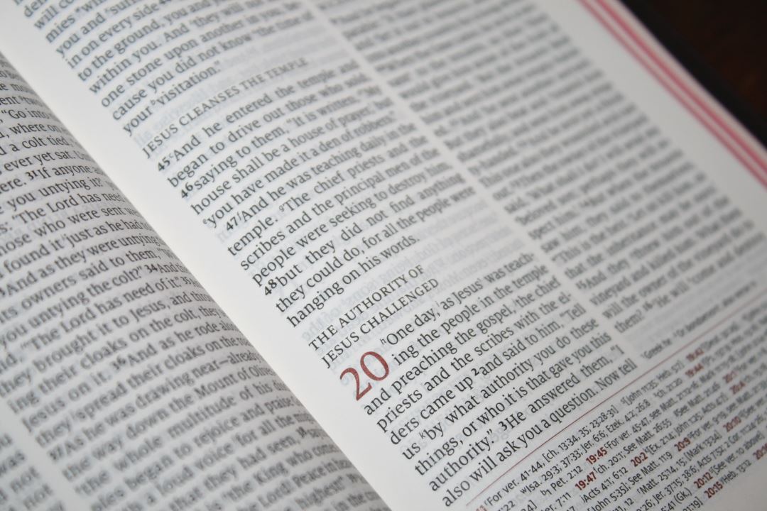
Verse numbers are larger than the cross-reference and footnote keys and are much darker. This helps them stand out and makes them easier to find. I have no issues finding them quickly. I also had no issues ignoring them. Chapter numbers are in a two-line drop-cap and are printed in a red. This is a nice dark red that makes the chapters stand out.
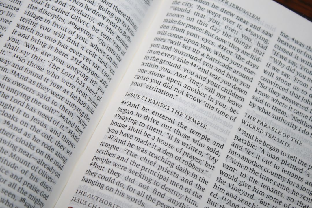
The section headings are in all caps. They stand out from the text really well but I also find them easy to ignore. Books start on a new page, giving you a little bit of space for notes at the end of most books.
Cross References
It has over 80,000 cross-references. They are keyed to the text with letters and are placed in the footer in Milo sanserif. I like that it uses the same font family as the text. The chapter and verse numbers are printed in red. My main concern with reducing the size of the Quentel was how difficult it would be to read the smaller cross-reference text. They are a little difficult to read, but I can read them with my bifocals. There are plenty enough references for study and sermon prep.
Here are a few examples:
- Genesis 1:1 – Job 38:4-7; Ps 33:6; 136:5; Isa 42:5; 45:18; John 1:1-3; Acts 14:15; 17:24; Col 1:16, 17; Heb 1:10; 11:3; Rev 4:11
- Deuteronomy 6:4 – Cited Mark 12:29;
- Isaiah 9:6 – [Isa 42:8; Zech 14:9; John 17:3; 1 Cor 8:4, 6]
- Matthew 17:20 – [John 11:40]; see ch 6:30; ch 21:21, 22; Mark 11:23; Luke 17:6; [ch 13:31]; ver 9; [1 Cor 13:2]; Mark 9:23
- Mark 11:23 – Matt 17:20; [Ps 46:2; 1 Cor 13:2; Rev 8:8]; Rom 4:20; 14:23; Ja 1:6; [ch 16:17; John 14:12]
- Mark 12:29 – Luke 10:27; cited from Dt 6:4, 5; Rom 3:30; 1 Cor 8:4, 6; Gal 3:20; Eph 4:6; 1 Tim 1:17; 2:5; Ja 2:19; 4:12; Jude 25; [Matt 19:17; 23:9]
- John 1:1 – Gen 1:1; [Col 1:17; 1 John 1:1; Rev 1:4, 8, 17; 3:14; 21:6; 22:13]; Rev 19:13; [Heb 4:12; 1 Jn 1:1]; 1 Jn 1:2; [ch 17:5]; Phil 2:6
- Acts 2:38 – ch 3:19; 20:21; 26:18, 20; Lk 24:47; ch 22:16; [ch 8:12]; see Mark 16:16; ch 10:48; see ch 8:16; see Mark 1:4; ch 10:45; [8:15, 20; 11:17]; see John 7:39
- 1 John 1:1 – see John 1:1; [ch 2:13, 14]; Acts 4:20; John 19:35; ch 4:14; John 1:14; 2 Pet 1:16; Luke 24:39; John 20:27
Footnotes
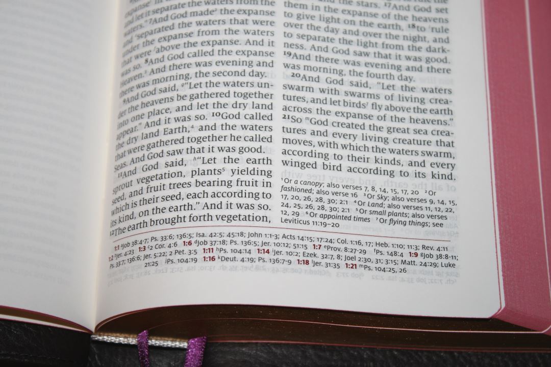
These are the standard ESV footnotes. They’re also printed in Milo sanserif and are the same size as the cross-references. They include notes from Greek, Hebrew, Aramaic, the Dead Sea Scrolls, Syriac, Masoretic Text, Vulgate, Septuagint, variant spellings of names and places (includes references), manuscript variants (including alternate renderings and omissions), where a name is spelled differently somewhere else along with a reference to the alternate spelling, when a word could more than one meaning, and if a Psalm is an acrostic.
Table of Weights and Measures and Abbreviations
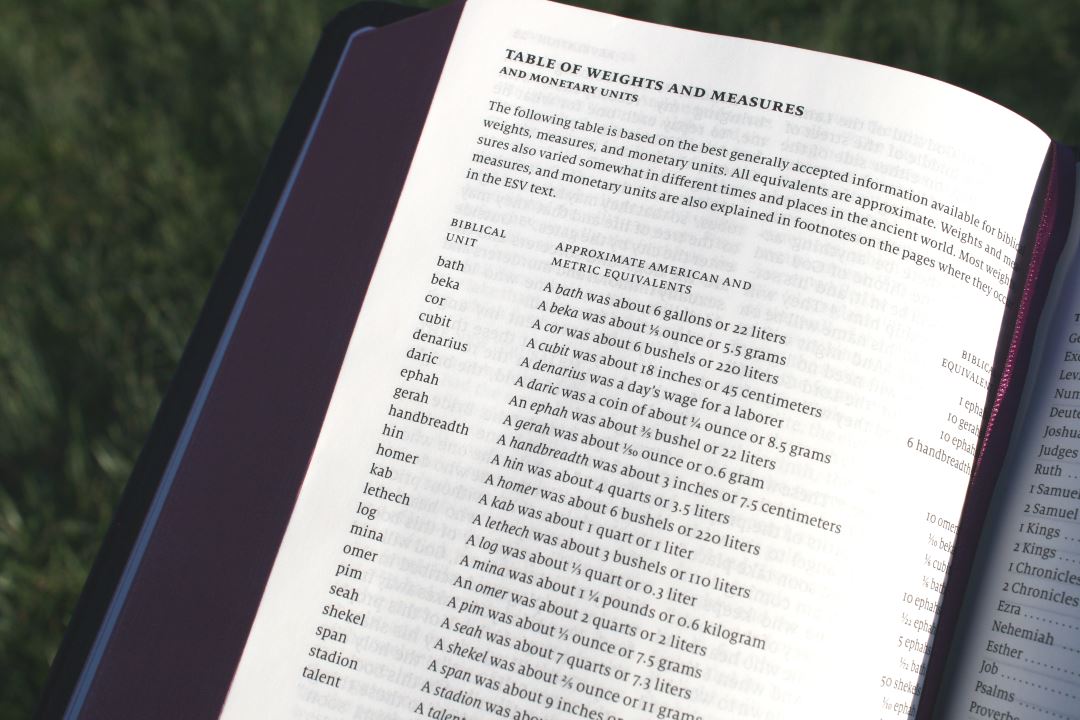
The Table of Weights and Measures is a simple table with the biblical unit, approximate American and metric equivalents, and the biblical equivalent. This is a common table that’s found in many Bibles. I find it helpful for study. The footnotes also include this information on the pages where they’re mentioned.

The Abbreviations table lists the books of the Bible in standard modern biblical order along with the abbreviation. The abbreviations usually give a list of books of the Bible as found in the concordance. This edition doesn’t have a concordance but the abbreviations are also found in the cross-references, so this take is still helpful.
Maps
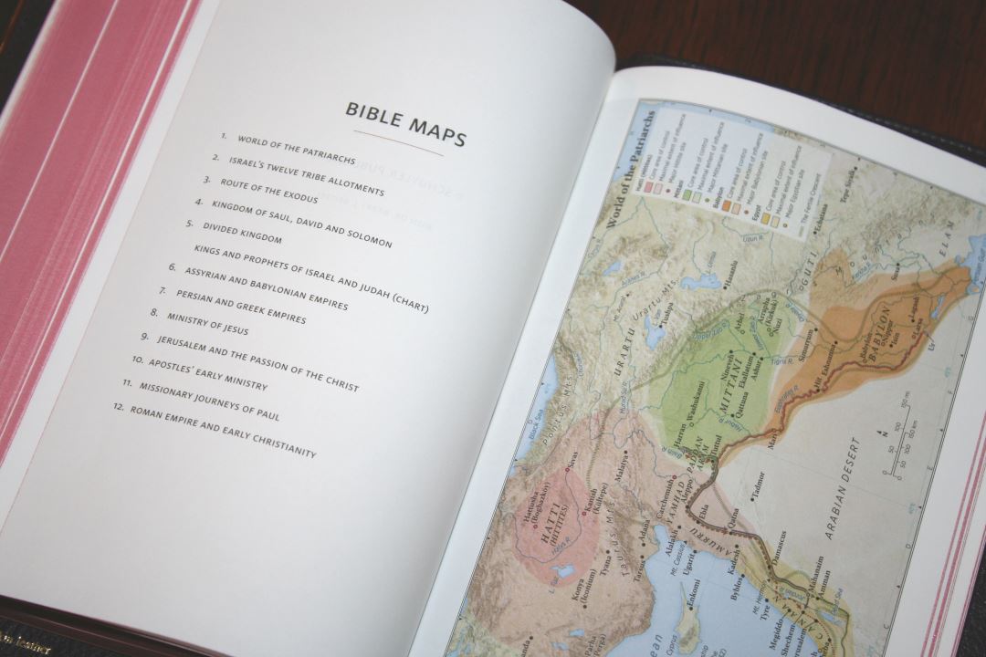
Unlike my original ESV Quentel, which had Oxford maps, the Personal Size edition comes with Schuyler maps by Dr. Barry J. Beitzel. These are the same maps as those in the NKJV Quentel and KJV Canterbury. They’re printed on thick, non-glossy, paper in full color. The colors aren’t bright. These are the colors I like the most for maps.
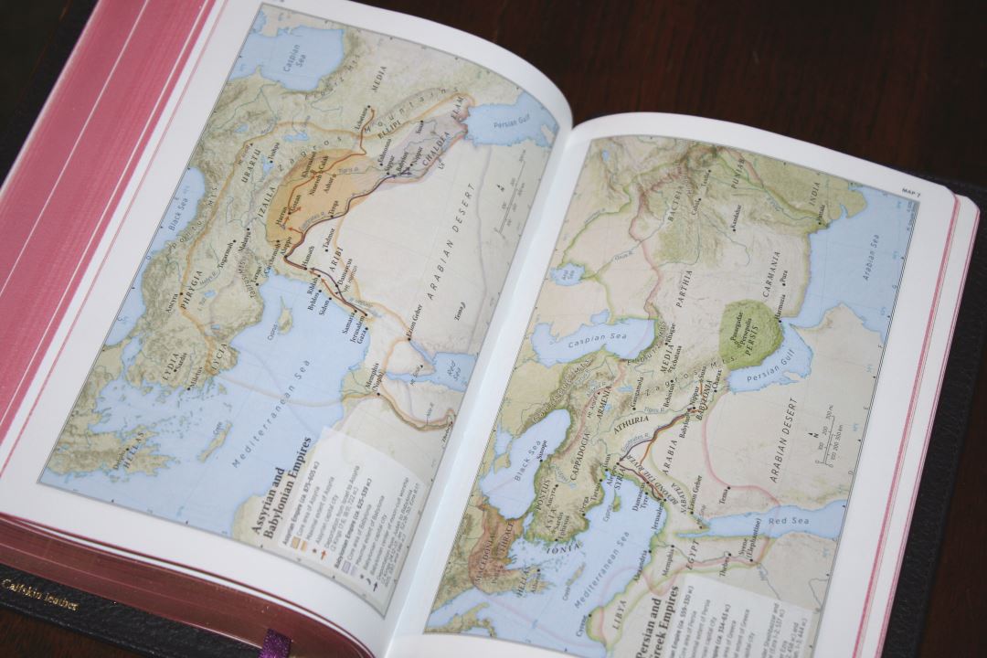
The maps cover cities, routes, distance, topography, areas of control (color-coded), capitals, cities of refuge, inheritance, battle sites, Scripture references, travels of Israel, kingdom territories, sites of royal inscriptions, dates, locations of events, locations where Paul wrote letters, lighthouse site, and more. It doesn’t include an index to maps. I suspect the font in the regular NKJV Quentel and Canterbury were too small to reduce.
Maps include:
- World of the Patriarchs
- Israel’s Twelve Tribe Allotments
- Route of the Exodus
- Kingdom of Saul, David and Solomon
- Divided Kingdom
- Kings and Prophets of Israel and Judah (Chart)
- Assyrian and Babylonian Empires
- Persian and Greek Empires
- Ministry of Jesus
- Jerusalem and the Passion of the Christ
- Apostles’ Early Ministry
- Missionary Journeys of Paul
- Roman Empire and Early Christianity
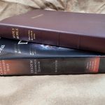
Comparisons
Here are some comparison photos. ESV Pitt Minion, Schuyler ESV Quentel, and ESV Cambridge Clarion.
ESV Pitt Minion
The Pitt Minion has a similar footprint as the Personal Size Quentel. It has a concordance, so it might be better suited for deeper study or sermon prep. It also has a much smaller typeface (6.75 vs 8.5) and I find it much more difficult to read. The poetic setting isn’t as well-developed as the Quentel. The PM is easier to carry, but the PSQ isn’t difficult to carry and I prefer the larger font.
ESV Cambridge Clarion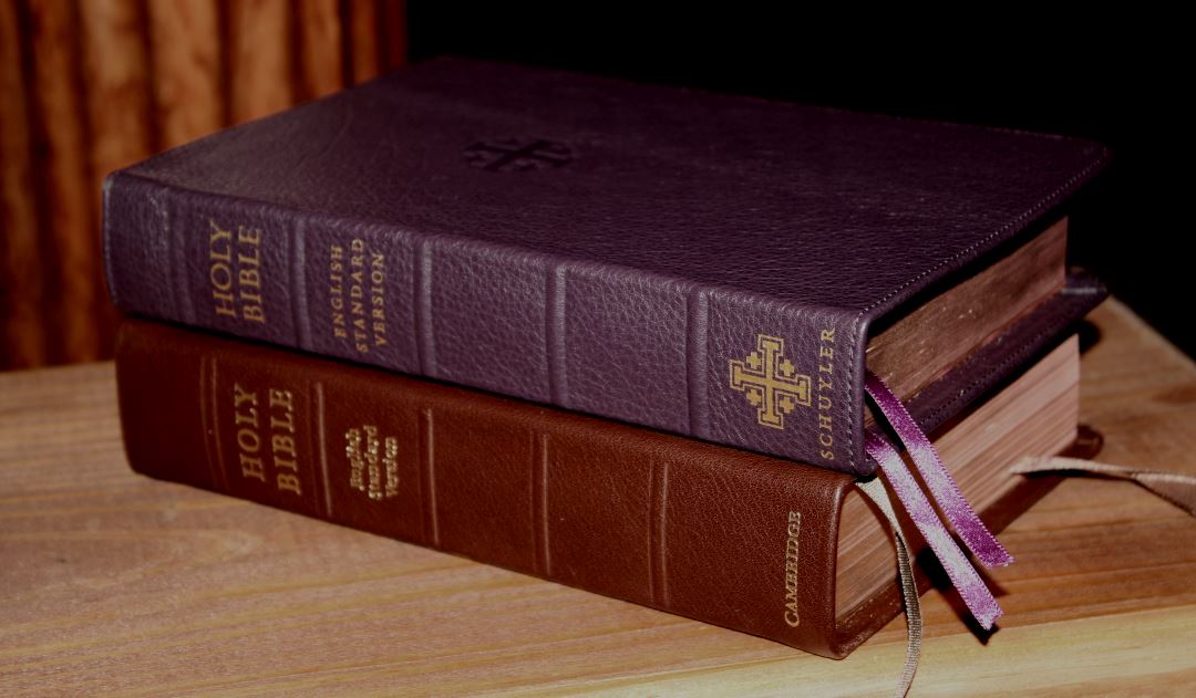
The Clarion also has a similar footprint as the PSQ. It has a slightly larger font (8.75 vs 8.5), but it’s also thicker. This is due to the single-column layout. I find the PSQ easier to handle, although I do love the single column layout of the Clarion and that the references are near their verses (I use them to find verses quicker). Sometimes single column can be more difficult to read with bi-focals. I don’t have that probelm with the PSQ.
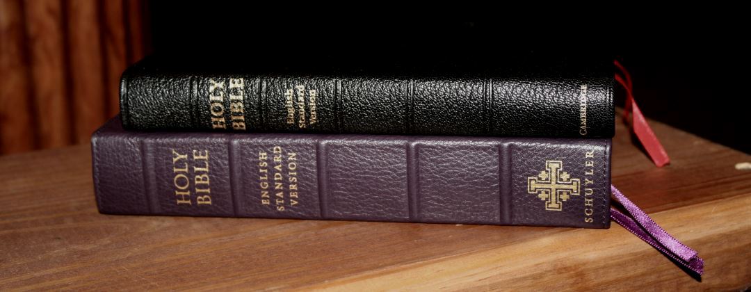
Schuyler ESV Quentel

The pagination is the same between the regular size Quentel and the PSQ. The regular size has much thicker paper (38gsm in my 2nd edition vs 28gsm), a much larger font (11 vs 8.5), and has a concordance, map index, and three ribbons. They make a great pair. I prefer the PSQ simply because I like smaller Bibles. I do find the regular edition much easier to read when my eyes are tired. To my eyes the opacity looks the same.
Conclusion
I love reading it and studying from Personal Size Quentel. I like the paper, print quality, and layout design. The double column design transfers well to the reduced size of the Personal Size Quentel. It creates an edition that’s designed to be read while providing 80,000 cross-references that don’t get in the way. It doesn’t include the concordance or map index, but everything else is here. I also like that they’ve added pages for notes.
The 8.5 text is much easier to read than I expected. I love the overall size of this Bible. I carried this Bible practically everywhere and found it to be great for carrying and reading on the go. This is the kind of Bible I can spend all day with. I usually preach from a larger print, but I found this Bible to be great for preaching. It would especially be a good choice for traveling preachers that want to carry smaller Bibles.
I can easily recommend Schuyler ESV Personal Size Quentel in purple calfskin to anyone interested in a reference ESV for carry, reading, and even preaching if you don’t need a larger print. This Bible is built well with high-quality materials and is one of the best designs available. Having the same pagination as the full-size edition makes the two editions a great combo- one for study at home or preaching from, and one for carry. This can easily be your one Bible if you don’t need a concordance. The ESV Personal Size Quentel in purple calfskin is on my list of all-time favorite Bibles.
________________________________________________
Click here to buy from EvangelicalBible
________________________________________________
This Bible was purchased for this review. I was not required to give a positive review- only an honest review. My opinions are my own.
Do you have a Schuyler ESV Personal Size Quentel? Let us know what you think about it in the comments below.


Do you underline or highlight in the PSQ? If so, is show through like it would be with other bibles with 28gsm? Also I like to keep my bible in my hand when I preach, would you recommend this particular one for that? Really enjoy your reviews and you do such an amazing job! God bless
Hi Hank! Thanks for the kind words! I appreciate it very much. I haven’t written in it. The show-through would match other Bibles with 28gsm that have Indopaque paper (Turquoise, Legacy, Omega, etc.). This Bible is perfect for holding while preaching as long as you don’t need large print. It’s a medium-sized print. I personally prefer larger fonts for preaching, but I leave it on the pulpit. For my eyes, it’s large and dark enough to read while holding.
Great review! Clear, informative, and intelligent, thanks so much for writing it! I’m trying to decide between the Schuyler PSQ ESV vs. the Crossway Heirloom Heritage ESV as my first premium Bible. I think I love both Bibles, but I also love single column like in the Heritage as well as a little bit of color like in the PSQ. I only wish there was a single column PSQ or a red colored/accented Heritage! Which would you pick between these two? It’s a tough call!
Thanks Michael! Hmm, that is a very tough call. I love both for different reasons. If I could only choose one, and the size wasn’t an issue, I’d choose the Heritage. I always lean toward single column and that single column has the best white space to text ratio that I’ve seen in a single-volume Bible. It stands as an example of a perfect design.