
Review of Cambridge Concord Reference KJV in Black Calf Split
Review of Cambridge Concord Reference KJV in Black Calf Split
By Matthew Everhard
“This is not your father’s Oldsmobile.”
So says the famous automobile advertisement. In every field and market, there exists a tension between the ancient and the modern. The time-honored and the cutting edge. There is a perpetual tug-of-war between “the way it has always been done” and new technologies and innovations that make the former way obsolete. Rarely does a product or design balance both so effectively.
Enter the KJV Cambridge Concord Reference Bible.
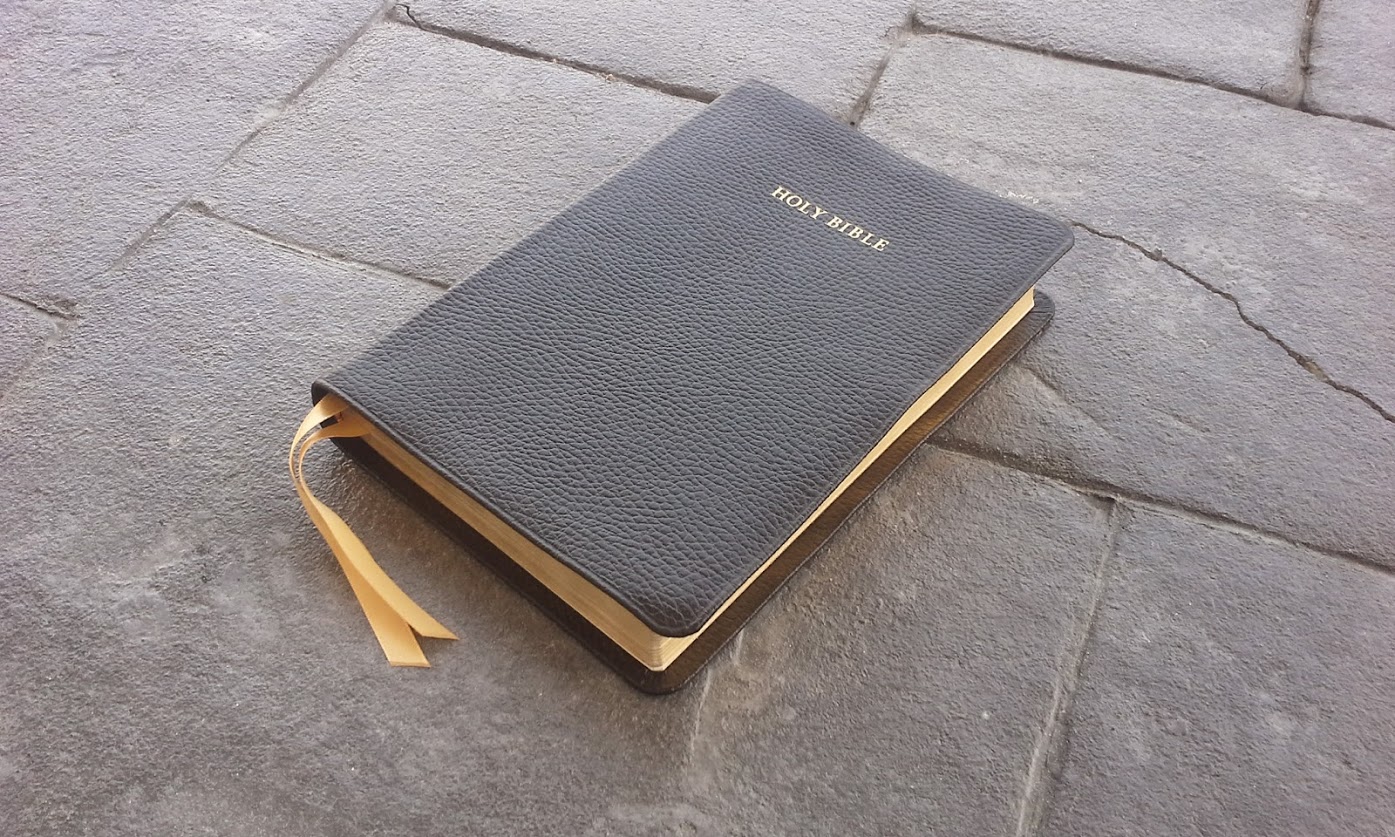
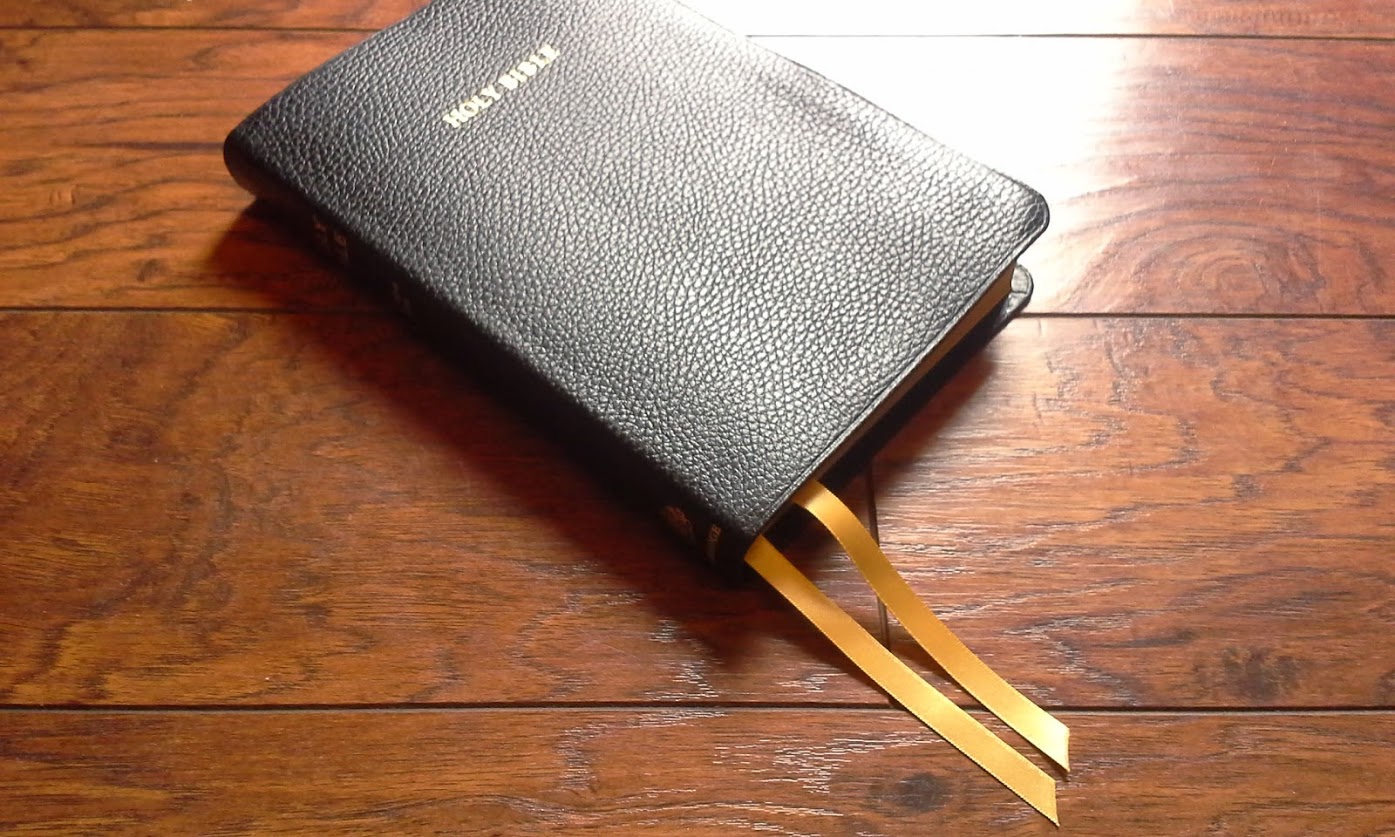
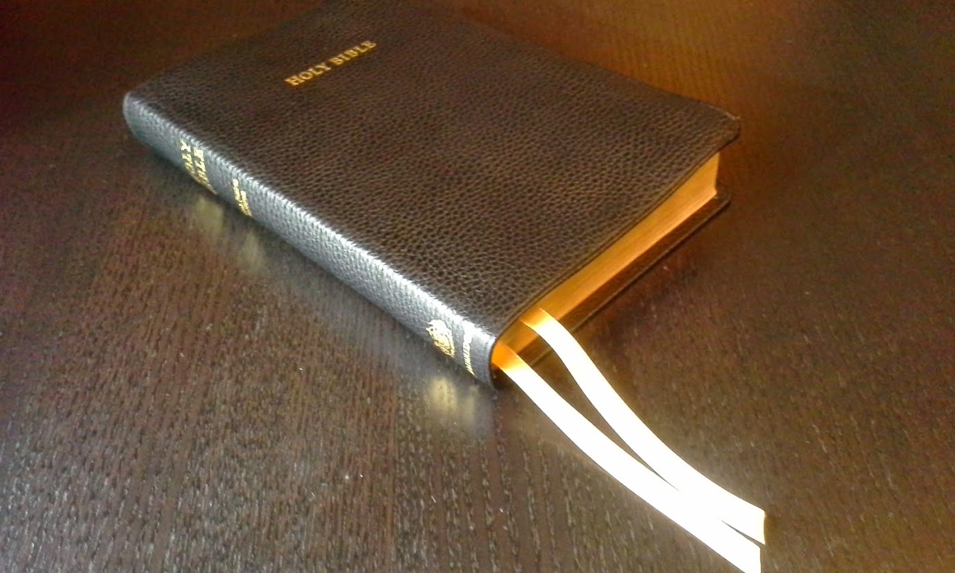
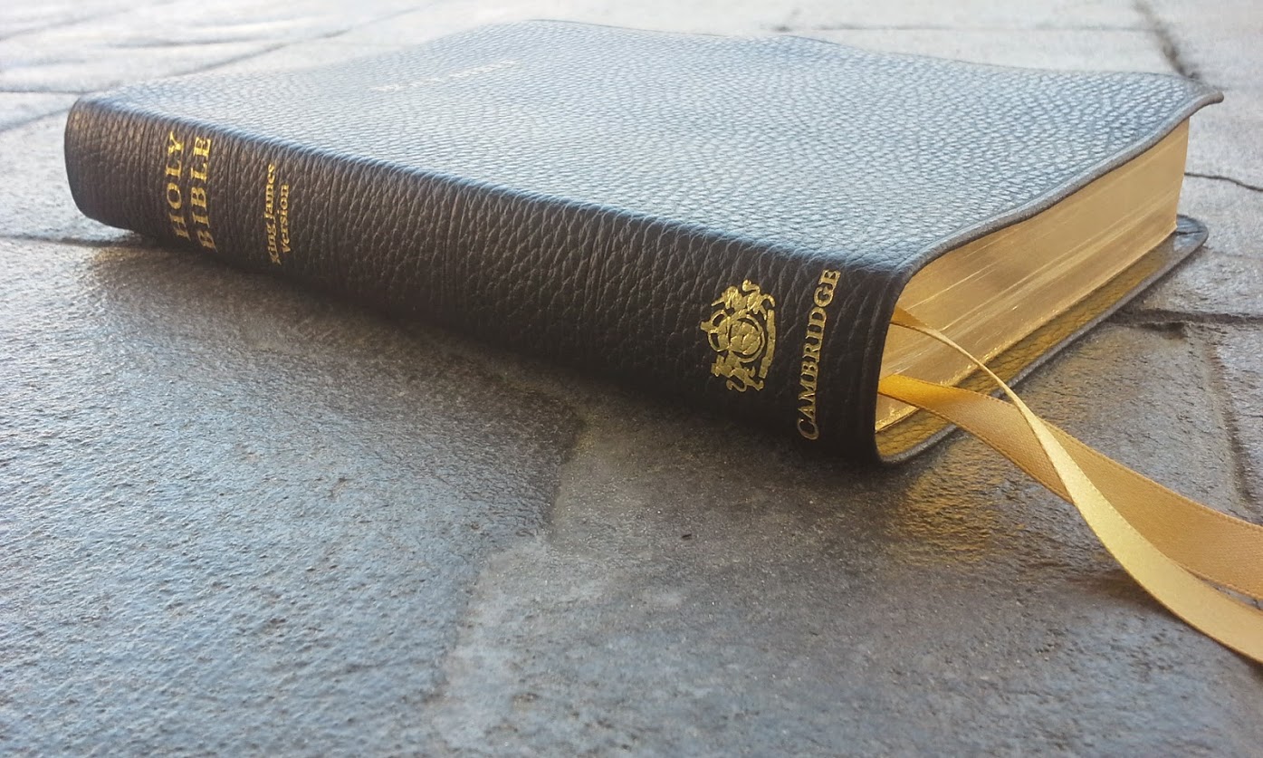
Custom ribbons installed by Matthew Everhard
Before us today, we have a Bible that superbly combines the look and feel of an old-style King James Bible—produced by the world’s most ancient continuing Bible publisher—with the sleek design styling of some of today’s newest and best editions of the sacred writ.
Overview
- Aesthetics: Classically proportioned and increasingly tactile with use.
- Binding: Smyth sewn; Cambridge/Jongbloed binding works loose and opens flat within hours.
- Cover: Black calf split matures slowly but surely with plenty of manipulation.
- Ergonomics: This perfectly sized edition should inspire more 8’ X 5’ range Cambridge editions and translations.
- Features: Numerous study features are accessible, if outmoded by the digital age.
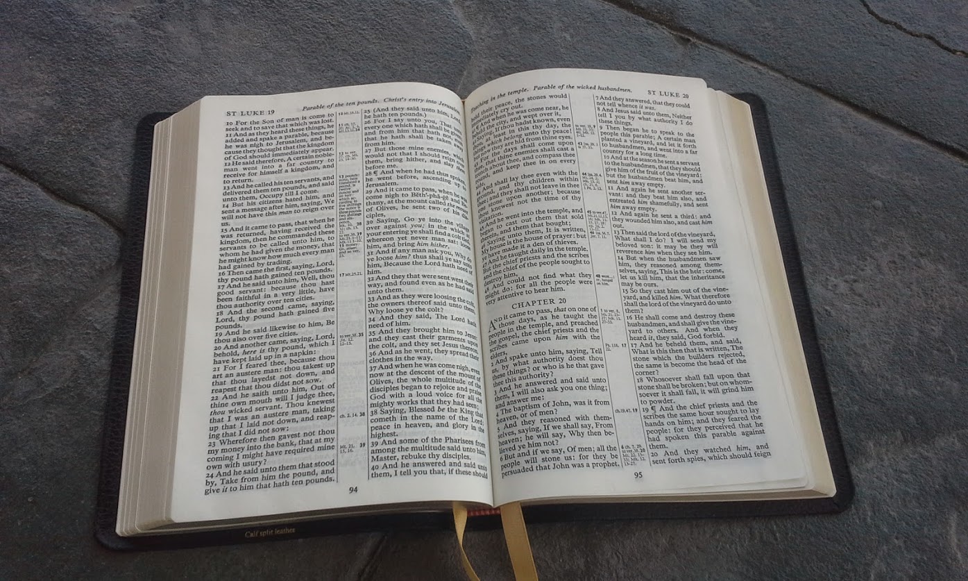
- Layout: Double-column, verse-by-verse format will be well-loved by traditional KJV fans; the center column references are slightly more awkward.
- Lining: Is it time for Cambridge and Jongbloed to look into new lining structures?
- Paper: Paper is soft to the touch; white in good lighting, and better than the Clarion.
- Readability: Legible 8-point font in Times Semi-bold 421 makes this a user-friendly edition.
- X-Factors: The quasi-ancient styling and text of this modern Bible production makes it a KJV lover’s dream reference Bible.
It is no secret that I love Cambridge Bibles. The very fact that they are the oldest existing publisher of Bibles in the world–running back to the days of the Reformation–is alluring enough to this history buff. The fact that I can hold a Bible today in my hands (the same translation even!) that came off the presses of Cambridge 400 years ago makes my heart go pitter patter.
Adding to this the fact that Cambridge continues to produce some of the best Bibles in the world today explains my desire to collect this label above and beyond other makes. The KJV Concord Reference is yet another essential edition to the stellar lineup by the British/Dutch tag-team of Cambridge and Jongbloed.
So, I took this model with me to the campus of Reformed Theological Seminary for a week’s worth of doctoral courses. What follows are some of my observations after working with this commendable edition of the Authorized text on campus for five days.

Let me run down some of the features of this text.
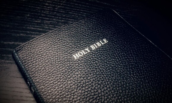
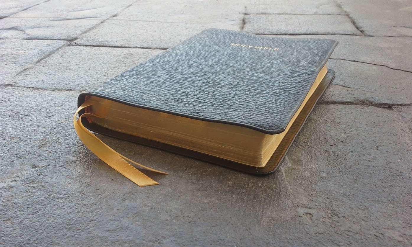
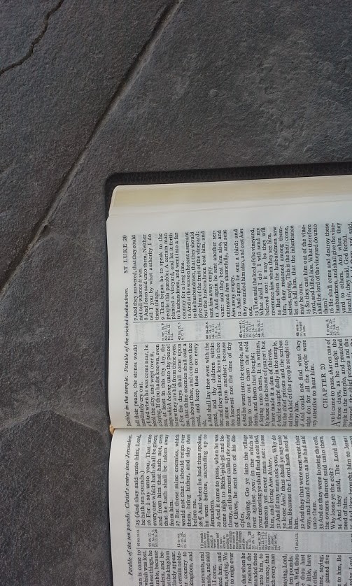
At first glance the Bible is gorgeous and well-proportioned. The dimpled texture of the cover is a delight to look at and feels wonderful too. I looked forward to pulling it out of my black leather messenger bag every morning and setting it down on the table in a room full of pastors and scholars. Immediately, it strikes the user as having a strong and durable leather, rather than a soft and floppy one. This one will hold up for years! The words “Holy Bible” are printed, center set, in gold letters in the upper quadrant giving this book a nostalgic aura.

As with every Jongbloed printed Bible I have ever seen, the page edges and gilting are utter perfection. There is no hint of unevenness or imprecision in the plaining of the pages. (Owners of some editions of Crossway’s Legacy will know what I mean by that; the gilting is wavy and uneven in some copies). Signature after signature meet exactly at page end like a placid golden river in the Concord.

This Bible does well in the category of aesthetics. No, it does not melt in the hands like an R.L. Allan cloaked in their famous Highland Goatskin. It doesn’t even double back on itself or fold over very well without stressing the joints. But I am giving this Bible a high score with the expectation that it will soften up like my Cambridge ESV Pitt Minion (in the same calf split leather) has done. I am grading it based on what I believe it will be rather than what it currently is.
Despite the fact that calf split is supposed to be the under-carriage of a good hide, my Pitt Minion (same skin) has become one of my most tactile Bibles in my possession. The calf split here in the Concord Reference too gets good grade in anticipation that it will become like its little cousin. This process may take some time though, and about six months from now the Concord Reference should be one of my most delightful Bibles to touch, hold, and use.
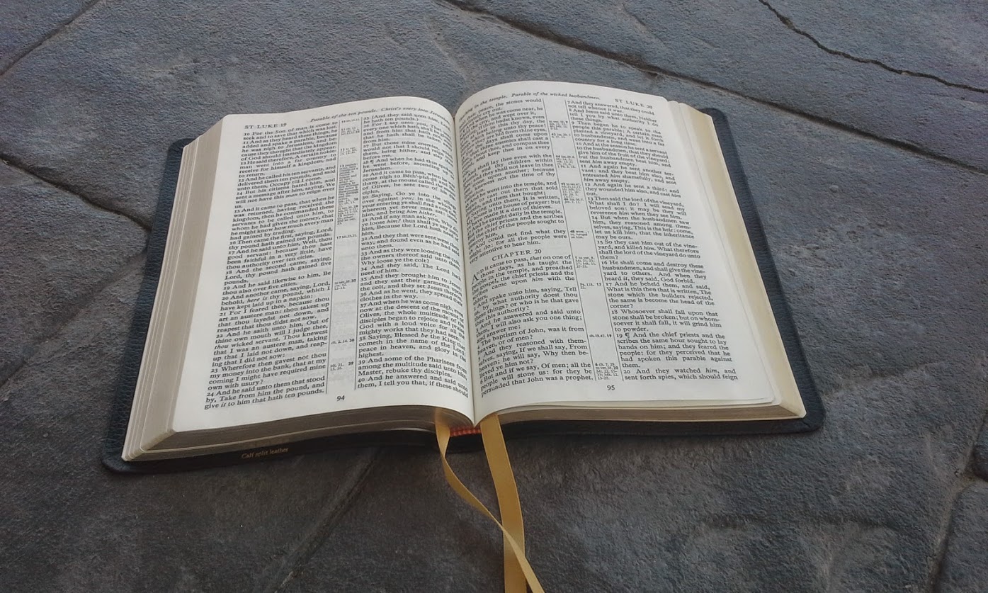
I should make some remarks about the text and font. Here is where the Concord gets its “old school” billing. Out of the box, it has the look of something that was printed in the vintage eras of yesteryear. This older look is especially notable when compared to a very close competitor, the TBS Windsor. The Windsor, by contrast, has chosen to employ a modern font (Swift) that gives that particular Bible an updated look. I almost forget I am reading the KJV with the Windsor, but the Concord constantly reminds me I am holding a descendant of a 400-year old textual tradition. The font used in the Concord Reference, Times Semi-bold 421, gives it an “undated” effect of appearing much older than it really is. I like that.
In my view, Cambridge got the sizing just right here. I personally find that Bibles in the 8’ X 5’ range are just right in the strike zone for all around usage. I think the sizing here is in the Goldilocks Zone: small enough to carry easily; large enough to use in public reading and teaching settings. Although 9’ X 6’ Bibles seem to be gaining the larger share of the market these days (Quentel anyone?) – no doubt due to their ability to bear larger and cleaner fonts – I am personally convinced that the 8’ X 5’ range is better for all around usage. For this reason, some KJV readers may find that this Bible could be their coveted “The One.” That is to say, the only Bible they need to do just about everything.
During my week on campus I used it in multiple ways: as a quick reference to follow the professor’s lectures, as a devotional reader in the evenings, and for some light sermon prep for this coming Sunday. Can this Bible be a reader? Yes. Can it serve dutifully in the pulpit or lectern? I believe it will. Does it have the functionality of a reference-based study tool? Absolutely.

If anyone from Cambridge happens upon this review, my plea to him or her would be to do more Bibles in this same size range. I have been pining for an ESV in this size range that shares the exact same text and layout formats as the Pitt Minion and the large Wide Margin.
But that plea is for another article.
I am a bit surprised that Cambridge and their Dutch partners at Jongbloed don’t toy around with the lining a bit, however. Some experimentation and variation of their “tried and true” paste-down might do them well. I understand that adding real leather liners would cause costs to soar (for both consumer and publisher), but I have observed that their cardboard strengthened liners can be a bit too stiff at first. I wonder if they considered a thinner piece of cardboard between the leather and the synthetic paste-off liner whether that would improve the overall aesthetic right out of the gate. In fact, I wonder what would happen if they toyed with using the polymer liner used in their goatskin editions with the calf split leather.
Is that even possible?
As a minor critique, I would have left out the various helps in the back of this text block. They did not help me much with my sermon preparation. With the voluminous amount of information readily available on our laptops and smart phones, much of this information is too easily gathered elsewhere. Some of this stuff is better reserved for the study Bible format. For the sake of discussion, here is a brief list of the “bonus features” included in this reference edition:
- Presentation Pages
- Glossary of Biblical Usage (just a few pages)
- Concordance (140 pages)
- Concise Bible Dictionary (130 pages)
- Cambridge Bible Maps
- and Map Index
Aside from the maps and the map index (very helpful by the way), I would go ahead and leave the other features out for the sake of aesthetic considerations in future editions. Shaving off a few ounces—and a couple hundred pages—from the final hand-held edition would be addition by subtraction.
[Note: Having just said that, there are some times that I am separated from my computer and need these features for a Bible Study or sermon preparation. More and more, however, those times of digital disconnect are infrequent].
In all, there is very little to find fault with in this reference Bible. It is a worthy heir to the King James publication legacy as well as the strong Cambridge Bible heritage. It is both robust and beautiful; classic and utilitarian.
As far as KJV texts go, I won’t need any others for a very long time.
I rate this Bible as “very good.”


The first bible I ever seen was 20 years ago in my local bible store, it was a beautiful calfsplit cameo or Pitt. I remember sliding it out of the box and being amazed at this little work of art that felt like a tank in my hands. I purchased a much cheaper bible that day, I was just recently saved and $100 for a bible was crazy town for me back then. Almost 20 years later I still do not own one but this review and seeing Cambridge bibles on YouTube have totally captured my attention, I much rather have a bible with tough leather then one that gives me anxiety over keeping it safe. You share the same taste and feelings as I do brother, excellent review and Cambridge will soon have a new life long costumer, once my pocket book allows they will get my money.
I whole heartedly agree with your paragraph about the 8 x 5 size being perfect for all around usage! And like you, I am loyal to Cambridge. I would love to see Cambridge produce a Concord in the NASB and other translations, or at least one that is the same dimensions. I do love my Clarion and its proportions. The Clarion is excellent for reading and studying. However, I teach three times a week or more and occasionally preach, and the Clarion is NOT suited for teaching and preaching. I do believe a verse-by-verse in the 8 x 5 range could suit all my purposes and be “the one!” Chris Wright at Cambridge said they were looking into doing an NASB verse-by-verse in the near future which means they would do that in other translations as well. You should contact him and share your thoughts on the 8 x 5 size!
Also, I assume those gold ribbons are custom? Is that a correct assumption? I think the combination of black leather with gold gilt and gold ribbon is beautiful!
Yes, the ribbons are after-market! I added them myself. I should have mentioned that in the body of the review, lest people think that this level of awesomeness is available without a home ribbon replacement job. Of course, the Concord comes with a fairly standard black, Cambridge-style ribbon of acceptable (but less ostentatious) fashion.
-M.E.
Dear Matthew:
I have admired the Concord, and for carrying to church ect. it is fine. I have bibles of similar size that I have found too large for one handed reading while seated in my chair. I freely admit that my reading sessions are usually over an hour in duration, and the problem is that the bible ends up resting on my abdomen, degrading the lower margins of the cover and pages. I purchased a smaller version with all the same features, material, and quality construction for less than $50 from EVB, the Personal Concord. This humble yet well built bible has proven to serve all my needs except for reading in dim light (6.5 font size), it is definitely the King of the Lampstand, it is roughly 5″X7″X1 1/8″ allowing easy one handed reading. I use the TBS Westminister Reference Bible for serious scholarship, but the Personal Concord, and the full size Concord are almost as good. The cover on my little bible is the same calfskin as the Concord, has with a few years use, worn into a pleasing patina. For anyone who doesn’t spend long sessions sitting in an armchair reading the full size Concord would be a wonderful bible. I’m searching for a new old stock Cameo that includes the concise dictionary, and I think 8 or 8.5 font size, this may be the do all bible I have been looking for. Thanks for your review, an excellent job.
Yours in Christ
Don Denison
The current KJV Concord and Concord wide-margin are in dire need of a new typesetting. The print quality is what many would call unacceptable. There’s just too much inconsistency and fading like the printer was running out of ink.
Words in the text having a marginal footnote have nothing to alert the reader, instead forcing people to be constantly checking the center-column, and then having to play the match-up game. It’s understandable not having reference superscripts, but not for marginal footnotes.
Thanks for an excellent review.
But I noticed recently that the Trinitarian Bible Society also have a Concord KJV on their website (www.tbsbibles.org). And they’ve got a sample page containing 1 Corinthians 1:
http://www.tbsbibles.org/pdf_printsample/1191_9.5_1.pdf
I’d really like to know whether this TBS Concord is exactly the same on the inside as the Cambridge Concord in terms of page lay-out.
Is there any chance you could check that by comparing 1 Corinthians 1 in your own Cambridge Concord with the TBS pdf via the above link?
Best wishes,
Rachel
HI Rachel,
It is exactly the same. I think the one by TBS has the older maps and I don’t think it has the dictionary.
Randy
Many thanks for your reply, Randy. That’s really helpful.
All the best, Rachel
Thanks for this review Matthew! I currently use an Allan Longprimer for preaching and wondered if you know how this reference edition compares with readability/font differences? I need to be able to read from pulpit. Also the Allan paper seems to wrinkle up easily. Interested in paper comparison as well. Thanks!
Hi Brian. Matthew doesn’t have a Longprimer to compare with. You’re in luck though because I have both. 🙂 I’m also working on a comparison between the two (and the Westminster). I’ll take a few photos tonight to compare the paper and fonts.
Hey brother. Sorry to take your time again on this. You were so helpful on the comparison with Concord WM. My ultimate desire is if the Concord worked to use the WM with my studies and to then leave behind to my children. Then also using the Reference for daily reading. The interaction between the two formats is aided for memory by having matching pagination. My other option is to continue with the Longprimer for reading and preaching, and just get a WM for study time (concord split calf, LCBP Cameo,etc). Thanks again!!
Brian
Hi Brian. It’s no bother at all. This is why this website exists 🙂 I have the exact same issues you do and I’m trying make the same decisions. I preach from several different Bibles (too many to name). I prefer the larger fonts. I also like the idea of using a wide margin with the same pagination as my carry and reading Bible. The Concords are great for that. I preached from the regular Concord this past Sunday because I’m trying to make this same decision. The problem is all of these are great choices and any preferences and differences I can come with are minor.
The Longprimer is great for pulpit use (as you already know). The larger font of the Longprimer is slightly easier to see. The paper in the Longprimer has a creamier tone than the Concord. They are about the same in thickness. The Longprimer is slightly more opaque. I prefer the Longprimer’s paper. I do wish the Longprimer had italics for supplied words. If you like larger fonts I would recommend sticking with the Longprimer.
The Concord’s font is slightly smaller, but it’s so dark, clean, and sharp that I find it easy to see and read from behind the pulpit. I’ve preached from the regular edition and the wide margin edition and I can use either one. It’s free of distractions. The paper in the wide margin is 38gsm (the same as the Longprimer Sovereign). The Concord and Longprimer both have around 32gsm.
The LCBP Cameo is a nice Bible too. I have the review for it coming up in a few weeks. I can actually see the advantage of using that one Bible for preaching, reading, and carry. It’s size is great for daily use. The font is 8-point like the Concord, but the text is scrunched a little closer and it has reference and footnote keys in the text. That’s fine, but it’s not as clean as the Concord. If you’re okay with that and you don’t need the notepaper or the glossary that the Concord wm has, or you don’t need your notes next to the verses for the inner margin, the Cameo is the better choice for an all-around Bible. You can get far more notes in the Concord though.
For me the primary difference between the Concord and the Longprimer comes down to overall size. It like to carry and hold the Concord (the calf split lays flat in one hand). The Longprimer isn’t too big, but the Concord feels better. Also, I prefer the Concord’s footnotes. As far as back material, you’ll have to decide between a topical index and a dictionary. I love both and they both have their advantages. I’d like to see the Concord have writing paper like the Longprimer does.
I’ve posted some comparison images between the Longprimer and Concord here: Concord and Longprimer Comparison Photos
Let me know if you’d like to see any other comparisons or more photos, or have any more questions. This will help me to decide too 🙂
Thanks for your comments. I am still undecided but will keep you posted. I was with family over the last two weeks and was able to look at an older Concord Reference and compare to my Longprimer in person. That was timely. Then, I discovered a 1998 Concord Wide Margin in Calfskin, with art gilding, brand new on my mother’s bookshelf. She has never used it. (So I might have discovered my WM if I go Cambridge 🙂 )
Thanks, and Merry Christmas!!
Wow, that was timely! Merry Christmas!
Randy, I mentioned seeing a brand new Concord WM at my Mom’s house. She is going to hand it off to me, since she has never used it. So, I am excited about that. It is burgundy calfskin and still has the ribbons tucked in from from the factory. It has her name stamped on the front cover (Oh well) but since my intent is to pass this on to my children when I get promoted to Glory, it has a connection to their grandmother with her name being on the front. (I just don’t know why people take a $200 Bible and then stamp their name on it,…just my worthless opinion!)
Oh, that is awesome! I’m like you… I don’t like names imprinted. But, when there’s a history like this one attached I don’t mind at all/ I love pricking up old Bibles and seeing dates and names in the presentation page. That’s odd for me, considering that I don’t like this in newer Bibles – only vintage.
Randy, how do you change ribbons? And where do you get thematerial. That gold looks awesome.
HI Rick. Matthew Everhard wrote this one. I’ll ask him about it.
Hey Rick! It is true that these ribbons were replaced by myself in this Bible and do not come factory. These ribbons are called Berisford (sp?) and can be ordered at various places including Etsy. I also found similar non-namebrand ribbons that are comparable at my local Hobby Lobby. For tips on replacement, I recommend a video by my friend Paul Tanca available on Youtube. Happy collecting!
Hi: I recently had an ad come up on my fb about Bibles from evangelicaBibles, and have spent time on their site researching out the Bibles they offer. I have many Bibles of my own in different translations, and have found over the years it is better to buy quality than to save money. Though I currently do not need a new one. I like reading reviews such as yours as being in the ministry for some 38 years now, I find many asking me about Bibles. Most book stores do not have quality Bibles, so finding resources to direct someone into a quality Bible is a good thing.
Thanks for your review, well done, lots of good practical info.
Jeff
Thanks Jeff! I appreciate it very much!
I’m sorry if this is an obvious question but why is it called ‘Concord’. I’ve been looking and I can’t find a reason and I just want to know if there is some meaning behind it that is important
Hi Cassandra. Good question! I don’t think they’ve ever told why they called it that. I’ll ask my contact if they have any information.
Hi Cassandra. I heard back from Cambridge. The name was chosen because it was considered to be a ‘concord’ or ‘harmony’ of different qualities. I’m sure this refers to all the different features such as a glossary, concordance, dictionary, etc.
Dear Randy,
Could you tell me what the occasional numbers are at the bottom of some of the pages of the Cambridge Concord Reference KJV? A couple examples are in Mark ch1 at the bottom of page 41 below the left column is a 2. Turn the page and on page 43 under the right column of chapter 4 is a 2-2. It’s in the OT as well. Genesis 24 page 25 under the left column is a letter B.
Any idea on what these are for? I couldn’t find any info on them in any review video on this bible.
Thank you for your time.
Hi Dan. Those are manufacturing tags that show the manufacturer how to put the signatures together in the proper order.