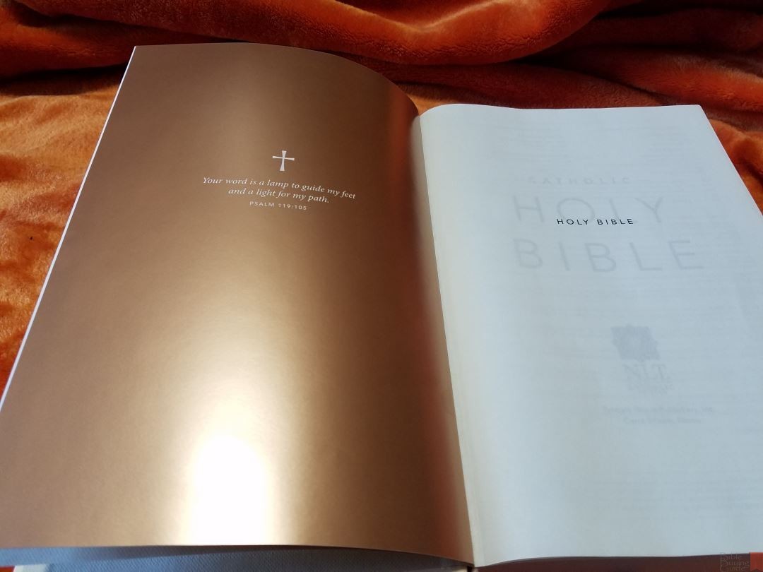
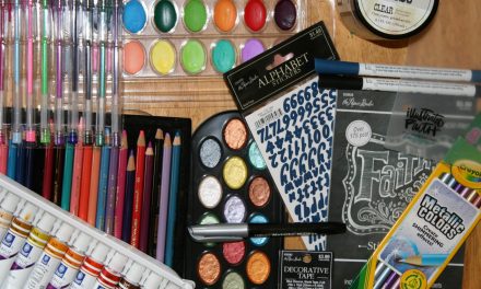
NLT Catholic Readers Edition
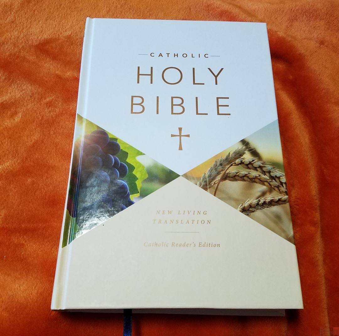
Tyndale’s NLT Catholic Readers Edition is an NLT with deuterocanonical books and is approved by the Catholic Church for reading and study. It includes the official Imprimatur, meaning it is officially licensed by the Roman Catholic Church. In this review I’m looking at the hard cover edition, ISBN: 9781496414014, printed in Italy.
Tyndale provided this Bible free for review. I was not required to give a positive review, only an honest one. All opinions are my own.
_________________________________________________________
This book is available at (includes some affiliate links)
and many local Bible bookstores
_________________________________________________________
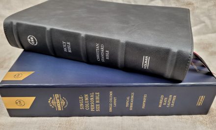
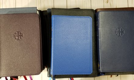
COVER AND BINDING
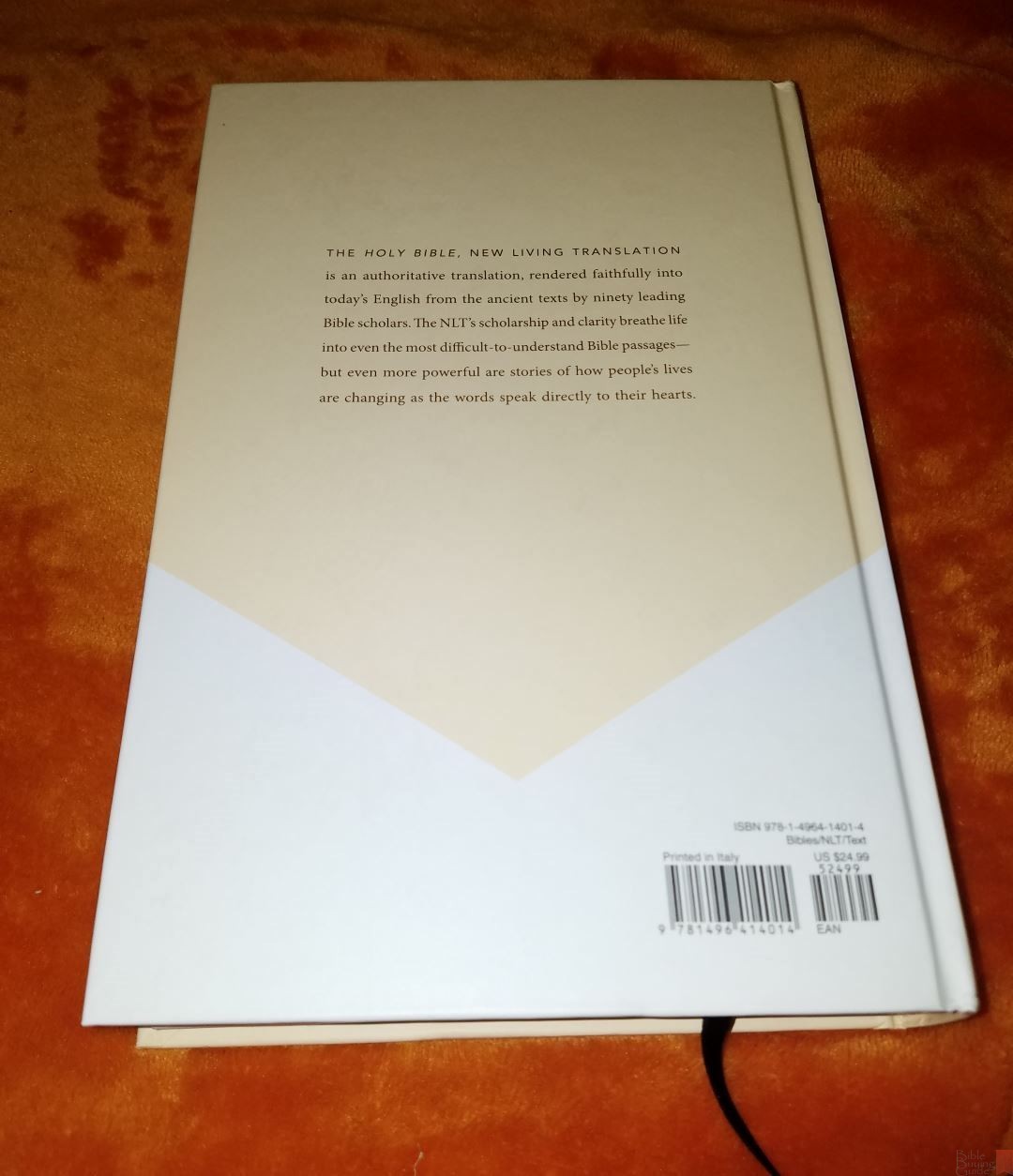
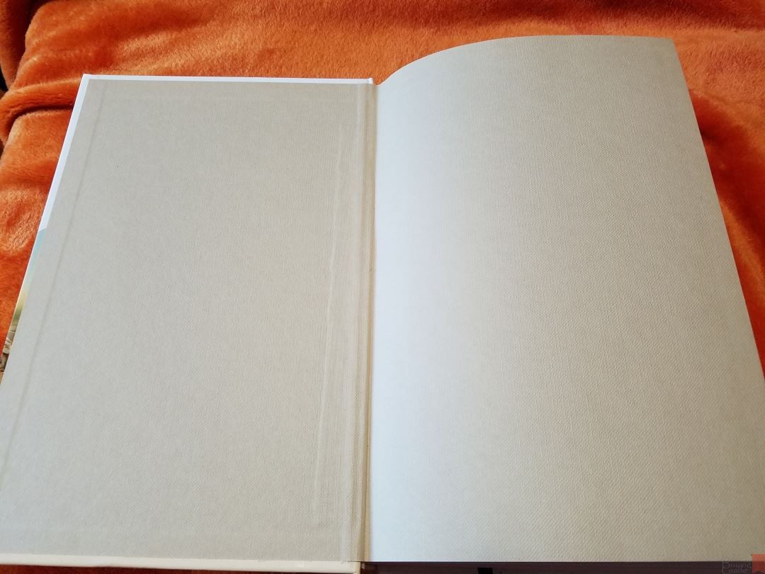
This is the hard cover edition with glued binding. The cover has a design with glossy photos in triangles. The back shows a paragraph about the NLT. The liner is a thick tan paper that has a rough texture and feels sturdy. It opens easily to any page. It includes a long thin dark blue ribbon marker and white head/tail bands. The overall size is 9.25 x 6.25 x 1.5″. The dimensions feel well-balanced.
PAPER
To my fingers the paper feels like it’s in the lower to mid 30’s in gsm and is very opaque. It’s white in color (slightly ivory under certain light – which I like a lot) and has an excellent contrast with the text. It has a rough texture that’s great for note-taking and highlighting. The pages are easy to turn. It has no glare under direct light. It has several pages in the back that can be used for notes.
TYPOGRAPHY
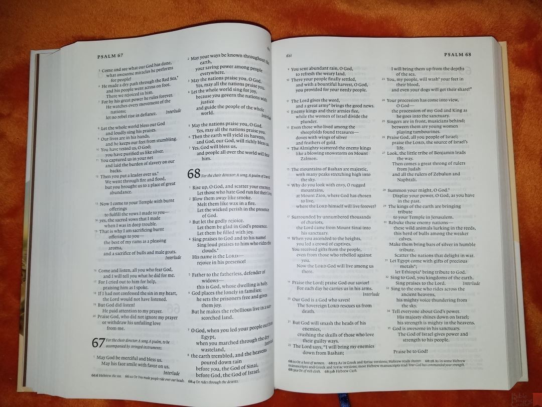
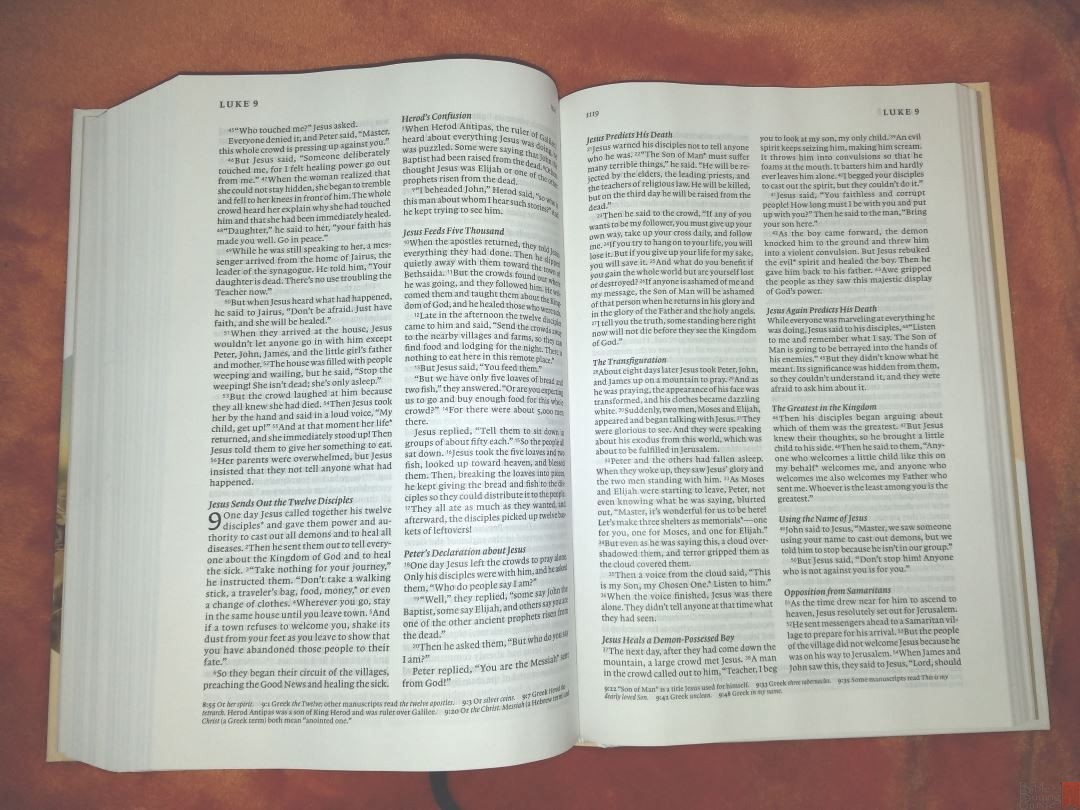
The text is presented in double column paragraph format with section headings in semi-bold italics. Poetry is placed in a poetic setting and letters are indented. The header includes the book name and chapter number in the outer margin and the page number in the inner margin. The footer shows the translator’s footnotes.

This isn’t like the standard reader’s editions that we’ve seen recently. This does have chapter and verse numbers, footnote keys, and section headings within the text. It’s called a readers edition because it isn’t approved by the Catholic Church for liturgical use – only for personal reading and study. It’s a text edition with footnotes rather than a reference edition.
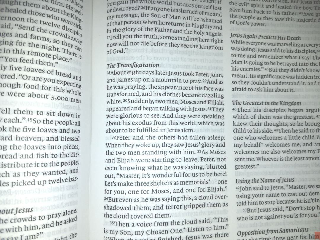
The font is black letter and is around 8 point. It’s sharp and dark, and is highly consistent throughout. This is a highly readable typeface. This is my favorite level of darkness for reading. It’s printed with line-matching, and the lines match up really well.
It has around 42-44 characters per line with 7-9 words per line. Asterisks are used to indicate that a footnote is available for a word or phrase.

Verse numbers are small and easy to ignore, but this also makes them more difficult to find. For me this improves readability and it’s a trade I’m willing to make.
The poetic settings look nice for a double column layout. Lines that continue a stanza are indented. There are several lines with a single word, which is difficult to avoid.
FOOTNOTES
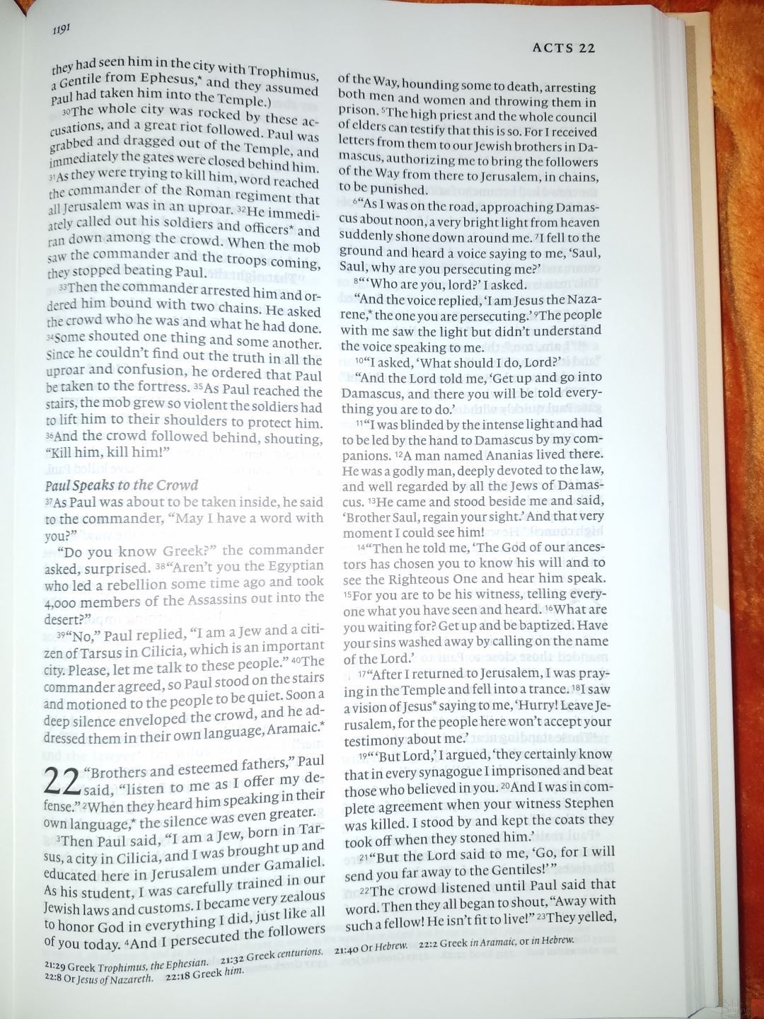
Footnotes are placed in the footer and include the chapter and verse number in a semi-bold font. They cover literal renderings of confusing phrases, alternate renderings, textual variants, references to OT quotes in the NT, measures, other passages with similar renderings, and cultural and historical information about places, things, and people. There are quite a few footnotes and I find them helpful for study and shedding light on the text.
BOOK INTRODUCTIONS
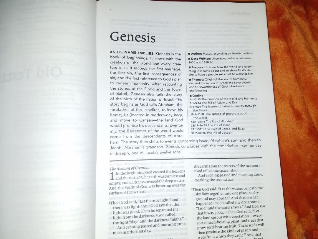
Book introductions are presented in two columns that take about a half page. They give a quick overview of the book, which takes about a paragraph. Bullets provide information about the author, date of writing, purpose, theme, and a short outline. The introductions are short but they provide a good bit of information in just a few words.
APOCRYPHA

What makes this a Catholic edition is that it has the Apocrypha mixed in with the rest of the biblical books, rather than placed at the end of the Old Testament. The index in the front shows where they’re placed within the text.
MAPS
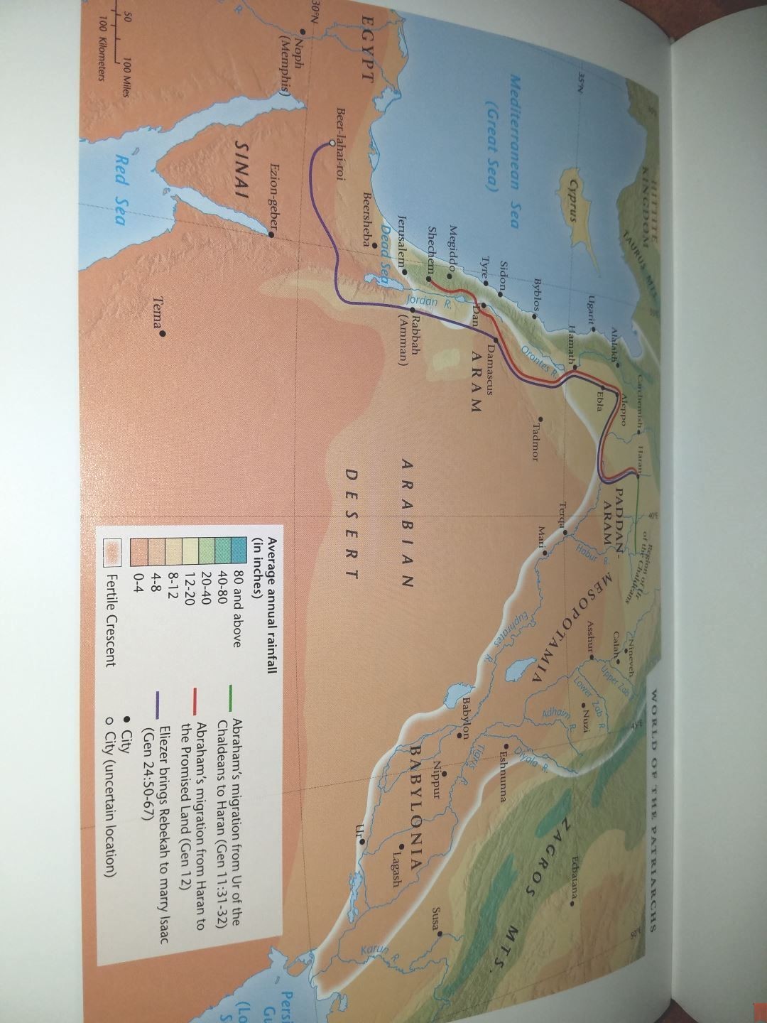
It has 8 colorful maps printed on thick glossy paper. They show the average rainfall, routes, Scripture references, cities, mountains, distance, annotations, kingdoms, dates, realms, territories, seas, topography, etc. It doesn’t have an index but they are labeled well, which helps in searching for locations.

Maps include:
- World of the Patriarchs
- Exodus From Egypt
- Kingdoms of Israel
- Assyrian and Babylonian Empires
- Greek Empire
- Roman Division of Palestine
- Ministry of Jesus
- Paul’s Missionary Journeys
FINAL THOUGHTS ON THE CATHOLIC READER’S BIBLE
Although it ins’t a reader’s edition without chapter and verse numbers, the Catholic Reader’s Bible is a highly readable edition of the NLT. The dark print and opaque paper are excellent for reading. There aren’t any references or other tools to get in the way of the text. The maps are colorful and useful. It’s an excellent choice for anyone looking for an NLT with the with deuterocanonical books.
_________________________________________________________
This book is available at (includes some affiliate links)
and many local Bible bookstores
_________________________________________________________
Photography by Matthew P. Brown
Tyndale provided this Bible free for review. I was not required to give a positive review, only an honest one. All opinions are my own.


Another great review! I actually picked up this bible recently. It’s one of the better mass-marketed NLT editions out there in terms of quality with the one negative being the glued binding. Randy, how much abuse and how long do you think this bible will hold up since it’s not a sewn bible? Would the glued binding dissuade someone from pursuing a rebind on this edition?
Love your reviews and keep up the great work! 🙂
Thanks Chase! Great question. It feels well-made, but I’m not sure I would want to rebind it. That’s just my personal preference. I’d like to know the answer to that question myself 🙂
I wouldn’t rebind this into a sewn binding for I suspect (judging by photos alone) the gutter isn’t wide enough & you’d end up with the text too tight to the centre hence difficult to read. Just off the cuff idea reading your post & replies/questions.