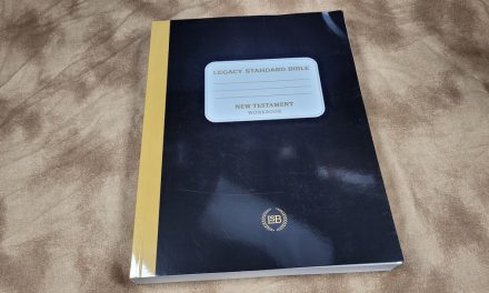
Holman KJV Reader’s Bible – Review
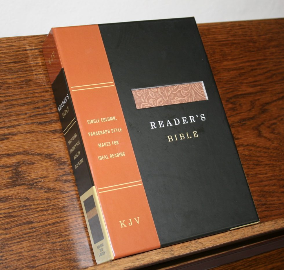
The Holman KJV Reader’s Bible was designed with reading in mind. It’s a Bible without all the other apparatus that gets in the way – chapter and verse numbers, reference and footnote keys, section headings, etc. I like being able to read God’s Word without the hindrances and distractions that are found in the typical Bible. A KJV that focuses on reading is something I’ve wanted for a long time.
The Holman is very much their KJV version of the Crossway ESV Reader’s Bible. In this review I’ll make comparisons with the ESV, so if you’re familiar with Crossway’s edition hopefully it will help you understand the differences.
Features
- KJV
- Imitation over board
- Sewn
- Single column paragraph
- 9-point font
- Black letter
- Line-matching
- No chapter or verse numbers
- 8 maps
- 1 ribbon
- 25 x 5.75 x 1.6”
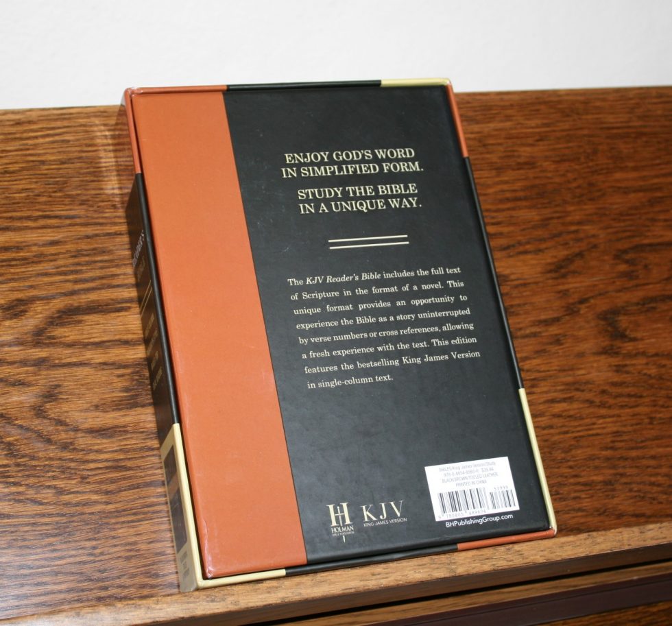
- Sturdy 2-piece gift box
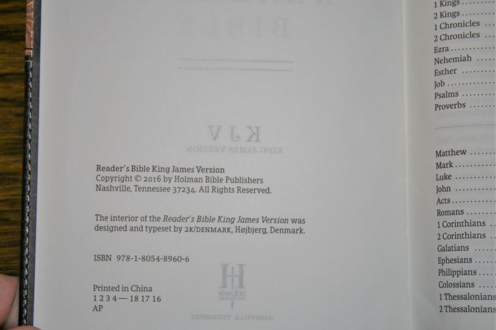
- Designed and Typeset by 2K/Denmark
- ISBN: 9780805489606
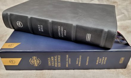
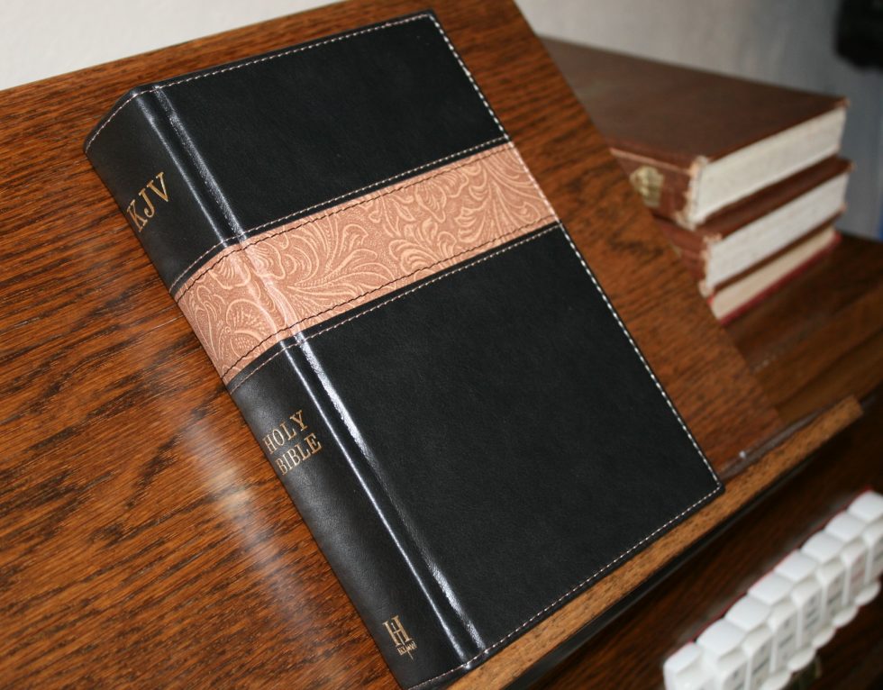
Binding
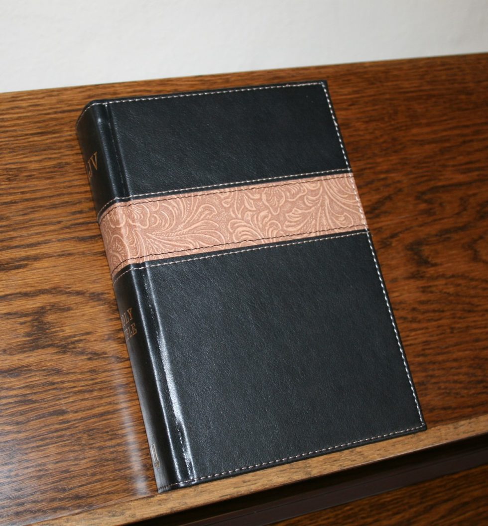
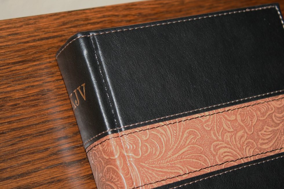
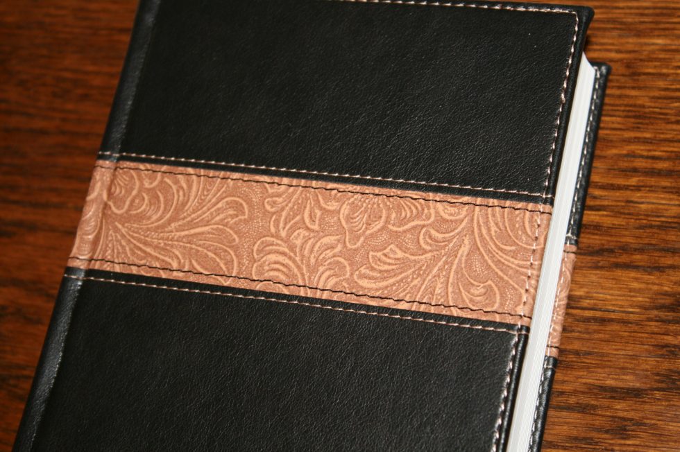
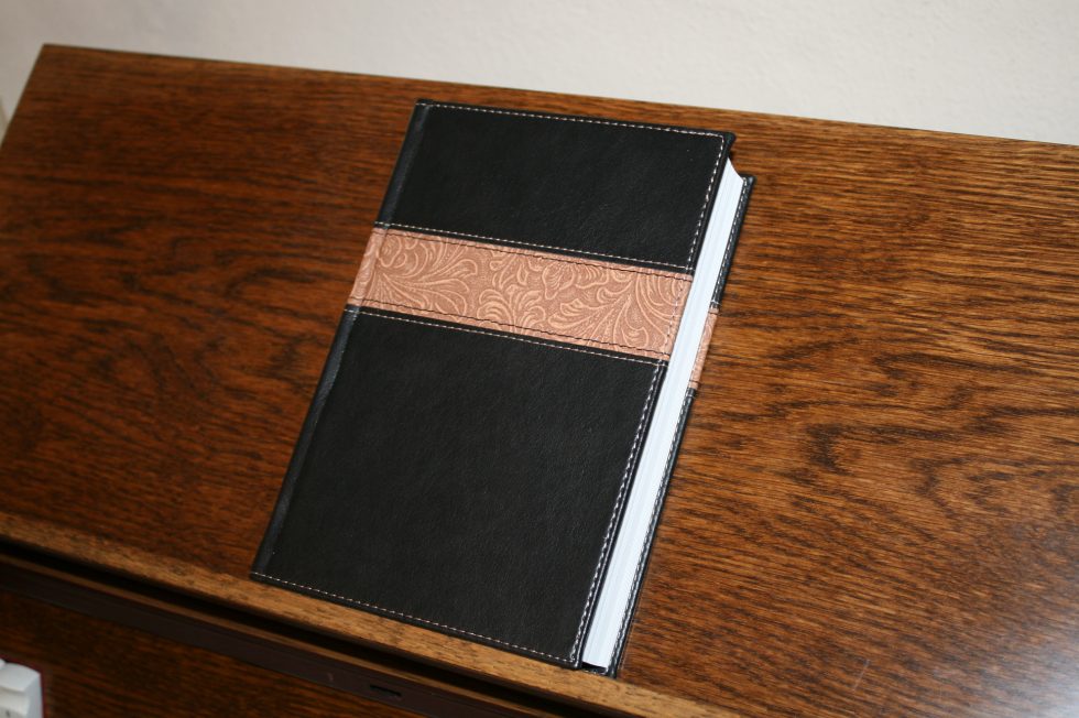
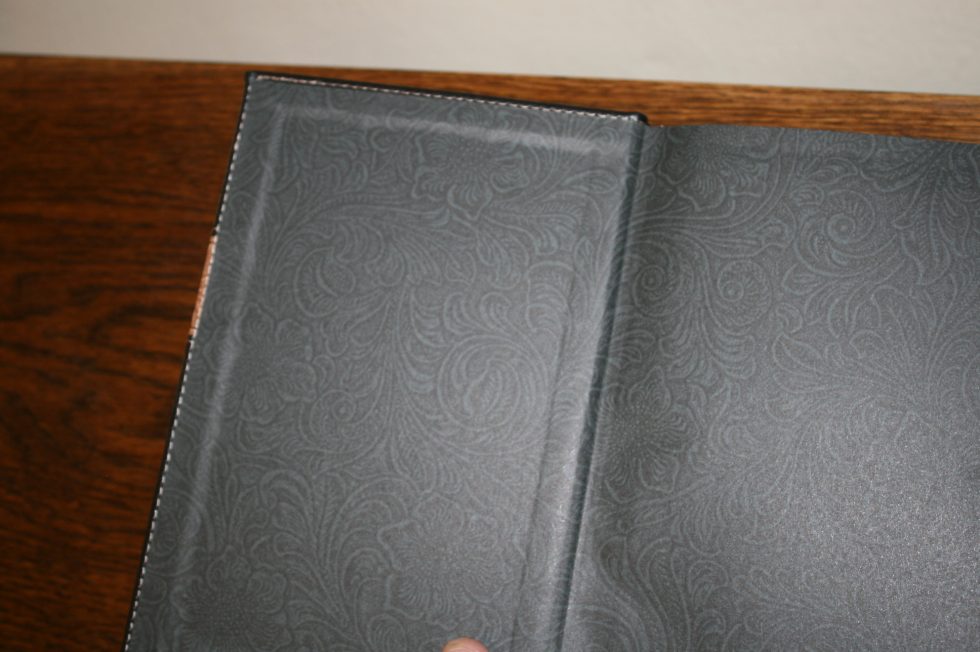
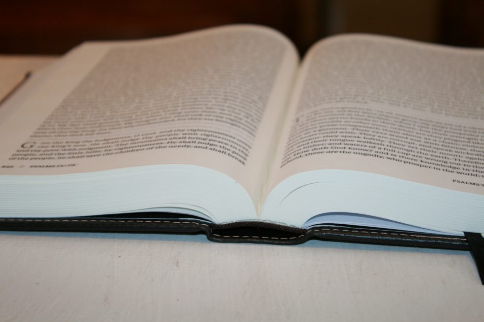
The cover is black/brown LeatherTouch over board, creating a nice hard cover with a tooled leather look. It includes perimeter stitching and a paper liner. It has KJV, Holy Bible, and Holman’s logo stamped onto the spine. The LeatherTouch has a nice grain with an interesting look and feel. The text-block is sewn. It easily lays open in the hand, perfect for reading. It feels sturdy and looks great.
Paper
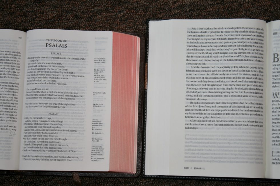
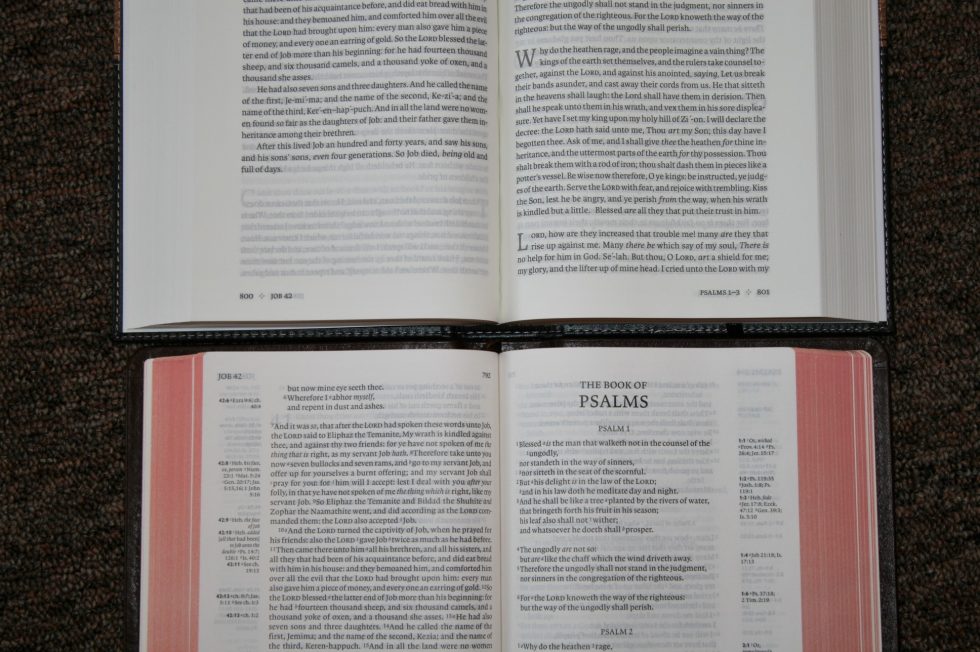
The paper is around 28-30gsm and has a slight cream color that helps improve readability. It does have some noticeable show-through. The show-through is mostly noticeable where there isn’t text on the page but it does sometimes affect readability. It doesn’t have any glare and I had no issues turning the pages or reading it for long periods of time.
Typography
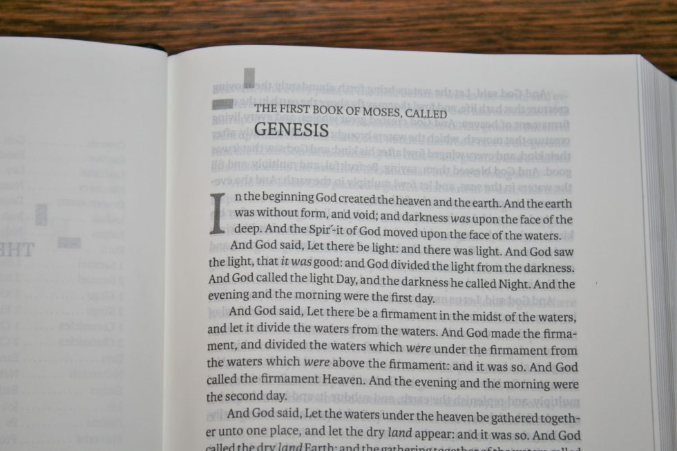
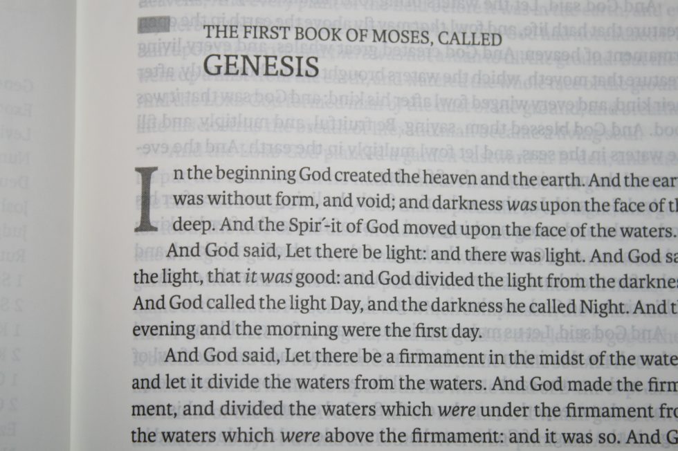
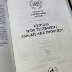
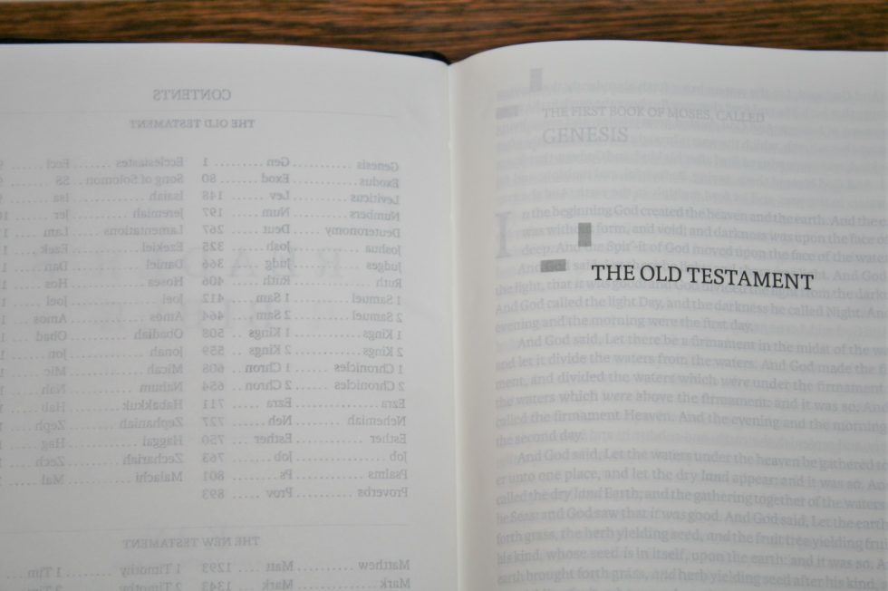
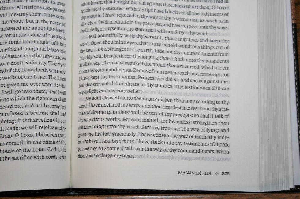
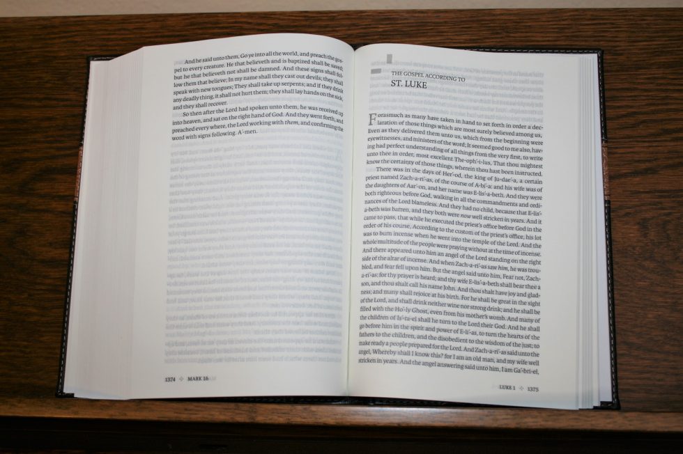
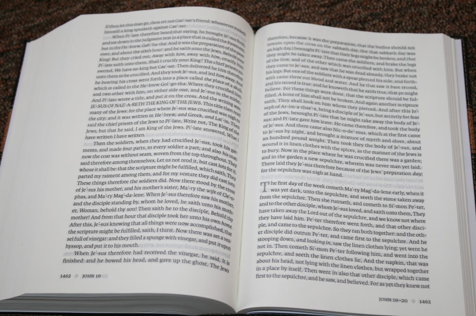
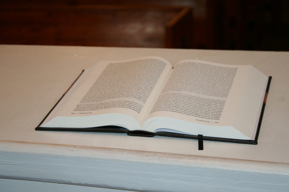
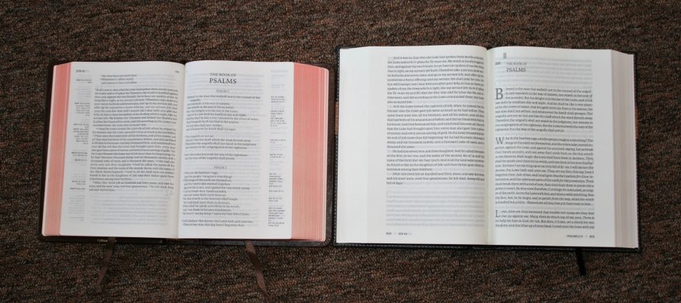
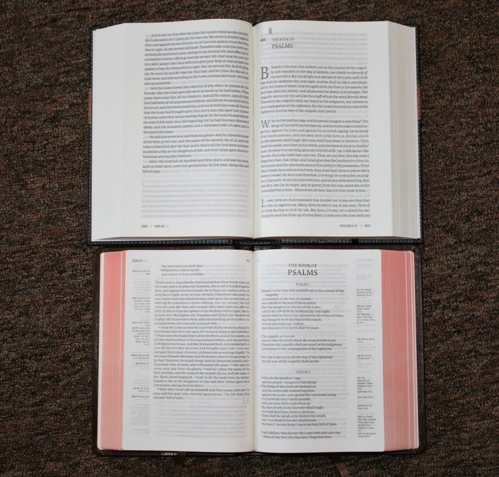
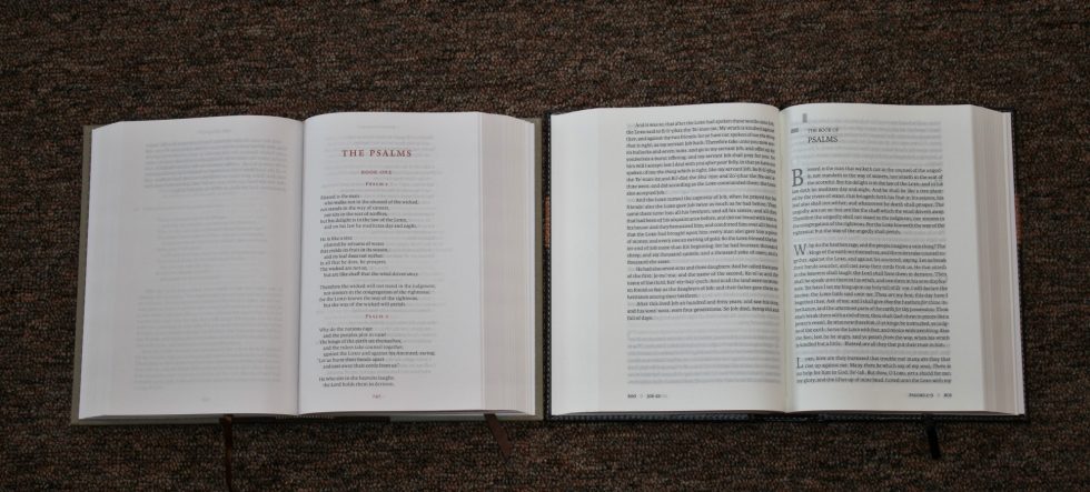
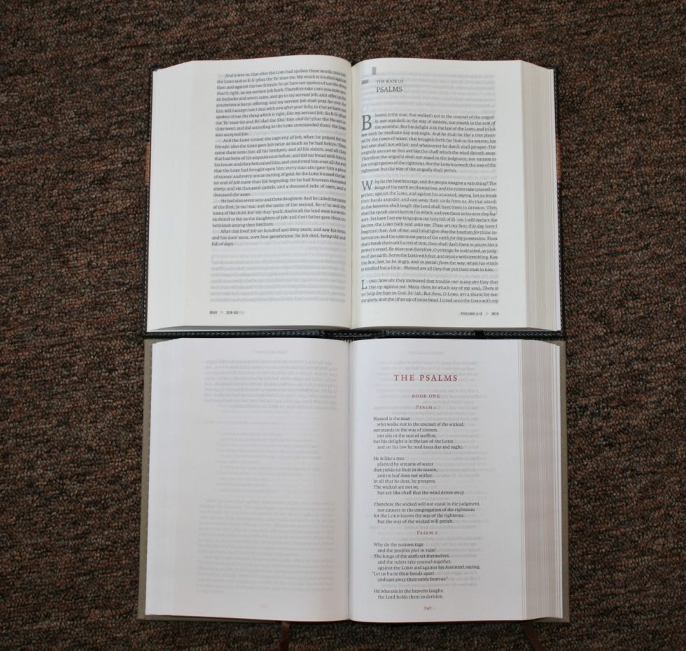
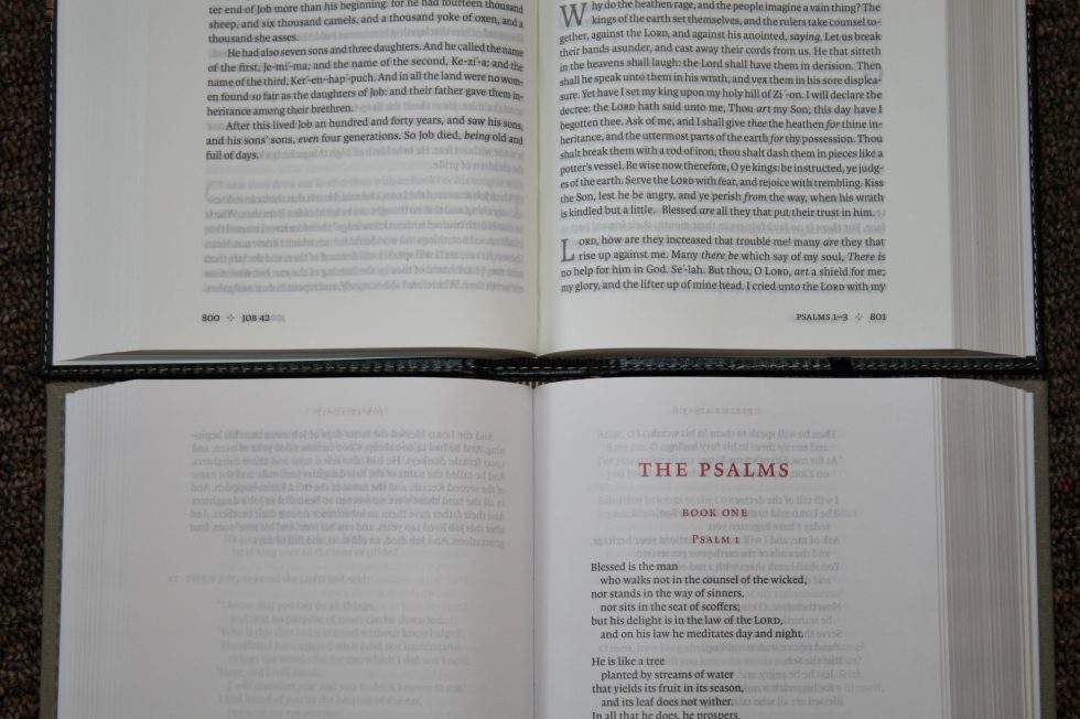
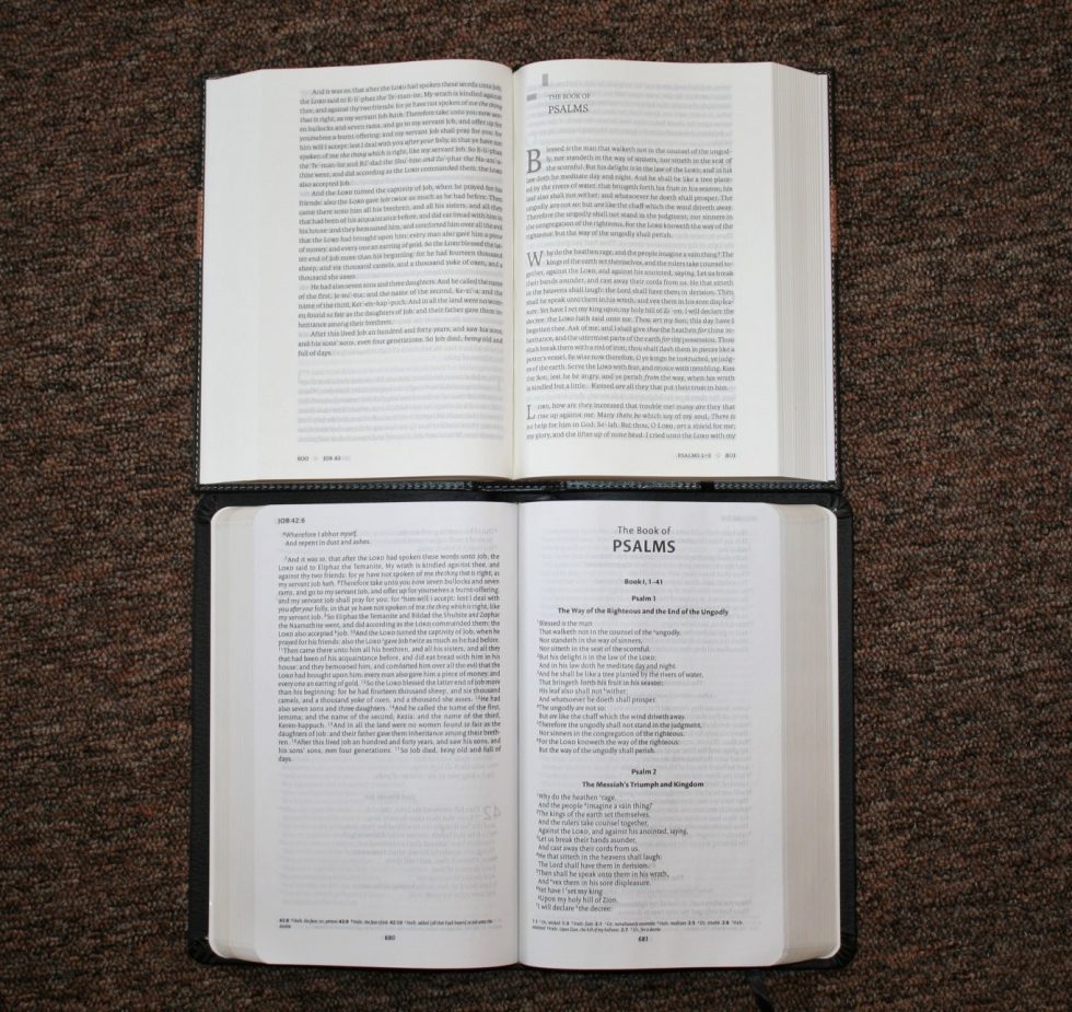
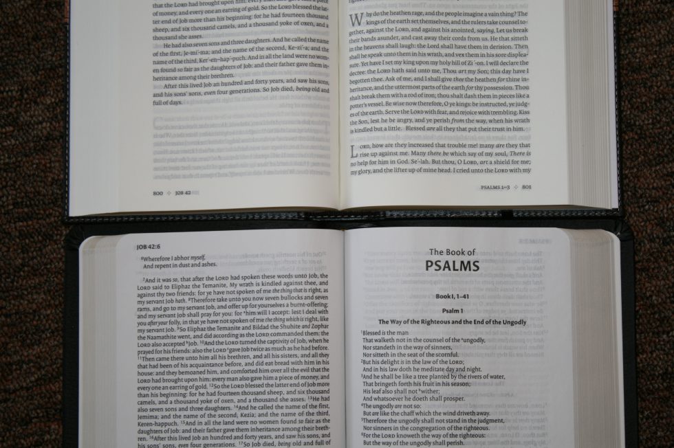
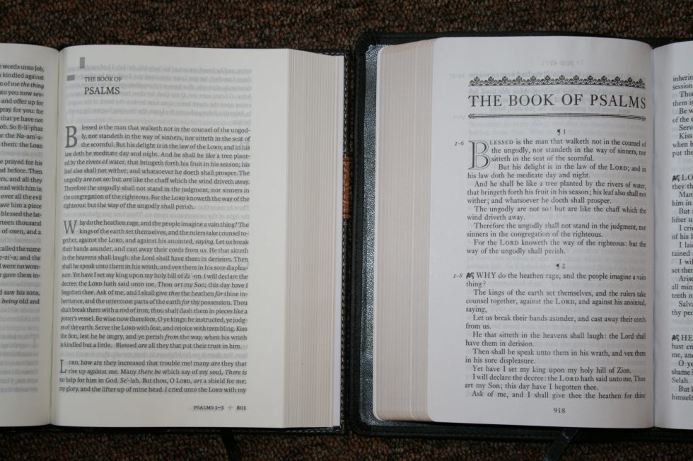
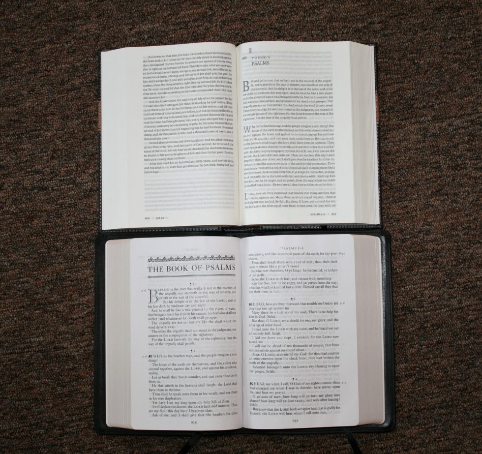
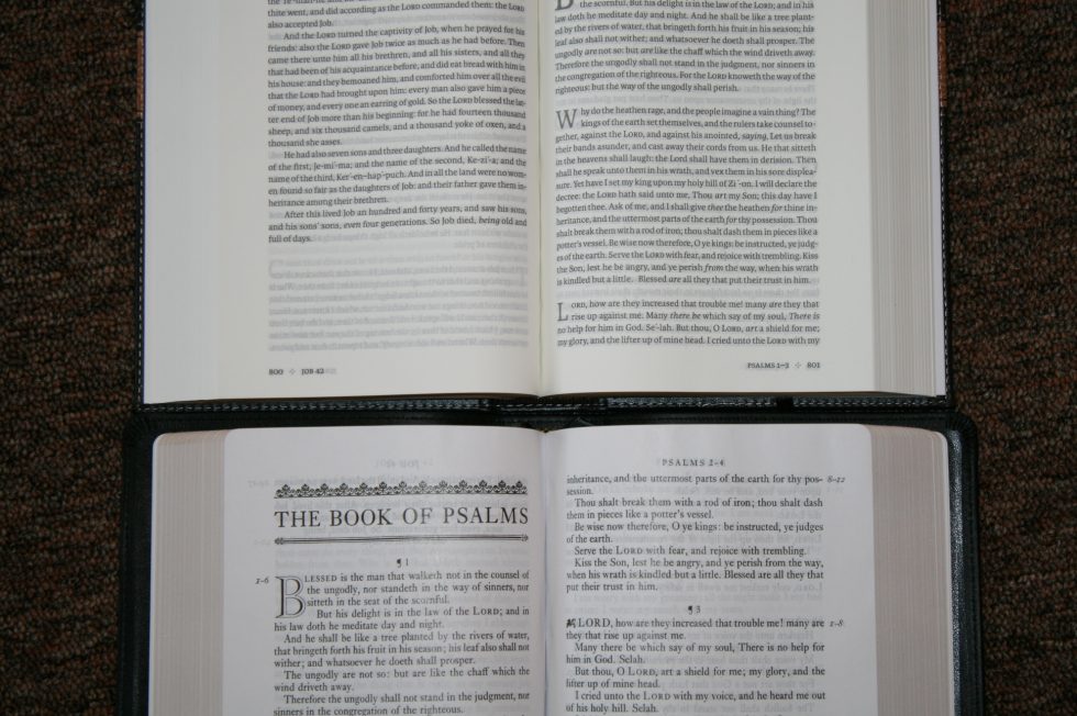
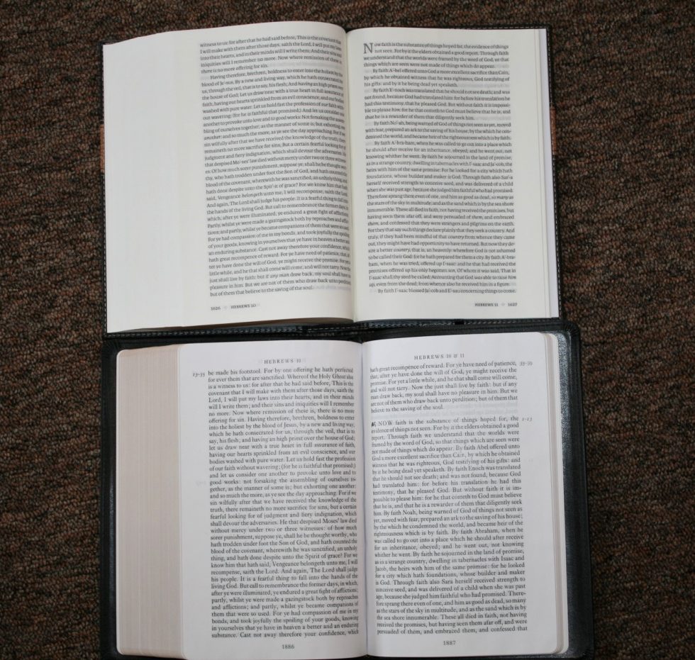
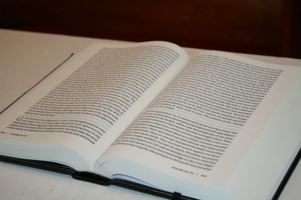
The Holman KJV Reader’s Bible layout was designed by 2K/Denmark. It provides a setting that’s almost unheard of with KJV’s – single-column paragraph. Unlike most paragraph Bibles, even poetry is in paragraph format. The footer shows the page number, and book name and chapter numbers that appear on that page. Each book starts on a new page.
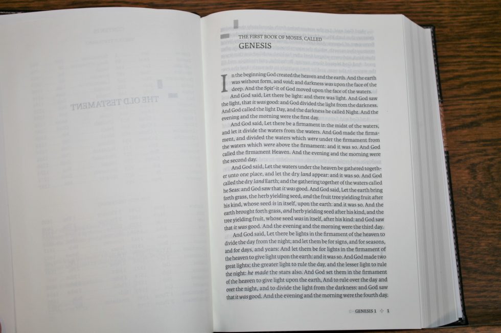
The point of this Bible is to be free of distractions and making reading as smooth as possible. This is a text-only edition with no chapter or verse numbers. Chapters are marked with a 2-line drop-cap (the first letter of the first word) with gray print. This is the only highlighted text on the page. I prefer the red highlight of the ESV but I prefer the drop-cap letter that this Bible has to the chapter number the ESV has. The chapters and verses are shown in the footer so you’ll have an idea of where you are in the book. So far I neither love it not hate it.
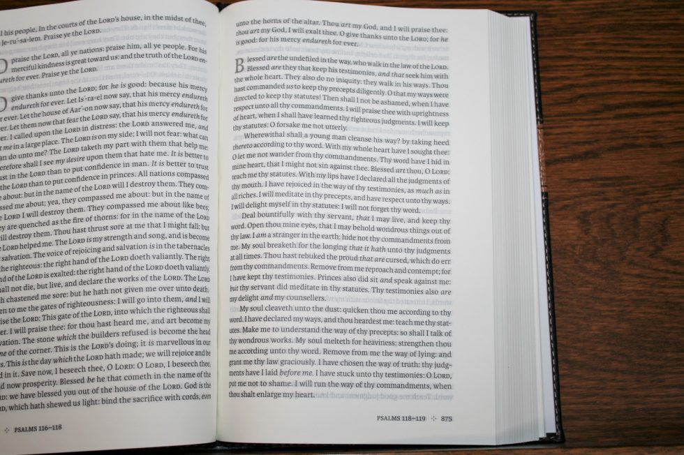
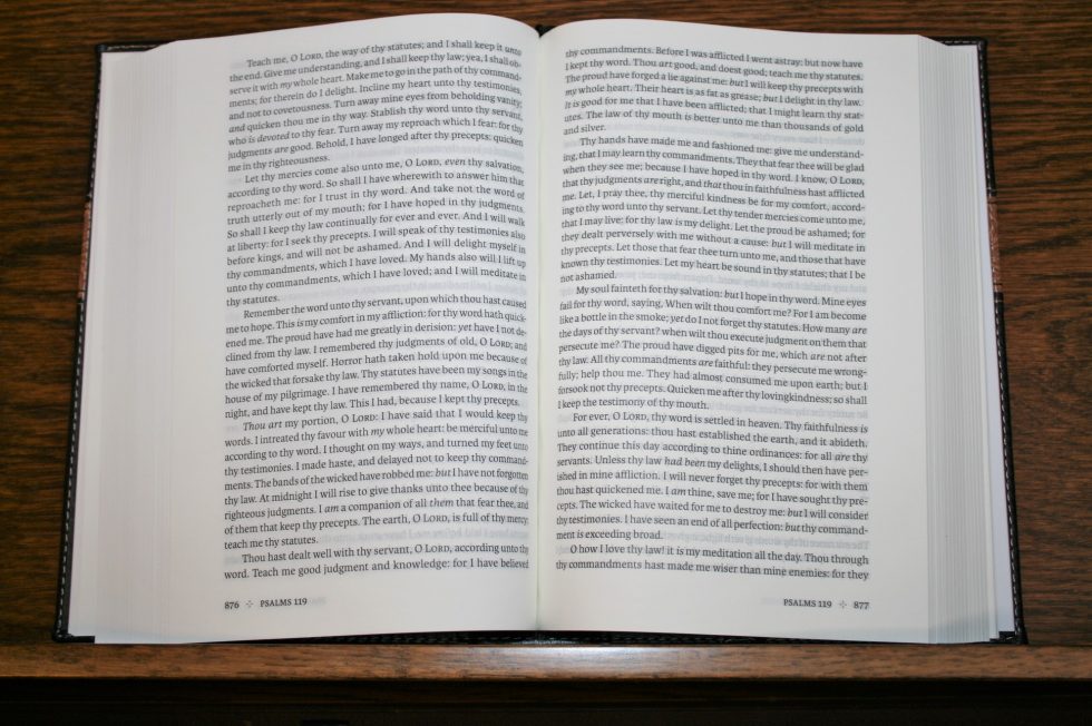
I was concerned at how poetry is set in paragraph format would affect readability. Most Psalms are a single paragraph. So far I think this is easier for reading aloud. It doesn’t seem to affect comprehension but it isn’t as pretty. The headings of Psalms have been removed. I think these should be included like the ESV edition. Psalm 119 has a new paragraph for each letter but the letters aren’t given.
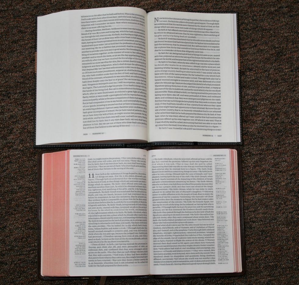
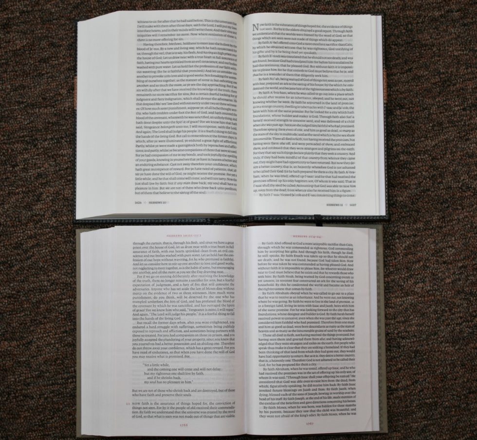
Some KJV’s have several paragraphs per chapter while others only have one. Fortunately it does have a lot of paragraphs. There are only a few KJV’s in paragraph format to compare to, but to help you compare here are a few chapters and their number of paragraphs:
- Genesis 1 – 9
- John 1 – 9
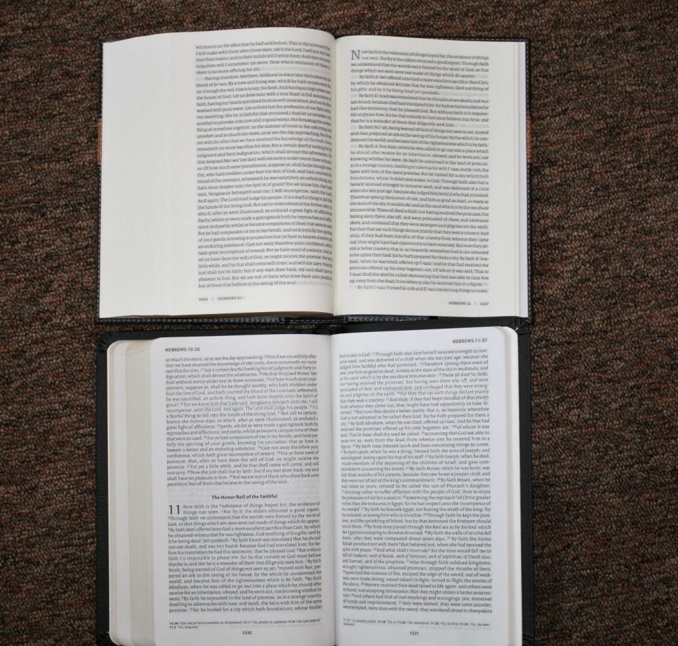
- Hebrews 9 – 2
- Hebrews 10 – 3
- Hebrews 11 – 12
- 1 John 1 – 2
- Revelation 1 – 4
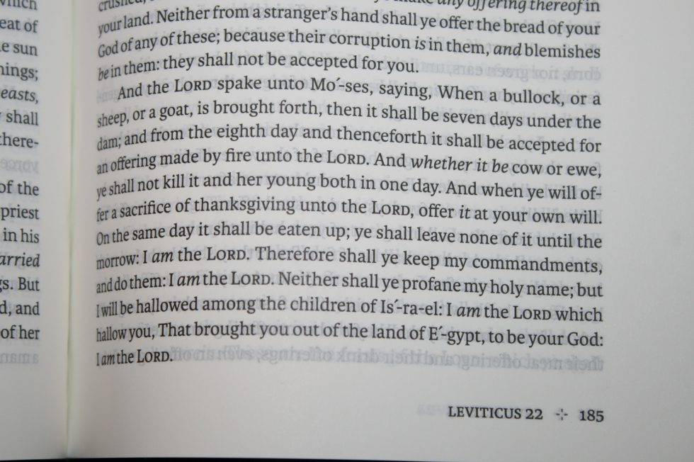
It has a black letter text with 9-point with a generous leading. The font is dark and sharp, and is consistent throughout the text. It retains italics for supplied words. The text is printed with line-matching. I found it highly readable but not as readable as the ESV. They use the same font but the ESV’s paper is more opaque. The Holman’s lower opacity doesn’t hide the text on the back of the page enough which requires a little more concentration to read it. Fortunately it is worth the effort.
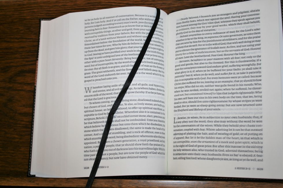
The text does include the standard Holman pronunciation marks to show the syllable-breakdown and accenting of names. For me this takes away from the beauty of the clean text. I would at least like to have them removed on common names like Jesus and David.
The columns are 4” wide and have around 74 characters. This allows for around 14 words on average per line. It has .75” outer and footer margins, .6” inner margins, and .375” header margins. There is enough inner margin that the text never gets lost in the bend of the gutter.
Maps
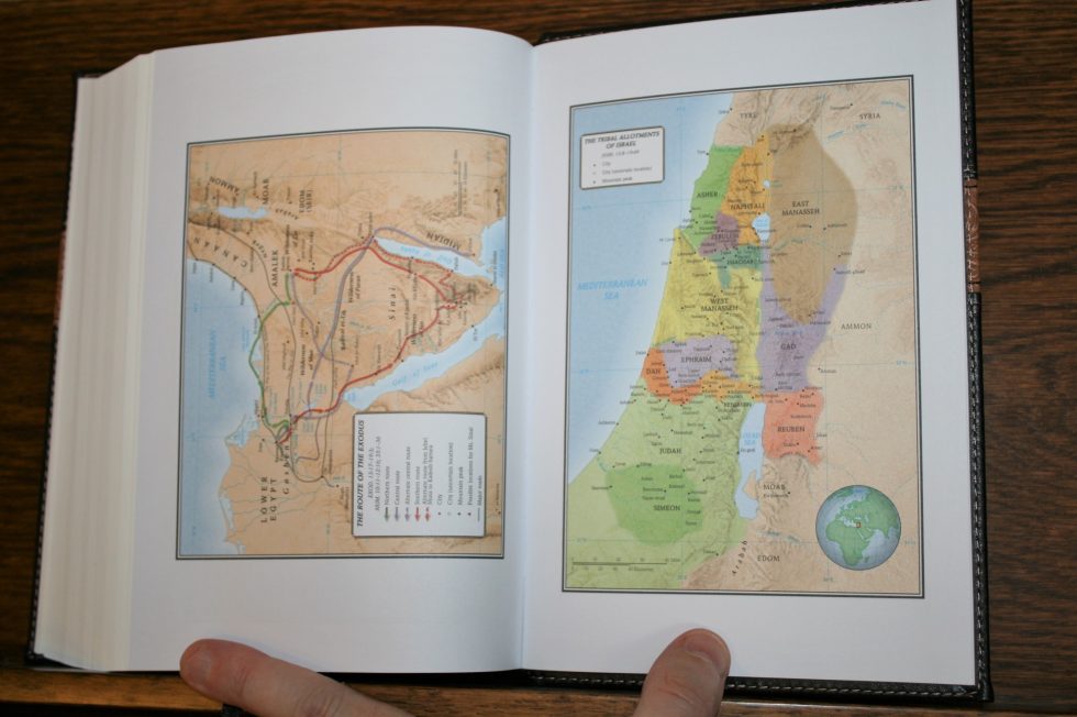
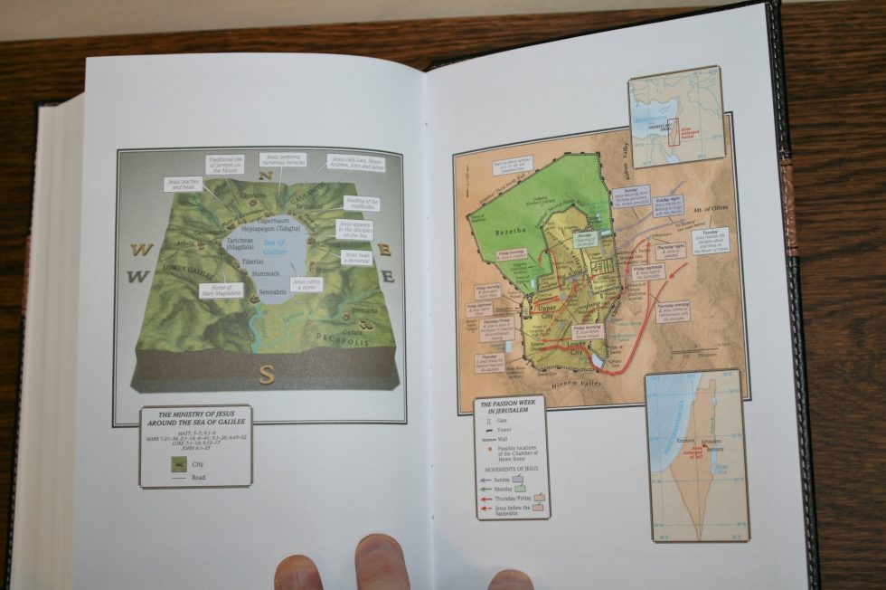
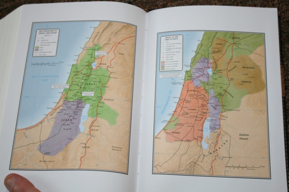
The standard Holman maps are included. They’re full-color and are printed on thick non-glossy paper. This is my favorite paper for maps. They include topography, distance, routes, borders, cities, water, annotations, Scripture references, etc. There isn’t an index but they are annotated well and I find them easy to use.
Maps include:
- The Migration of Abraham
- The Route of the Exodus
- The Tribal Allotments
- The Kingdoms of Israel and Judah
- Israel in the Time of Jesus
- The Ministry of Jesus Around the Sea of Galilee
- The Passion Week in Jerusalem
- Paul’s Missionary Journey’s
Thoughts on Using It
The size of this Bible feels like an average hard cover novel, making it just as easy to handle and carry. I used it in the car, at home, and carried it around. The size is great for carry.
I see the Reader’s Bible as an important Bible design and I think every translation should have one. This design isn’t meant to trivialize the Bible down to nothing more than a novel. It’s meant to improve readability. It removes the un-natural break-points and helps us see verses in larger portions. When reading a verse in a paragraph it’s easier to realize how it fits within its surrounding verses. This helps keep us from isolating verses and taking them out of context. This is more important in a KJV where most readers have only seen individual verses that are numbered and set apart as if they stand alone. If any translation needs a reader’s edition it’s the KJV.
Readability is improved partially from the paragraphs. There are a few KJV’s with paragraphs but many of them don’t break the text into enough of them to break up into smaller thoughts. For example, a large chapter that only has one paragraph would be more readable if it had 3-5. This Bible does that and the result is greater readability.
Even though this was designed with reading in mind I think it could be used as a teaching and preaching Bible. Reading it aloud helps get rid of awkward pauses because of marks like verse numbers and reference keys in the text. This would be improved even more without the pronunciation marks.
It even has some decent margin space if you want to use it. I’d like to get a second copy and write the verse numbers in the margins next to the lines they correspond to. Then I could place a dot next to the first word of the verse. At first that idea sounds ridiculous (in my head anyway), it would be easy to scan down the page for the verse and then look across the printed line for the dot. This would be great for preaching because I could find the verses as fast as I could with verse-by-verse settings and I could read it without any awkward pauses caused by numbers within the text. Just a thought.
I actually like using this Bible for study. Using the chapter numbers in the footer will let you know if you’re on the right page (or in the area). Then, instead of finding a single verse that can easily be taken out of context you have to read the surrounding verses which helps give you the bigger picture. I like to use the analogy of watching a parade. If you’re on the ground you see one float in front of you. You can see part of the previous float as it’s leaving and part of the next float as it’s arriving, but you don’t know where you are in the parade. This is like seeing one verse at a time.
If you have a blimp or hot-air balloon you could raise up until you could see half the parade. You could see the beginning and middle, or the middle and end. This is more like seeing a whole passage or chapter. If you raised up even higher you could see the whole parade. This is like seeing the whole book and how it corresponds to the rest of Scripture. Placing verses in paragraphs without verse numbers lets you study ranges of verses or a chapter at a time, letting you see more of the context at once. It takes longer to find the specific verse you’re looking for but you see more of the text in the process.
This is an excellent Bible for expository preaching. The format allows you to stop naturally based on thoughts rather than artificially based on numbers. I could even see this in a wide margin edition. I do recommend that you use something to hold your place if you look up while preaching or teaching.
When reading a paragraph edition, and especially an edition without verse numbers, I find that I read more, faster, and retain better. Even with verse-by-verse editions I typically just keep reading, but this layout makes that much easier.
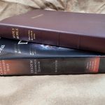
Comparisons
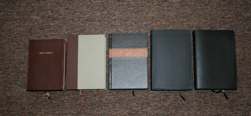
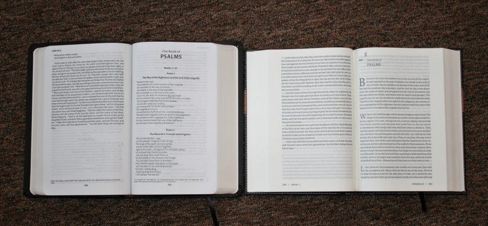
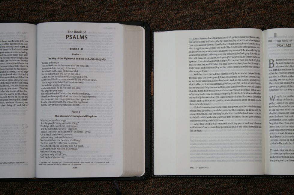
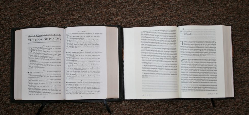
Here’s a look at how the Holman KJV Reader’s Bible compares to the Crossway ESV Reader’s Bible, Cambridge KJV Clarion, Nelson Paragraph Bible, and the LCBP Paragraph Bible. Each have their advantages and disadvantages.
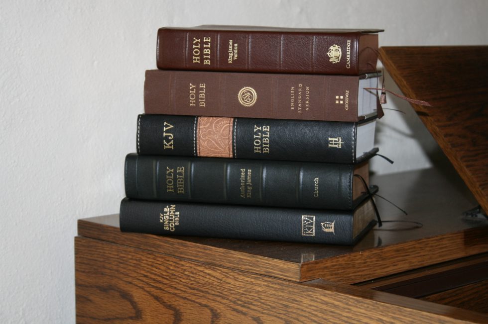
From top to bottom (above) and left to right (below): Cambridge Clarion, Crossway ESV Reader’s Bible, Holman KJV Reader’s Bible, LCBP Paragraph Bible, and Nelson KJV Paragraph Bible.
Clarion
ESV Reader’s Bible
Nelson Paragraph KJV
LCBP Paragraph Bible
Conclusion
The idea of this edition was to make reading the Bible like reading a novel. This means removing the things that hinder readability – chapter numbers, verse numbers, and each verse on its own line. The result is a clean text with improved readability. I see the Reader’s Bible as an important edition. I’m glad to see Holman produce this in KJV and NKJV. I’d like to see it in even more translations.
Although the paper isn’t as opaque as the ESV edition and it has accent marks for many names, the readability is so much enhanced that I just keep reading. It was designed for pure readability and it delivers. If I could make one change I would make the paper more opaque, but it isn’t so bad that it would keep me from using it.
The Holman KJV Reader’s Bible isn’t as pretty as the Crossway ESV Reader’s Bible. This is due to a few design decisions: less opaque paper, no highlights on the page, and poetry set to paragraphs. I wouldn’t call this the definitive reader’s edition but until one is produced to match the ESV Reader’s Bible I highly recommend the Holman KJV.


Thanks for the review Randy. Despite the self-pronunciation which Holman goes overboard on the layout looks so nice that I may try this.
Between this and the Reader’s Reference which do you prefer?
John
Hi John. They both have their advantages. Here’s the short answer: general use – Reader’s Reference Bible; reading – Reader’s Bible.
To my eye the Reader’s Reference Bible looks better (I prefer it’s paper and font). It’s also easier to use as an overall Bible because of having chapter and verse numbers.
I love the size of the Reader’s Bible and it’s a better choice for reading without distractions.
I haven’t gotten the NKJV edition yet of the Reader’s Bible. If I do then I’ll compare their layouts.
Thank you for an informative review. My first try at a reader’s Bible was the ESV Reader’s Bible 6-volume set that I received as a gift from my wife. I was not very familiar with reader’s Bibles, and in particular the ESV, but I liked the idea of a modern translation in paragraph format, and was tired of the tongue-twisting 17th century English of the KJV. I am now aware of some of the “deal-killer” translation flaws of the ESV (Genesis 3:16, et al).
However, the more I researched modern English translations, the more I appreciated the KJV, to the point where I now prefer it. I thought perhaps the the NKJV would be good (I have a Gideon’s edition) , but even that one has it’s flaws, and it’s not in paragraph format.
Short story is I like what I see in the Holman’s KJV Reader’s Bible. Your review was the most helpful of all the other reviews I read. I’ll be buying a copy soon.
Thanks Greg! I’m sure you’ll like it.
You have done an excellent review and presented a strong case for this Bible. Yes, it looks very nice, and I might well buy it. I can see that it might attract previous non-readers of the AV/KJV. But, a couple of comments from you resonate with me, in that I suspect that we were taught to read verse-by-verse Bibles which had paragraph markers or raised or bold initial paragraph letters or the like. That skill and practice, which allowed us to read our Bible both analytically and synthetically at the same time, is probably now well-nigh gone, it seems.So, for me, give me, give me my AV TBS Westminster or my NASB SideColumn or my ESV Verse -by-Verse – all with sidecreferences. For me, that is the best format for reading or studying or preaching or teaching. ..But, the Holman DOES look nice…..!
The 9 point type is a bit small for me,even with
reading glasses; is there a large or even a giant
print version of ESV and KJV readers bibles available?
Those pages, in which they are all text with really, few paragraphs, look a little daunting to me.
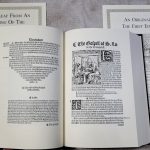
I just discovered that the original KJV 1611 and 1769 bibles had both paragraph separators (pilcrows) and section headers also. The section headers were not in the text, but put in smaller print, at the start of the chapter with their corresponding verse numbers.
I was under the impression, that they were added years later. I had to go to the photographed pages of the bibles at archive.org to see this.
But somehow, though they could break up the text further, they are not being used in the text. I’m guessing, even though they were in the originals, that they are not considered reliable today?
Well, after I commented, I missed that one purpose of these bibles was to avoid section headers. Still, it is possible that if a section header was called for due to a change in thought, that, without adding the header, a new paragraph indent could be started.
I am just probably too used to science textbooks, and smaller paragraphs for difficult concepts.
I’m with you on this. I want smaller paragraphs to break up the page. Science books are the best description for me. I’m a technical writer and I like it when the page is designed into smaller sections like you’re describing.