
CBP Handsize Center Column Reference Bible Review

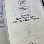
The Handsize Center Column Reference Bible from Church Bible Publishers reproduction of the Cambridge Turquoise that’s been reduced in size, creating a personal sized version of the popular edition of the KJV. It’s about the footprint and font size of the Cambridge Concord, filling a gap for medium print editions with center column references. It includes family pages, Translators to the Reader, concordance, and maps with an index.
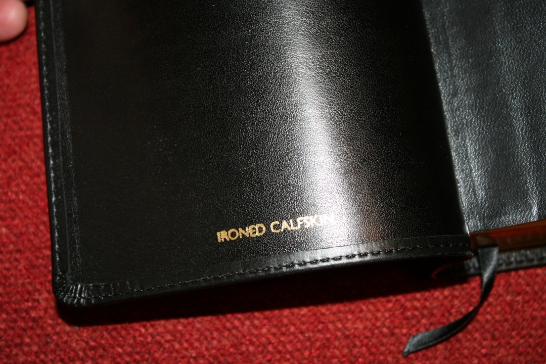
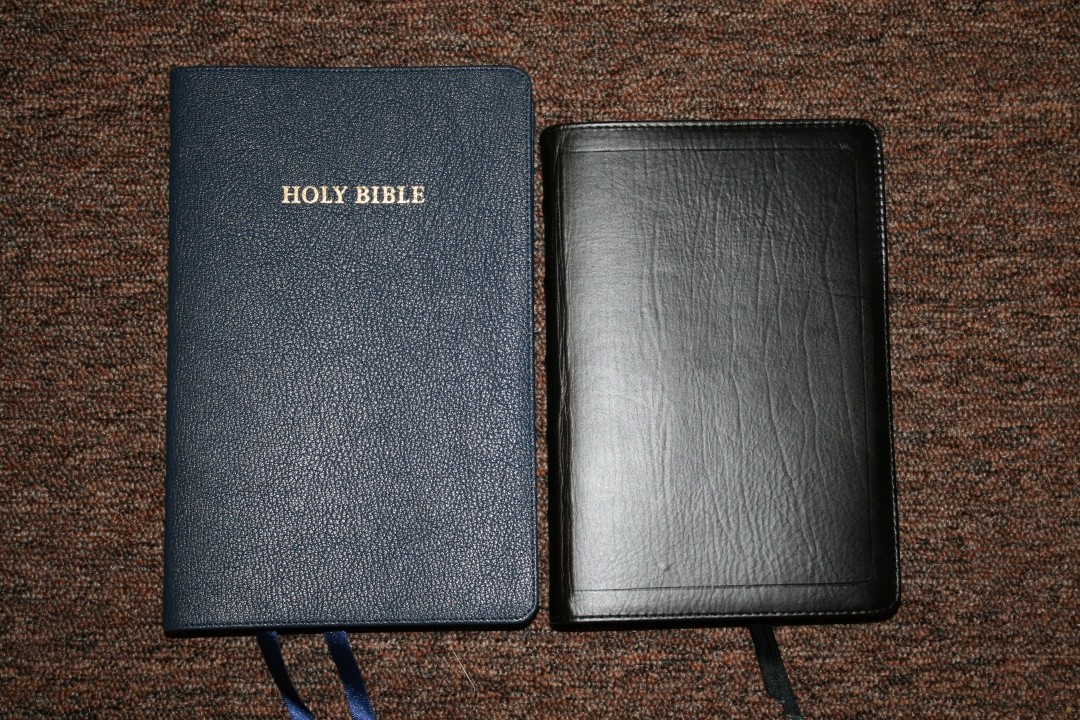
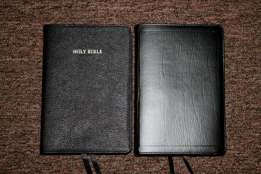
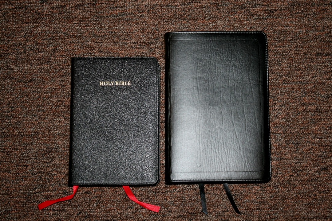
It’s available in 7 cover options including 3-piece calfskin/synthetic in black/pink or black/purple, and in ironed calfskin in one piece black, brown, or red, or three pieces in black with white threads or black/brown. I’m reviewing the one piece ironed calfskin in black.
___________________________
Purchase from CBP
___________________________
Video Review
Cover and Binding
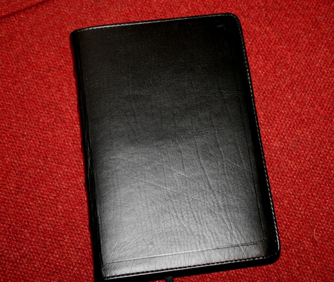
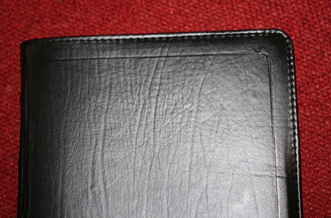
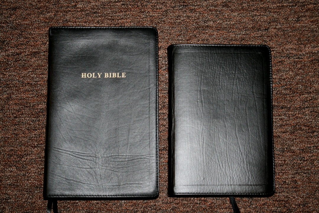
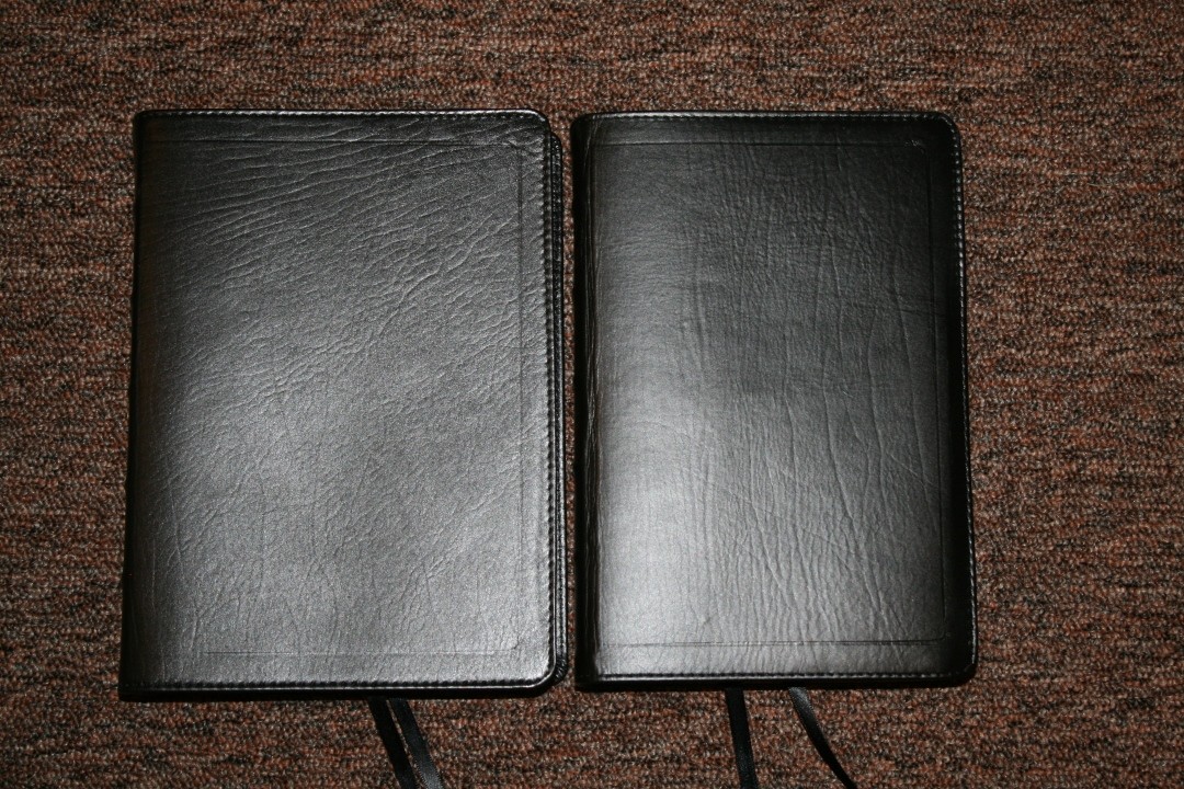
The cover is black ironed calfskin with an edge-lined synthetic liner. It has perimeter stitching. The cover is smooth but you can still see the grain. I’m a fan of pronounced grain and texture, but this does look good.
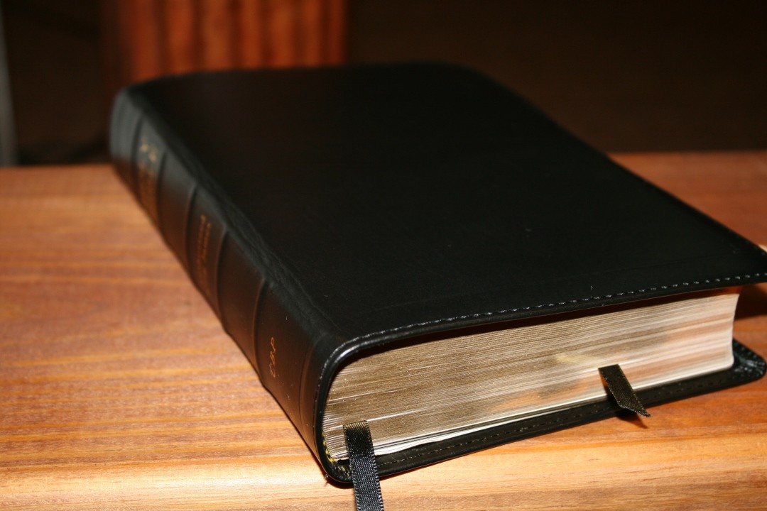
The front of the cover has no text while the spine has HOLY BIBLE, Authorized King James, and CBP printed in gold. It also includes 5 raised spine ribs.
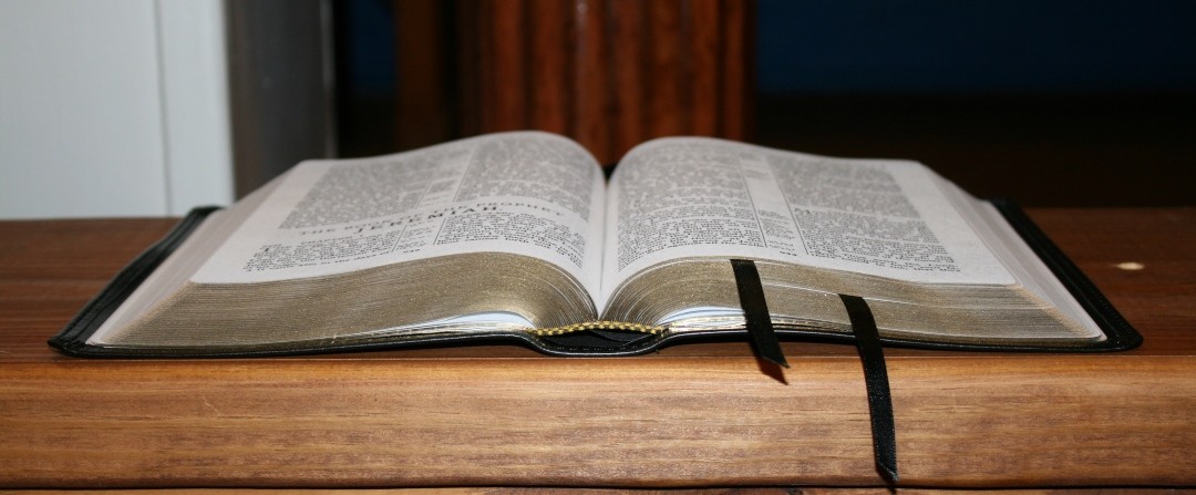
The text-block is Smyth sewn. It has no trouble staying open in Genesis 1 out of the box. It didn’t have to break in before I could read or preach from the first page of Genesis.
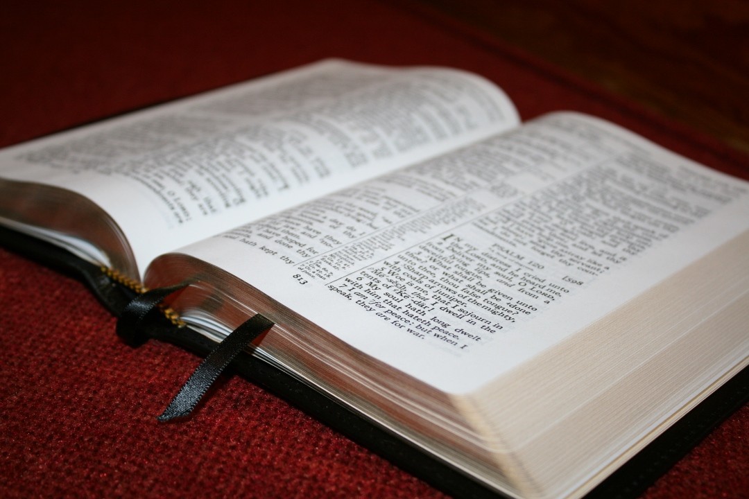
It includes two black ribbons that are more than long enough to pull to the corner to open the Bible, and gold and black head/tail bands. The overall size is 8.75 x 5.8 x 1.5″. It weighs 2lbs, 1.8oz. I love this size for carrying and reading.
Paper
The paper is made in USA 22# Domtar TitaniumJET, which is somewhere in the mid 30’s in gsm. It has a brightness of 90 and it’s treated for pigma inks (meaning it needs less ink than non-treated paper). It’s more opaque than the paper they use in their 120 wide margin Cameo. It’s white in color and it’s extremely opaque. It does have some glare under direct lighting. I only see this while sitting at my desk or under a reading light. In normal or natural light there is no glare.
I had no issues turning pages. The paper is smooth but I can still separate the pages easily with one hand. The page edges are gold gilt.
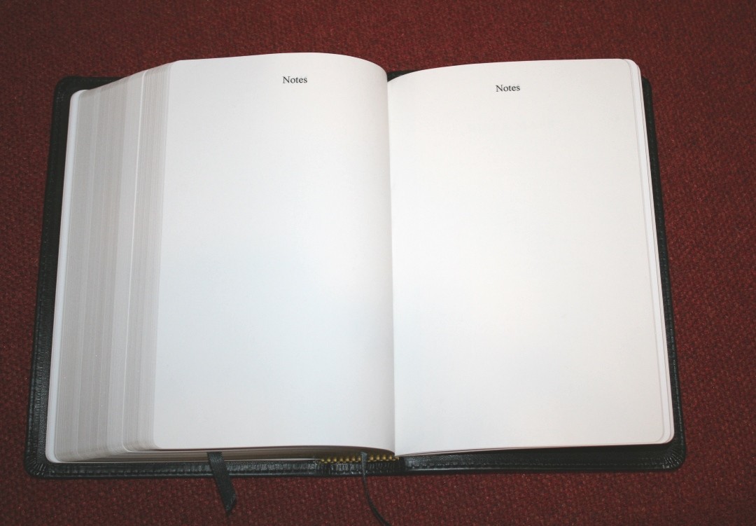
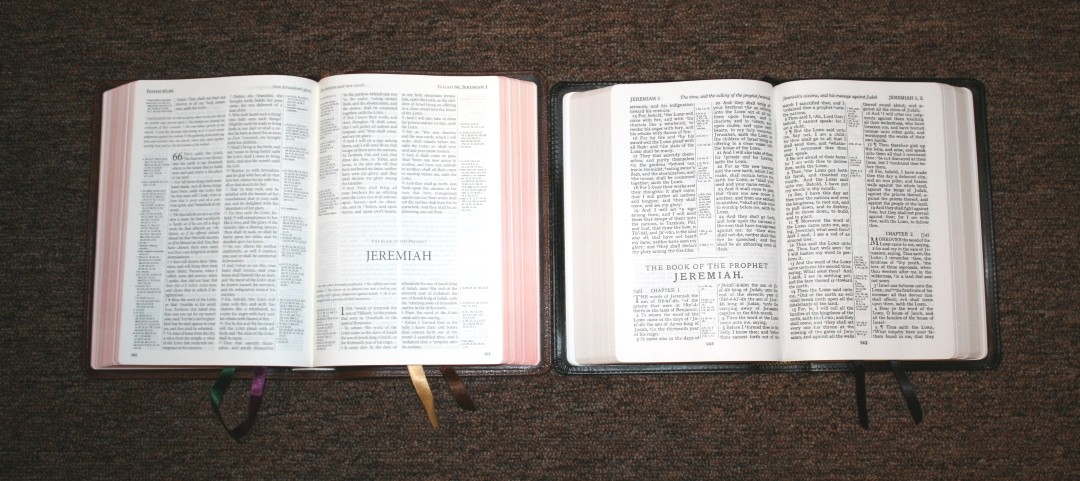
It has 22 pages in the back for notes (20 are labeled NOTES) and several thick end-sheets that can be used for notes. I’m glad this is included. I like the thick end-sheets because it adds structure, but they’re also great for writing.
Typography
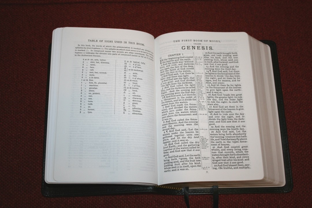
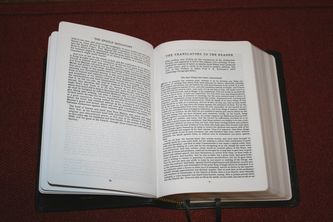
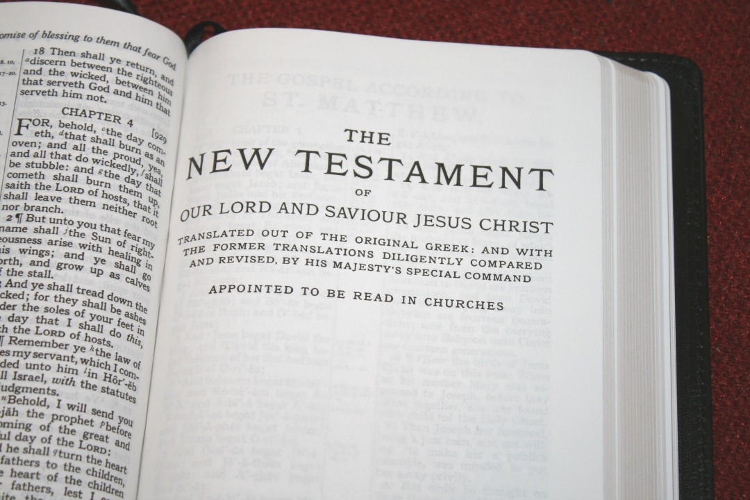
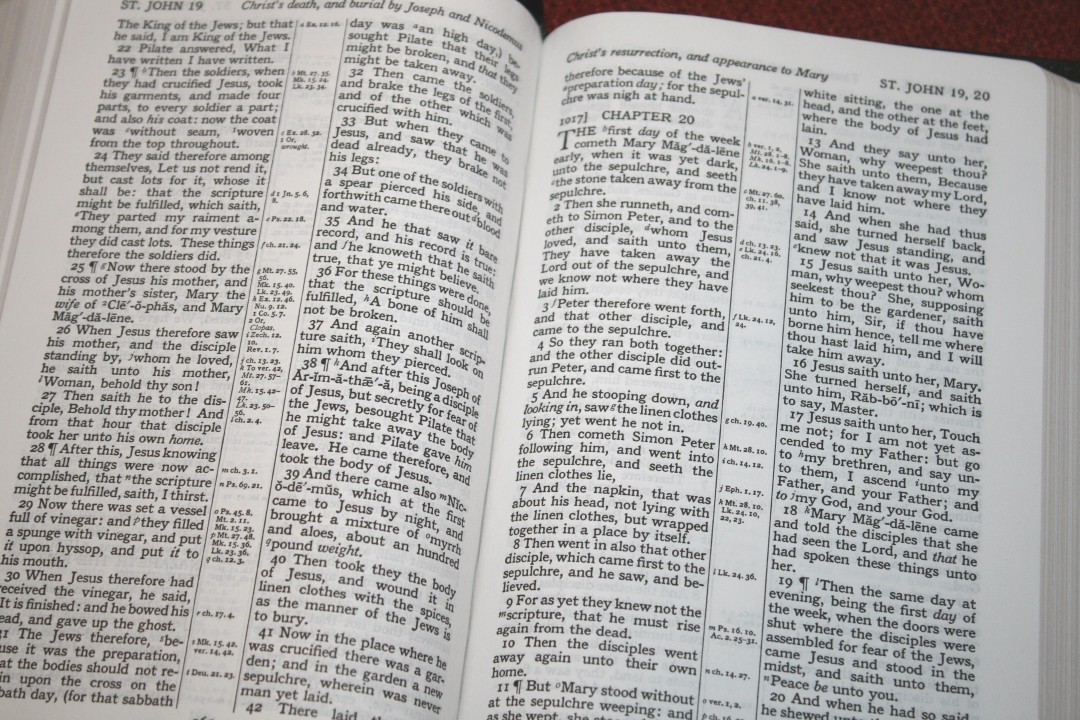
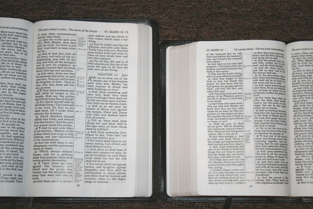
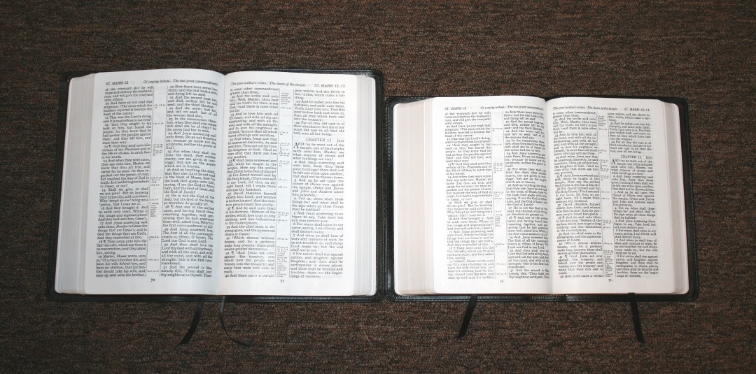
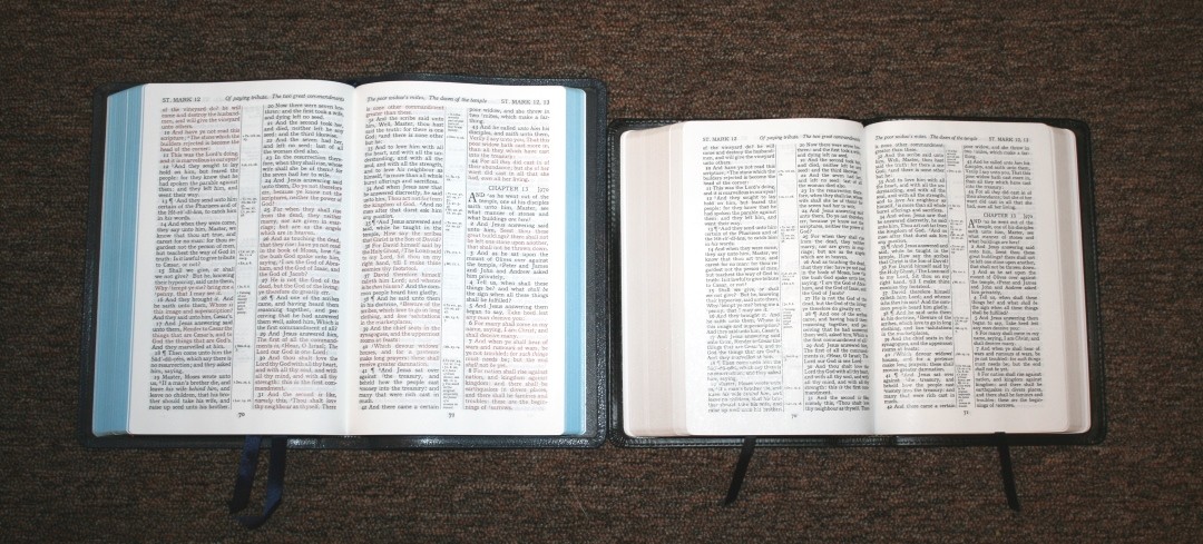
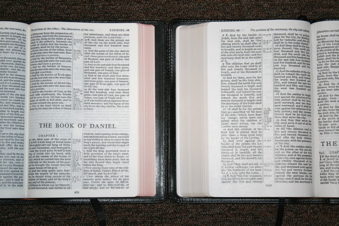
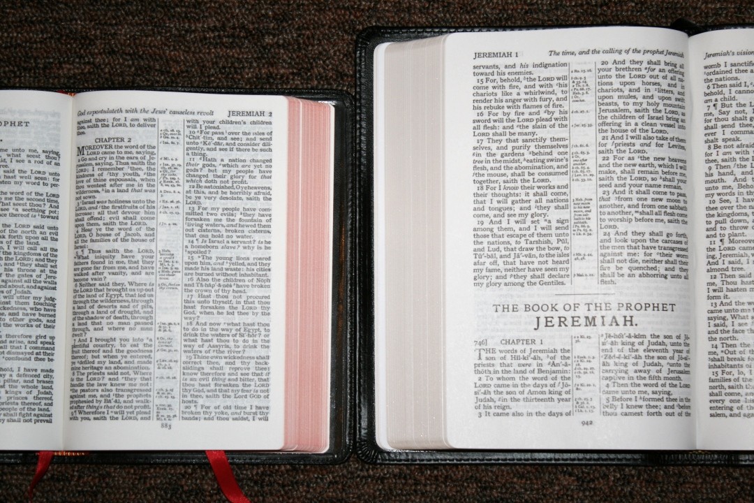
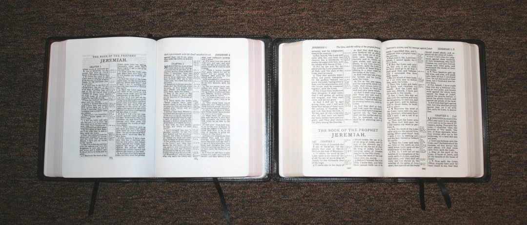
This is the vintage Turquoise design with the traditional verse-by-verse double column layout with center column references. The header includes the book name and the chapters on that appear on that page in the outer margin and a page-summary for each column in the inner column. The footer has the page number in the center. Each of the chapters are numbered.

The font is a bold 9 point with a 10 point leading (the space between the lines). This is a dark font that actually looks larger than it is because of the design. I find it easier to read than most Bibles because of the extra white space around the text. This is a black-letter edition. The darkness of the print is consistent throughout. I can read it easily in bad lighting.
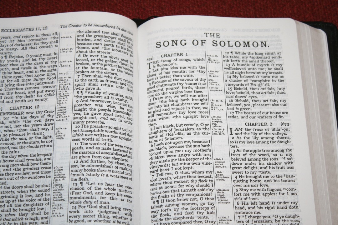
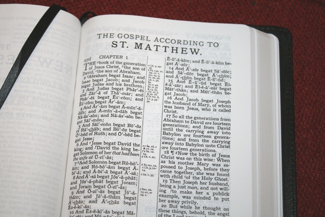
The text includes self-pronouncing markings for the more difficult names. It includes a guide in the front to show how to pronounce the symbols. I like that it isn’t overdone. I like that it doesn’t include common names like Jesus, David, Israel, Judah, or Jerusalem. This is helpful for preaching or teaching. Italics are used for supplied words. It includes paragraph marks (pilcrows) but there are none after Acts 20. It includes footnote and reference keys. It uses numbers for footnotes and letters for references. They are decently large, but they’re not bold.

It has around 32 characters per line with around 5-7 words per line. This is an old setting, so there are a few places where the words are a little too close. A few lines might take a second to think about but I still find it easy enough to read. The text is mostly line-matched. This isn’t on purpose but it does improve readability. The paper is so opaque that the show-through isn’t noticeable even where the lines don’t match.
It has .6″ margins, which brings the text out of the gutter and keeps it from bending out of view. It also provides a little bit of room for small notes.
References and Footnotes
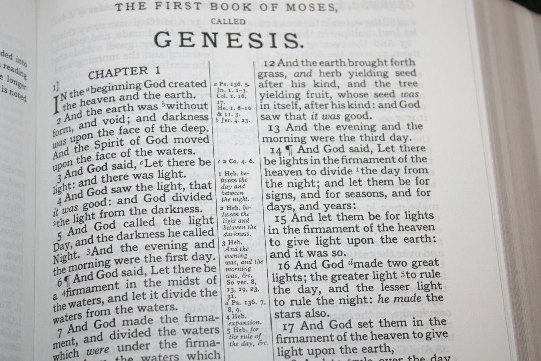
Cross-references and footnotes are placed next to the verses they correspond to, making them easy to find and providing a little bit of space for small notes. They show the key and reference or note. They’re labeled within the text from left to right, moving across both columns.
I’m just guessing, but it seems to have around 44-45,000 cross references. This is good for basic study and sermon prep. Here are some example references to help you compare:
- Genesis 1:1 – Ps 136:5; Jn 1:1-3; Col 1:16,17; He 1:8-10; 11:3; Jer 4:23
- Deuteronomy 6:4 – Mk 12:29; Isa 42:8; Jn 17:3; 1 Co 8:4,6
- Isaiah 9:6 – Lk 2:11; Isa 7:14; Mt 28:18; Judg 13:18; Eph 2:14
- Matthew 17:20 – Mt 21:21; Mk 11:23; Mt 13:31; Mt 17:9
- Mark 11:23 – N/A
- Mark 12:29 – Deu 6:4,5
- John 1:1 – Ge 1:1; Jn 17:5; Col 1:17; 1 Jn 1:1; Jn 1:14; Rev 19:13; 1 Jn 1:2; Phil 2:6
- John 2:19 – Mt 26:61; 27:40; Mk 14:58; Jn 10:18
- Acts 2:38 – Lk 24:47; Acts 3:19; 20:21; 8:15,16; 22:16; Mt 26:28; Acts 10:45
- 1 John 1:1 – Jn 1:1; 1 Jn 2:13,14; Rev 1:2; Jn 1:14; Lk 24:49; Jn 1:4
These are the translators footnotes, which include alternate renderings and explanations from the Hebrew and Greek. They’re helpful for study and I’m glad they’re included.
Family Records

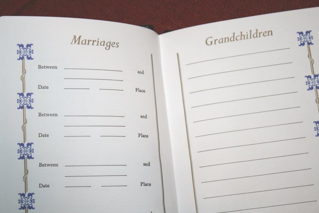
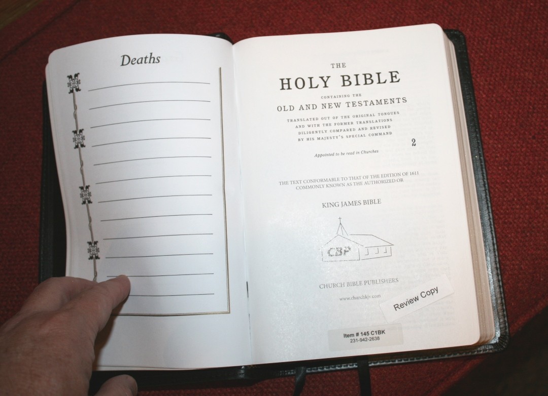
In the front are several thick, non-shiny, pages that include a presentation page, the family record of the husband and wife, children, marriages, grandchildren, and deaths. Most have blue and gold highlights. The deaths page has black and gold.
Concordance
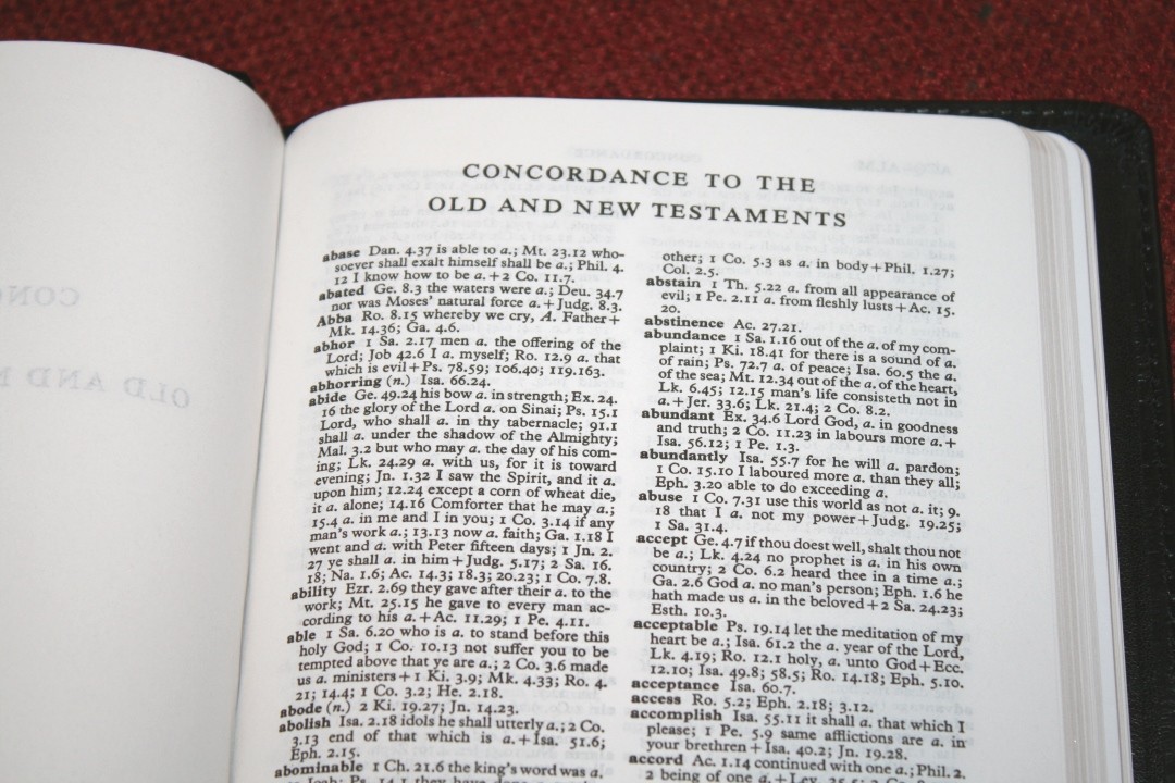
The concordance is 126 pages with 2 columns per page. It places the references in a paragraph layout, which I find to be difficult to use. It does have a lot of entries and references though, so it is a good concordance for study and sermon prep. It includes the parts of speech with separate entries for each.
Here are a few examples with their number of entries to help you compare:
- Christ – 36
- Christian – 3
- Faith – 54
- Faithful – 27
- Faithfully – 3
- Faithfulness – 6
- Faithless – 4
- God – 76
- Goddess – 3
- Godhead – 3
- Godliness – 4
- Godly – 2
- God-ward – 3
- Praise (n) – 11
- Praise (v) – 14
- Pray – 45
- Prayer – 22
MAPS
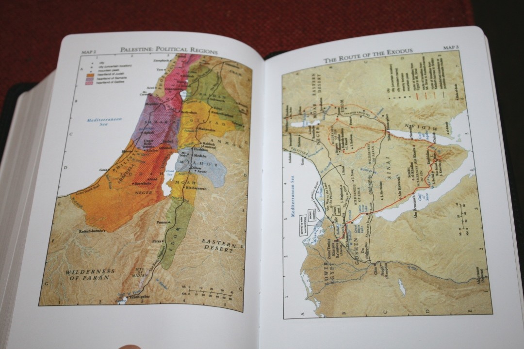
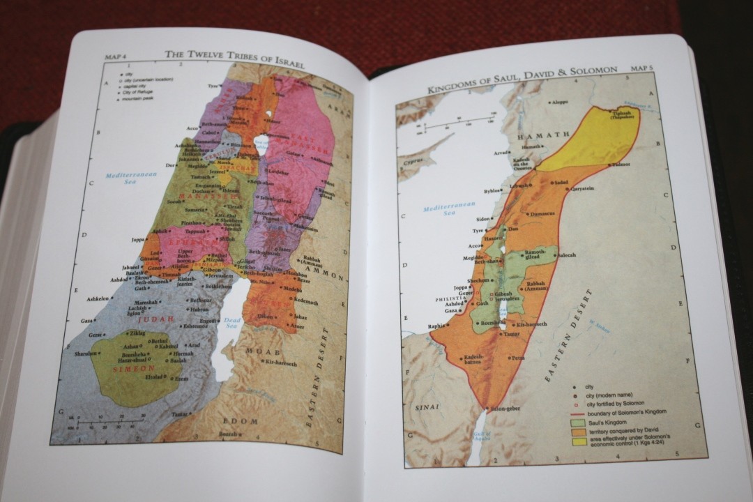
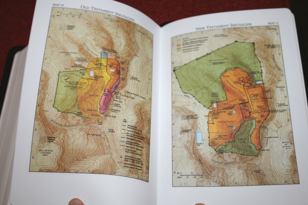
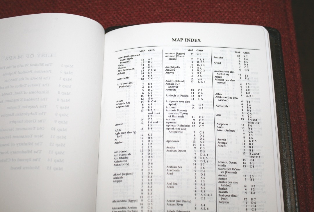
It has 15 older Cambridge maps printed in bold colors on thick non-glossy paper. They include cities, routes, Scripture references, distance, mountains, territorial expansions with dates, topography, kingdoms, battle sites, locations of events, addressees of Pauline epistles, etc. It also includes the 8-page Cambridge index, which I like because it makes finding locations much easier.
The annotations are bold and dark. I find some of the small text difficult to read because of how bold it is. They’re not as easy to read as their Cambridge counterparts, but I prefer them to the vintage maps.
Maps include:
- The Biblical World of the Patriarchs
- Palestine: Political Regions
- The Route of the Exodus
- The Twelve Tribes of Israel
- Kingdoms of Saul, David & Solomon
- The Divided Kingdom: Israel & Judah
- The Assyrian Empire
- The Babylonian Empire
- The Greek Empire
- Old Testament Jerusalem
- New Testament Jerusalem
- The Ministry of Jesus
- The Missionary Journeys of Paul
- The Spread of Christianity
- Modern Israel
Comparisons
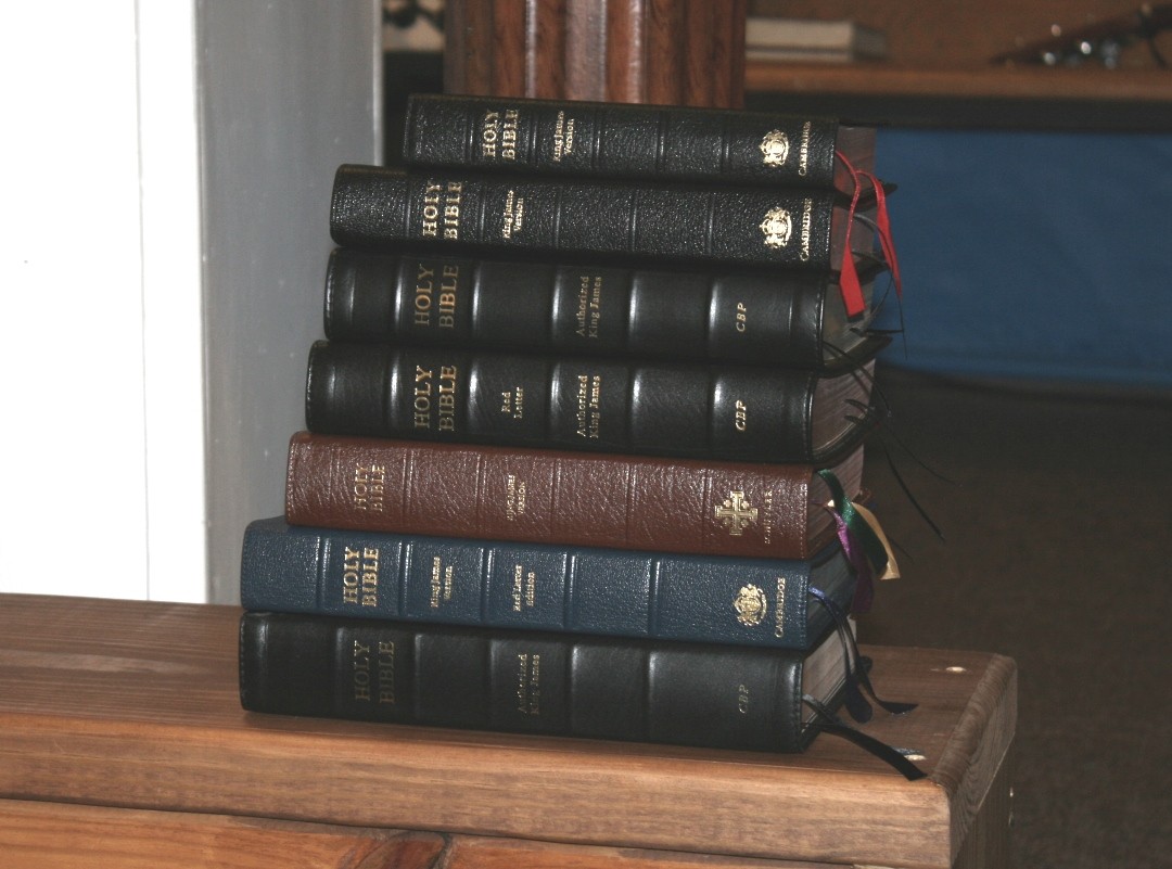
Here’s a look at how the Handsize Center Column Reference Bible compares to its most prominent competition and the regular size edition from both Cambridge and CBP. From the top down: Cameo, Concord, handsize Turquoise, CBP 120, Westminster, Cambridge Turquoise, CBP Turquoise.
Regular CBP Turquoise
The Handsize Center Column Reference Bible is a scaled-down version of the regular CBP Turquoise with one major difference: the regular edition includes a dictionary and the hand size edition does not. Everything else is the same, which makes a great combo if you want a large version to read, study, and preach or teach from and a smaller version of the same layout to carry.
Cambridge Turquoise

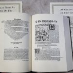
The Cambridge edition is the Bible the CBP is a replica of. It was originally printed in the 1920’s, so they’re able to scan and reproduce the text. Cambridge has re-released the Turquoise in higher-quality materials produced by Royal Jongbloed. The hand size edition would also make a great combo if you have the Cambridge version.
Westminster


The TBS/Schuyler Westminster (the Schuyler version is shown here, but they have the same text-block using the same paper) is slightly larger but is close in size. It has a creamier paper (with no glare), 200,000 cross-references, and the same concordance. The digital font is a touch larger and sharper, but it’s not as dark.
Concord

The Concord has the same footprint but it’s quite a bit thinner. The text looks a little more compact compared to the hand size Turquoise. The font size is the same and they have the same boldness.
Cameo

The Cameo has a different layout, but it looks like the Turquoise’s little brother. They use the same typeface, but the Cameo’s is 8-point. If you need an even smaller Bible the Cameo is a great choice.
CBP 120

The CBP 120 is their version of the Cameo wide margin that’s no longer in print. It has an 8-point font and the same references and maps, and no concordance. The CBP version Has wide margins in the inner margin and has red-letter through Revelation. Its footprint is a touch wider than the Hand Size Turquoise.
Final Thoughts on the CBP Handsize Center Column Reference Bible
The Church Bible Publisher’s Handsize Center Column Reference Bible (Turquoise) is an easy Bible to like. The 9-point font is easy to read and the references, translator’s footnotes, and concordance make it a good option for study and sermon prep. Unless you need something pocket-sized, the overall size is ideal for carry. The overall size to font size ratio is perfect. I was able to preach from it with no issues. The paper had no glare from the light above my pulpit and I had no trouble turning the pages or reading aloud.
It makes a great lower cost alternative to the Concord and it’s easily one of my all-time favorite Bibles. I would LOVE to see this in a wide margin edition. Anyone looking for a well-made hand size reference KJV with a medium-sized dark print would love the CBP Hand Size Turquoise.
___________________________
Purchase from CBP
___________________________
CBP provided this Bible free for review. I was not required to give a positive review, only an honest one. All opinions are my own.


Hi Randy!
Thank you for your review. You mentioned 1 John 5:8 in passing during this review. Does this handsize Turquoise edition have the S in Spirit capitalized or lower-case? Thank you.
Does the actual Cambridge productions of the Turquoise include any blank pages for taking notes like the CBP ones do? Thank you.
Chris
Hi Chris. It uses a lower-case s. The recent Cambridge edition has a capital S. It doesn’t have pages for notes.
Thank you for posting this and all your reviews! My search for a new KJV has become very difficult. I’m looking for a good bible I can carry. At first I wasn’t sure about references but do use them. What’s important is a smaller bible my aging eyes can comfortably read. This one looks good but there are so many. I’d love a higher end, but budget’s an issue. This looks great! Any other suggestions?
Hi Stephen! Thanks for stopping by! I highly recommend this one. It has a great balance of overall book size to font size and the references are highly readable. And, the price is hard to beat.
It’s become either this or something simpler as in text only. Specially Windsor or the BPS Hand Size.
This is an excellent Bible. Between the Windsor and BPS, the Windsor is made better and has higher quality materials.
Very helpful review. I just ordered one of these today (brown calfskin). As much as I like my full size CBP Turquoise it is a little larger than I like for carry or travel so I mainly use it for reading at my desk. I currently use a 90’s vintage Cambridge Cameo with a calfskin cover and zipper closure which is great for travel. I can still read my Cameo with glasses but would like a reference Bible for travel that is easier to read. I am hoping this hand size Turquoise is just right for that. I also have a Cambridge goatskin Concord but it really is not much easier for me to read than the Cameo. To me the font in the Concord kind of makes the words and various letters look too much a like and just run together. Your comparison with the Concord in this review was very helpful in the decision to purchase the hand size Turquoise.
Thanks Blake. I’m sure you’ll love the hand size Turquoise. It’s one of my favorites.
Randy, Just wanted you to know i have been using my new CBP Hand Size Turquoise for the last few days. I was initially a little disappointed because my sample does not seem as opaque as yours but still not bad. And I do wish there were there weren’t as many pages where the two center lines do not line up with the two center lines on the back side of the page. However when I decided I would just start using it with a Bible study I began to really appreciate this new Bible. The ease of reading for the size is unlike anything I have tried. Much easier for me to read than either the Cameo or the Concord. And though the font is a little smaller I find it just as easy to read as the LCBP 180 which is saying a lot. The space between the lines and the general white space we get in the magisterial regular Turquoise is still there in the Hand Size Turquoise. And exactly like you mentioned I am finding that the references are less distracting in this hand size vs. the full size. I find I can read and just ignore the references much easier. That said when I want a reference it is no problem to find it and read the center column. So this Bible will be in heavy rotation for me and I definitely give it a strong recommendation at that price (for me less than $60 with shipping).
The brown ironed calfskin turned out even better than I thought it would. Just feels inviting and soft when held yet not too soft.
Some of the brown CBPs I have seen in videos tend to be more of a lighter milk chocolate type brown. Mine is darker and more of a cinnamon or rust brown which is much more to my liking. Really just a beautiful Bible compared to my black full size Turquoise. The stitching on the cover is gold and it matches the two gold ribbons. The gold stitching kind of looks like a perimeter gold gilding when the Bible is open. Also on the top and bottom of the spine there is brown and gold vs. the black and gold you get with the black covers.
Again than you for sharing. Would be interesting if Cambridge would print the same size Turquoise print as this CBP hand size. I am sure it would be considerably thinner with opacity as good or better. I would want one for sure. By the way mine has a Concordance and Bible Dictionary in the back making it the same thickness as my full size CBP Turquoise.