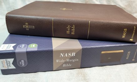

Cambridge NLT Pitt Minion – Bible Review
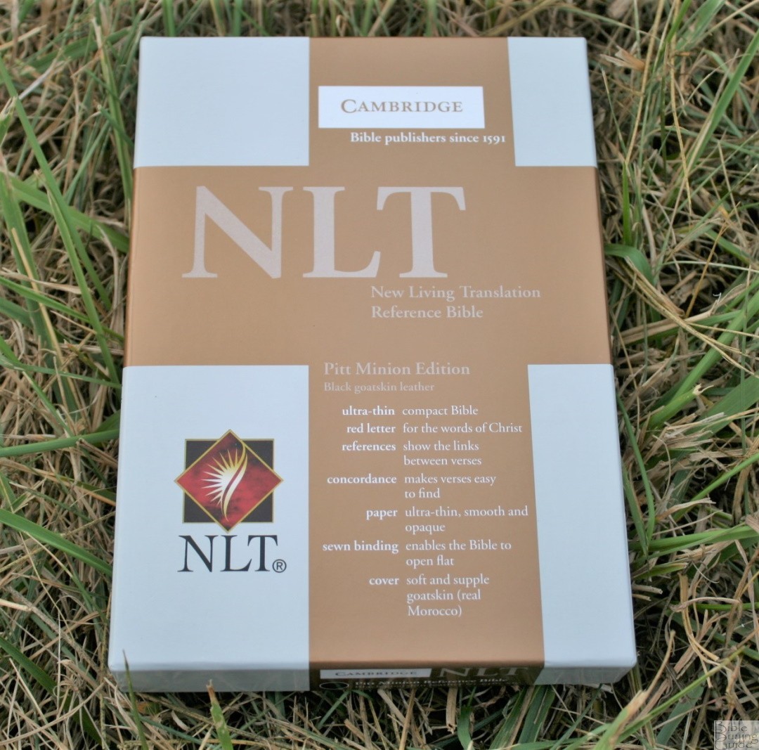
The Cambridge Pitt Minion Reference Edition has long been a standard in the high quality yet portable range of Bibles. It was originally only available in the KJV. Recent years has seen the addition of many of the popular translations including the New Living Translation. In this review, I take a look at the NLT Pitt Minion in black goatskin.
FEATURES
- NLT (New Living Translation)
- Black goatskin cover
- Sewn
- Art gilt
- 6.75 font
- Red letter
- Double-column paragraph
- Concordance
- 15 maps
- 2 ribbons
- ISBN: 9780521735285
- Model NL446: XR
___________________________
___________________________
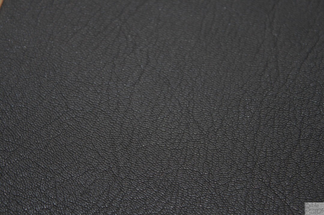
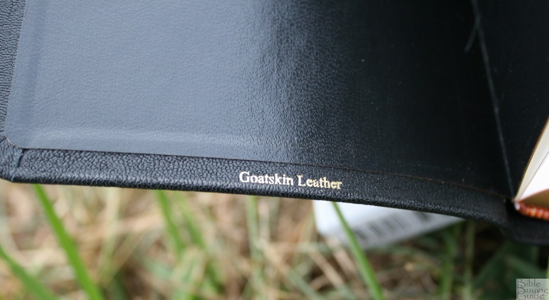
BINDING

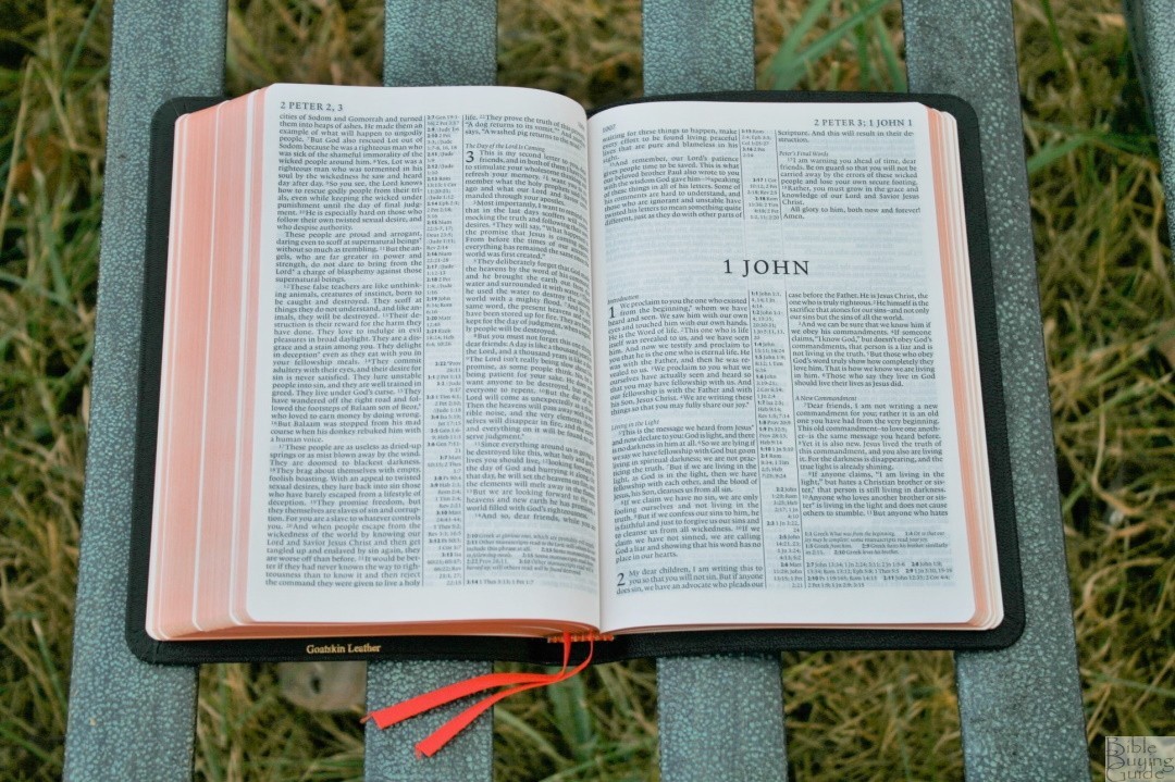
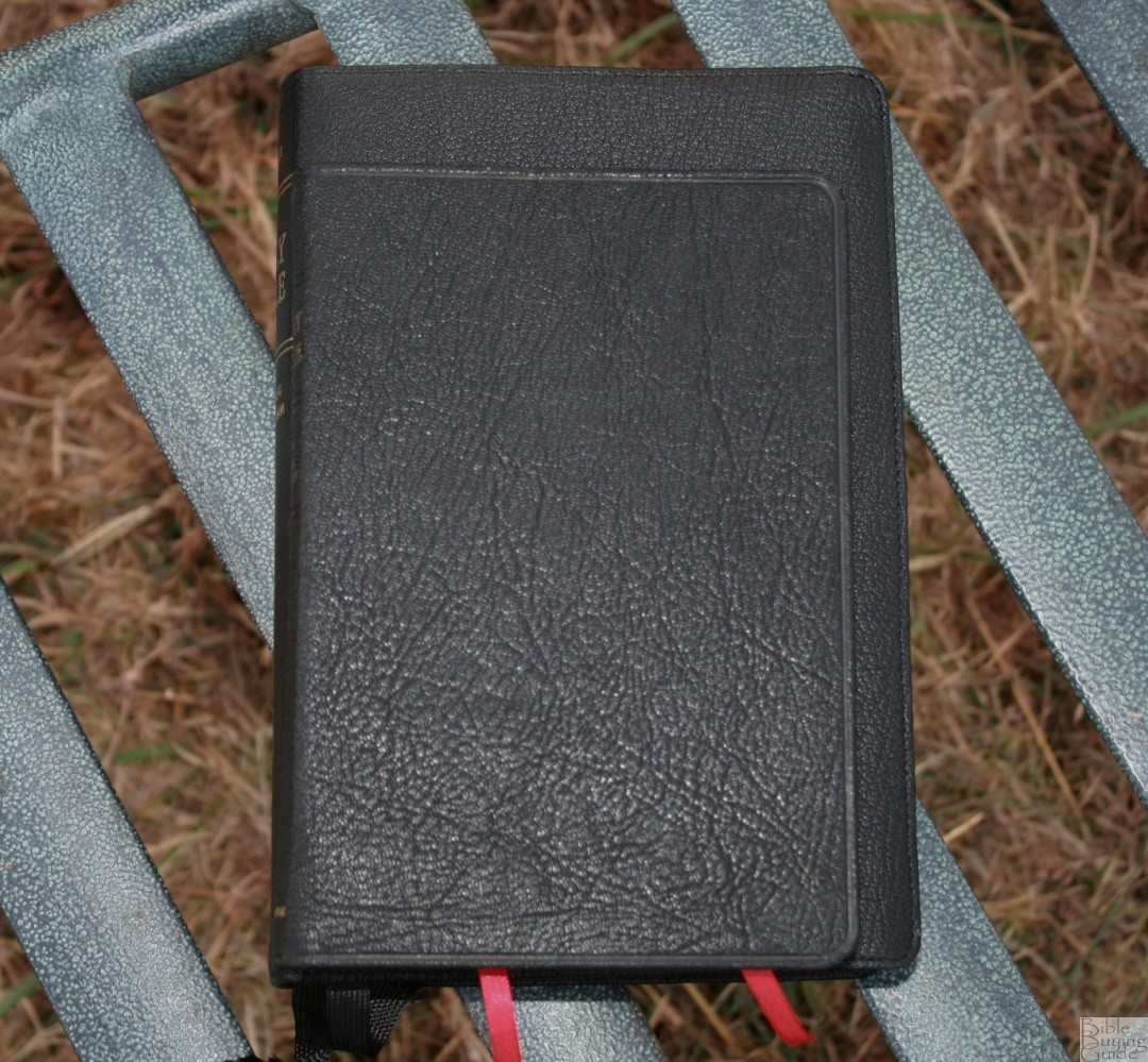
The NTL Pitt Minion is available in black imitation leather, and brown or black goatskin. This edition is black goatskin. All editions have a paste-down liner. It has a pronounced grain that I love the look and feel of. This one has a slight shine to the leather. The leather feels soft to the touch but it’s not limp at all. This matches my personal preference exactly. It’s easy to hold in one hand and have both pages lay flat. It’s also easy to tilt toward you (my preferred holding method) without having to fight against the cover or without it sliding out of your hand.
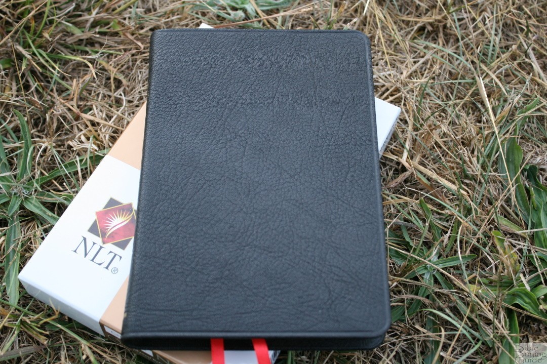
A line is impressed into the leather along the outer perimeter. Nothing is printed on the front. On the spine is printed Holy Bible, New Living Translation, and Cambridge. It has 5 impressions of spine ridges. The text-block is Smyth sewn and has no issues laying open. The weight of the paper isn’t quite enough to keep it open in Genesis 1, but I think it will break in after enough use.
The overall size is 7.3 x 5.25 x 1”. This is a slim Bible. I’ve come to love this size. Now that I’ve used this size for a while it’s hard to use anything else. It’s printed and bound in the Netherlands by Jongbloed. It has two cardinal red ribbons and red and gold head/tail bands.

PAPER
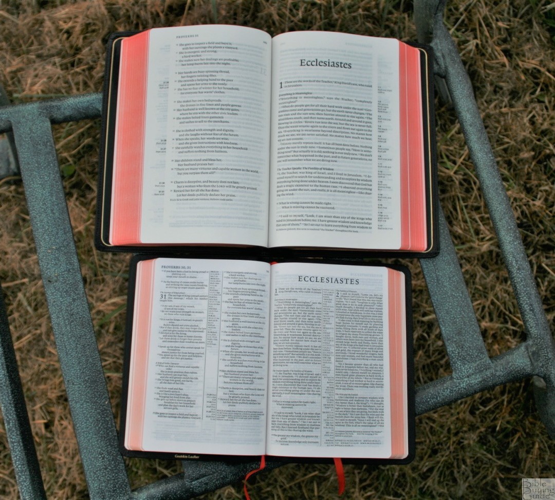
Pitt Minions use India paper with a gsm of 27 or 28. It’s thin but it doesn’t have much show-through. I didn’t have any issues turning the pages. The ivory color makes a great contrast against the typeface and makes the print really pop. In certain conditions, it did get page-curl (when sitting outside on a cool and windy day), but that was one time out of the dozens of times I took it with me. The edges are art-gilt. It has 1146 pages plus maps.
TYPOGRAPHY
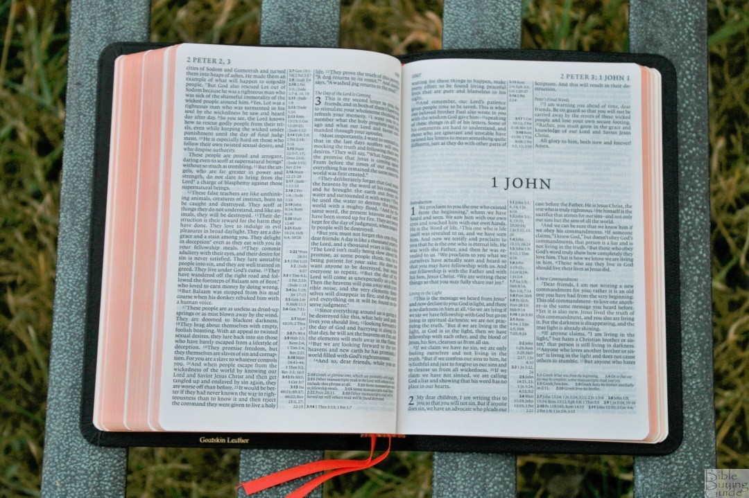
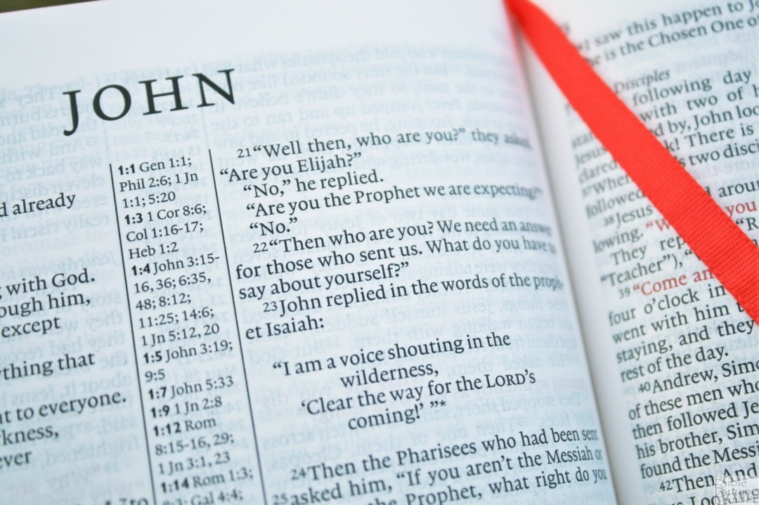
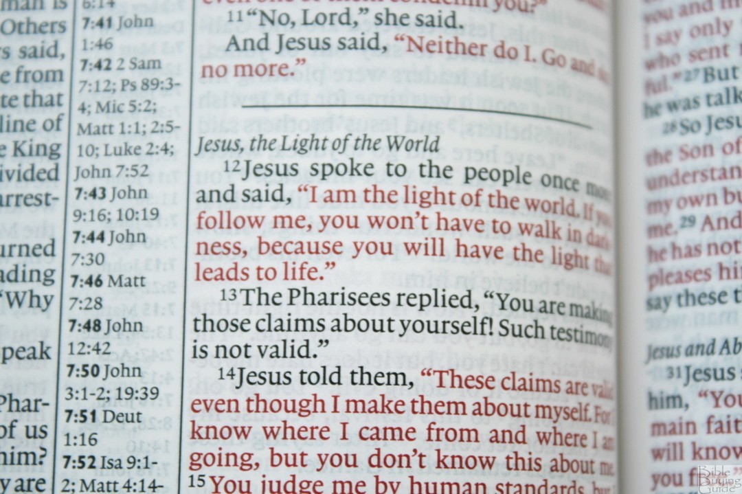
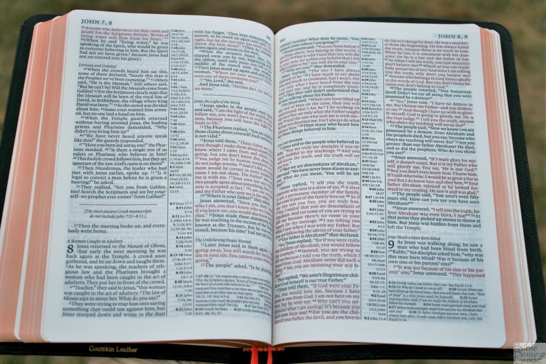
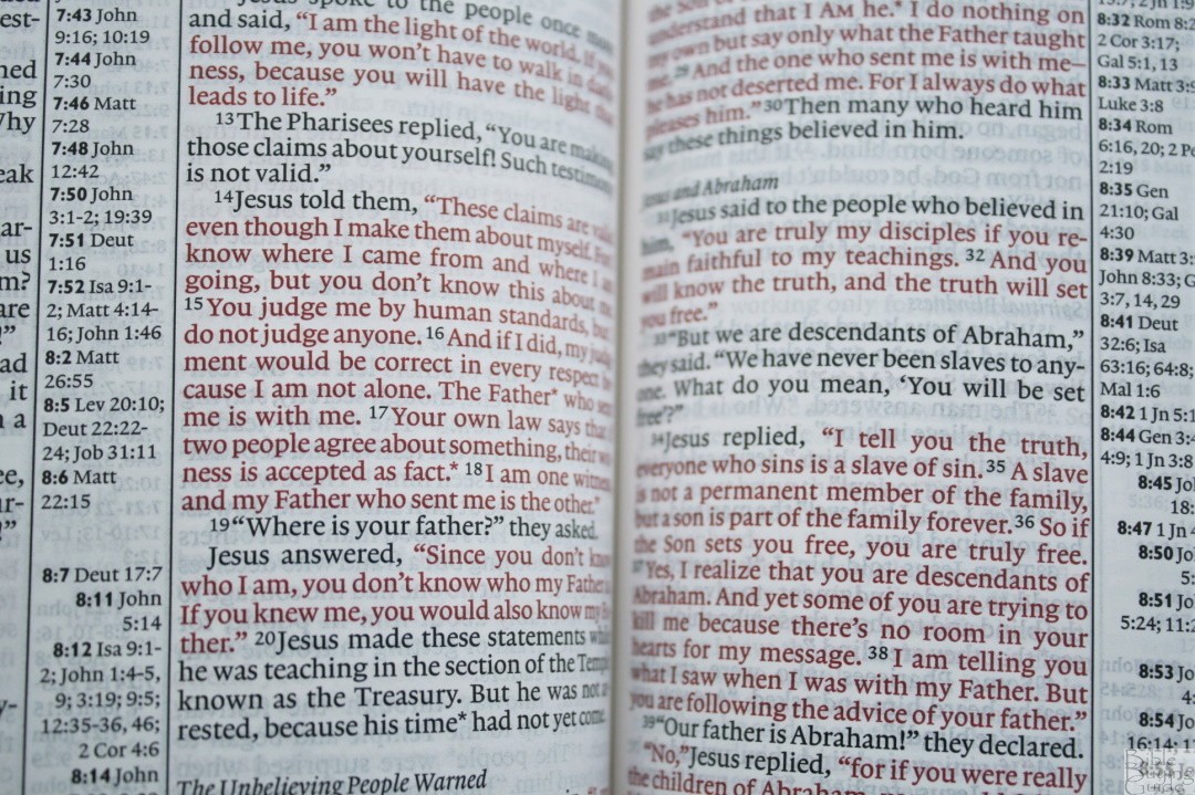
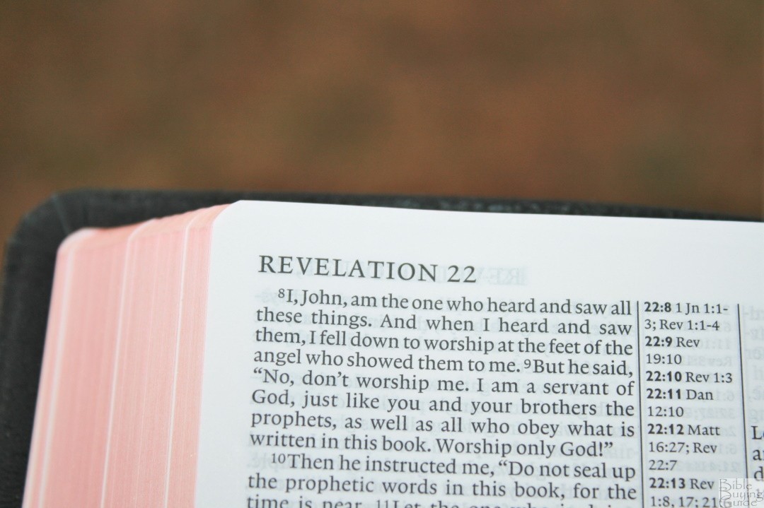
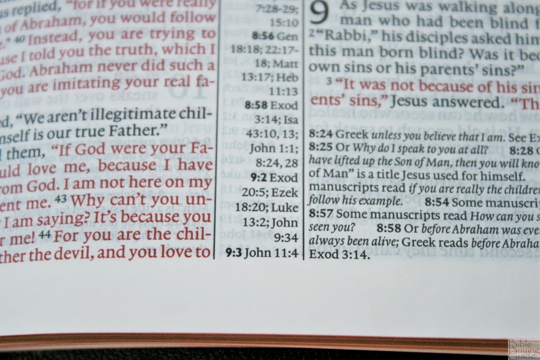
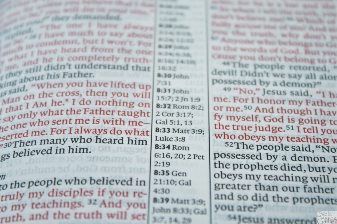
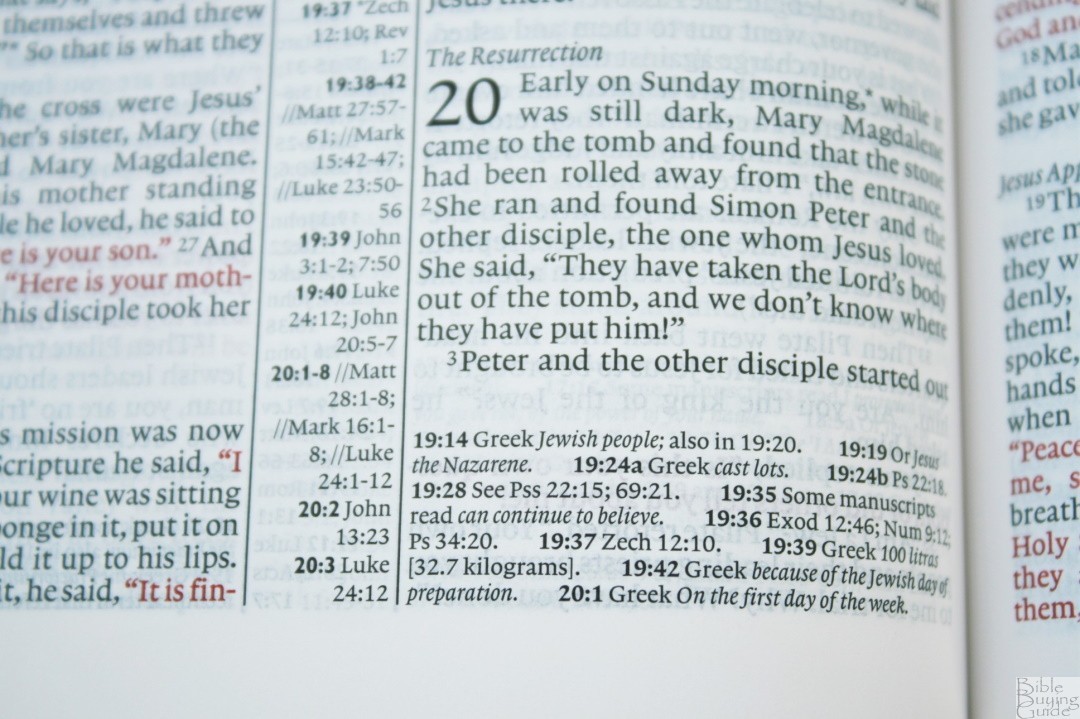
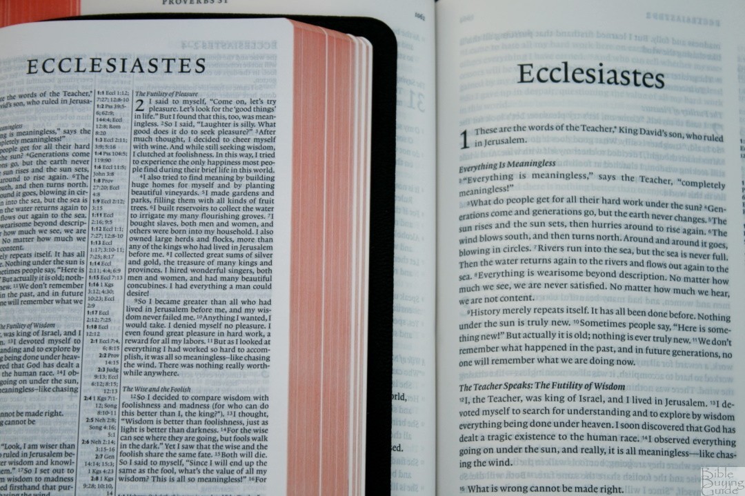
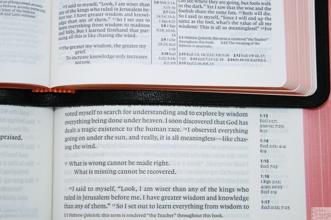
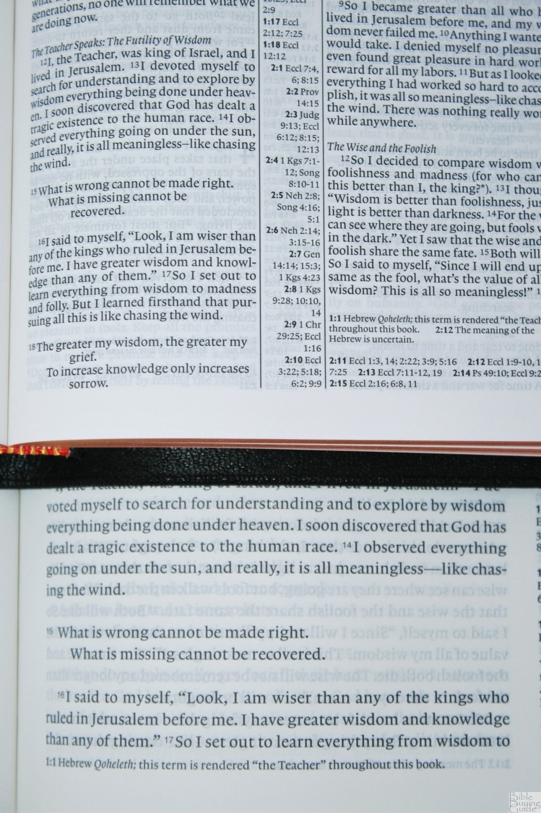
The text is presented in double-column paragraph format with poetry set in stanzas. Dreams and letters are indented and not right-justified, making them stand apart from the rest of the text. Lists are presented as tables. Thoughts are separated by section headings. Cross-references are placed in the center column and footnotes are placed under the last verse on the page.
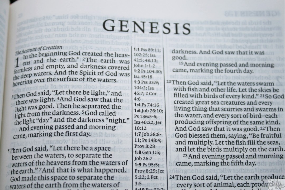
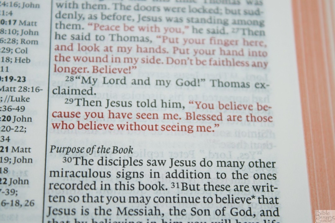
The typeface uses a 6.75-point Lexicon No. 1 by Blue Heron Bookcraft. It has a 7-point leading (size of the font plus the space between the lines). The text is line-matched (lines on both sides of the page are printed in the same location to reduce show-through). This is a red-letter edition. Both red and black are dark and consistent throughout. The font is sharp and well-designed for reading at a smaller size.
In order to get everything in this small of a book-block, the leading has to be small. The text is still readable but for me, it takes a little more concentration. I have to use my bifocals but with them, I can read and even preach from it with no trouble. A larger leading would help but it would also drastically change the layout.
Readability is greatly improved by not including reference keys in the text. This does make the references a little more difficult to use but I read the text more than run the references, so I prefer this method. The only interruptions are asterisks for footnotes. The section headings are in italics. I find them easy to ignore.
The columns are 1.75” wide and have around 47 characters, giving space for 8-9 words per line. There isn’t much of an inner margin but the spine is so narrow that the pages lay flat without the text bending much at all.
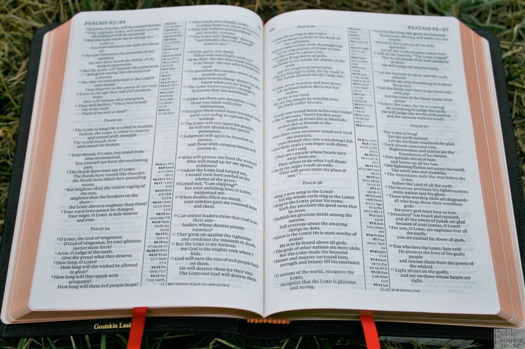
Dialog is set apart on individual lines. This can sometimes be mistaken for poetry. Poetry does suffer from the narrow columns. It looks great but there are many verses that place a single word on a line, which interrupts the poetic stanzas. This could have been solved by breaking up the sentence where it naturally breaks.
There’s something about this text that kept me reading it. I think a lot of it has to do with not having reference keys. I ended up reading Jonah, Acts-Revelation, and portions of the Gospels before writing this review. I couldn’t stop. Of all the Bibles I had at my fingertips this is the one I grabbed.
REFERENCES
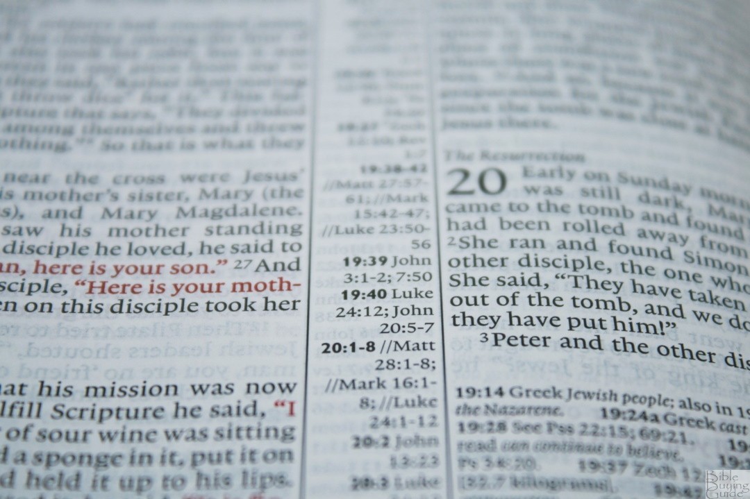
The cross-references are not keyed to the text. Instead, they only include the chapter and verse number in bold in the center column followed by the cross-references. Parallel passages are marked with double lines //. This is so easy to understand that it’s natural.
The references for the left column align with the top of the column and are left-justified. References for the right column are aligned with the bottom of the column and are right-justified. This leaves blank space in the middle of the center column on many pages.
If there are more references than will fit within the column they are placed under the footnotes. This causes you to look in two different locations for references. I’d like to see all of the references under the footnotes like Crossway’s settings. This would give a wider column which would give more horizontal space for poetry.
Here are a few sample entries to help you compare:
- Genesis 1:1 – Ps 89:11; 102:25; Isa 42:5; 48:13; Jn 1:1-2
- Deuteronomy 6:4-5 – Deut 4:35, 39; *Mt 22:37; *Mk 12:29-3; Lk 10:27; 1 Cor 8:4,
- Matthew 17:20 – Mt 21:21; Mk 11:23; Lk 17:6; 1 Cor 13:2
- Mark 11:23 – x
- Mark 12:29-30 – *Dt 6:4-5; *Josh 22:5; Lk 10:27
- John 1:1 – Gen 1:1; Phil 2:6; 1 Jn 1:1; 5:20
- 1 John 1:1 – Jn 1:1, 4, 14; 1 Jn 4:14
FOOTNOTES
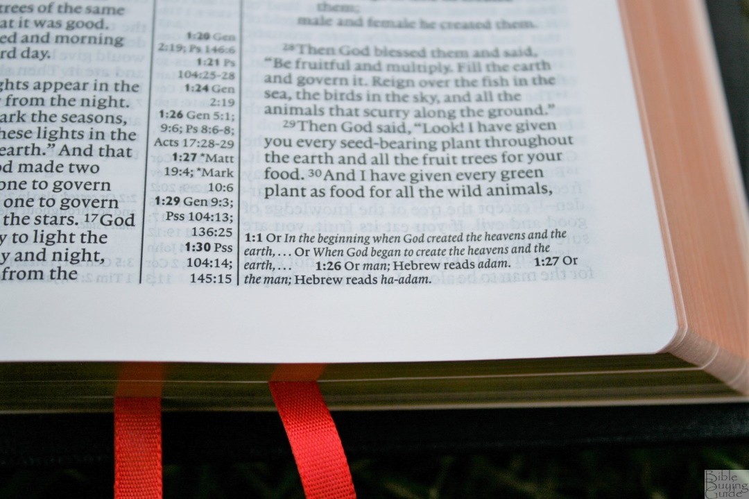
Footnotes appear under the last verse on the page. They include the chapter and verse numbers and are printed in a much smaller font than the text. I’m not sure of the size but it’s close to 4 point.
Footnotes include the original languages, alternate renderings, literal renderings, manuscript variations (does not identify Greek manuscripts, but it does identify variants from Dead Sea Scrolls and many others), weights and measures, variant spellings, references to quotes, descriptions, explanations of people such as ranks, meanings of names, wordplay, etc.
I found the footnotes to be useful for understanding the text and for seeing alternate renderings when I came across a verse that seemed to go into a different direction than I expected. There are some places where I expected to see a footnote where there wasn’t one. For example, 1 John 3:2.
CONCORDANCE

The concordance is 118 pages with 2 columns per page. Entries include the part of speech, a short definition, and similar words to look up.
Here are a few example entries with their alternate entries, part of speech, definition, and number of references given:
- Christian, Christians (n) one who professes belief in and follows the teachings of Jesus Christ; believer – 7
- Faith (n) reliance, loyalty, or complete trust in God; a system of religious beliefs. See also believe, trust – 56
- Faithful (adj) firm adherence, utterly loyal. See also loyal, trustworthy – 43
- Faithfulness (n) the quality of steadfast loyalty or firm adherence to promises – 15
- God-breathed (KJV) – 1
- Godliness (n) devotion to God; piety. See also righteousness – 4
- Praise, praises (n) worship; commendation; value, merit – 16
- Praise, praised, praises, praising (v) to worship, commend, or give honor to – 44
- Pray, prayed, praying, prays (v) to address God with adoration, confession, supplication, or thanksgiving; to intercede – 41
- Prayer, prayers (n) conversation with God–in praise, thanksgiving, or intersession – 20
MAPS
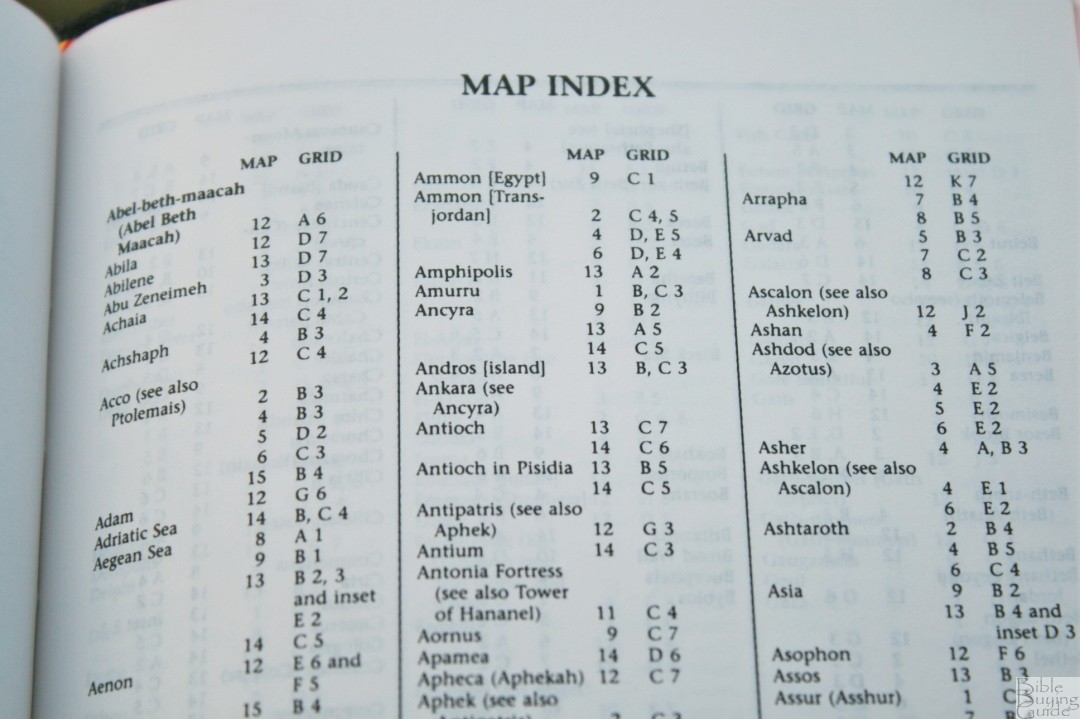
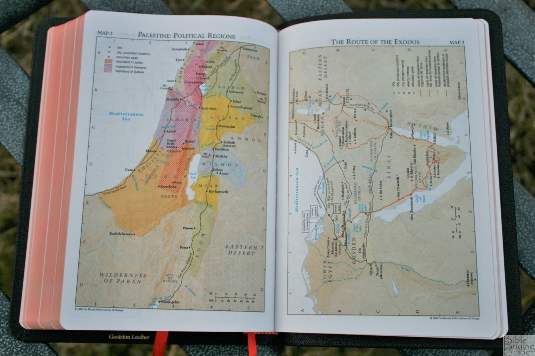
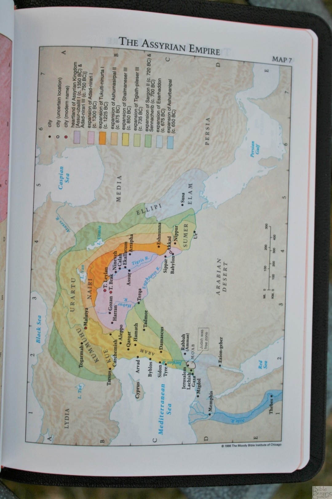
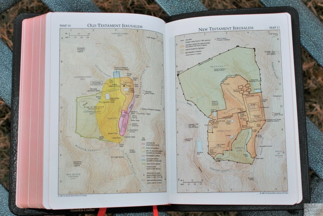
It has 16-pages with 15 full-color maps on thick non-glossy paper. It includes an 8-page index. This Pitt Minion is an older edition that has the older maps and does not include the color-code in the index.
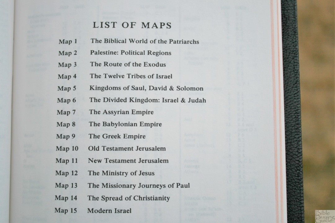
Maps include:
- The Biblical World of the Patriarchs
- Palestine: Political Regions
- The Route of the Exodus
- The Twelve Tribes of Israel
- Kingdoms of Saul, David, and Solomon
- The Divided Kingdom: Israel and Judah
- The Assyrian Empire
- The Babylonian Empire
- The Greek Empire
- Old Testament Jerusalem
- New Testament Jerusalem
- The Ministry of Jesus
- The Missionary Journeys of Paul
- The Spread of Christianity
- Modern Israel
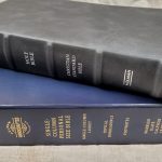
COMPARISONS
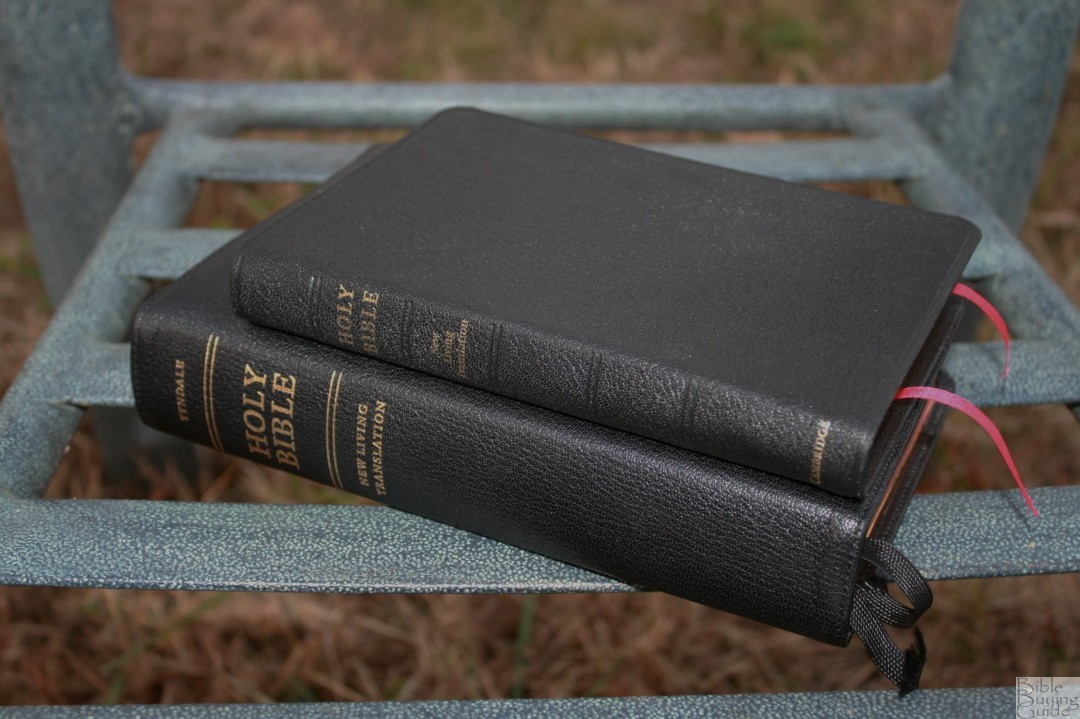
To help give you an idea of the size of the NLT Pitt Minion here’s how it looks sitting next to the NLT Select.

CONCLUSION

The Pitt Minion is the perfect size for carrying and handling. The quality of the materials and construction are excellent. I love the look and feel of the black goatskin. The text is small and takes a little more concentration to read but I find it easy enough to read with my glasses. Readability is improved by not having reference keys in the text. I recommend the Cambridge NLT Pitt Minion for anyone looking for a small reference NLT in a quality edition.
___________________________
___________________________
Photography by hannah C brown
Cambridge provided this Bible free for review. I was not required to give a positive review – only an honest review. My opinions are my own.


Trackbacks/Pingbacks