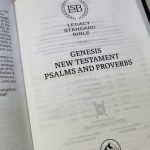
Cambridge NASB Pitt Minion Bible Review
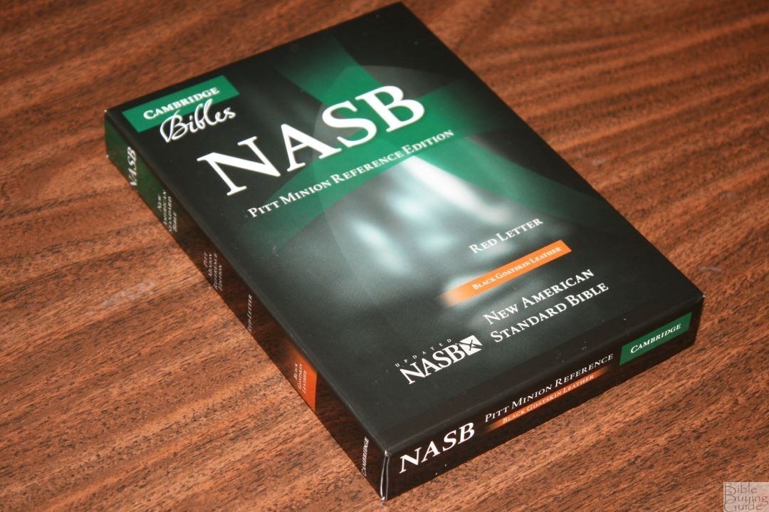
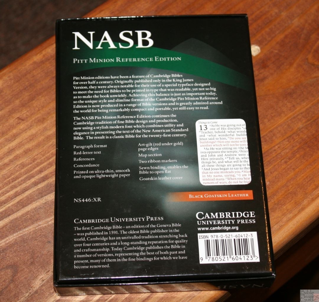
The Cambridge Pitt Minion has been a popular Bible for many years, and with good reason – the size and quality create a Bible that’s easy to carry without sacrificing features. It’s available in several translations including the NASB. In this review, I’m taking a look at the NASB Pitt Minion in black goatskin. This is model NS446:XR, ISBN: 9780521604123, which was printed and bound in the Netherlands by Royal Jongbloed and provided free for review by Cambridge University Press.
_______________________________________________
Buy from (includes affiliate links)
and a few local Bible bookstores
_______________________________________________
PROS
- Easy to carry
- Goatskin cover
CONS
- Some will have trouble with the small type
FEATURES
- NASB
- Goatskin cover
- Sewn binding
- 28 gsm paper
- 6.75-point font
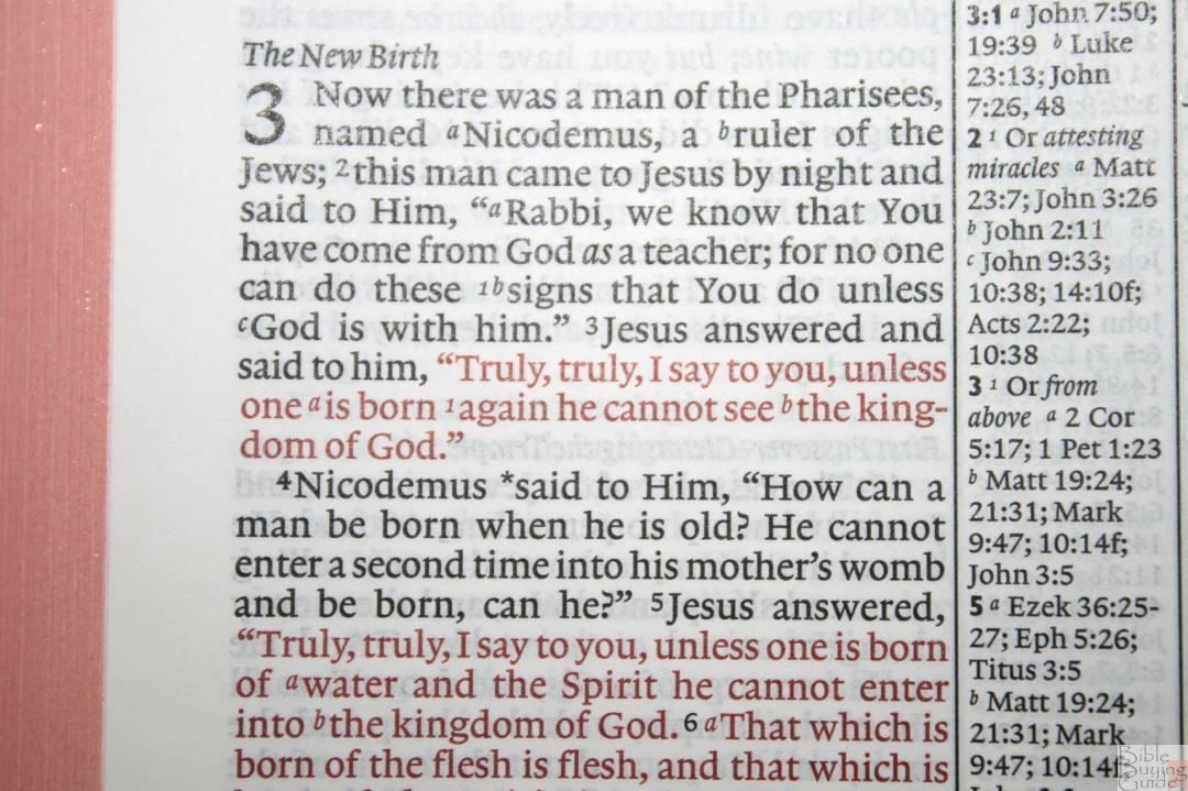
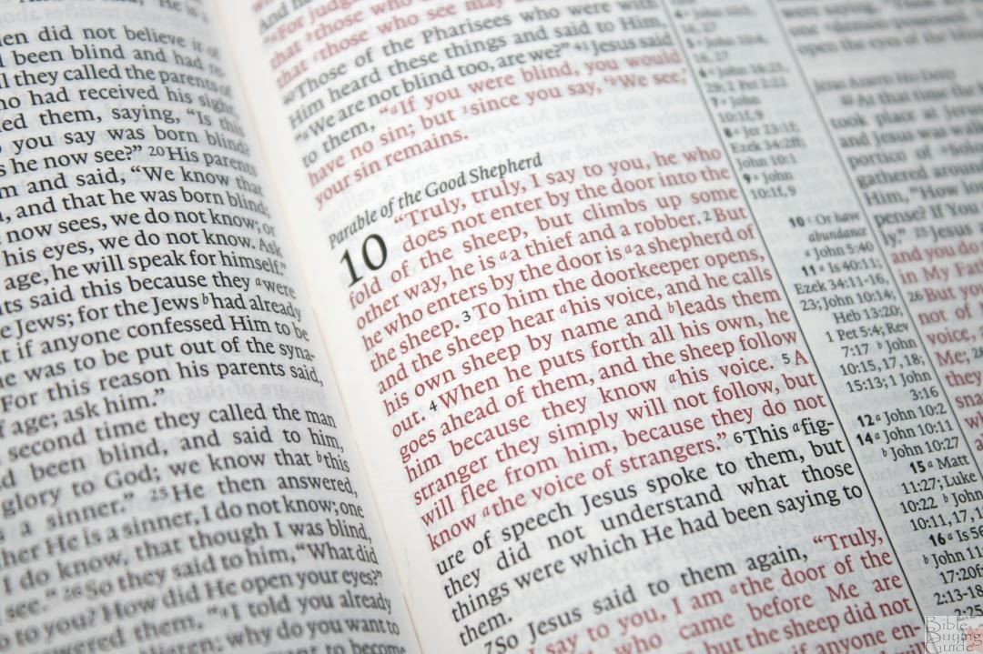
- Red letter
- Red under gold art-gilt edges
- Concordance
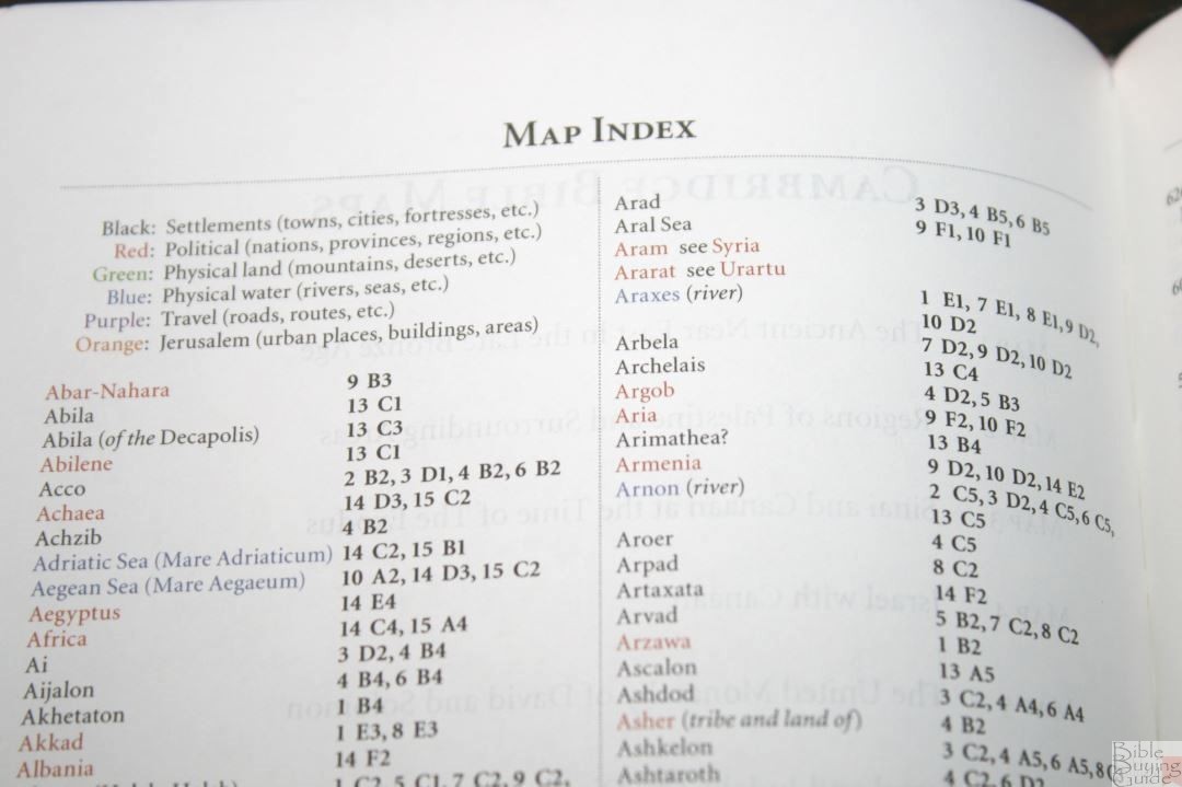
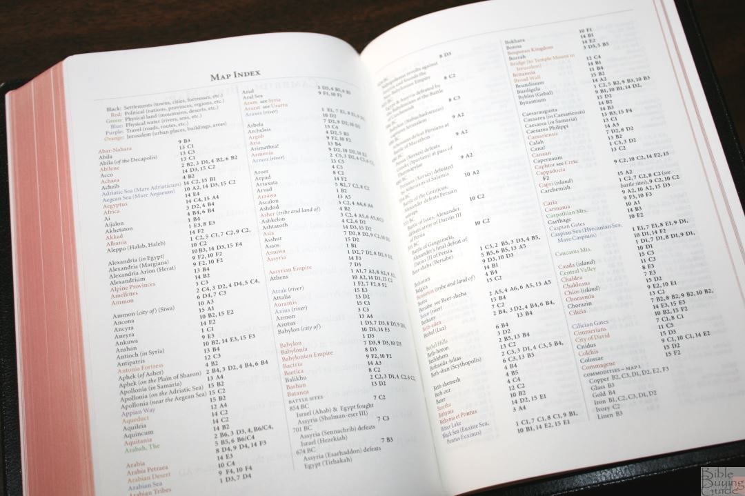
- Index to maps
- 15 pages of maps
- Presentation page with no text (lines only)
- 2 ribbons
- 7 3/5 x 5 x 1” (cover)
- Model NS446:XR
- ISBN: 9780521604123
- Printed and bound in the Netherlands by Royal Jongbloed
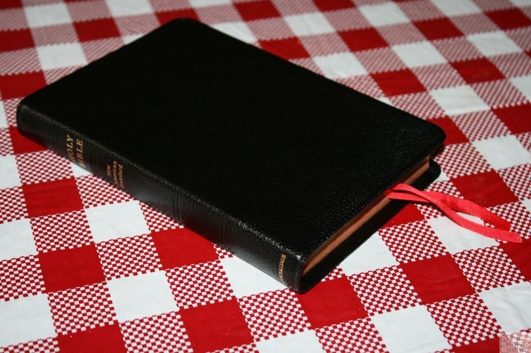
COVER
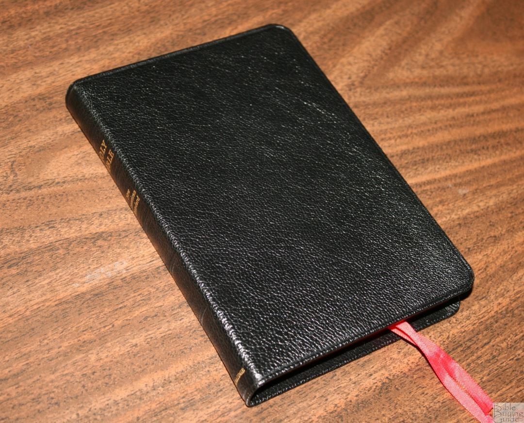
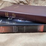
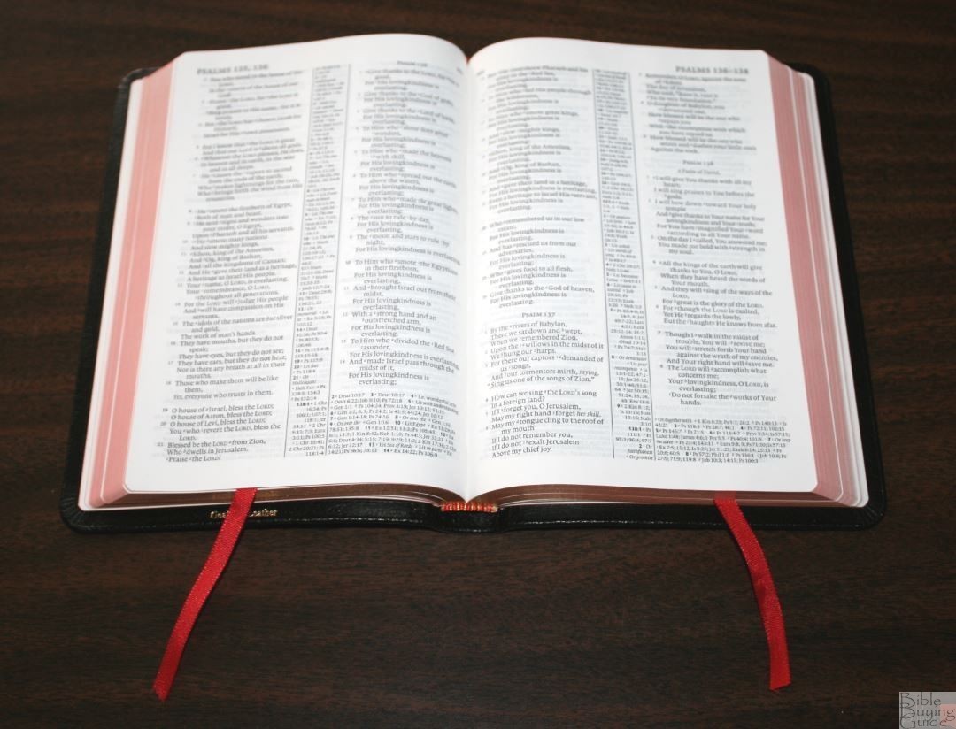
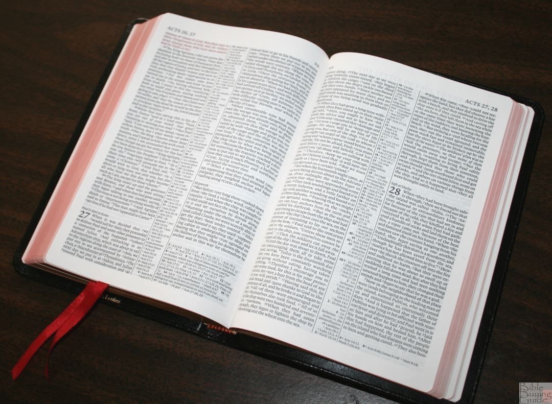
The cover is a soft pebbly black goatskin with a paste-down liner. The liner keeps the cover from being floppy. It’s sewn and lies open in Genesis after a little use. It’s easy to hold open in one hand a read for long periods of time. I love the soft feel of the leather.
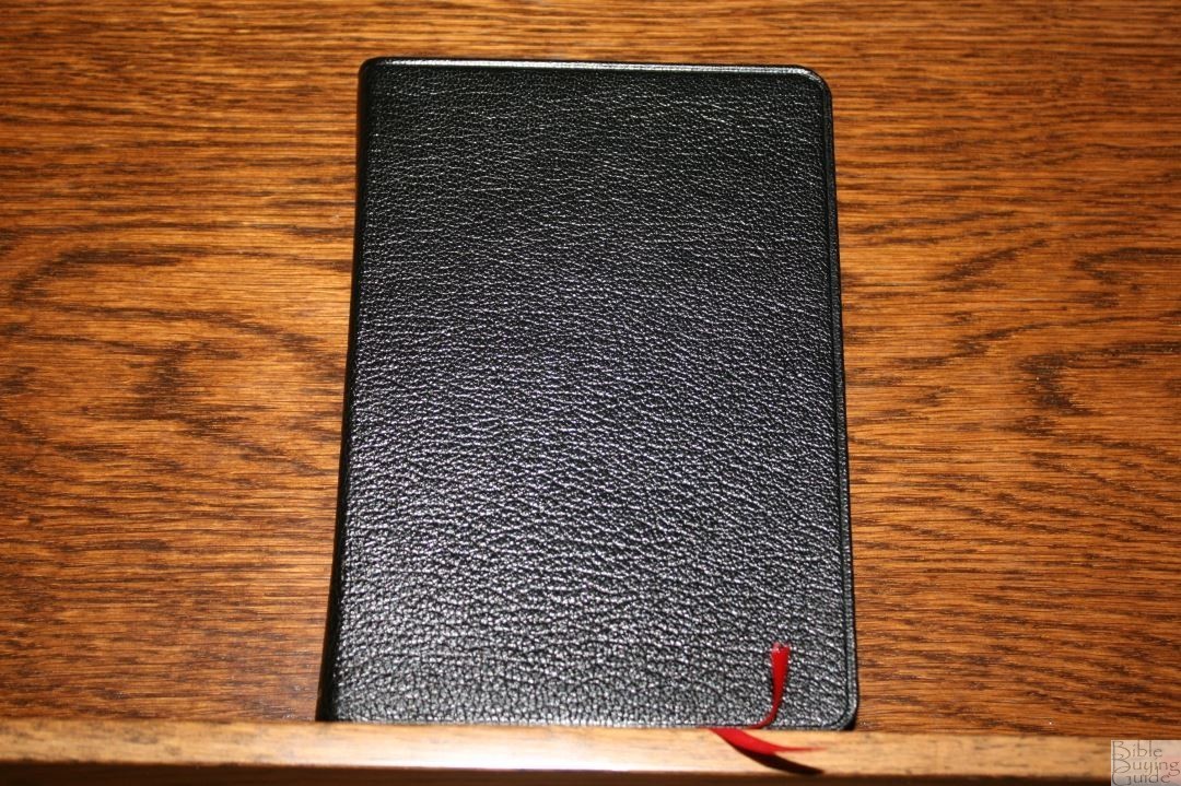
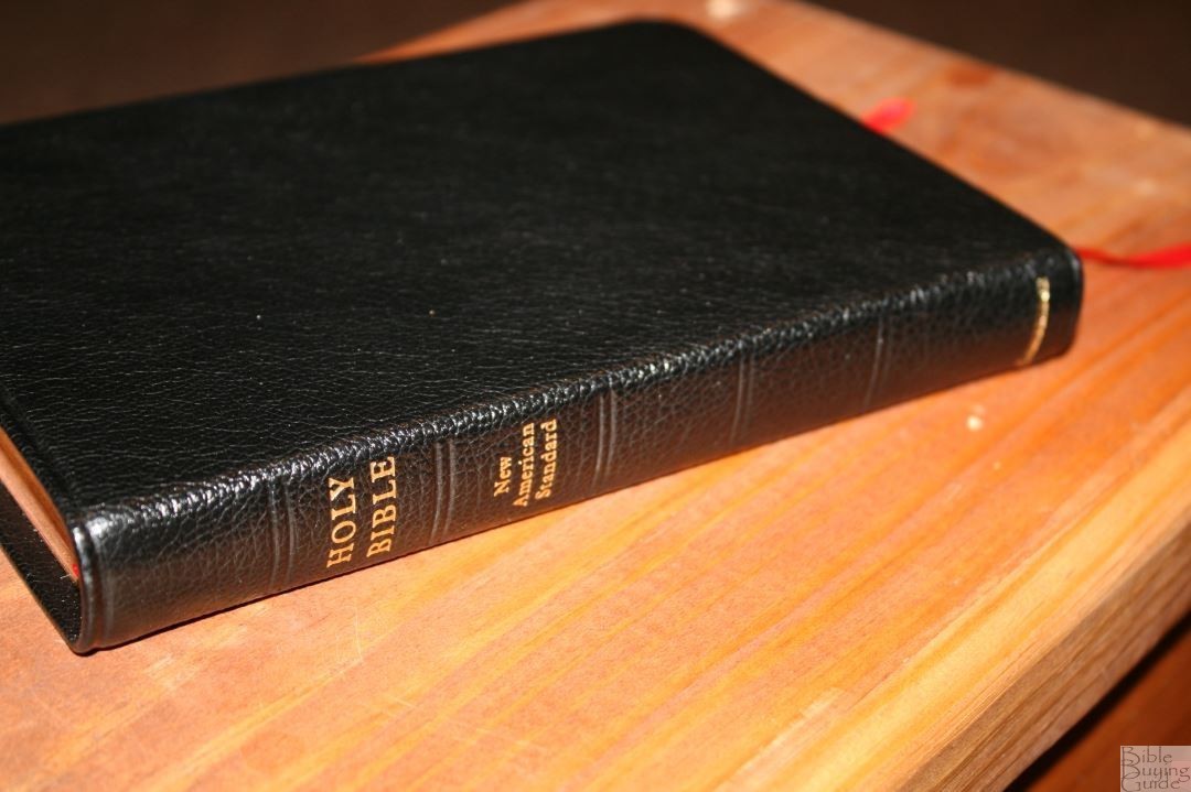
The spine has Holy Bible, New American Standard, and Cambridge printed in gold. There’s nothing printed on the front. It includes 5 tooled spine ribs (not raised). It also has tooling around the perimeter of the cover.

It includes 2 red ribbons and red and gold head/tail bands. The overall size is 7 3/8″ x 5″ x 1″. It weighs 15.3 ounces.
PAPER
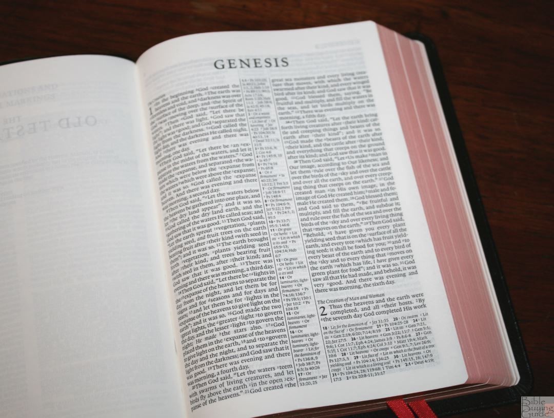
The paper is 28gsm. It’s smooth to the touch and has a slight cream shade. It’s highly opaque and contrasts the ink beautifully. Show-through is mostly noticeable in the poetic settings and even then it’s minor. The edges are art-gilt (red under gold). I used it all through winter and haven’t had any issues with page-curl. If there was any it was minor. I found the pages easy enough to turn.
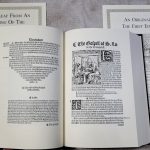
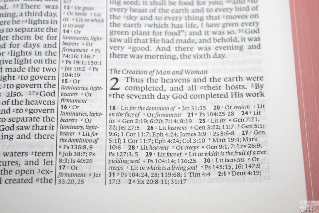
TYPOGRAPHY
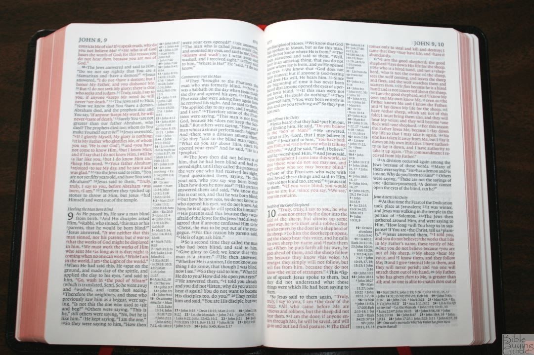
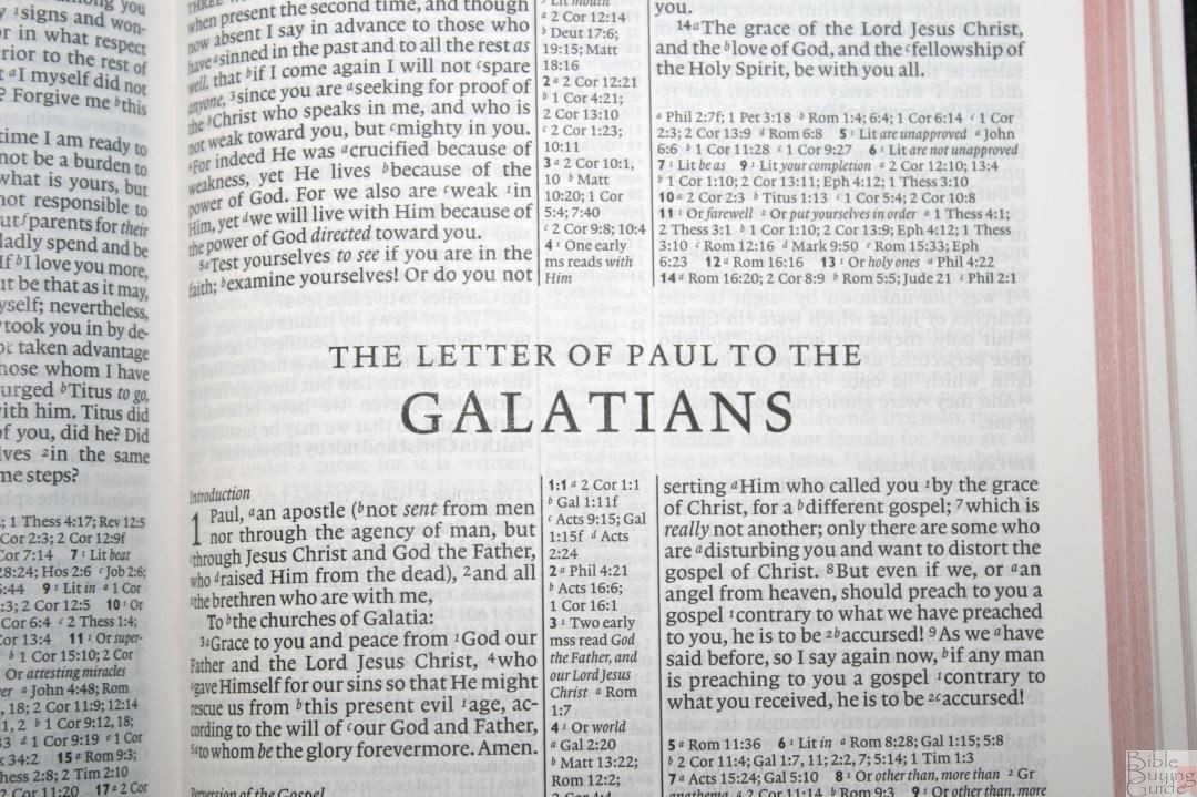
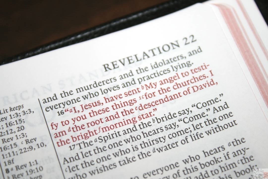
The text is presented in double-column paragraph format with poetry set to an indented poetic setting and Old Testament quotes in all caps. Letters are indented. It includes section headings. Center-column references and footnotes with some appearing under the last verse on the page. The header shows the book name and chapter numbers in the outer margin and page number in the inner margin.
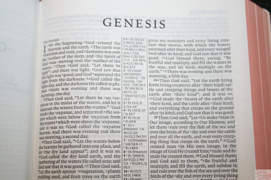
The font is 6.75 Lexicon No. 1 with a 7-point leading. Both the black and red-letter is medium to dark and highly consistent throughout. Lexicon No. 1 has always been a highly-legible font at small sizes and that legibility shines in every Pitt Minion I’ve seen including this one.
Even though I need glasses to read anything up close I can read the Pitt Minion with ease. After a while of reading the text does begin to feel cramped due to the small print and leading. This is more noticeable when my eyes are tired from writing all day. I have more trouble with the reference and footnote keys than anything else.
Each column has around 42 characters across with 7-9 words on average. The words have enough space between them that they don’t run together. It has enough inner margin, and the Bible is thin enough, that the text doesn’t get lost in the bend of the gutter.
The text includes footnote and reference keys using the traditional numbers and letters. They’re small enough to ignore easily. The references and footnotes being in the center column and in the footer means there are two locations to search for them. They’re not near the verses they correspond to. Considering how many there are it would be difficult to place them near their verses. Also, I don’t use them so much that searching in two locations bothers me.
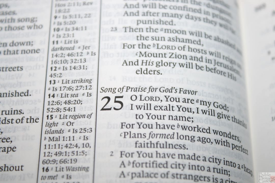
The text looks excellent on the page. The paragraphs are small and make sense. The section headings are in italics and help break up the text a little but don’t get in the way of reading. The poetic settings could break the lines a little better. Rather than breaking the lines as stanzas, they go all the way to the physical edge of the printed area. This creates lots of lines with a single word. This is only a minor complaint and won’t keep me from reading it.
REFERENCES
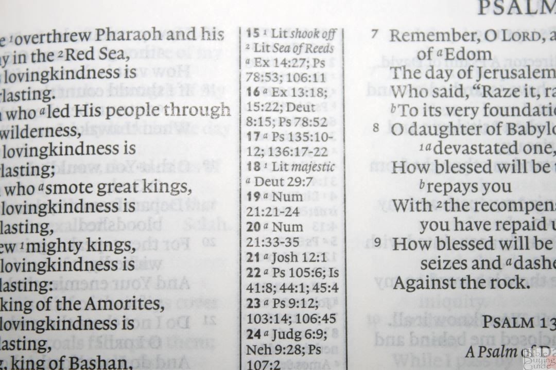
References for the left column appear at the top and are left-justified while references for the right column appear at the bottom of the column and are right justified. The reference verse numbers are in bold. If there are more references that will fit in the center column they’re placed under the last verse.
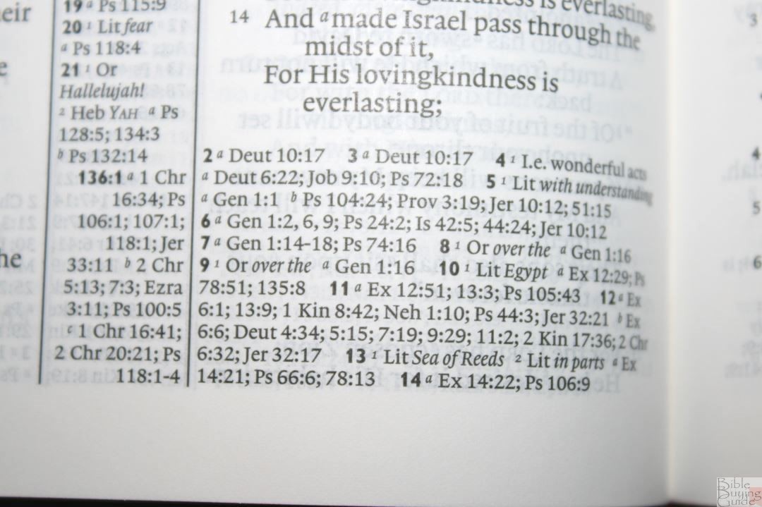
Here are a few examples of references to help you compare:
- Genesis 1:1 – a Ps 102:25; Isa 40:21; Jn 1:1, 2; Heb 1:10; b Ps 89:11; 90:2; Acts 17:24; Rom 1:20; Heb 11:3 c Job 38:4; Is 42:5; 45:18; Rev 4:11
- Deuteronomy 6:4 – a Matt 22:37; Mk 12:29, 30; Luke 10:27 b Deut 4:35, 39; John 10:30; 1 Cor 8:4; Eph 4:6
- Isaiah 9:6 – x Lit be a Is 7:14; 11:1, 2; 53:2; Luke 2:11 b Jn 3:16 c Matt 28:18; 1 Cor 15:25 d Is 22:22; e Is 28:29 f Deut 10:17; Neh 9:32; Is 10:21 g Is 63:16; 64:8 h Is 26:3, 12; 54:10; 66:12
- Matthew 17:20 – x Lit as a Matt 21:21f; Mk 11:23f; Luke 17:6; b Matt 13:31; Luke17:6; c Matt 17:9; 1 Cor 13:2; d Mark 9:23; John 11:40
- Mark 11:23 – Matt 17:20; 1 Cor 13:2
- Mark 12:29 – Deut 6:4
- Acts 2:38 – a Mark 1:15; Luke 24:47; Acts 3:19; 5:31; 20:21; b Mark 16:16; Acts 8:12, 16; 22:16
- John 1:1 – a Gen 1:1; Col 1:17; 1 John 1:1; b 1 John 1:14; Rev 19:13; c John 17:5; 1 John 1:2; d Phil 2:6
- 1 John 1:1 – a John 1:1f; I John 2:13, 14 b Acts 4:20; I John 1:3; c John 19:35; 2 Peter 1:16; I John 1:2 d John 1:14; I John 4:14 e Luke 24:39; John 20:27 f John 1, 4
FOOTNOTES
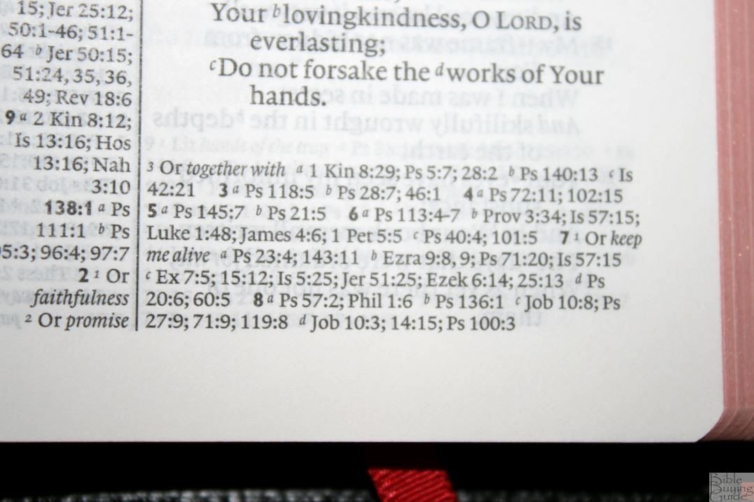
Footnotes appear in the center column with the references and include alternate renderings, literal renderings, manuscript variants, explanatory equivalents, explanations of Greek, Hebrew, and Aramaic words, weights, measures, time, etc. They’re helpful for shedding light on the wording in the original languages.
CONCORDANCE
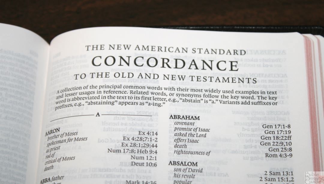
The concordance is 84 pages in double-column format. It includes related words or synonyms following the keywords. It’s a decent concordance for study and sermon prep.
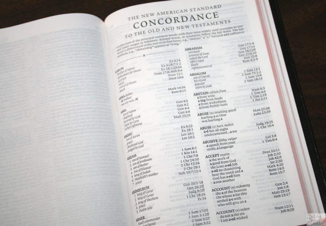
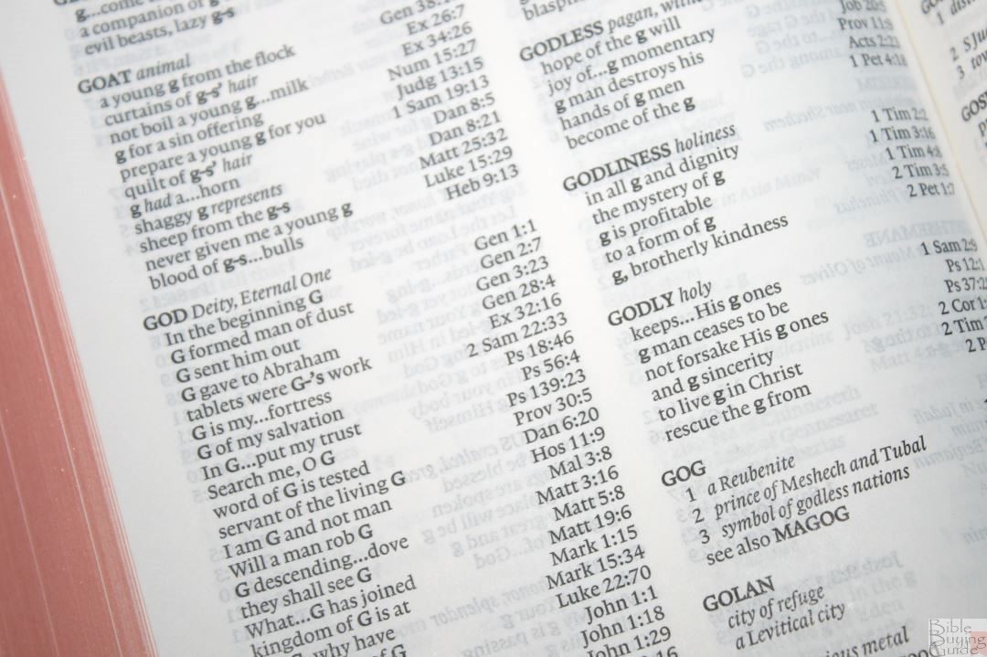
Sample entries include:
- Christ Messiah – 17
- Christian follower of Christ– 3
- Faith believe, trust– 36
- Faithful loyal, trustworthy – 15
- Faithfulness loyalty – 7
- Faithless unbelieving – 4
- God Deity, Eternal One– 37
- God false diety, idols – 8
- Goddess female diety – 3
- Godless pagan, without God – 5
- Godliness holiness– 5
- Godly holy – 6
- Praise (n) acclamation, honor – 10
- Praise (v) extol, glorify – 12
- Pray ask, worship – 19
- Prayer – 15
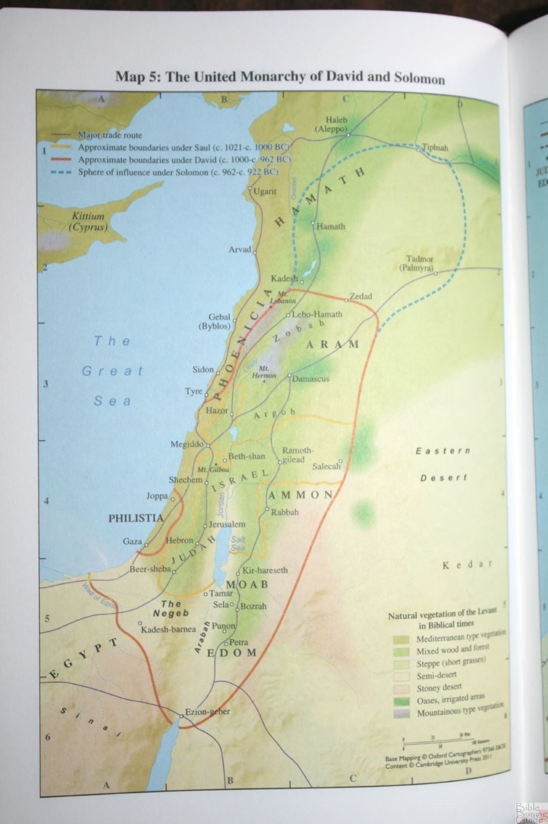
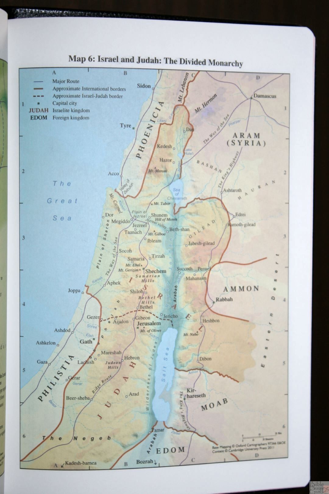
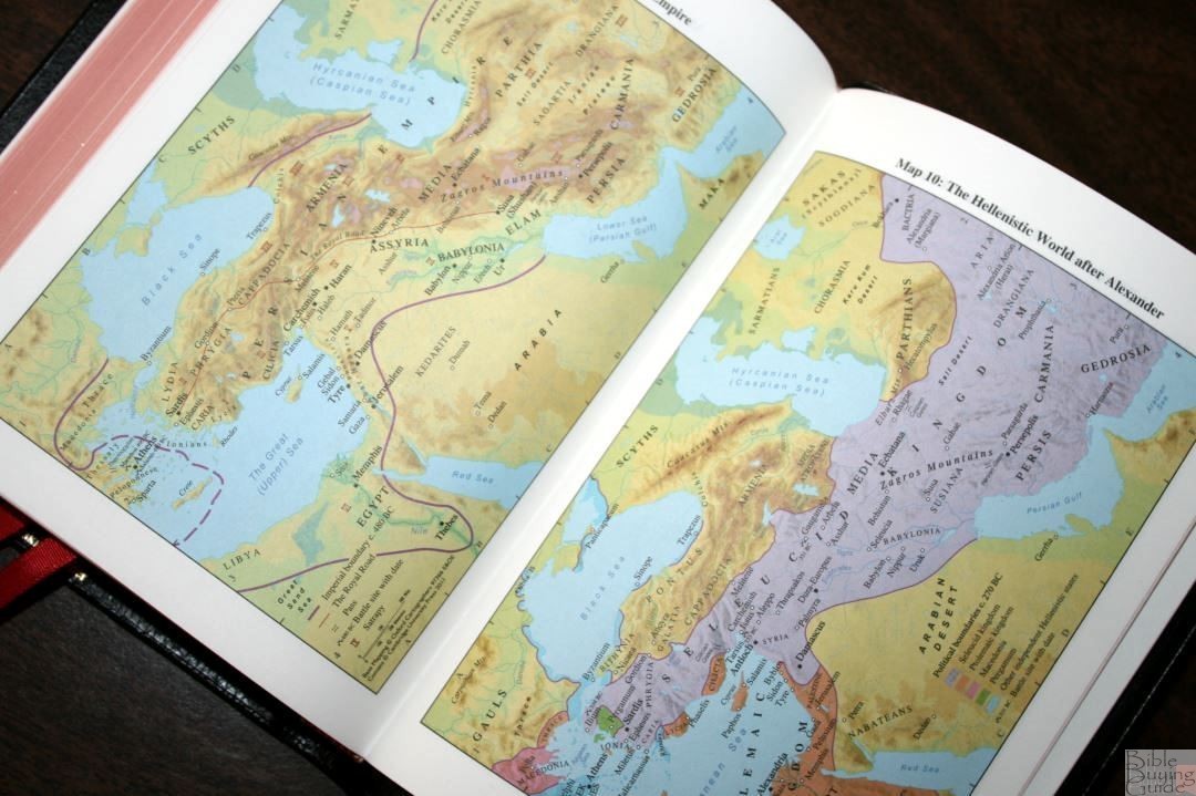
MAPS
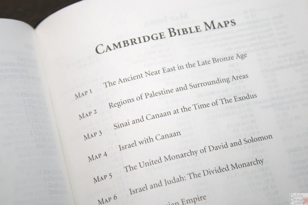
It has 15 pages of maps on thicker, non-glossy, paper. The maps are colorful and include distance, topography, routers, borders, water, settlements, dates, commodities, natural vegetation regions, battles, kingdoms, etc. The maps are detailed and easy to use.
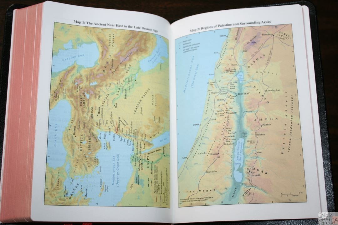
It also includes an 8-page color-coded index to maps printed on the same thick paper. The color code highlights settlements, political, physical land, travel, and Jerusalem.
Maps include:
- The Ancient Near East in the Late Bronze Age
- Regions of Palestine and Surrounding Areas
- Sinai and Canaan at the Time of the Exodus
- Israel with Canaan
- The United Monarchy of David and Solomon
- Israel and Judah: The Divided Monarchy
- The Assyrian Empire
- The Babylonian Empire
- The Persian Empire
- The Hellenistic World after Alexander
- Jerusalem in Old Testament Times
- Jerusalem in New Testament Times
- Palestine in the New Testament
- The Roman Empire
- The Eastern Mediterranean in the First Century AD
FINAL THOUGHTS ON THE NASB PITT MINION BIBLE
The Cambridge NASB Pitt Minion is a joy to hold, carry, and read from. I even used it in the pulpit with no issues. I love the size and weight. I’ve become fond of thin Bibles (around an inch thick) and this one doesn’t suffer from being so thin. The text is small, but that’s an advantage for the Pitt Minion and part of how it has so much in such a small package. Even the thin paper is highly opaque and a joy to read.
It has the same pagination as the wide margin edition (which has a slightly larger font) and the two make a great combo. Like all of the current Pitt Minion line (see reviews of the KJV, ESV, NLT), the NASB is a full reference edition with nothing missing. I highly recommend the NASB Pitt Minion in goatskin for anyone interested in a small yet high-quality NASB.
_______________________________________________
Buy from (includes affiliate links)
and a few local Bible bookstores
_______________________________________________
Photography by hannah C brown.
Cambridge University Press provided this Bible free in exchange for an honest review. I was not required to provide a positive review. My opinions are my own.


Trackbacks/Pingbacks