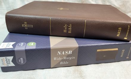
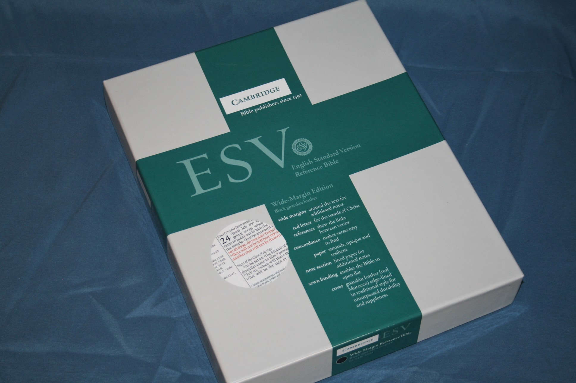
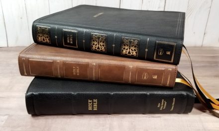
Cambridge ESV Wide Margin Bible in Goatskin – Review
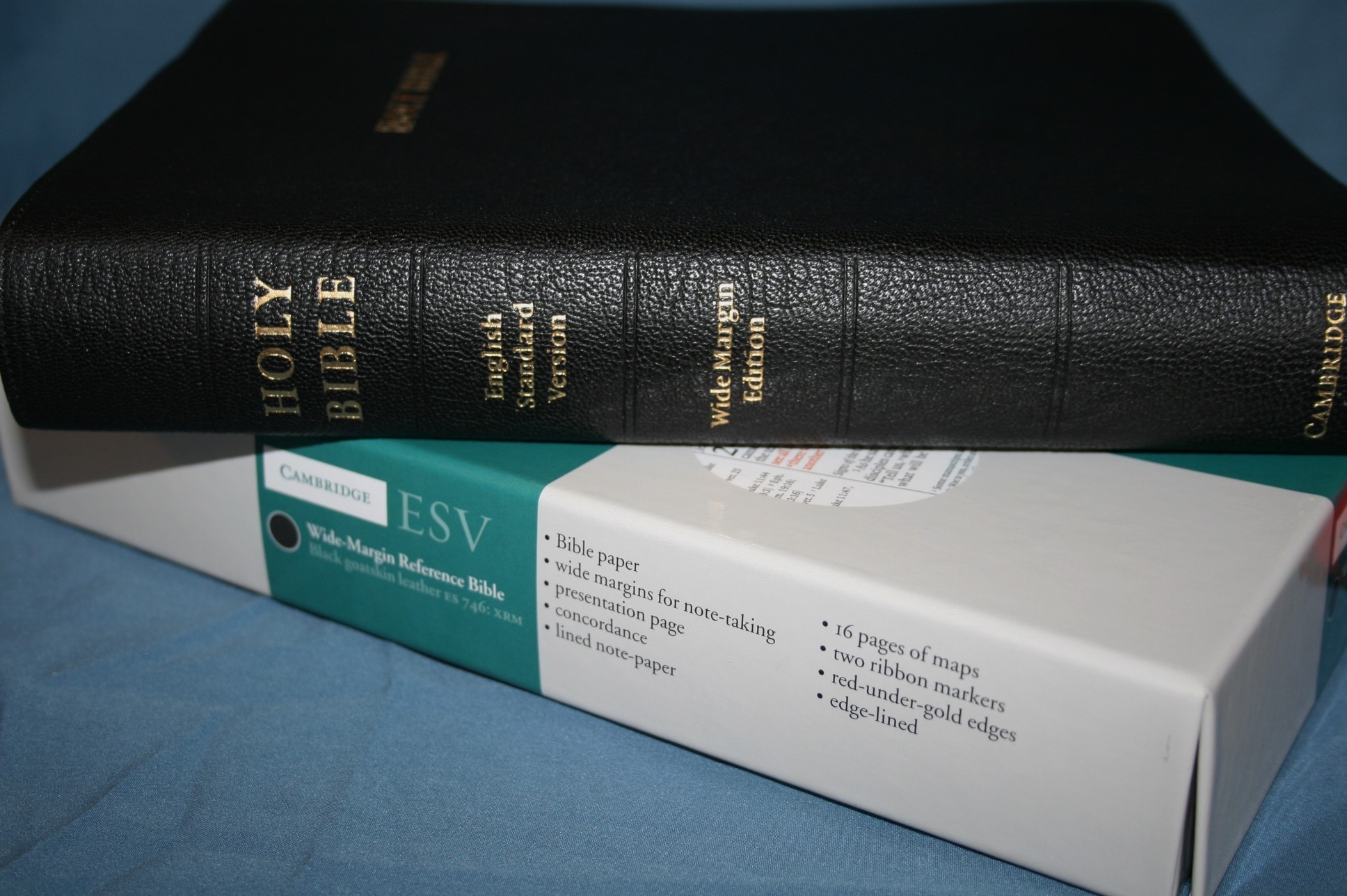 A wide margin Bible is the best Bible anyone can own. It’s an instant study Bible – just add study. Instead of having someone else’s study, a wide margin Bible lets you have a Bible with your own notes. Cambridge’s wide margin Bibles are perfect for this. In this review I put Cambridge’s top of the line ESV Wide Margin Bible in goatskin to the test.
Pros
- Pitt Minion layout
- Goatskin cover
Cons
- Inner margin smaller than outer margin
Features
- 2007 ESV
- Sewn binding
- Goatskin cover
- 38 gsm writable paper
- 8-point font
- Red letter
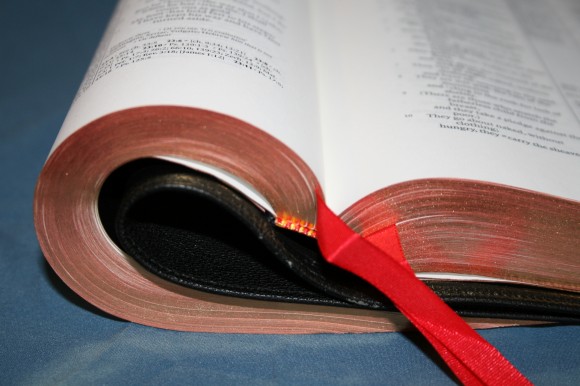
- 2 ribbons
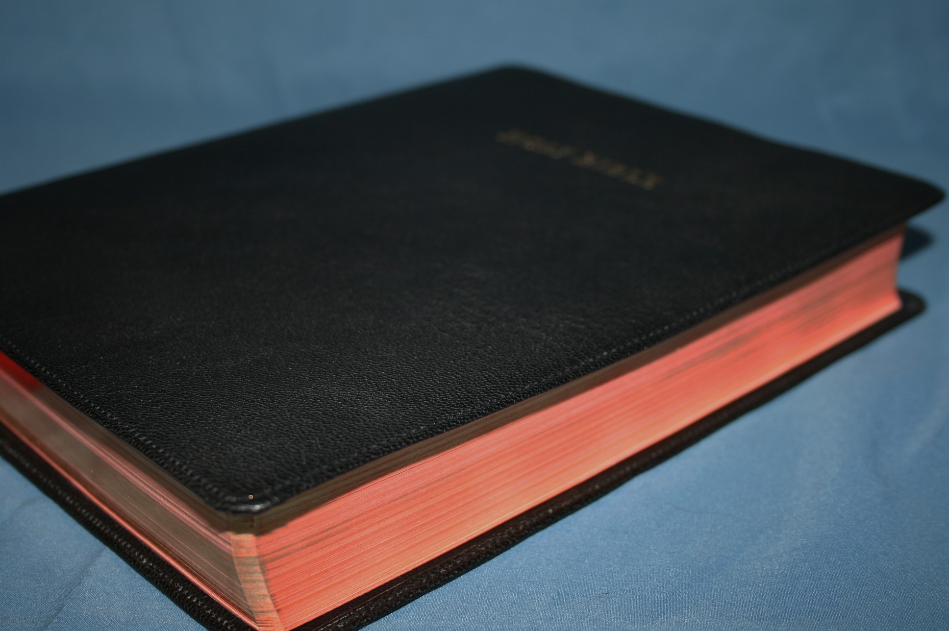
- Red under gold art-gilt edges
- Concordance
- 16 pages of maps
- Index to maps
- Blank pages for index to notes
- Lined blank pages for notes
- Presentation page with no text (lines only)
- 5 x 9.5 x 1.5 (cover)
- 7 1/8 x 9 x 1 7/8 (paper)
- ISBN: 9780521708166
- Printed and bound in the Netherlands by Jongbloed
Cover and Binding
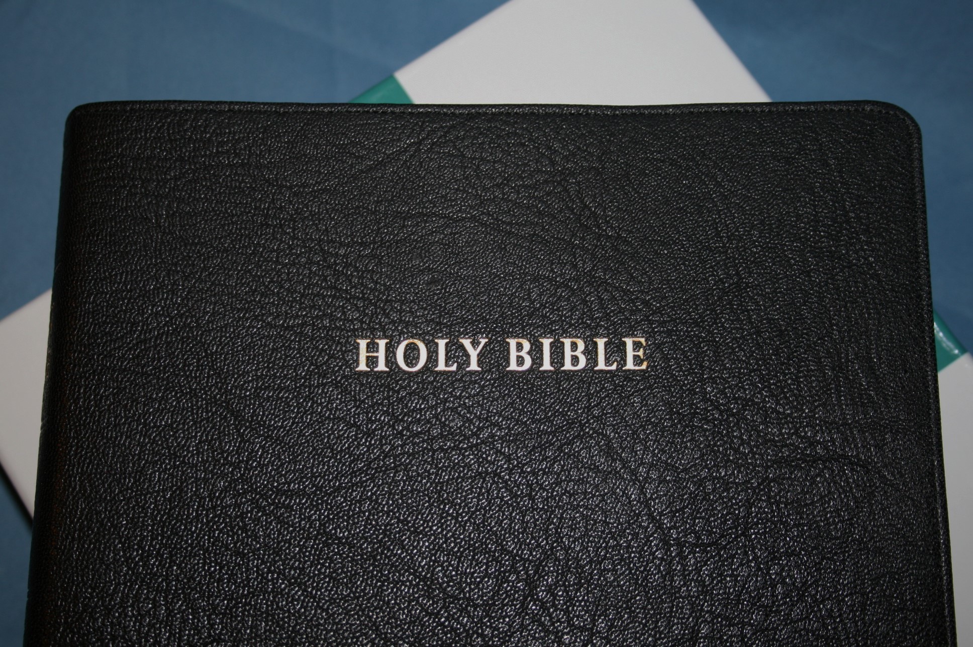
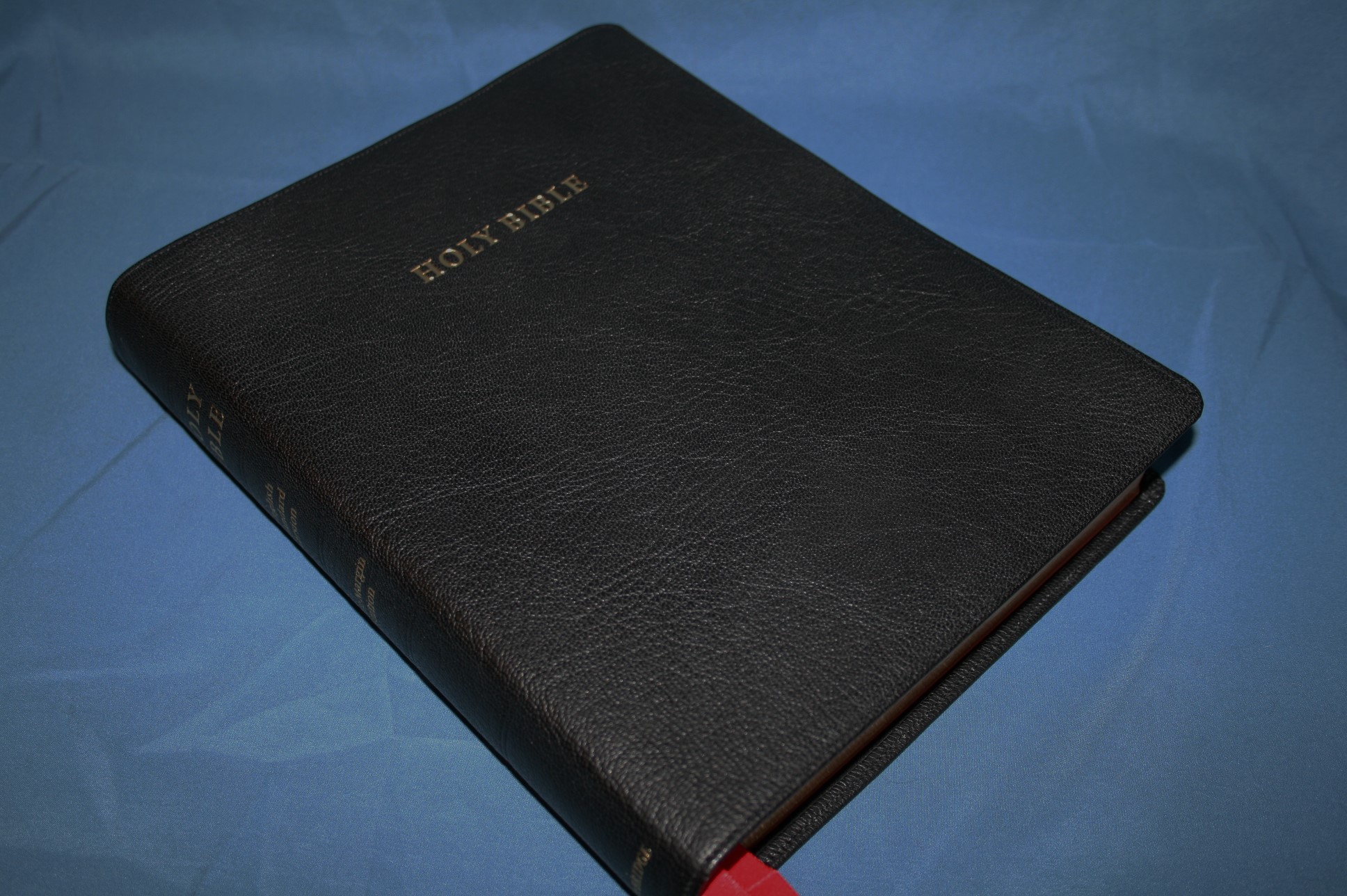
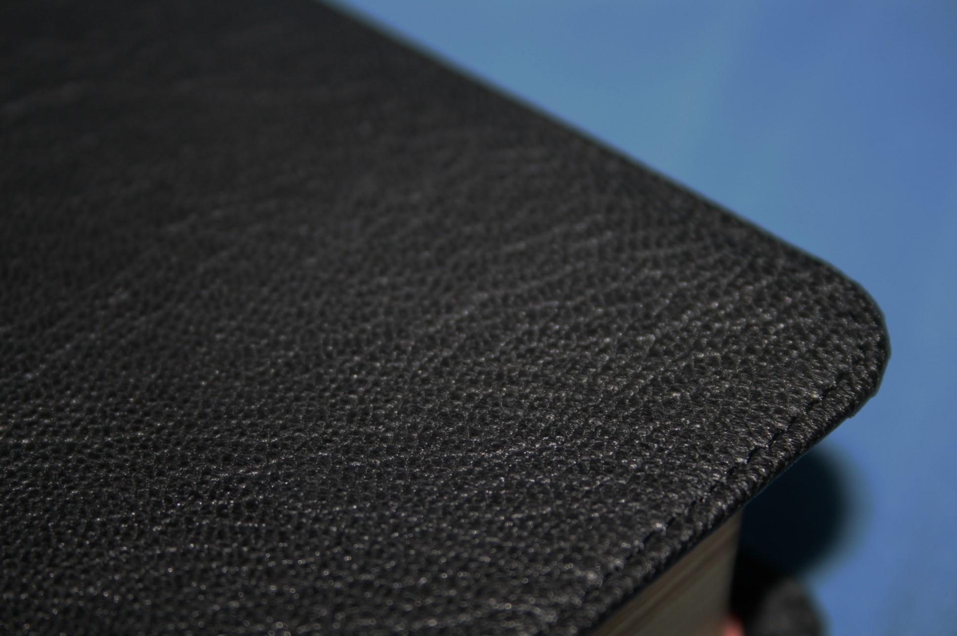

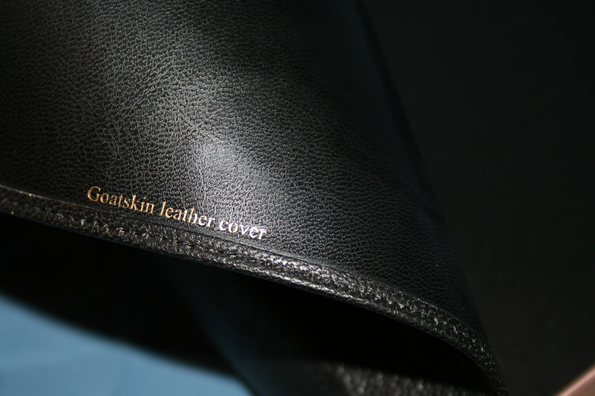

The cover is goatskin with a synthetic liner. It is edge-lined and has stitching around the outside perimeter. It has a natural grain that looks and feels amazing. The synthetic liner doesn’t have any squeaky sounds when it rubs across the end-page. The hinge held the cover open a little too much at first. When I left it open at Genesis and flattened the page so I could easily see the margin, the end-pages wanted to close. After using it for just a few days (and applying some pressure to the hinge) the end-pages now lay down pretty good. After a few more weeks it should lay completely flat.
The flexibility of the goatskin makes holding it a little difficult compared to smaller Bibles or Bibles with calf-skin leather. The Bible is larger than most, so there’s more area of floppy leather. After using it for a while it’s not that difficult to handle. I’ve gotten used to holding it open with one hand. I lay the cover across my arm and in my open palm. It’s still a little more difficult to hold than calf-split, but I like it a lot and I wouldn’t change a thing. I love the look and feel. It doesn’t feel too big to handle and I had no problems carrying it around.
Paper
The paper is 38gsm Tervakoski Thinopaque Bible paper. It has an ivory tint and an 84% opacity rating. It isn’t shiny at all and it’s extremely opaque. It adds to the readability, making this Bible a joy to read. It takes color from color pencils very well and Pigma Micron markers have only a small amount of show-through. It’s perfect for writing and highlighting.

There are 13 blank pages (counting both sides) in the back to be used as an index to your notes. Each page has two letters in alphabetical order. These are great to show what page you’ve written your notes. You can also use them for any other notes you want to make including definitions, character studies, lists of Scriptures on a certain topic, sermons, etc. Also, there are 32 lined pages (counting both sides) in the back for notes, sermons, studies, etc.
The font is a 7.9 Lexicon 1 with an 8.2 leading, making it a 7.9/8.2. Might as well just call it an 8-point font. On paper that doesn’t sound like enough leading for comfortable underlining and reading. In reality it’s not that bad. The boldness of the print and the opacity of the paper help with that a lot; they keep the print consistently readable throughout the Bible. The lines are a little close, but they’re not too close for careful underlining with thin pens or pencils. It would help if there was more leading. Of course the red letter is just as consistent throughout as the black font. The red is about a medium, medium/ dark shade.
I wish the verse numbers were a little larger or bolder. I had trouble trying to find verses. This is fine for reading, but for study and preaching it’s difficult for me because I spend extra time looking for a verse.
Layout
The pagination is the same as the Pitt Minion. In fact, this actually is the Pitt Minion with a larger font and wide margins. I like this because if you’re used to the Pitt Minion then you’ll be used to where the verses are laid out on the page. They make a great combo – one for carry and reading and one for study, teaching, and preaching.

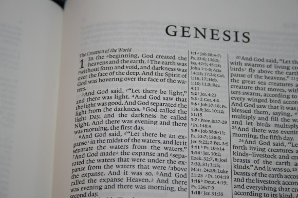
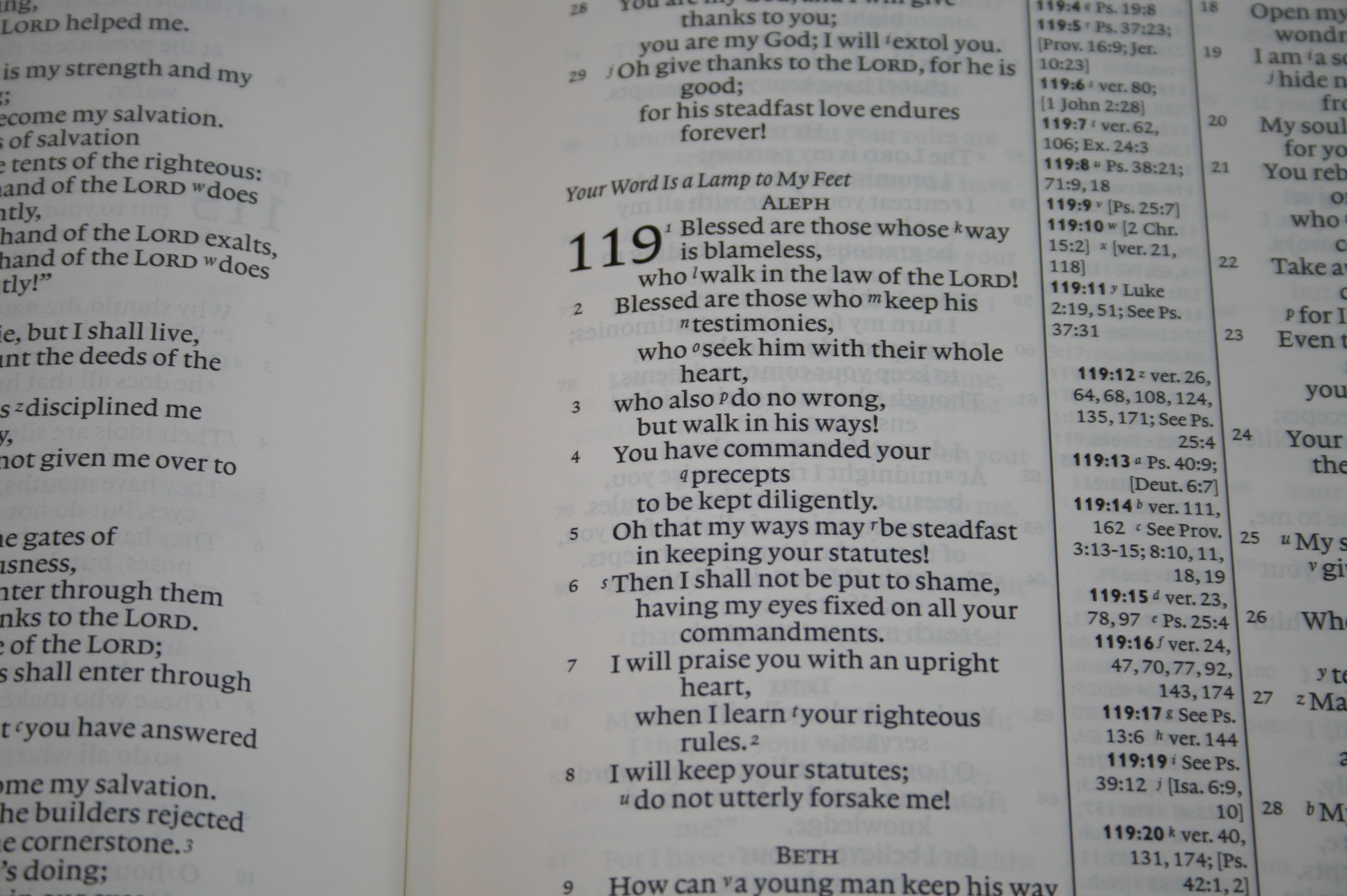
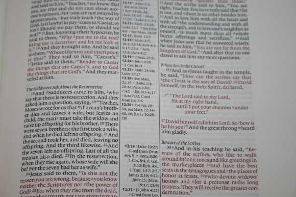
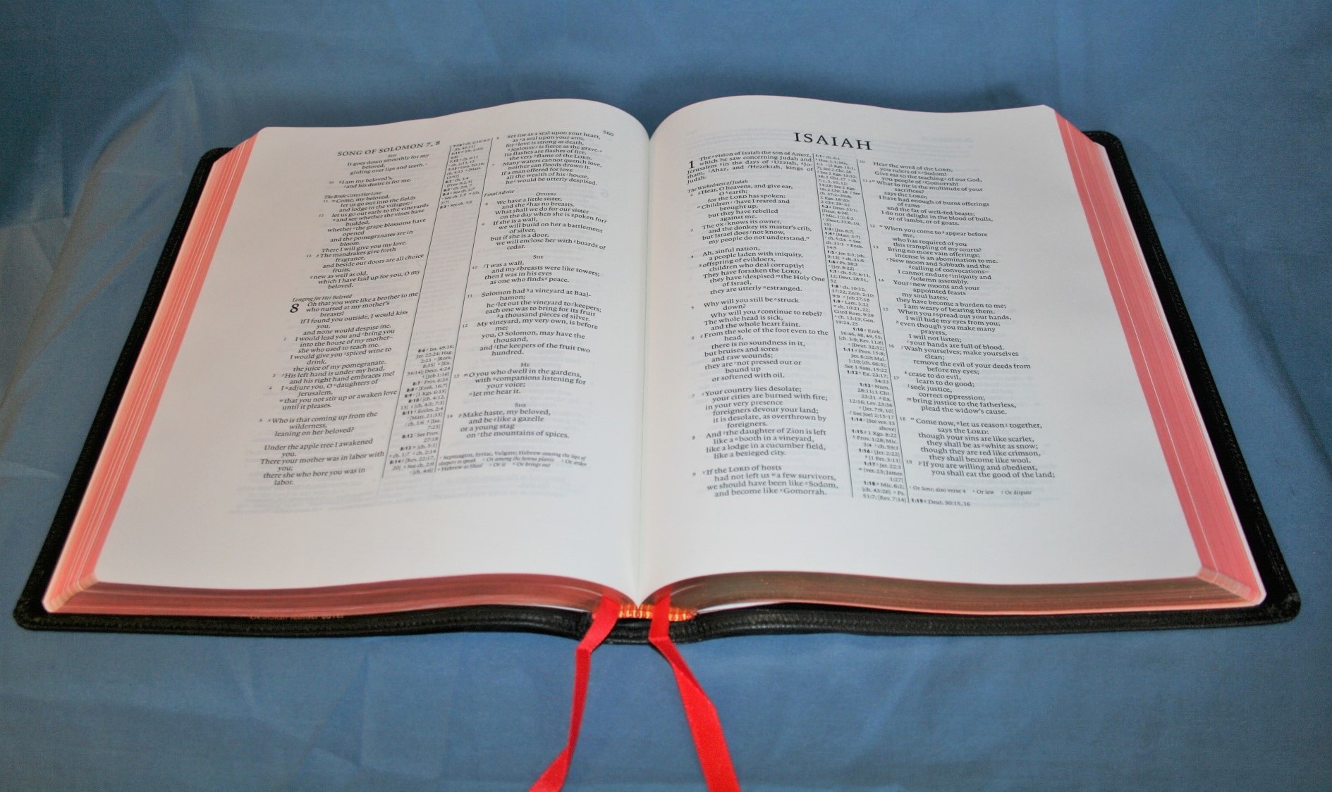
The text is set in a two-column, paragraph layout with center-column references. Poetry is set to verse and Old Testament quotes are offset. The margins are wide on all four sides. The outer margin is 1 3/8”, the inner margin is 1”, the footer is 1”, and the header is 5/8”. Columns are 2” wide and contain 43 characters.
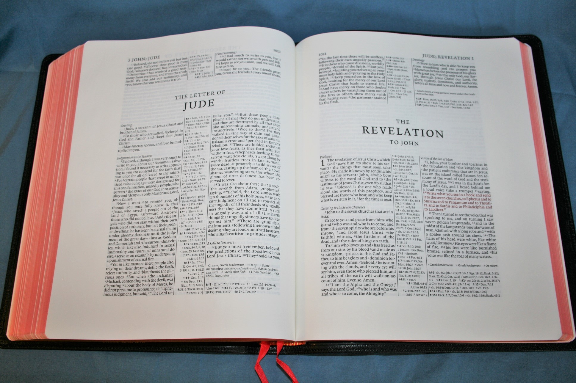
Section headings are in italics. They set the sections apart really well and I don’t find them distracting at all. The header shows all of the book names and chapters that appear on that page (over the outer edge of the outer column) and the page number (over the inner edge of the inner column).
New books start on the same page where the previous book left off. I really would like to see books start on a new page. This would give you more writing space within the text itself, which can be valuable writing space. I realize this is the Pitt Minion and this wouldn’t make sense in the regular Pitt Minion, but I’m looking at it from the standpoint of a stand-alone wide margin Bible. If you have the regular Pitt Minion, it might be more valuable to you for the pages to match rather than having a few more pages to write on.
References
References are keyed to the text with letters. They appear in the center column under the chapter and verse number they correspond to. References for verses in the left column are at the top and references for the right column are at the bottom. If there are too many to fit, the rest will be placed at the bottom of the page under the translation notes.

There are a lot of good quality references that cover both words and themes. Here are a few example of just looking at the number of references for some key verses:
- Genesis 1:1 – 18 references
- John 1:1 – 15 references
- 1 john 1:1 – 10 references
FootNotes
The footnotes are keyed to the text with numbers and appear under the last verse on the page. Unlike the references, the notes do not show which verse they go to. This can be a disadvantage if something in the notes catches your eye and you want to know what verse it goes to. The numbers in the text are hard to find, so you might end up having to read the page to find it.

Sometimes I looked for a footnote when the number in the text was the verse number. The numbers for footnotes are at the end of a word, but if the words are close it almost reads like it could be a footnote or verse number. The numbers for the footnotes are italic where the verse numbers are not, but I’d like to see a little more visual difference between the two (I vote for verse numbers being bolder).
As far as their content, they include:
- Alternate translations
- Literal translations that are too awkward for English
- Hebrew and Greek terms
- Special uses of Greek words
- The meanings of names
- Uncertain meanings
- Clarifying additional meanings
- Grammatical points
- To show supplied pronouns
- To show English equivalents of weights and measures
- Manuscript variations
The footnotes add a lot of good information that is useful for personal study and for sermon prep.
Concordance
The concordance is 88 pages with 3 columns per page and has lots of entries. There is a lot of good material here that greatly helps in study and sermon prep.

It includes:
- Faith – 83
- Faithful – 23
- Faithfully – 4
- Faithfulness – 12
- Faithless – 4
- Faithlessness – 1
- God – 369
- Godliness – 10
- Godly – 7
- Gods – 6
The layout is one verse per line, making it much easier to use and read than the Concord. It even includes line matching. I doesn’t have wide margins like the Concord, which would give you some space to add your own entries, definitions, facts, etc. With the number of entries, you wouldn’t need to add much anyway and you do still have the space at the bottom of the page for notes.
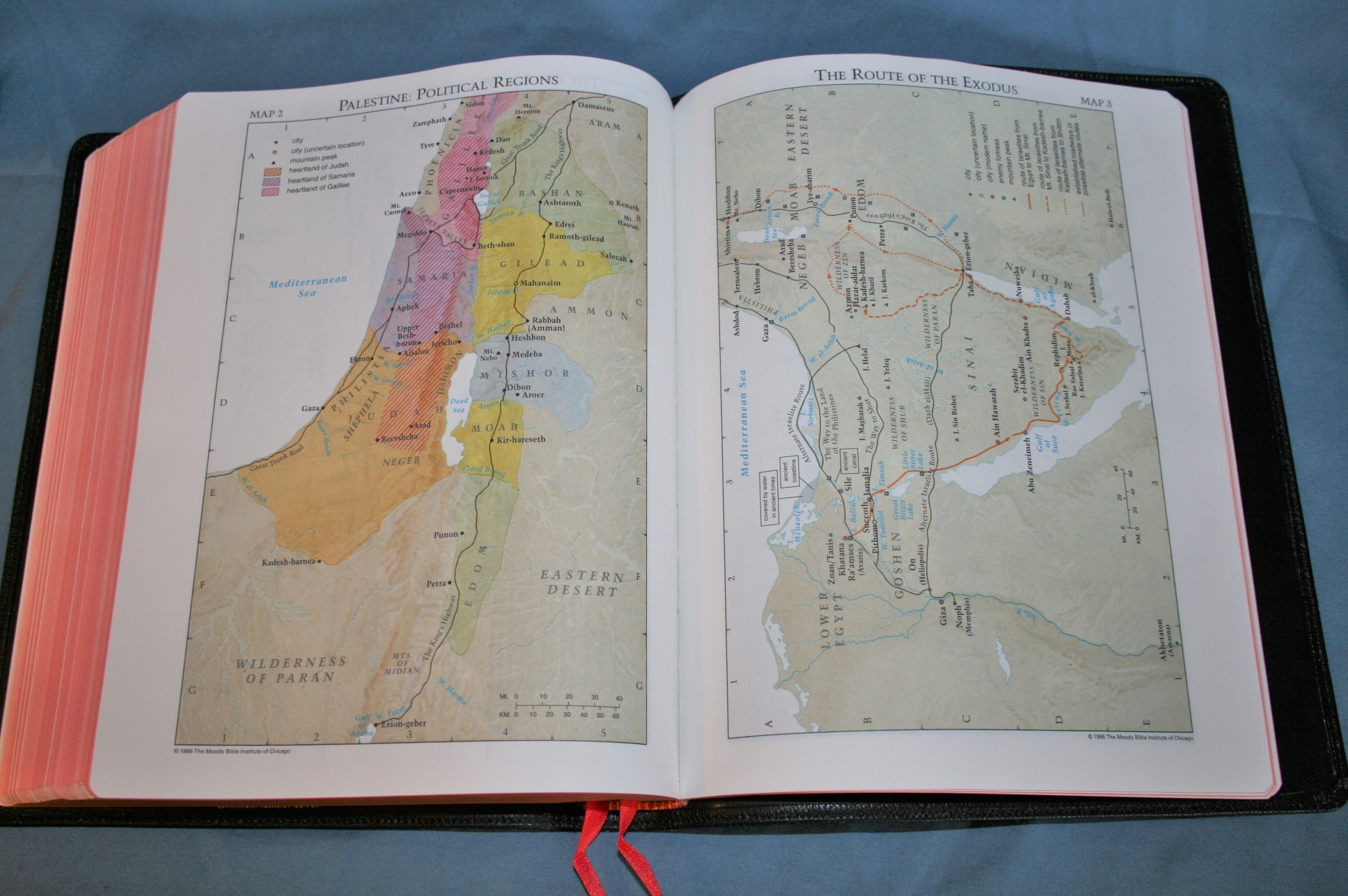
Maps
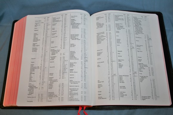
There are 15 full-color maps complete with a 7.5 page index to maps. One thing I love about Cambridge Bibles is the index to their wonderfully drawn maps. The index is very extensive. The maps are colorful and printed on thick, non-glossy paper (my favorite paper for maps).
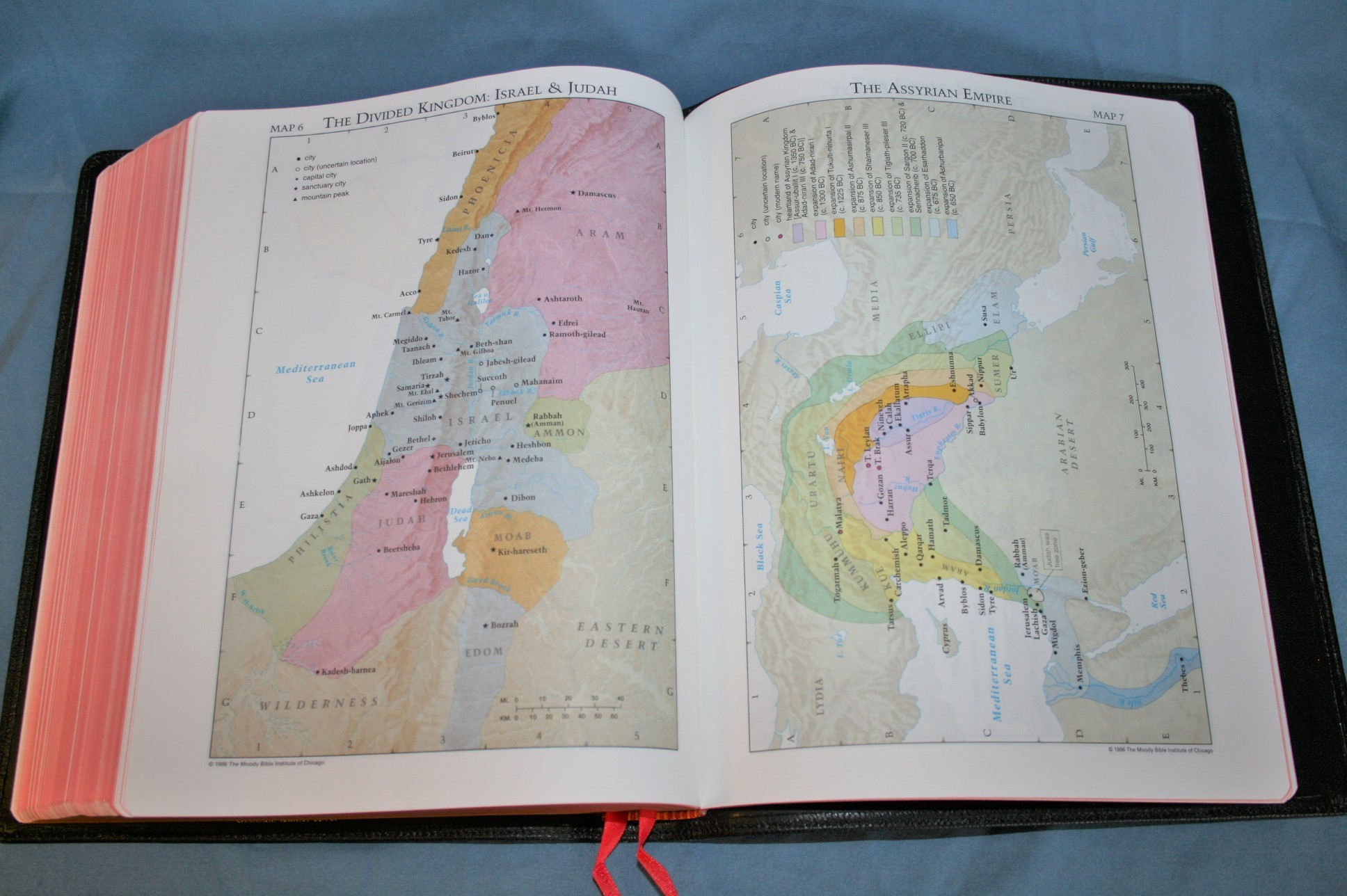
Maps include:
- The Biblical World of the Patriarchs
- Palestine: Political Regions
- The Route of Exodus
- The Twelve Tribes of Israel
- Kingdoms of Saul, David, & Solomon
- The Divided Kingdom: Israel and Judah
- The Assyrian Empire
- The Babylonian Empire
- The Greek Empire
- Old Testament Jerusalem
- New Testament Jerusalem
- The Ministry of Jesus
- The Missionary Journeys of Paul
- The Spread of Christianity
- Modern Israel
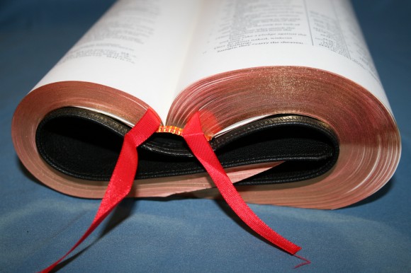
Ribbons
There are two cardinal red ribbons. They’re long enough to pull them to the corner and still have something to hold onto. The ribbons are more functional than elegant. I’d love to see four ribbons that were a little wider and maybe in different colors.
Putting it to Use
My first thought was a Bible this large would be difficult to use as a daily Bible. After using it for a while, I found that it was practical for just about every use. I even carried it with me and read it in the car with little trouble. It wasn’t as convenient as a hand-size Bible of course, but I would use it in the car if I wanted to. This is partially due to it not being very heavy.
Preaching, Teaching, and Sermon Prep
This Bible is amazing for both preaching and teaching. I consider the wide margin Bible to be the best study Bible – one that has your own study notes instead of someone else’s. I love preaching from a wide margin Bible. I like to make small bullets to jog my memory, place a reference for where I should go next or to show what is related, place a note to show the context (although section headings do a great job at this, so this is not always needed), provide a word study, etc.
It lays open on the pulpit beautifully (especially after the hinge breaks in). The color of the paper and the boldness of the font give enough contrast to make it easy to read at a glance, although I find the Concord wide margin to be a little bolder and easier to read. For preaching, I wouldn’t mind if the font was a 9-point, had more leading, or was just a touch darker.
I approach preaching like a giving PowerPoint presentation. You have the entire text before you, but instead of reading from the screen you just need a bullet point to jog your memory. That way you talk instead of read. You can do the same thing in your Bible with highlighting. I like to highlight the keywords within a passage. Those become my bullets that I can see quickly at a glance. I like to use Prismacolor pencils for this. I use several colors – one for each topic. This paper is perfect for it. Of course other options are dry highlighters and Inductive marking kits like those from Christianbook.
This Bible is also very helpful for sermon prep. I looked up ‘mountain’ in the concordance. This took me to Matthew 17:20. The topic I’m looking for is faith – not ‘mountains’. The references point me to verse 9, which does talk about maintains, and to 21:21 which is a parallel passage that talks about faith to move mountains. It also includes Mark 11:23 (mountains) and Luke 17:6 (mulberry tree), which are parallel passages to Matthew 17:20 that continue the theme of faith. This helps in building a harmony of the Gospels and expand on the topic. Of course these verses had more references than this, but these alone were enough to get me through the topic and start building my point. I could have gone into a lot more detail using these references.
Margins
The inner margin is smaller than the outer margin, so writing in the inner margin will be a little more difficult. It’s still a great place to write bullet points, definitions, references, thoughts, topics, outlines, etc.
The bottom of the page also has a lot of space. I like using this space to write detailed definitions of commentary. The definitions wouldn’t even have to relate to the page they’re on. For example, you could write a definition in alphabetical order at the bottom of every page. Since it has 1127 pages that would be at least 1127 definitions. You could also use the space for timelines, facts, character studies, or you could draw maps. You could also use the bottom of the page to write information that won’t fit in the inner margin.
Paper in the Back
There are lots of good uses for the blank and lined pages in the back. The blank pages are meant to be an index to your notes. As an example of this, you could write the references on a specific topic where you’ve written notes. You could also write what page a definition appears or where you’ve written information about a person or place.
Pens, Pencils, and Highlighters
The best tools that I’ve used for notes are Pigma Micron markers. I’ve also used a mechanical pencil and it worked great. Just be careful to not bare down too hard. I also like to use PrismaColor color pencils. Sometimes though, the darker colors can show through a little too much. You might also consider dry highlighters. For highlighters I like sets with 5 or 6 markers. For Pigma Microns, I like the 8-piece Inductive Bible Study Kit.
Conclusion
Cambridge’s ESV Wide Margin Bible is perfect for all students of God’s Word. I highly recommend it for anyone that wants to interact with the Scriptures and write their thoughts and studies in the margins, and I especially recommend it preachers, teachers, and pastors who use their notes for delivering messages. I like wide margin Bibles with paper in the back for these uses and this one delivers.
If I could change one thing, I’d like to see the text shifted outward about ¼”. This would make the inner margin more usable. I recommend the Cambridge ESV Wide Margin Bible even if you don’t want to write in your Bible because the paper and print are so elegant that just reading it is a joy.
Cambridge provided this Bible free for review. I was not required to give a positive review- only an honest review.


Once again Randy an excellent review, Cambridge really has my attention because they give premium bible lovers a choice to have Christ in red. I have grown to just live with the fact that red is always going to be not so nice in bibles, this is not the case with Cambridge. Their paper is so beautifully done and they have an elegance about them that pulls me in. Thankyou for another great review brother, you have pointed me in the right direction and have not failed me yet. Blessings, can’t wait for your next one…good things indeed:)
How would you compare this bible to the ESV Heirloom Legacy as far as note-taking, reading, and preaching/teaching are concerned?
The paper in this wide margin is thicker (38gsm vs 28gsm) and a lot more opaque. The Legacy is easier to carry and hold and has a larger font. I prefer the Cambridge for notes because of the paper thickness and paper in the back. For reading and carry I would prefer the Legacy. I’m working on a comparison between this one and the Crossway wide margin and regular Legacy (the Heirloom was a giveaway copy, so I can’t compare it). I will have it posted this week.